Book Image

Learn Microsoft PowerApps

By : Matthew Weston
Book Image

Learn Microsoft PowerApps

By: Matthew Weston

Overview of this book

Microsoft PowerApps provides a modern approach to building business applications for mobile, tablet, and browser. Learn Microsoft PowerApps will guide you in creating powerful and productive apps that will add value to your organization by helping you transform old and inefficient processes and workflows. Starting with an introduction to PowerApps, this book will help you set up and configure your first application. You’ll explore a variety of built-in templates and understand the key difference between types of applications such as canvas and model-driven apps, which are used to create apps for specific business scenarios. In addition to this, you’ll learn how to generate and integrate apps directly with SharePoint, and gain an understanding of PowerApps key components such as connectors and formulas. As you advance, you’ll be able to use various controls and data sources, including technologies such as GPS, and combine them to create an iterative app. Finally, the book will help you understand how PowerApps can use several Microsoft Power Automate and Azure functionalities to improve your applications. By the end of this PowerApps book, you’ll be ready to confidently develop lightweight business applications with minimal code.
Table of Contents (25 chapters)
Free Chapter
1
Section 1: Getting Started with PowerApps
6
Section 2: Developing Your PowerApp
11
Section 3: Extending the Capabilities of Your PowerApp
18
Section 4: Working with Model-Driven Apps
21
Section 5: Governing PowerApps

Controls

Controls are key components that are used to build the basic functionality and interactivity of your app. While text controls are the most common components we'll use, the following controls will allow you to customize the input experience so that you can take other data types and other input methods into account.
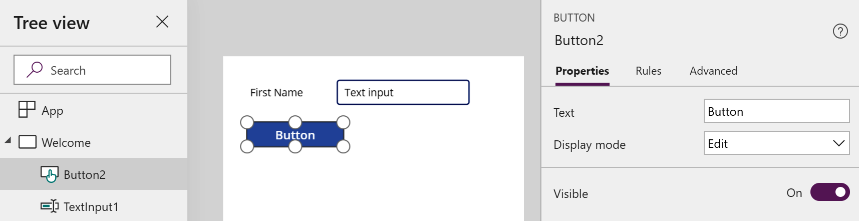
BUTTON

Buttons are one of the most simple controls that you can work with; they are designed to be a focal point for a click or a tap and are generally used to instantiate an action. The default styling on a button makes it stand out as a clickable control, as shown in the following screenshot. However, this styling can be changed to suit the look and feel of your page:

Figure 5.6: BUTTON control

While the ability to edit the styling of the button is available, the most important aspect of this control is the OnSelect property. OnSelect allows you to define the behavior of the button using a formula; for example, when a button is clicked, it will save an item...