Book Image

Python GUI Programming Cookbook - Third Edition

By : Burkhard Meier
Book Image

Python GUI Programming Cookbook - Third Edition

By: Burkhard Meier

Overview of this book

Python is a multi-domain, interpreted programming language that is easy to learn and implement. With its wide support for frameworks to develop GUIs, you can build interactive and beautiful GUI-based applications easily using Python. This third edition of Python GUI Programming Cookbook follows a task-based approach to help you create effective GUIs with the smallest amount of code. Every recipe in this book builds upon the last to create an entire, real-life GUI application. These recipes also help you solve problems that you might encounter while developing GUIs. This book mainly focuses on using Python’s built-in tkinter GUI framework. You'll learn how to create GUIs in Python using simple programming styles and object-oriented programming (OOP). As you add more widgets and expand your GUI, you will learn how to connect to networks, databases, and graphical libraries that greatly enhance the functionality of your GUI. You’ll also learn how to use threading to ensure that your GUI doesn't become unresponsive. Toward the end, you’ll learn about the versatile PyQt GUI framework, which comes along with its own visual editor that allows you to design GUIs using drag and drop features. By the end of the book, you’ll be an expert in designing Python GUIs and be able to develop a variety of GUI applications with ease.
Table of Contents (13 chapters)

Creating a check button with different initial states

In this recipe, we will add three check button widgets, each with a different initial state:

  • The first is disabled and has a checkmark in it. The user cannot remove this checkmark as the widget is disabled.
  • The second check button is enabled, and by default has no checkmark in it, but the user can click it to add a checkmark.
  • The third check button is both enabled and checked by default. The users can uncheck and recheck the widget as often as they like.

Getting ready

This recipe extends the previous recipe, Creating combobox widgets.

How to do it...

Here is the code for creating three check button widgets that differ in their states:

  1. Start with the GUI_combobox_widget_readonly_plus_display_number.py module and save it as GUI_checkbutton_widget.py.
  2. Create three tk.IntVar instances and save them in local variables:
chVarDis = tk.IntVar()
chVarUn = tk.IntVar()
chVarEn = tk.IntVar()
  1. Set the text attributes for each of the Combobox widgets we are creating:
text="Disabled"
text="UnChecked"
text="Enabled"
  1. Set their state to deselect/select:
check1.select()
check2.deselect()
check3.select()
  1. Use grid to lay them out:
check1.grid(column=0, row=4, sticky=tk.W)
check2.grid(column=1, row=4, sticky=tk.W)
check3.grid(column=2, row=4, sticky=tk.W)

The preceding steps will finally produce the following code (GUI_checkbutton_widget.py):

  1. Run the module. Running the new code results in the following GUI:

Let's go behind the scenes to understand the code better.

How it works...

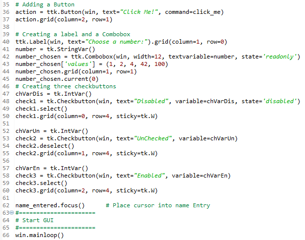
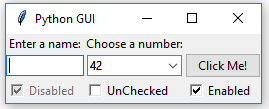
Steps 1 to 4 show the details and the screenshot in step 5 displays the important aspects of the code.

In lines 47, 52, and 57 ,we create three variables of the IntVar type. In the line following each of these variables, we create a Checkbutton widget, passing in these variables. They will hold the state of the Checkbutton widget (unchecked or checked). By default, that is either 0 (unchecked) or 1 (checked), so the type of the variable is a tkinter integer.

We place these Checkbutton widgets in our main window, so the first argument passed into the constructor is the parent of the widget, in our case, win. We give each Checkbutton widget a different label via its text attribute.

Setting the sticky property of the grid to tk.W means that the widget will be aligned to the west of the grid. This is very similar to Java syntax, and it means that it will be aligned to the left. When we resize our GUI, the widget will remain on the left side and not be moved toward the center of the GUI.

Lines 49 and 59 place a checkmark into the Checkbutton widget by calling the select() method on these two Checkbutton class instances.

We continue to arrange our widgets using the grid layout manager, which will be explained in more detail in Chapter 2, Layout Management.

We've successfully learned how to create a check button with different initial states. Now, let's move on to the next recipe.