


Contour plots can hide some detail of the surface that they represent since they only show where the "height" is similar and not what the value is, even in relation to the surrounding values. On a map, this is remedied by printing the height onto certain contours. Surface plots are more revealing, but the problem of projecting three-dimensional objects into 2D to be displayed on a screen can itself obscure some details. To address these issues, we can customize the appearance of a three-dimensional plot (or contour plot) to enhance the plot and make sure the detail that we wish to highlight is clear. The easiest way to do this is by changing the colormap of the plot.
In this recipe, we will use the reverse of the binary colormap.
Getting ready
We will generate surface plots for the following function:

We generate the points at which this should be plotted as in the previous recipe:
X = np.linspace(-2, 2)
Y = np.linspace(-2, 2)
x, y = np.meshgrid(X, Y)
t = x**2 + y**2  # small efficiency
z = np.cos(2*np.pi*t)*np.exp(-t)
How to do it...
Matplotlib has a number of built-in colormaps that can be applied to plots. By default, surface plots are plotted with a single color that is shaded according to a light source (see the There's more... section of this recipe). A colormap can dramatically improve the effect of a plot. The following steps show how to add a colormap to surface and contour plots:
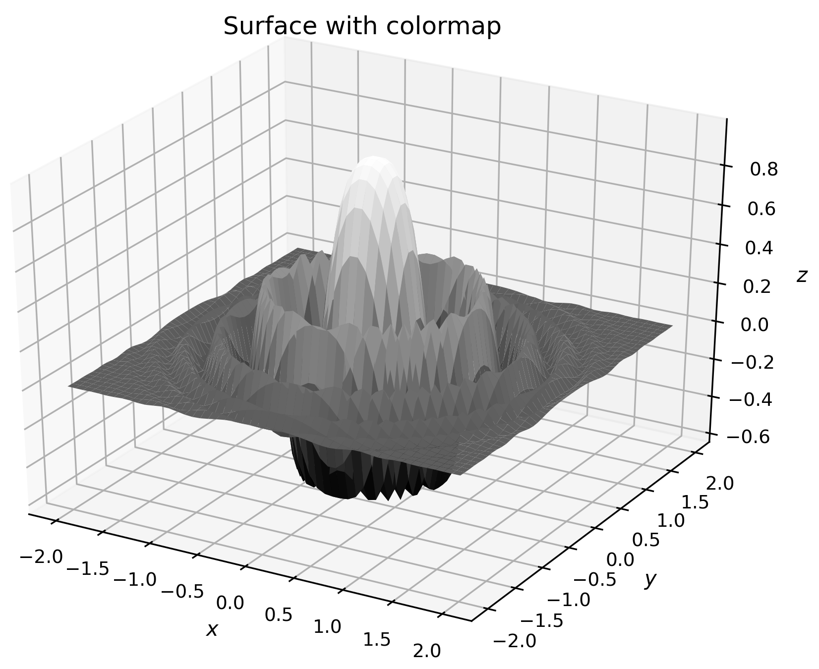
- To start, we simply apply one of the built-in colormaps, binary_r, which is done by providing the cmap="binary_r" keyword argument to the plot_surface routine:
fig = plt.figure()
ax = fig.add_subplot(projection="3d")
ax.plot_surface(x, y, z, cmap="binary_r")
ax.set_title("Surface with colormap")
ax.set_xlabel("$x$")
ax.set_ylabel("$y$")
ax.set_zlabel("$z$")
The result is a figure (Figure 2.9) where the surface is colored according to its value, with the most extreme values at either end of the colormap—in this case, the larger the z value, the lighter the shade of gray. Note that the jaggedness of the plot in the following diagram is due to the relatively small number of points in the mesh grid:
Colormaps apply to other plot types in addition to surface plots. In particular, colormaps can be applied to contour plots, which can help to distinguish between the contours that represent higher values and those that represent lower values.
- For the contour plot, the method for changing the colormap is the same; we simply specify a value for the cmap keyword argument:
fig = plt.figure()
plt.contour(x, y, z, cmap="binary_r")
plt.xlabel("$x$")
plt.ylabel("$y$")
plt.title("Contour plot with colormap set")
The result of the preceding code is shown here:
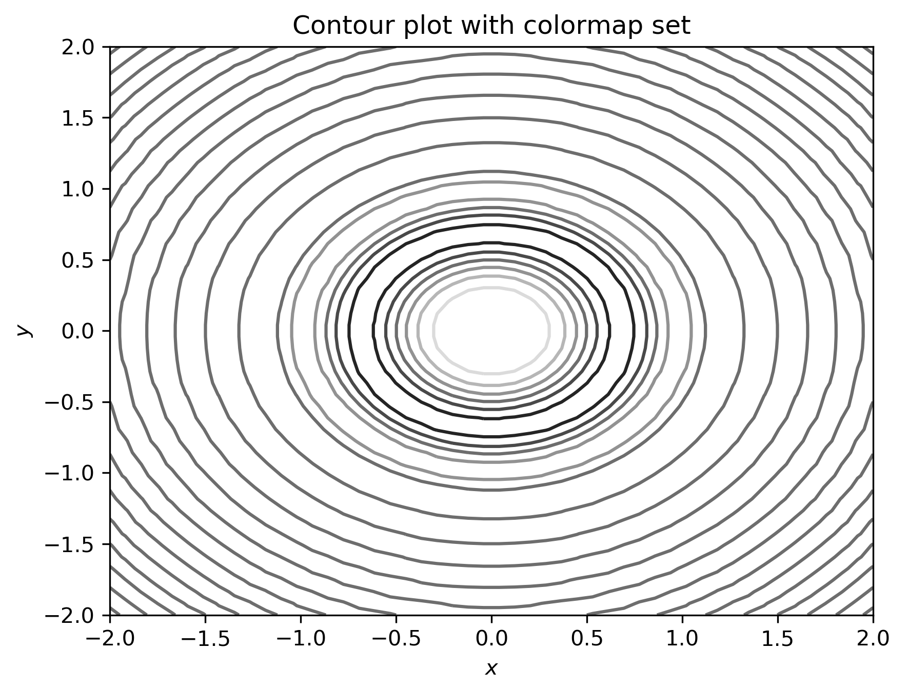
The darker shades of gray in the diagram correspond to the lower values of z.
How it works...
Color mapping works by assigning an RGB value according to a scale—the colormap. First, the values are normalized so that they lie between 0 and 1, which is typically done by a linear transformation that takes the minimum value to 0 and the maximum value to 1. The appropriate color is then applied to each face of the surface plot (or line, in another kind of plot).
Matplotlib comes with a number of built-in colormaps that can be applied by simply passing the name to the cmapkeyword argument. A list of these colormaps is given in the documentation (https://matplotlib.org/tutorials/colors/colormaps.html), and also comes with a reversed variant, which is obtained by adding the _rsuffix to the name of the chosen colormap.
There's more...
The normalization step in applying a colormap is performed by an object derived from the Normalize class. Matplotlib provides a number of standard normalization routines, including LogNorm and PowerNorm. Of course, you can also create your own subclass of Normalize to perform the normalization. An alternative Normalize subclass can be added using the norm keyword of plot_surface or other plotting functions.
For more advanced uses, Matplotlib provides an interface for creating custom shading using light sources. This is done by importing the LightSource class from the matplotlib.colors package, and then using an instance of this class to shade the surface elements according to the z value. This is done using the shade method on the LightSource object:
from matplotlib.colors import LightSource
light_source = LightSource(0, 45)  # angles of lightsource
cmap = plt.get_cmap("binary_r")
vals = light_source.shade(z, cmap)
surf = ax.plot_surface(x, y, z, facecolors=vals)
Complete examples are shown in the Matplotlib gallery should you wish to learn more about how this works.


