Book Image

jQuery UI 1.10: The User Interface Library for jQuery - Fourth Edition

Book Image

jQuery UI 1.10: The User Interface Library for jQuery - Fourth Edition

Overview of this book

jQuery UI, the official UI widget library for jQuery, gives you a solid platform on which to build rich and engaging interfaces quickly, with maximum compatibility, stability, and effort. jQuery UI's ready-made widgets help to reduce the amount of code that you need to write to take a project from conception to completion. jQuery UI 1.10: The User Interface Library for jQuery has been specially revised for Version 1.10 of jQuery UI. It is written to maximize your experience with the library by breaking down each component and walking you through examples that progressively build up your knowledge, taking you from beginner to advanced user in a series of easy-to-follow steps. Throughout the book, you'll learn how to create a basic implementation of each component, then customize and configure the components to tailor them to your application. Each chapter will also show you the custom events fired by the components covered and how these events can be intercepted and acted upon to bring out the best of the library. We will then go on to cover the use of visually engaging, highly configurable user interface widgets. At the end of this book, we'll look at the functioning of all of the UI effects available in the jQuery UI library.
Table of Contents (22 chapters)
jQuery UI 1.10: The User Interface Library for jQuery
Credits
About the Authors
About the Reviewers
www.PacktPub.com
Preface
Index

Switching themes quickly and easily


Once we have developed content using the base theme, we may decide to change the theme to something that fits in better with our overall site theme; thankfully, the CSS framework makes switching themes a painless task. Looking at the previous example, all we need to do to change the skin of the widget is choose a new theme using ThemeRoller (available at http://www.jqueryui.com/themeroller), and then download the new theme. We can download the new theme by selecting all of the components in the download builder and clicking on Download to obtain the theme.

Within the downloaded archive, there will be a directory with the name of the chosen theme, such as redmond. We drag the theme folder out of the archive into the development-bundle\themes folder and link the new theme file from our page, giving our form a completely new look as shown in the following screenshot:

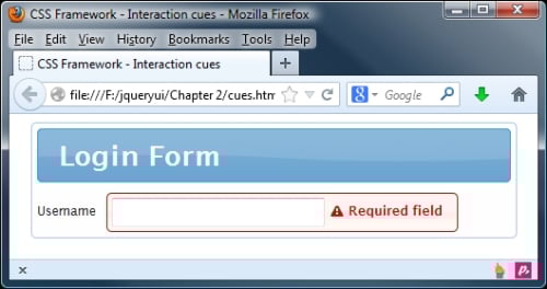
The theme I used to obtain this screenshot is redmond. This uses various shades of blue, either...