Book Image

Responsive Web Design with HTML5 and CSS3 Essentials

By : Alex Libby, Gaurav Gupta, Asoj Talesra
Book Image

Responsive Web Design with HTML5 and CSS3 Essentials

By: Alex Libby, Gaurav Gupta, Asoj Talesra

Overview of this book

Responsive web design (RWD) is a web design approach aimed at crafting sites to provide an optimal viewing and interaction experience—providing easy reading and navigation with minimum resizing, panning, and scrolling—and all of this across a wide range of devices from desktop computer monitors to mobile phones. Responsive web design is becoming more important as the amount of mobile traffic now accounts for more than half of the Internet’s total traffic. This book will give you in depth knowledge about the basics of responsive web design. You will embark on a journey of building effective responsive web pages that work across a range of devices, from mobile phones to smart TVs, with nothing more than standard markup and styling techniques. You'll begin by getting an understanding of what RWD is and its significance to the modern web. Building on the basics, you'll learn about layouts and media queries. Following this, we’ll dive into creating layouts using grid based templates. We’ll also cover the important topic of performance management, and discover how to tackle cross-browser challenges.
Table of Contents (11 chapters)
Responsive Web Design with HTML5 and CSS3 Essentials
Credits
About the Authors
About the Reviewer
www.PacktPub.com
Preface

Exploring some examples


Open a browser; let's go and visit some sites.

Now, you may think I've lost my marbles, but stay with me. I want to show you a few examples. Let's take a look at a couple of example sites at different screen widths. How about this example from my favorite coffee company, Starbucks:

Try resizing the browser window; if you get small enough, you will see something akin to this:

Here's another example—we cannot forget the site for the publisher of this book, Packt:

Try changing the size of your browser window. If we resize it enough, it will show this:

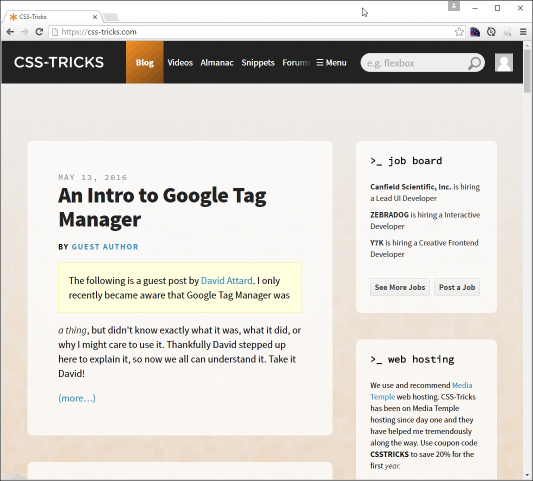
For our third and final example, let's go visit CSS Tricks, the site created by Chris Coyier, at http://www.css-tricks.com:

If we resize this to a smaller width, this is what we will get:

Now, what was the point of all that, I hear you ask? Well, it's simple. All of them use media queries in some form or other; CSS Tricks uses the queries built into WordPress, Packt's site is hosted using Drupal, and Starbucks' site...