Now that you know the families, you need to know the general rules that will make your text and their usage flow like a springtime breeze.
Is the adjusting of space between two characters to achieve a visually balanced word trough and a visually equal distribution of white space.
The word originates from the Latin word cardo meaning hinge. When letters were made of metal on wooden blocks, parts of them were built to hang off the base, thus giving space for the next character to sit closer.

Tracking is also as called letter-spacing and it is concerned with the entire word—not single characters or the whole text block—to change the density and texture in a text and to affect its readability.
The word originates from the metal tracks where the wooden blocks with the characters were moved horizontally.

Tracking request careful settings: too much white space and the words won't appear as single coherent blocks anymore – reduce the white space between the letters drastically and the letters themselves won't be readable.
As a rule, you want your lines of text to be made of 50 to 75 characters, including dots and spaces, to achieve better readability. Some will ask you to stop your typing as soon as approximately 39 characters are reached, but I tend to differ.
According to kerning, especially on serifs, two or three character can clash together. Ligatures are born to avoid this; they are stylistic characters that combine two or three letters into one letter:
Standard ligatures are naturally and functionally the most common ones and are made between fi, fl, and other letters when placed next to an f. They should be used, as they tend to make the script more legible.
Discretionary ligatures are not functional, they just serve a decorative purpose. They are commonly found and designed between Th and st; as mentioned previously, you should use them at your discretion.

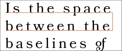
Leading is the space between the baselines of your text, while line-height adds to the notions and also to the height of ascenders and descenders. The name came to be because in the ancient times, stripes of lead were used to add white space between two lines of text.
There are many rules in typesetting (none of which came out as a perfect winner) and everything changes according to the typeface you're using.
Mechanical print tends to add 2 points to the current measure being used, while a basic rule for digital is to scale the line-spacing as much as 120 percent of your x-height, which is called single spacing.
As a rule of thumb, scale in between 120 and 180 percent and you are good to go (of course with the latter being used for typefaces with a major x-height). Just remember, the descenders should never touch the next line ascenders, otherwise the eye will perceive the text as crumpled and you will have difficulties to understand where one line ends and the other start.
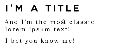
This is important in a text because it helps the reader understand the order of the text, what's more important, what's regular text, what requires attention, and also with the use of descriptive titles it helps him skip entire parts of the text that are of no specific interest.
To achieve the aspect of a title and of a sub-title, different sizes and weights are used between the two parts. We generally prefer to triple the dimension of the actual text and go with the corresponding leading directly above it; if a subtitle is present, leading can be adjusted from 100 to 110 percent.
This book is written in English, actually aiming at the western cultures, which we tend to read and write from left to right; hence, the alignment of it's type follows the same direction.
It depends on your culture and whom your text is aimed to. It also depends on the general aesthetic that you're trying to achieve and usually compromises between the two needs to be fulfilled.
Scientifically speaking, centrally aligned text is the weakest from a readability point of view: your eye can't find a consistent starting and stopping point. So, every passage will automatically adjust every new line in an instant; it's a subtle but catastrophic step, since the focus will be shifted from the word to the general picture. People tend to be easily distracted when reading a text that is centrally aligned.
So, both left and right edges are good for typesetting; it depends on your language and aesthetics.
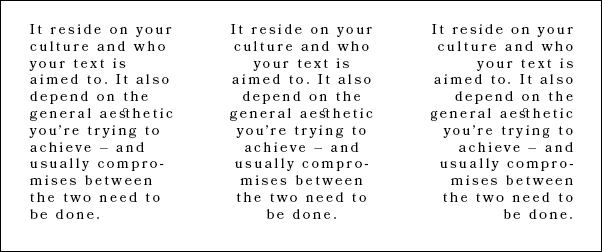
It's a term and a direct consequence of your alignment; it's the uneven vertical edge in a block of type.
A good rag goes in and out from the margin in small increments; while a bad, distracting one creates distracting shapes.
This can be managed by manually adjusting line breaks or by editing the copy:
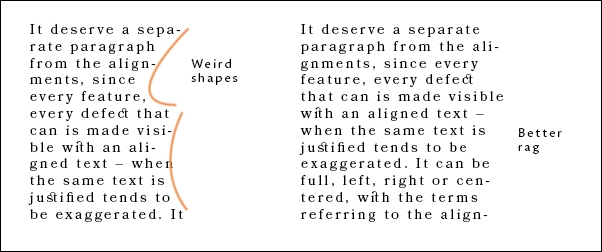
It deserves a separate paragraph from the alignments, since every feature and every defect can be made visible with an aligned text; when the same text is justified, it tends to be exaggerated. It can be full, left, right, or centered with the terms referring to the alignment of the last line of text.
It's a common type of text alignment in print, where the spaces between words are stretched or compressed to align the left and right edges of the text equally.
This commonly gives birth to various issues, as a loose line where the space is just too much, or a tight one, where the text is too crumpled.
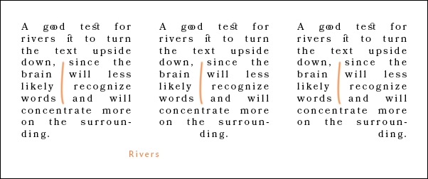
The centered one especially gives birth to rivers, which are gaps in the text that appear to run almost vertically and are bad for readability, since they distract the eye.
One good test for you to discover rivers in your typesetting is to take the paper or the text and rotate it by 180 degrees, turning it upside down.
Doing so will make the words and text less easy to be recognized by the brain, which will now concentrate more on the actual shape of your paragraph, instead of its meaning, which will allow you to see them better.
