
Throughout the course of this chapter, we will focus on decorating the blog with CSS and JavaScript. We will be using CSS3 to add the blog styles. CSS3 brings a number of new CSS properties, such as border-radius, box-shadow, and box-sizing, that allow us to decorate websites without the need to add images and extra markup.
It's going to be an adventurous chapter. Let's go.
In this chapter, we shall cover the following topics:
CSS3 ships with long-awaited properties, border-radius and box-shadow, that simplify old and tedious methods that were used to present rounded corner and drop shadow in HTML. On top of that, it also brings a new type of pseudo-element that enables us to style the placeholder text shown in input fields through the HTML5 placeholder attribute.
Let's take a look at how they work.
Back in the 90s, creating a rounded corner was complicated. Adding a pile of HTML markup, slicing out images, and formulating multiple line style of rules is inevitable, as presented in the post by Ben Ogle at http://benogle.com/2009/04/29/css-round-corners.html.
CSS3 makes it much simpler to create rounded corners with the border-radius property, and the following is an example:
div {
  width: 100px; height: 100px;
  border-radius: 30px;
}
The preceding style rule will round the box corner (read the A word on CSS Box Model section in Chapter 1, Responsive Web Design) each for 30px, as shown in the following figure:

Furthermore, we can also round only to specific corners. The following code snippet, for example, will round only the top-right corner:
Much the same as creating rounded corners, using images was unavoidable to create shadow effects in the website in the past. Now, adding a drop shadow has been made easy with the introduction of the box-shadow property. The box-shadow property consists of five parameters (or values):
The first parameter specifies where the shadow takes place. This parameter is optional. Set the value to inset to let the shadow appear inside the box or leave it empty to display the shadow outside.
The second parameter specifies the shadow vertical and horizontal distance from the box.
The third parameter specifies the shadow blur that fades the shadow; a bigger number will produce a bigger but faded shadow.
The fourth parameter specifies the shadow expansion; this value is slightly contradicted to the shadow blur value. This value will enlarge yet also intensify the shadow depth.
Carrying on the preceding example, we can add up box-shadow, as follows:
The preceding code will output the shadow, as shown in the following figure:

Add inset at the beginning if you want to show the shadow inside the box, as follows:
Both the border-radius and box-shadow properties have been well-implemented in many browsers. Technically, if we would cater only to the latest browser versions, we do not need to include the so-called vendor prefix.
Yet, if we intend to enable these two properties, border-radius and box-shadow, back in the earliest browser versions, where they were still marked as experimental by the browser vendors such as Safari 3, Chrome 4, and Firefox 3, adding the vendor prefix is required. Each browser has its prefix as follows:
-webkit-: This is the Webkit-based browsers prefix, which currently includes Safari, Chrome, and Opera.-moz-: This is the Mozilla Firefox prefix.-ms-: This is the Internet Explorer prefix. But Internet Explorer has been supportingborder-radiusandbox-shadowsince Internet Explorer 9 without the need to add this prefix.
Let's carry on our previous examples (again). With the addition of the vendor prefix to cater to the earliest versions of Chrome, Safari, and Firefox, the code would be as follows:
Note
Chrome and its new browser engine, Blink
Chrome decided to fork Webkit and built its own browser engine on top of it, named Blink (http://www.chromium.org/blink). Opera, which previously discarded its initial engine (Presto) for Webkit, follows along the Chrome movement. Blink eliminates the use of the vendor prefix, so we would not find -blink- prefix or such like. In Chrome's latest versions, instead of using the vendor prefix, Chrome disables experimental features by default. Yet, we can enable it through the options in the chrome://flags page.
With the addition of HTML5, the placeholder attribute brings the question of how to customize the placeholder text. By default, browsers display the placeholder text with a light gray color. How do we change, for example, the color or the font size?
At the time of writing this, each browser has its own way in this regard. WebKit-based browsers, such as Safari, Chrome, and Opera, use ::-webkit-input-placeholder. Internet Explorer 10 uses :-ms-input-placeholder. Firefox 4 to 18, on the other hand, use pseudo-class, :-moz-placeholder, but it has then been replaced with the pseudo-element ::-moz-placeholder (notice the double colons) since Firefox 19 to keep up with the standard.
These selectors cannot be used in tandem within a single style rule. So, the following code snippet will not work:
They have to be declared in a single style rule declaration, as follows:
This is definitely inefficient; we added extra lines only to achieve the same output. There isn't another viable option at the moment. The standard for styling the placeholder is still in discussion (see the CSSWG discussion at http://wiki.csswg.org/ideas/placeholder-styling and http://wiki.csswg.org/spec/css4-ui#more-selectors for more details).
The underlying thing that distinguishes between a CSS library and a CSS framework is the problem it addresses. For example, a CSS framework, such as Blueprint (http://www.blueprintcss.org/), is designed as a foundation or starting point of a new website. It generally ships with various pieces of libraries to encompass many circumstances. A CSS library, on the other hand, addresses a very specific thing. Generally, a CSS library is also not tied down to a particular framework. Animate.css (http://daneden.github.io/animate.css/) and Hover.css (http://ianlunn.github.io/Hover/) are two perfect examples in this regard. Both of them are CSS libraries. They can be used along with any framework.
Herein, we will integrate two CSS libraries into the blog, namely Normalize (http://necolas.github.io/normalize.css/) and Formalize (http://formalize.me/). These CSS libraries will standardize basic element styles across different browsers and minimize styling errors that may unexpectedly occur.
Once we have explored all the things that we are going to include in this project, let's set up the tool to put them together. In Chapter 1, Responsive Web Design, we have installed Koala. Koala is a free and open source development tool that ships with many features. In this first project, we will use Koala to compile style sheets and JavaScripts into a single file, as well as minify the codes to result in a smaller file size.

As shown in the preceding screenshot, the browser performs five HTTP requests to load all the style sheets, which have a size of 24.4 KB in total and require around 228 ms in total to load.

Tip
Best practices to speed up website performance:
Head over to YSlow! performance rules (https://developer.yahoo.com/performance/rules.html) or Google PageSpeed Insight rules (https://developers.google.com/speed/docs/insights/rules) for further steps to make a website load faster, aside from combining style sheets and JavaScripts.
In this section, we will integrate the configured Koala to compile and output the style sheets, by performing the following steps:
- Create a new style sheet in the
cssfolder namedmain.css. This is the prime style sheet, where we will compose our own style rules for the blog. - Create a new style sheet named
style.css. - Download
normalize.css(http://necolas.github.io/normalize.css/), and put it in thecssfolder of the project directory. - Download
formalize.css(http://formalize.me/), and also put it in thecssfolder of the project directory. - Open
style.cssin Sublime Text. - Import the supporting style sheets using the
@importrule in the following order, as follows:@import url("css/normalize.css"); @import url("css/formalize.css"); @import url("css/responsive.gs.12col.css"); @import url("css/main.css"); @import url("css/responsive.css"); - Launch Koala. Then, drag-and-drop the project directory into the Koala sidebar. Koala will show and list recognizable files, as shown in the following screenshot:

- Select
style.cssand tick Auto Compile to compilestyle.cssautomatically whenever Koala detects a change in it. Have a look at the following screenshot:
- Select the Combine Import option to let Koala combine the content within the style sheets (the content that was included in
style.css) with the@importrule. Take a look at the following screenshot:
- Set Output Style: to compress. Take a look at the following screenshot:

This will compress the style rules into a single line, which eventually will make the
style.cssfile size smaller. - Click on the Compile button. Take a look at the following screenshot:

This will compile
style.cssand generate a new file namedstyle.min.cssas the output. - Open
index.htmland linkstyle.min.css. using the following code:<link href="style.min.css" rel="stylesheet">
The style.min.css name is the default name set by Koala; it inserts the suffix, min, to every minified output. Though it is the most popular naming convention for minified web source files, style sheets, and JavaScript, Koala allows you to rename the output to match your personal liking. To do so, click on the edit icon that is highlighted with a circle in the following screenshot:

The following are a few alternative naming ideas you can try:
main.css and style.css. We have also put together five style sheets, including main.css, in the style.css file using the @import rule. We combined these files and generated a new style sheet named style.min.css, which can be found inline with style.css, as shown in the following screenshot:

style.min.css, in index.html.
The style.min.css name is the default name set by Koala; it inserts the suffix, min, to every minified output. Though it is the most popular naming convention for minified web source files, style sheets, and JavaScript, Koala allows you to rename the output to match your personal liking. To do so, click on the edit icon that is highlighted with a circle in the following screenshot:
The following are a few alternative naming ideas you can try:
style.min.css name is the default name set by Koala; it inserts the suffix, min, to every minified output. Though
Pop quiz – website performance rules
Mobile-first is one of the buzzwords in the web design community. Mobile-first is a new way of thinking on building websites of today, which also guides the pattern to build websites that are optimized for mobile use. As mentioned in Chapter 1, Responsive Web Design, mobile users are growing and desktop is no longer the main platform where users can access the web.
The mobile-first concept drives us to think and prioritize mobile use on building the website blocks, including how we compose style rules and media queries. In addition, adopting mobile-first thinking, as Brad Frost demonstrated in his blog post (http://bradfrostweb.com/blog/post/7-habits-of-highly-effective-media-queries/), allows producing leaner codes than the other way around (desktop to mobile). Herein, we will first optimize and address the blog for mobile and then enhance to the desktop version afterwards.
Mobile-first is beyond the capacity of this module, we'll make Mobile-first web applications later in Module 3, HTML5 and CSS3 Responsive Web Design Cookbook. The following are some of my recommendation sources to dig into this topic further:
- Mobile First by Luke Wroblewski (http://www.abookapart.com/products/mobile-first)
- Mobile First Responsive Web Design by Brad Frost (http://bradfrostweb.com/blog/web/mobile-first-responsive-web-design/)
- Building a Better Responsive Website by Jeremy Girard (http://www.smashingmagazine.com/2013/03/05/building-a-better-responsive-website/)
In the preceding sections, we added third-party styles that lay down the blog appearance fundamentals. Starting in this section, we are going to compose our own style rules for the blog. We will begin from the header then go down to the footer.
In this section, we are going to write blog base styles. These style rules encompass the content font family, the font size, and a number of elements therein in general.
Note
Today, with the advancement in @font-face specification, as well as the license of font usage on the Web, we are now able to use fonts on the website outside the font selection of the user's computer. There are also now larger collections of fonts that we can embed on the Web for free, such as the ones that we can find in Google Font (http://www.google.com/fonts), Open Font Library (http://openfontlibrary.org/), Font Squirrel (http://www.fontsquirrel.com), Fonts for Web (http://fontsforweb.com/), and Adobe Edge Web Font (https://edgewebfonts.adobe.com/).
I really encourage web designers to explore more the possibility of, and build, a more enriched website using the custom fonts on their websites.
Perform the following steps to compose the base style rules:
- To make our blog look more refreshing, we will use a couple of custom fonts from the Google Font library. Google Font has made it easy for us to use fonts on the Web. Google has taken care of the hassle of writing the syntax, as well as ensuring that the font formats are compatible in all major browsers.
Note
Speaking of which, refer to the Paul Irish post, Bulletproof @font-face syntax (http://www.paulirish.com/2009/bulletproof-font-face-implementation-syntax/), for further help on composing CSS3
@font-facesyntax that works across all browsers. - In addition, we won't be befuddled with the font license, as Google Font is completely free. All we have to do is add a special style sheet as explained in this page https://developers.google.com/fonts/docs/getting_started#Quick_Start. In our case, add the following link before the prime style sheet link:
<link href='http://fonts.googleapis.com/css?family=Droid+Serif:400,700,400italic,700italic|Varela+Round' rel='stylesheet'>
Upon doing so, we will be able to use the Droid Serif font family, along with Varela Round; see these font specimens and characters in the following web pages:
- Set the entire element box sizing to
border-box. Add the following line (as well as the other lines in the next steps) inmain.css:* { -webkit-box-sizing: border-box; -moz-box-sizing: border-box; box-sizing: border-box; *behavior: url(/scripts/boxsizing.htc); } - We are going to set the blog main font, that is, the font that applies to the entire content of the blog. Herein, we will use Droid Serif of Google Font. Add the following style rules after the list of
@importstyle sheet:body { font-family: "Droid Serif", Georgia, serif; font-size: 16px; } - We are going to apply a different font family for the headings (
h1,h2,h3,h4,h5, andh6) in order to set it apart from the body content. Herein, we will apply the second custom font family that we brought from the Google Font collection, Varela Round. - Add the following line to apply Varela Round to the headings:
h1, h2, h3, h4, h5, h6 {
    font-family: "Varela Round", Arial, sans-serif;
    font-weight: 400;
}
Note
Refer to the A List Apart article, Say No to Faux Bold (http://alistapart.com/article/say-no-to-faux-bold) for further information about faux-bold.
- In this step, we will also customize the default anchor tag or link styles. It's my personal preference to remove the underline of the default link style.
Furthermore, we also change the link color to
#3498db. It's blue, but subtler than the blue color applied as the default link style, as shown in the following screenshot:
- Add the following lines to change the default link color:
a { color: #3498db; text-decoration: none; } - We will set the color of the link to hover state, as well. This color appears when the mouse cursor is over the link. Herein, we set the link hover color to
#2a84bf, the darker version of the color we set in step 4. Have a look at the following screenshot:
- Add the following line to set the color of the link when it is in hover state, as follows:
a:hover { color: #2a84bf; } - Make the image fluid with the following style rules, as follows:
img {
  max-width: 100%;
  height: auto;
}

Please note that the link color, #2a84bf, is my personal selection. There are a number of considerations when choosing a color, such as the brand, the audience, and the content. The link doesn't have to be #2a84bf. The link color in the Starbucks website (http://www.starbucks.co.id/about-us/pressroom), for example, is green, which refers to its brand identity.
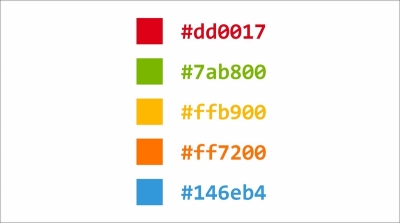
So, don't be afraid to explore and try new colors. The following are a few color ideas:
Next, we will compose the blog header and navigation style rules. The style rules will mostly be applied through the element's classes. So, before proceeding, please refer to Chapter 2, Web Development Tools, to see the class names and ID that we added in the elements.
Please note that the link color, #2a84bf, is my personal selection. There are a number of considerations when choosing a color, such as the brand, the audience, and the content. The link doesn't have to be #2a84bf. The link color in the Starbucks website (http://www.starbucks.co.id/about-us/pressroom), for example, is green, which refers to its brand identity.
So, don't be afraid to explore and try new colors. The following are a few color ideas:
Next, we will compose the blog header and navigation style rules. The style rules will mostly be applied through the element's classes. So, before proceeding, please refer to Chapter 2, Web Development Tools, to see the class names and ID that we added in the elements.
#2a84bf, is my personal selection. There are a number of considerations
when choosing a color, such as the brand, the audience, and the content. The link doesn't have to be #2a84bf. The link color in the Starbucks website (http://www.starbucks.co.id/about-us/pressroom), for example, is green, which refers to its brand identity.
So, don't be afraid to explore and try new colors. The following are a few color ideas:
Next, we will compose the blog header and navigation style rules. The style rules will mostly be applied through the element's classes. So, before proceeding, please refer to Chapter 2, Web Development Tools, to see the class names and ID that we added in the elements.
- Open
main.css. - Add some whitespace surrounding the header with
padding, and also set the header color to#333, as follows:.blog-header { padding: 30px 15px; background-color: #333; } - To make the logo look prominent, we will set it with Varela Round font, which is the same font family we used for the headings. We also make it bigger and transform the letters all to uppercase, as follows:
.blog-name { font-family: "Varela Round", Arial, sans-serif; font-weight: 400; font-size: 42px; text-align: center; text-transform: uppercase; } - The logo link color currently is
#2a84bf, which is the common color we set for links<a>. This color does not suit well with the background color. Let's change the color to white instead, as follows:.blog-name a { color: #fff; } - Set the search input styles, as follows:
.search-form input {
  height: 36px;
  background-color: #ccc;
  color: #555;
  border: 0;
  padding: 0 10px;
  border-radius: 30px;
}
These style rules set the input color, border color, and the background colors. It turns the input into something as shown in the following screenshot:

- As you can see in the preceding screenshot, the placeholder text is barely readable as the color blends with the input background color. So, let's make the text color a bit darker, as follows:
.search-form input::-webkit-input-placeholder {
  color: #555;
}
.search-form input:-moz-placeholder {
  color: #555;
}
.search-form input::-moz-placeholder {
  color: #555;
}
.search-form input:-ms-input-placeholder {
  color: #555;
}
If you use OS X or Ubuntu, you will see the glowing color that highlights the input when it is currently targeted, as shown in the following screenshot:

In OS X, the glowing color is blue. In Ubuntu, it will be orange.
- I would like to remove this glowing effect. The glowing effect is technically shown through
box-shadow. So, to remove this effect, we simply set the inputbox-shadowtonone, as follows:.search-form input:focus { -webkit-box-shadow: none; -moz-box-shadow: none; box-shadow: none; }It's worth noting that the glowing effect is part of the User Experience (UX) design, telling the users that they are currently within the input field. This UX design is particularly helpful if the users were only able to navigate the website with a keyboard.
- So, we will have to create an effect that brings a similar UX as a replacement. Herein, we will replace the glowing effect that we removed by lightening the input background color. The following is the complete code of this step:
.search-form input:focus {
  -webkit-box-shadow: none;
  -moz-box-shadow: none;
  box-shadow: none;
  background-color: #bbb;
}
The input background color becomes lighter when it is in focus, as shown in the following screenshot:

- We will write the style for the navigation. First, align the menu to the center, and add some whitespace at the top and the bottom of the navigation with the margin. Have a look at the following code:
.blog-menu { margin: 30px 0; text-align: center; } - Remove the left-hand side padding of
<ul>, as follows:.blog-menu ul { padding-left: 0; } - Add some whitespace between the menus with a margin, and remove the list bullet, as follows:
.blog-menu li { margin: 15px; list-style-type: none; } - Customize the menu color and font, as follows:
.blog-menu a {
  color: #7f8c8d;
  font-size: 18px;
   text-transform: uppercase;
   font-family: "Varela Round", Arial, sans-serif;
}
.blog-menu a:hover {
    color: #3498db;
}
We have just decorated the header and the navigation. Corresponding to the mobile-first way of thinking, which we discussed earlier in this section, we first aim the styles to optimize the blog presentation in mobile.

decorated the header and the navigation. Corresponding to the mobile-first way of thinking, which we discussed earlier in this section, we first aim the styles to optimize the blog presentation in mobile.
#333. I truly understand that this color may look boring to some of you. Hence, freely customize the color as well as the style of the logo and the search input field. Some
Perform the following steps to style the blog content:
- Add whitespace on all sides of the content section with
paddingandmargin, as follows.blog-content { padding: 15px; margin-bottom: 30px; } - Separate each blog post with some whitespace and borderline, as follows:
.post { margin-bottom: 60px; padding-bottom: 60px; border-bottom: 1px solid #ddd; } - Align the title to the center, adjust the title font size a little, and change the color with the following style rules:
.post-title { font-size: 36px; text-align: center; margin-top: 0; } .post-title a { color: #333; } .post-title a:hover { color: #3498db; } - Below the title, we have
post-meta, which consists of the post author name and the post publishing date. Similar to the title, we also adjust the font size and the whitespace, and change the font color, as follows:.post-meta { font-size: 18px; margin: 20px 0 0; text-align: center; color: #999; } .post-meta ul { list-style-type: none; padding-left: 0; } .post-meta li { margin-bottom: 10px; } - The post thumbnail, as you can see in the following screenshot, looks small and squished due to the margin on all its sides:

- Let's remove these margins, as follows:
.post-thumbnail {
  margin: 0;
}
Some of the images, as shown in the following screenshot, have a caption:

- Let's style it to make it look distinctive from the rest of the content and also show that it is an image caption. Add the following lines of code to style the caption:
.post-thumbnail figcaption { color: #bdc3c7; margin-top: 15px; font-size: 16px; font-style: italic; } - Adjust the post excerpt font size, color, and line height, as follows:
.post-excerpt { color: #555; font-size: 18px; line-height: 30px; } - Starting in this step, we will write the style of the blog pagination. First, let's make some adjustments to the font size, the font family, the whitespace, the position, and the alignment, as shown in the following code:
.blog-pagination { text-align: center; font-size: 16px; position: relative; margin: 60px 0; } .blog-pagination ul { padding-left: 0; } .blog-pagination li, .blog-pagination a { display: block; width: 100%; } .blog-pagination li { font-family: "Varela Round", Arial, sans-serif; color: #bdc3c7; text-transform: uppercase; margin-bottom: 10px; } - Decorate the pagination link with rounded corner borders, as follows:
.blog-pagination a { -webkit-border-radius: 30px; -moz-border-radius: 30px; border-radius: 30px; color: #7f8c8d; padding: 15px 30px; border: 1px solid #bdc3c7; } - Specify the link decoration when the mouse cursor hovers over the links, as follows:
.blog-pagination a:hover { color: #fff; background-color: #7f8c8d; border: 1px solid #7f8c8d; } - Finally, place the page number indicator at the top of the pagination links with the following style rules:
.blog-pagination .pageof {
  position: absolute;
  top: -30px;
}
We just styled the blog content section—including the page navigation (pagination), and the following screenshot shows how the content section looks:

Perform the following steps to enhance the footer style:
- Adjust the footer font, color, and the margin, as follows:
.blog-footer { background-color: #ecf0f1; padding: 60px 0; font-family: "Varela Round", Arial, sans-serif; margin-top: 60px; } .blog-footer, .blog-footer a { color: #7f8c8d; } - The footer contains social media links. Let's adjust the styles that encompass the margin, padding, alignment, colors, and whitespace, as follows:
.social-media { margin: 0 0 30px; } .social-media ul { margin: 0; padding-left: 0; } .social-media li { margin: 0 8px 10px; list-style: none; } .social-media li, .social-media a { font-size: 18px; } .social-media a:hover { color: #333; } - Set the margin-top out of the copyright container.
.copyright { margin-top: 0; } - Align the footer content to the center, as follows:
.social-media,
.copyright {
  text-align: center;
}

The blog is currently optimized for mobile, or narrow viewport size. If you view it in a larger viewport size, you will find that some elements are misplaced or are not properly aligned. The blog logo and the navigation, for example, are currently aligned to the center, as you can see in the following screenshot:

As per our blueprint that we have shown you in Chapter 3, Constructing a Simple Responsive Blog with Responsive.gs, the logo should align to the left-hand side and each menu link should be displayed inline. In the upcoming steps, we will fix these through Media Queries; we will optimize the blog for desktop view.
Perform the following steps to compose style rules for desktop:
We will add all the style rules in the following steps within this media query. This media query specification will apply the style rules within the viewport width starting from 640 px and up.
- Align the blog logo to the left-hand side, as follows:
.blog-name { text-align: left; margin-bottom: 0; } - Display the list item of the navigation menu, post meta, and social media inline, as follows:
.blog-menu li, .post-meta li, .social-media li { display: inline; } - Increase the post title size, as follows:
.post-title { font-size: 48px; } - Also, display the blog pagination links inline, as follows:
.blog-pagination li, .blog-pagination a { display: inline; } - Put the pagination page indicator in its initial position—inline with the blog pagination link, as follows:
.blog-pagination .pageof { position: relative; top: 0; padding: 0 20px; } - Align the social media links in the footer to the left and the copyright notice to the right, as follows:
.social-media {
  text-align: left;
}
.copyright {
  text-align: right;
}
We have just added style rules that address the blog for the desktop view. If you are now viewing the blog in the viewport width that is larger than 640 px, you should find that the elements in the blog such as the logo and the navigation menu are in their common position, as shown in the following screenshot:

With the use of glorious CSS3 and HTML5 features, comes a consequence: the layout failed and is broken in the old Internet Explorer, as you can see in the following screenshot:

If you are okay with it, you can skip this section and head over to the next project immediately. However, if you feel adventurous, let's proceed to this section and fix those bugs.
Perform the steps to patch Internet Explorer with polyfills:
- We have a number of polyfills in the scripts folder namely
html5shiv.js,respond.js, andplaceholder.js. Let's combine these scripts into a single file. - First, create a new JavaScript file named
polyfills.jsthat will hold the content of those polyfill scripts. - Open
polyfills.jsin Sublime Text. - Add the following lines to import the polyfill scripts:
// @koala-prepend "html5shiv.js"
// @koala-prepend "respond.js"
// @koala-prepend "placeholder.js"
- In Koala, select
polyfills.js, and click on the Compile button, as shown in the following screenshot:
By this step, Koala will have generated the minified file named
polyfills.min.js. - Open
index.html, and linkpolyfills.jsbefore</head>, as follows:<!--[if lt IE 9]> <script type="text/javascript" src="scripts/polyfills.min.js"></script> <![endif]-->
We just applied polyfills in the blog to patch Internet Explorer rendering issues with HTML5 and Media Queries. These polyfills work out-of-the-box. Refresh Internet Explorer, and voila! Have a look at the following screenshot:

The style rules are applied, the layout is in position, and the placeholder text is there.
We will end this project. But, as you can see from the preceding screenshot, there are still many things to address to make the blog appearance in the old Internet Explorer as good as in the latest browsers. For example:
- Referring to the preceding screenshot, the placeholder text is currently aligned to the top. You can fix it and make it align vertically to the center.
- You can also apply a polyfill named CSS3Pie (http://css3pie.com/) that brings the CSS3 border radius in Internet Explorer to make the search input field rounded as it is in the latest browser versions.
Queries. These polyfills work out-of-the-box. Refresh Internet Explorer, and voila! Have a look at the following screenshot:
The style rules are applied, the layout is in position, and the placeholder text is there.
We will end this project. But, as you can see from the preceding screenshot, there are still many things to address to make the blog appearance in the old Internet Explorer as good as in the latest browsers. For example:
- Referring to the preceding screenshot, the placeholder text is currently aligned to the top. You can fix it and make it align vertically to the center.
- You can also apply a polyfill named CSS3Pie (http://css3pie.com/) that brings the CSS3 border radius in Internet Explorer to make the search input field rounded as it is in the latest browser versions.