
Bootstrap (http://getbootstrap.com/) is one of the sturdiest frontend development frameworks. It ships with amazing features, such as a responsive grid, user interface components, and JavaScript libraries that let us build responsive websites up and running quickly.
Bootstrap is so popular that the web development community positively supports it by developing extensions in a variety of forms to add extra features. In case the standard features that come with Bootstrap are not sufficient, there can be an extension to cover your particular requirements.
The discussion that we are going to cover in this chapter will include the following topics:
Unlike the Responsive.gs framework that we used in the first project, Bootstrap is shipped with extra components, which are commonly used in the Web. Hence, before we step further into developing the portfolio website, first let's explore these components, mainly those of which we will employ within the website, such as the responsive grid, the buttons, and the form elements.
Note
Frankly, the official Bootstrap website (http://getbootstrap.com/) is always the best source to be up-to-date with anything related to Bootstrap. So, herein, I would like to point out the key things that are straightforward.
Bootstrap comes with a Responsive Grid System, along with the supporting classes that form the columns and the rows. In Bootstrap, we build the column using these prefix classes: col-xs-, col-sm-, col-md-, and col-lg-. This is then followed by the column number, ranging from 1 to 12, to define the column size as well as to aim the column for a specific viewport size. See the following table for more detail on the prefixes:
|
Prefix |
Description |
|---|---|
|
|
This specifies the column for the Bootstrap-defined smallest (extra small) viewport size, which is equal to or less than 768 px |
|
|
This specifies the column for the Bootstrap-defined small viewport size, which is equal to or greater than 768 px. |
|
|
This specifies the column for the Bootstrap-defined medium viewport size, which is equal to or greater than 992 px |
|
|
This specifies the column for the Bootstrap-defined large viewport size, which is equal to or greater than 1,200 px |
So, each column will have the same size, and they will scale down up to the Bootstrap-defined small viewport size (≥ 768px). The following screenshot shows how the preceding markup turns out in the browser (by adding a few styles):


Given the preceding example, the columns will have the same size within the Bootstrap-defined large viewport size (≥ 1,200 px), as shown in the following screenshot:


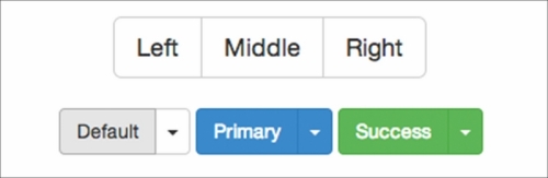
Other components that we will incorporate into the website are buttons and forms. We will create an online contact through which users will be able get in touch. In Bootstrap, the button is formed with the btn class followed by btn-default to apply Bootstrap default styles, as shown in the following code:
Replace the btn-default class with btn-primary, btn-success, or btn-info to give the buttons the colors specified, as shown in the following code:
The code snippet defines the button size with these classes: btn-lg to make the button large, btn-sm to make it small, and btn-xs to make the button even smaller, as shown in the following code:

Bootstrap allows us to display buttons in a number of ways, such as displaying a series of buttons inline together or adding a dropdown toggle in a button. For further assistance and details on constructing these types of buttons, head over to the button groups (http://getbootstrap.com/components/#btn-groups) and the button dropdown (http://getbootstrap.com/components/#btn-dropdowns) sections of Bootstrap's official website.
The Bootstrap buttons groups and buttons with a dropdown toggle

For more information regarding styling and arranging the form element in Bootstrap, refer to the form section of the Bootstrap official page (http://getbootstrap.com/css/#forms).
Bootstrap describes Jumbotron as follows:
"A lightweight, flexible component that can optionally extend the entire viewport to showcase key content on your site" (http://getbootstrap.com/components/#jumbotron)
Jumbotron is a special section to display the website's first-line message, such as the marketing copy, catchphrases, or special offers, and additionally a button. Jumbotron is typically placed above the fold and below the navigation bar. To construct a Jumbotron section in Bootstrap, apply the jumbotron class, as follows:
<div class="jumbotron">
  <h1>Hi, This is Jumbotron</h1>
<p>Place the marketing copy, catchphrases, or special offerings.</p>
  <p><a class="btn btn-primary btn-lg" role="button">Got it!</a></p>
</div>
With the Bootstrap default styles, the following is how the Jumbotron looks:

It's impossible to cater to everyone's needs, and the same thing applies to Bootstrap as well. A number of extensions are created in many forms—from CSS, JavaScript, icons, starter templates, and themes—to extend Bootstrap. Find the full list on this page (http://bootsnipp.com/resources).
In this project, we will include an extension named Jasny Bootstrap (http://jasny.github.io/bootstrap/), developed by Arnold Daniels. We will use it primarily to incorporate off-canvas navigation. The off-canvas navigation is a popular pattern in responsive design; the menu navigation will first set off the visible area of the website and will only slide-in typically by clicking or tapping, as illustrated in the following screenshot:

Jasny Bootstrap is an extension that adds extra building blocks to the original Bootstrap. Jasny Bootstrap is designed with Bootstrap in mind; it follows Bootstrap conventions in almost every aspect of it, including the HTML markups, the class naming, and the JavaScript functions as well as the APIs.
As mentioned, we will use this extension to include off-canvas navigation in the portfolio website. The following is an example code snippet to construct off-canvas navigation with Jasny Bootstrap:
As you can see from the preceding code snippet, constructing off-canvas navigation requires a bunch of HTML elements, classes, and attributes in the mix. To begin with, we need two elements, <nav> and <div>, to contain respectively the menu and the button to toggle the navigation menu on and off. The <nav> element is given an ID as a unique reference of which menu to target via the data-target attribute in <button>.
navmenu: Jasny Bootstrap has a new type of navigation, called navmenu. Thenavmenuclass will display the navigation vertically, and placed on the side—right-hand or left-hand—of the website content, instead of at the top.navmenu-default: The class that will set thenavmenuclass with the default styles, which is dominated by light gray. Use thenavmenu-inverseclass instead if you prefer a dark color. Have a look at the following screenshot:
Two default colors of off-canvas navigation
- The
navmenu-fixed-leftclass positions the navmenu on the left-hand side. Use thenavmenu-fixed-rightclass to set it on the right-hand side instead. - The
offcanvasclass is the prime class to set the navigation menu off the canvas. - The
data-target="#offcanvas-nav"code in<button>acts as a selector that refers to a specific navigation menu with the given ID. - The
data-toggle="offcanvas"code tells the button to toggle the off-canvas navigation. In addition, the original Bootstrap ships with several types ofdata-toggleto hook up different widgets, such as the modal (data-toggle="modal"), dropdown (data-toggle="dropdown"), and tab (data-toggle="tab"). - The data-target="body" lets the website body slide along with the off-canvas navigation at the same time when being toggled on and off. Jasny Bootstrap calls it as push menu; follow this page (http://jasny.github.io/bootstrap/examples/navmenu-push/) to see it in action.
Exploring every inch of Bootstrap component is beyond the capacity of this module. Hence, we only discussed a couple of things from Bootstrap that will be essential to the project. Aside from the Bootstrap official website (http://getbootstrap.com/), the following are a couple of dedicated references that dig deep into Bootstrap that you can look into:
- Bootstrap tutorials for beginners by Coder's Guide (http://www.youtube.com/watch?v=YXVoqJEwqoQ), a series of video tutorials that help beginners to get up and running with Bootstrap
- Twitter Bootstrap Web Development How-To, David Cochran, Packt Publishing (http://www.packtpub.com/web-development/twitter-bootstrap-web-development-how-instant)
- Mobile First Bootstrap, Alexandre Magno, Packt Publishing (http://www.packtpub.com/web-development/mobile-first-bootstrap)
- Learning Bootstrap, Packt Publishing (https://www.packtpub.com/web-development/learning-bootstrap)
Retina or high-definition (HD) display makes everything on the screen look sharper and more vibrant. But, the problem lies with the legacy images or web icons brought before the advent of HD display. These images typically are served as a bitmap or a raster image, and they turn blurry on this screen, as shown in the following screenshot:

To tell the truth, Bootstrap ships with a font icon set called Glyphicon. Sadly, it does not come with the social media icons that we need. After going through a number of font-icon sets, I finally opted for Ionicons (http://ionicons.com/). Herein, we will use the alternative version that comes with LESS, which is official repository so we will be able to integrate with Bootstrap seamlessly, which also happens to use LESS.
Before we start building the blocks and edges of the website, let's take a look the website wireframe. This wireframe will be the reference and give us the picture of how the website layout will be organized both in the mobile and desktop view.

The website will have a button positioned at the top-left of the website with a so-called hamburger icon to slide in the off-canvas menu. Then comes the website's first line, which says the website name and a line of catchphrase. The subsequent section will contain the portfolio images, while the last section will contain an online form and social media icons.
The mobile view looks more simplified, yet maintaining the same logical structure as in the desktop view layout, as shown in the following screenshot:

Let's start off the project by organizing the project directories and assets that include the dependencies, images, and font icon.
In this project, we will put Bower (http://bower.io/) into practice to organize the project dependencies. Bower, as we briefly mentioned in Chapter 1, Responsive Web Design, is a frontend package manager that streamlines the way to install, remove, and update frontend development libraries, such as jQuery, Normalize, and HTML5Shiv.
In this section, we are going to add the project dependencies that include the Bootstrap, Jasny Bootstrap, Ionicons, and HTML5Shiv. We will install them using Bower so that we are able to maintain them—remove and update them—more seamlessly in the future.
- In the
htdocsfolder, create a new folder, and name itportfolio. This is the project directory, where we will add all project files and folders to. - In the
portfoliofolder, create a new folder namedassets. We will put the project assets, such as image, JavaScript, and style sheet in this folder. - In the assets folder, create these following folders:
imgto contain the website images and image-based iconsjsto contain the JavaScript filesfontsto contain the font icon setlessto contain the LESS style sheetscssas the output folder of LESS
- Create
index.htmlas the website's main page. - Add the images for the website in the
imgfolder; this includes the portfolio images and the icons for a mobile device, as shown in the following screenshot:
Note
This website has around 14 images including the icons for mobile devices. I would like to thank my friend Yoga Perdana (https://dribbble.com/yoga) for allowing me to use his wonderful work In this module. You can find these images bundled along with this module. But, certainly, you can replace them with your very own images.
- We will install the dependencies—packages, libraries, JavaScript, or CSS that are required to run the project, as well as to build the website—through Bower. But, before running any Bower command to install the dependencies, we would like to set the project as a Bower project using the
bower initcommand to define the project specification inbower.json, such as the project name, the version, and the author. - To begin with, open a terminal or command prompt if you are using Windows. Then, navigate to the project directory using the
cdcommand, as follows:- In Windows:
cd \xampp\htdocs\portfolio - In OS X:
cd /Applications/XAMPP/htdocs/portfolio - In Ubuntu:
cd /opt/lampp/htdocs/portfolio
- In Windows:
- Type
bower init, as shown in the following screenshot:
- First, we specify the project name. In this case, I would like to name the project
responsive-portfolio. Type the name as follows, and press Enter to proceed. Have a look at the following screenshot:
- Specify the project version. Since the project is new, let's simply set it to
1.0.0, as shown in the following screenshot:
- Press Enter to proceed.
- Specify the project description. This prompt is entirely optional. You may leave it empty if you think it's not required for your project. In this case, I will describe the project as
a responsive portfolio website built with Bootstrap, as shown in the following screenshot:
- Specify the main file of the project. This certainly will vary depending on the project. Herein, let's set the main file to
index.html, the website's home page, as shown in the following screenshot:
- This prompts the question, "what types of modules does this package expose?" It specifies what the package is used for. In this case, simply select the global option, as shown in the following screenshot:

- Press the Space Bar key to select it, and press Enter to continue.
Note
This prompt describes what the module technology in the project (our project) is meant for. Our project is not attached to a particular technology or module; it's just a plain static website with HTML, CSS, and a few lines of JavaScript. We are not building Node, YUI, or AMD modules. Thus, it is best to select the
globalsoption. - The keywords prompt tells the project relation. In this case, I would like to fill it as
portfolio,responsive,bootstrap, as shown in the following screenshot. Press Enter to continue:
The keywords prompt is optional. You can leave it empty if you want by pressing the Enter key with the value left empty.
- The authors prompt specifies the author of the project. This prompt is prepopulated with your computer user name and e-mail that you have registered in the system. Yet, you can overwrite it by specifying a new name and pressing Enter to continue, as shown in the following screenshot:

- Specify the project license. Herein, we will simply set it to the
MITlicense. TheMITlicense grants anyone to do whatever he or she wants with the code in the project, including modification, sublicensing, and commercial use. Have a look at the following screenshot:
- Specify the home page of the project. This could be your own website repository. In this case, I would like to set it with my personal domain,
creatiface.com, as shown in the following screenshot:
- In the set currently installed components as dependencies?: command, type
n(no), as we haven't installed any dependencies or packages yet, as shown in the following screenshot:
- The Add commonly ignored files to ignore list? command will create the
.gitignorefile containing a list of common files to exclude from the Git repository. TypeYfor yes. Have a look at the following screenshot:
Note
I will use Git to manage the code revision and will upload it to a Git repository, such as Github or Bitbucket, hence I selected
Y(yes). If, however, you are not familiar with Git yet, and do not plan to host the project in a Git repository, you may ignore this prompt and typen. Git is beyond the scope of this module's discussion. To learn more about Git, the following is the best reference I recommend:Learn Git for beginners by GitTower (http://www.git-tower.com/learn/).
- For the would you like to mark this package as private which prevents it from being accidentally published to the registry? command type
Yas we won't register our project to the Bower registry. Have a look at the following screenshot:
- Examine the output. If it looks good, type
Yto generate the output within thebower.jsonfile, as shown in the following screenshot:
- There are a number of libraries we want to install. To begin with, let's install Bootstrap with the
bower install bootstrap ––savecommand, as shown in the following screenshot:
The
--saveparameter following the command will register Bootstrap as the project dependency inbower.json. If you open it, you should find it recorded under the dependencies, as shown in the following screenshot:
You should also find the Bootstrap package saved in a new folder,
bower_components, along with jQuery, which is a Bootstrap dependency, as shown in the following screenshot:
- Install the Bootstrap extension, Jasny Bootstrap, with the
bower install jasny-bootstrap –savecommand. - Install Ionicons with the LESS style sheet, with the
bower install ioniconscommand. - The Ionicons package ships with the font files. Move them to the
fontsfolder of the project directory, as shown in the following screenshot:
- Finally, install HTML5Shiv to enable the new elements of HTML5 in Internet Explorer 8 and below, with the
bower install html5shiv ––savecommand.
We have downloaded these libraries via the bower install command, which is leaner than having to download and extract the .zip package. All the libraries should have been added within a folder named bower_components, as shown in the following screenshot:

Bower, by default, creates a new folder named bower_components. Bower allows us to configure the folder name through the Bower configuration file, .bowerrc. Change the folder name as per your preference by creating .bowerrc. Follow this reference (http://bower.io/docs/config/) to configure bower.
As the dependencies are installed with Bower, maintaining the project will be more streamlined. These libraries can be updated to the newer version at a later time. With the use of Bower commands, updating the libraries that we have just installed is practically leaner than downloading the .zip package and manually moving the files into the project directory.
Run the bower list command to see all installed Bower packages, and check whether a new version of the packages is available, as shown in the following screenshot:
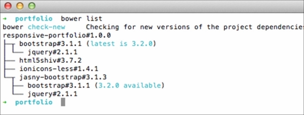
Then, install the new version using the bower install command and followed by the Bower package name along with the version number. To install Bootstrap version 3.2.0, for example, run the bower install bootstrap#3.2.0 ––save command.
Note
We actually should be able to update packages with the bower update command. Yet, it seems this command does not work as expected in accordance with a number of reports in the following Bower Issue thread (https://github.com/bower/bower/issues/1054). So, using the bower install command, as shown previously, is the way to go at the moment.
index.html. Images and icons that are going to be displayed on the website are also prepared. We also recorded the project specification in bower.json. Through this file, we can tell that the project is named responsive-portfolio, currently at version 1.0.0, and has a couple of dependencies, as follows:
We have downloaded these libraries via the bower install command, which is leaner than having to download and extract the .zip package. All the libraries should have been added within a folder named bower_components, as shown in the following screenshot:
Bower, by default, creates a new folder named bower_components. Bower allows us to configure the folder name through the Bower configuration file, .bowerrc. Change the folder name as per your preference by creating .bowerrc. Follow this reference (http://bower.io/docs/config/) to configure bower.
As the dependencies are installed with Bower, maintaining the project will be more streamlined. These libraries can be updated to the newer version at a later time. With the use of Bower commands, updating the libraries that we have just installed is practically leaner than downloading the .zip package and manually moving the files into the project directory.
Run the bower list command to see all installed Bower packages, and check whether a new version of the packages is available, as shown in the following screenshot:
Then, install the new version using the bower install command and followed by the Bower package name along with the version number. To install Bootstrap version 3.2.0, for example, run the bower install bootstrap#3.2.0 ––save command.
Note
We actually should be able to update packages with the bower update command. Yet, it seems this command does not work as expected in accordance with a number of reports in the following Bower Issue thread (https://github.com/bower/bower/issues/1054). So, using the bower install command, as shown previously, is the way to go at the moment.
a new folder named bower_components. Bower allows us to configure the folder name through the Bower configuration file, .bowerrc. Change the folder name as per your preference by creating .bowerrc. Follow this reference (http://bower.io/docs/config/) to configure bower.
As the dependencies are installed with Bower, maintaining the project will be more streamlined. These libraries can be updated to the newer version at a later time. With the use of Bower commands, updating the libraries that we have just installed is practically leaner than downloading the .zip package and manually moving the files into the project directory.
Run the bower list command to see all installed Bower packages, and check whether a new version of the packages is available, as shown in the following screenshot:
Then, install the new version using the bower install command and followed by the Bower package name along with the version number. To install Bootstrap version 3.2.0, for example, run the bower install bootstrap#3.2.0 ––save command.
Note
We actually should be able to update packages with the bower update command. Yet, it seems this command does not work as expected in accordance with a number of reports in the following Bower Issue thread (https://github.com/bower/bower/issues/1054). So, using the bower install command, as shown previously, is the way to go at the moment.
bower remove command.
bower uninstall command.
bower delete command.
bower search followed by a keyword.
bower search followed by the library name.
bower browse followed by a keyword.
bower info.
bower detail.
bower property.
As the dependencies are installed with Bower, maintaining the project will be more streamlined. These libraries can be updated to the newer version at a later time. With the use of Bower commands, updating the libraries that we have just installed is practically leaner than downloading the .zip package and manually moving the files into the project directory.
Run the bower list command to see all installed Bower packages, and check whether a new version of the packages is available, as shown in the following screenshot:
Then, install the new version using the bower install command and followed by the Bower package name along with the version number. To install Bootstrap version 3.2.0, for example, run the bower install bootstrap#3.2.0 ––save command.
Note
We actually should be able to update packages with the bower update command. Yet, it seems this command does not work as expected in accordance with a number of reports in the following Bower Issue thread (https://github.com/bower/bower/issues/1054). So, using the bower install command, as shown previously, is the way to go at the moment.
Now that we have put together the essential stuff to build the website. Let's start building the website's HTML structure. As in the last project, herein, we will be using a couple of new HTML5 elements to build the semantic structure.
In this section, we are going to build the website's HTML structure. You will find that a few of the elements that we are going to add herein will be similar to the ones we added in the first website, responsive blog. Hence, the following steps will be straightforward. If you have followed the first through to the end, these steps should also be easy to follow. Let's carry on.
- Open
index.html. Then, add the basic HTML structure, as follows:<!DOCTYPE html> <html lang="en"> <head> <meta charset="UTF-8"> <title>Portfolio</title> </head> <body> </body> </html>
- Below
<meta charset="UTF-8">, add a meta tag to address the Internet Explorer rendering compatibility:<meta http-equiv="X-UA-Compatible" content="IE=edge">
The preceding meta tag specification will force Internet Explorer to use the latest engine's version therein to render the page.
- Below the
http-equivmeta tag, add the meta viewport tag:<meta name="viewport" content="width=device-width, initial-scale=1">
The preceding viewport meta tag specification defines the web page viewport width to follow the device viewport size, as well as scale the page at a ratio of 1:1 upon opening the web page the first time.
- Below the viewport meta tag, add the link to the favicon and apple-touch-icon, which will display the website's icon in Apple devices, such as iPhone, iPad, and iPod:
<link rel="apple-touch-icon" href="assets/img/apple-icon.png">
<link rel="shortcut icon" href="assets/img/favicon.png" type="image/png">
- Add the website's meta description below
<title>:<meta name="description" content="A simple portoflio website built using Bootstrap">
The description specified within this meta tag will be displayed in the Search Engine Result Page (SERP).
- You may also specify the author of the page with a meta tag below the meta description tag, as follows.
<meta name="author" content="Thoriq Firdaus">
- Inside
<body>, add the website off-canvas navigation HTML, as follows:<nav id="menu" class="navmenu navmenu-inverse navmenu-fixed-left offcanvas portfolio-menu" role="navigation"> <ul class="nav navmenu-nav"> <li class="active"><a href="#">Home</a></li> <li><a href="#">Blog</a></li> <li><a href="#">Shop</a></li> <li><a href="#">Speaking</a></li> <li><a href="#">Writing</a></li> <li><a href="#">About</a></li> </ul> </nav>Aside from the essential classes that we have mentioned in the Jasny Bootstrap off-canvas section in this chapter, we have also added a new class named
portfolio-menuin the<nav>element to apply our very own styles to the off-canvas navigation. - Add the Bootstrap
navbarstructure, along with<button>to slide the off-canvas in and out:<div class="navbar navbar-default navbar-portfolio portfolio-topbar"> <button type="button" class="navbar-toggle" data-toggle="offcanvas" data-target="#menu" data-canvas="body"> <span class="icon-bar"></span> <span class="icon-bar"></span> <span class="icon-bar"></span> </button> </div> - Below
navbar, add the<main>element, as follows:<main class="portfolio-main" id="content" role="main"> </main>
As described in W3C (http://www.w3.org/TR/html-main-element/), the
<main>element defines the main content of the website. So, this is where we will put the website content including the portfolio images. - Add Bootstrap Jumbotron, containing the portfolio website name and a line of catchphrase. Since I will display the work of a friend of mine, Yoga Perdana, I wish to show off his name, along with his catchphrase that is displayed in his Dribbble page profile (https://dribbble.com/yoga), as follows:
<main class="portfolio-main" id="content" role="main"> <section class="jumbotron portfolio-about" id="about"> <h1 class="portfolio-name">Yoga Perdana</h1> <p class="lead">Illustrator & Logo designer. I work using digital tools, specially vector.</p> </section> </main>
You may freely add your name or company name in this matter.
- Below the Bootstrap Jumbotron section, add a new section with the HTML5
<section>element, along with a heading that defines this section, as follows:... <section class="jumbotron portfolio-about" id="about"> <h1 class="portfolio-name">Yoga Perdana</h1> <p class="lead">Illustrator & Logo designer. I work using digital tools, specially vector.</p> </section> <section class="portfolio-display" id="portfolio"> <h2>Portfolio</h2> </section>
- Add a Bootstrap container (http://getbootstrap.com/css/#overview-container) below the heading that will contain the portfolio images using the following code:
<section class="portfolio-display" id="portfolio">
<h2>Portfolio</h2>
   <div class="container">
</div>
</section>
- Arrange the portfolio images into columns and rows. We have 12 portfolio images, which means we may have four images/columns in a row. The following is the first row:
...
<div class="container">
<div class="row">
<div class="col-md-3 col-sm-6 portfolio-item">
    <figure class="portfolio-image">
<img class="img-responsive" src="assets/img/6layers.jpg" height="300" width="400" alt="">
<figcaption class="portfolio-caption">6 Layers</figcaption>
          </figure>
  </div>
<div class="col-md-3 col-sm-6 portfolio-item">
    <figure class="portfolio-image">
<img class="img-responsive" src="assets/img/blur.jpg" height="300" width="400" alt="">
<figcaption class="portfolio-caption">Blur</figcaption>
</figure>
  </div>
<div class="col-md-3 col-sm-6 portfolio-item">
          <figure class="portfolio-image">
<img class="img-responsive" src="assets/img/brain.jpg" height="300" width="400" alt="">
<figcaption class="portfolio-caption">Brain</figcaption>
</figure>
  </div>
  <div class="col-md-3 col-sm-6 portfolio-item">
       <figure class="portfolio-image">
<img class="img-responsive" src="assets/img/color.jpg" height="300" width="400" alt="">
<figcaption class="portfolio-caption">Color</figcaption>
</figure>
  </div>
</div>
</div>
Each column is assigned with a special class to allow us to apply customized styles. We also added a class in
<figure>that wraps the image, as well as the<figcaption>element that wraps the image caption for the same purpose. - Add the remaining images into columns and rows. Since, in this case, we have 12 images, there should be three rows displayed in the website. Each row contains four images, including one row that we've added in step 13.
- Below the portfolio section, add the website message form containing three form fields and a button, as shown in the following code:
...
</section>
<div class="portfolio-contact" id="contact">
      <div class="container">
        <h2>Get in Touch</h2>
<form id="contact" method="post" class="form" role="form">
            <div class="form-group">
<input type="text" class="form-control input-lg" id="input-name" placeholder="Name">
</div>
                 <div class="form-group">
<input type="email" class="form-control input-lg" id="input-email" placeholder="Email">
                  </div>
                  <div class="form-group">
<textarea class="form-control" rows="10"></textarea>
                  </div>
 <button type="submit" class="btn btn-lg btn-primary">Submit</button>
           </form>
</div>
</div>
Herein, we made the website form simple with only three form fields. But, you may add extra form fields, as per your own requirement.
- Finally, we will add the website footer with the HTML5
<footer>element. The footer, as we have seen from the website wireframe, contains the social media icons and the website copyright statement. - Add the following HTML markup below the website's main content:
... </main> <footer class="portfolio-footer" id="footer"> <div class="container"> <div class="social" id="social"> <ul> <li class="twitter"><a class="icon ion-social-twitter" href="#">Twitter</a></li> <li class="dribbble"><a class="icon ion-social-dribbble-outline" href="#">Dribbble</a></li> </ul> </div> <div class="copyright">Yoga Perdana © 2014</div> </div> </footer>
We just constructed the portfolio website HTML structure with a couple of HTML5 elements and Bootstrap reusable classes. You should be able to see the website through the following address http://localhost/portfolio/ or http://{computer-username}/portfolio/ if you are using OS X. No styles have yet been applied to the website at this stage; we haven't linked any style sheet in the page. So, the screenshot following the upcoming tip is how the website looks currently.

Bootstrap ships a variety of components. Yet, we use only a couple, including the grids, Jumbotron, buttons, and forms. Extend the website by adding extra Bootstrap components, as follows:
In addition, try creating more web pages and link them through the off-canvas navigation menus.
Bootstrap ships a variety of components. Yet, we use only a couple, including the grids, Jumbotron, buttons, and forms. Extend the website by adding extra Bootstrap components, as follows:
In addition, try creating more web pages and link them through the off-canvas navigation menus.
In addition, try creating more web pages and link them through the off-canvas navigation menus.
col-sm-pull-8
col-md-push-3
col-xs-offset-5
col-lg-6
col-xl-7
btn-link
btn-submit
btn-send
btn-cancel
btn-enter