


Every project using PrimeNG needs the locally installed library. You can achieve this by running the following command:
npm install primeng --save
As a result, PrimeNG is installed in your project root under the node_modules folder as well as added in package.json as a dependency. Here again, you can skip this step if you use the seed project hosted on GitHub--just run npm install. The next step is to add two new entries to the SystemJS configuration file. For shorter import statements, it is recommended to map primeng to node_modules/primeng. PrimeNG components are distributed as CommonJS modules ending with .js. That means we should set the default extension too:
System.config({
  ...
  map: {
    ...
    'primeng': 'node_modules/primeng'
  },
  packages: {
    'primeng': {
      defaultExtension: 'js'
    },
    ...
  }
});
Now, you are able to import PrimeNG modules from primeng/primeng. For instance, write this line to import AccordionModule and MenuItem:
import {AccordionModule, MenuItem} from 'primeng/primeng';
This way of importing is not recommended in production because all other available components will be loaded as well. Instead of that, only import what you need using a specific component path:
import {AccordionModule} from 'primeng/components/accordion/accordion';
import {MenuItem} from 'primeng/components/common/api';
In the demo application, we will only use ButtonModule and InputTextModule so that we need to import them as follows:
import {ButtonModule} from 'primeng/components/button/button';
import {InputTextModule} from 'primeng/components/inputtext/inputtext';
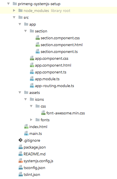
The demo project we want to create consists of application code and assets. A detailed description of every file would go beyond the scope of this book. We will only show the project structure:
A typically PrimeNG application needs a theme. We would like to take the Bootstrap theme. The file index.html must have three CSS dependencies included within the <head> tag--the theme, the PrimeNG file, and the FontAwesome file for SVG icons (http://fontawesome.io):
<link rel="stylesheet" type="text/css"
      href="../node_modules/primeng/resources/themes/bootstrap/theme.css"/>
<link rel="stylesheet" type="text/css"
      href="../node_modules/primeng/resources/primeng.min.css"/>
<link rel="stylesheet" type="text/css"
      href="src/assets/icons/css/font-awesome.min.css"/>
All FontAwesome files were placed under src/assets/icons. Mostly PrimeNG components are native, but there is a list of components with third-party dependencies. These are explained in the following table:
| Component | Dependency |
| Schedule | FullCalendar and Moment.js |
| Editor | Quill editor |
| GMap | Google Maps |
| Charts | Charts.js |
| Captcha | Google Recaptcha |
Exact links to those dependencies will be shown later in concrete examples. For now, we have finished our setup. Let's start our first application by running npm start in the project root.
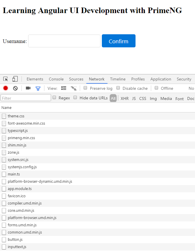
The application gets launched in browser with two PrimeNG components, as shown in the following screenshot. As you can see, a lot of single web resources (CSS and JS files) are being loaded in the browser:


