Book Image

Web Application Development with R Using Shiny - Third Edition

By : Chris Beeley, Shitalkumar R. Sukhdeve
Book Image

Web Application Development with R Using Shiny - Third Edition

By: Chris Beeley, Shitalkumar R. Sukhdeve

Overview of this book

Web Application Development with R Using Shiny helps you become familiar with the complete R Shiny package. The book starts with a quick overview of R and its fundamentals, followed by an exploration of the fundamentals of Shiny and some of the things that it can help you do. You’ll learn about the wide range of widgets and functions within Shiny and how they fit together to make an attractive and easy to use application. Once you have understood the basics, you'll move on to studying more advanced UI features, including how to style apps in detail using the Bootstrap framework or and Shiny's inbuilt layout functions. You'll learn about enhancing Shiny with JavaScript, ranging from adding simple interactivity with JavaScript right through to using JavaScript to enhance the reactivity between your app and the UI. You'll learn more advanced Shiny features of Shiny, such as uploading and downloading data and reports, as well as how to interact with tables and link reactive outputs. Lastly, you'll learn how to deploy Shiny applications over the internet, as well as and how to handle storage and data persistence within Shiny applications, including the use of relational databases. By the end of this book, you'll be ready to create responsive, interactive web applications using the complete R (v 3.4) Shiny (1.1.0) suite.
Table of Contents (11 chapters)

Introduction to the tidyverse

The tidyverse is, according to its homepage, "an opinionated collection of R packages designed for data science" (see https://www.tidyverse.org/). All of the packages are installed using install.packages("tidyverse"), and calling library(tidyverse) loads a subset of these packages, those considered to have the most value in day-to-day data science. Calling library(tidyverse) loads the following packages:

  • ggplot2: For plotting
  • dplyr: For data wrangling
  • tidyr: For tidying (and untidying!) data
  • readr: Better functions for reading comma- and tab-delimited data and other types of flat files
  • purrr: For iterating
  • tibble: Better dataframes
  • stringr: For dealing with strings
  • forcats: Better handling of factors, an R property used to describe the categories of a variable, described briefly earlier in the chapter

Installing the tidyverse also installs the following packages, which then need to be loaded separately with their own library() instruction: readxl, haven, jsonlite, xml2, httr, rvest, DBI, lubridate, hms, blob, rlang, magrittr, glue, and broom. For more details on these packages, consult the documentation at tidyverse.org/.

The key word in this description is opinionated. The tidyverse is a set of R packages that work with tidy data, either producing it, or consuming it, or both. Tidy data was described by Hadley Wickham in the Journal of Statistical Software, Vol 59, Issue 10 (https://www.jstatsoft.org/article/view/v059i10/v59i10.pdf). Tidy data obeys three principles:

  • Each variable forms a column
  • Each observation forms a row
  • Each type of observational unit forms a table

For many R users, their first introduction to tidy data will have been ggplot2, which consumes tidy data and requires other types of data to be munged into this form. In order to explain what this means, we will look at a simple example. For the purposes of this discussion, we will ignore the last principle, which is more about organizing groups of datasets rather than individual datasets.

Let's have a look at a simple example of a messy dataset. In the real world, you will find datasets that are a lot messier than this, but this will serve to illustrate the principles we are using here. The following are the first three rows of the medal table for the Pyeongchang Winter Olympics, which took place in 2018, as an R dataframe:

medals = data.frame(country = c("Norway", "Germany", "Canada"),
gold = c(14, 14, 11),
silver = c(14, 10, 8),
bronze = c(11, 7, 10)
)

If we print it at the console, it looks like the following screenshot:

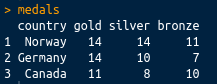
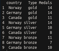
This is perhaps the most common sort of messy data you will come across: great as a summary, certainly intelligible to people watching the Winter Olympics, but not tidy. There are medals in three different columns. A tidy dataset would contain only one column for the medal tallies. Let's tidy it up using the tidyr package, which is loaded with library(tidyverse), or you can load it separately with library(tidyr). We can tidy the data very simply using the gather() function. The gather() function takes a dataframe as an argument, along with key and value column names (which you can set to what you like), and the column names that you wish to be gathered (all other columns will be duplicated as appropriate). In this case, we want to gather everything except the country, so we can use -variableName to indicate that we wish to gather everything except variableName. The final code looks like the following:

library(tidyr)
gather(medals, key = Type, value = Medals, -country)

This has a nice tidy output, as shown in the following screenshot:

Ceci n'est pas une pipe

Now that we've covered tidy data, there is one more concept that is very common in the tidyverse that we should discuss. This is the pipe (%>%) from the magrittr package. This is similar to the Unix pipe, and it takes the left-hand side of the pipe and applies the right-hand side function to it. Take the following code:

mpg %>% summary()

The preceding code is equivalent to the following code:

summary(mpg)

As another example, look at the following code:

gapminder %>% filter(year > 1960)

The preceding code is equivalent to the following code:

filter(gapminder, year > 1960)

Piping greatly enhances the readability of code that requires several steps to execute. Take the following code:

x %>% f %>% g %>% h

The preceding code is equivalent to the following code:

h(g(f(x)))

To demonstrate with a real example, take the following code:

groupedData = gapminder %>%
filter(year > 1960) %>%
group_by(continent, year) %>%
summarise(meanLife = mean(lifeExp))

The preceding code is equivalent to the following code:

summarise(
group_by(
filter(gapminder, year > 1960),
continent, year),
meanLife = mean(lifeExp))

Hopefully, it should be obvious which is the easier to read of the two.

Gapminder

Now we've looked at tidying data, let's have a quick look at using dplyr and ggplot to filter, process, and plot some data. In this section, and throughout this book, we're going to be using the Gapminder data that was made famous by Hans Rosling and the Gapminder foundation. An excerpt of this data is available from the gapminder package, as assembled by Jenny Bryan, and it can be installed and loaded very simply using install.packages("gapminder"); library(gapminder). As the package description indicates, it includes, for each of the 142 countries that are included, the values for life expectancy, GDP per capita, and population, every five years, from 1952 to 2007.

In order to prepare the data for plotting, we will make use of dplyr, as shown in the following code:

groupedData = gapminder %>%
filter(year > 1960) %>%
group_by(continent, year) %>%
summarise(meanLife = mean(lifeExp))

This single block of code, all executed in one line, produces a dataframe suitable for plotting, and uses chaining to enhance the simplicity of the code. Three separate data operations, filter(), group_by(), and summarise(), are all used, with the results from each being sent to the next instruction using the %>% operator. The three instructions carry out the following tasks:

  • filter(): This is similar to subset(). This operation only keeps rows that meet certain requirements—in this case, years beyond 1960.
  • group_by(): This allows operations to be carried out on subsets of data points—in this case, each continent for each of the years within the dataset.
  • summarise(): This carries out summary functions, such as sum and mean, on several data points—in this case the mean life expectancy within each continent and available year.

So, to summarize, the preceding code filters the data to select only years beyond 1960, groups it by the continent and year, and finds the mean life expectancy within that continent or year. Printing the output from the preceding code yields the following:

As you can see, the output is a tibble, which has a nice print method that only prints the first several rows. Tibbles are very similar to dataframes, and are often produced by default instead of dataframes within the tidyverse. There are some nice differences, but they are fairly interchangeable with dataframes for our purposes, so we will not get sidetracked by the differences here.

Now we have mentioned tibbles, you can see that the dataframe is a nice summary of the mean life expectancy by year and continent.

A simple Shiny-enabled line plot

We have already seen how easy it is to draw line plots in ggplot2. Let's add some Shiny magic to a line plot now. This can be achieved very easily indeed in RStudio by just navigating to File | New File | R Markdown | New Shiny document and installing the dependencies when prompted. Once a title has been added, this will create a new R Markdown document with interactive Shiny elements. R Markdown is an extension of Markdown (see daringfireball.net/projects/markdown/), which is itself a markup language, such as HTML or LaTeX, which is designed to be easy to use and read. R Markdown allows R code chunks to be run within a Markdown document, which renders the contents dynamic. There is more information about Markdown and R Markdown in Chapter 2, Shiny First Steps. This section gives a very rapid introduction to the type of results possible using Shiny-enabled R Markdown documents.

For more details on how to run interactive documents outside RStudio, refer to goo.gl/Ngubdo. By default, a new document will have placeholder code in it which you can run to demonstrate the functionality. We will add the following:

---
title: "Gapminder"
author: "Chris Beeley"
output: html_document
runtime: shiny
---

```{r, echo = FALSE, message = FALSE}

library(tidyverse)
library(gapminder)

inputPanel(
checkboxInput("linear", label = "Add trend line?", value = FALSE)
)

# draw the plot
renderPlot({

thePlot = gapminder %>%
filter(year > 1960) %>%
group_by(continent, year) %>%
summarise(meanLife = mean(lifeExp)) %>%
ggplot(aes(x = year, y = meanLife,
group = continent, colour = continent)) +
geom_line()

if(input$linear){
thePlot = thePlot + geom_smooth(method = "lm")
}

print(thePlot)
})

```

The first part between the --- is the YAML, which performs the setup of the document. In the case of producing this document within RStudio, this will already be populated for you.

R chunks are marked as shown, with ```{r} to begin and ``` to close. The echo and message arguments are optional—we use them here to suppress output of the actual code and any messages from R in the final document.

We'll go into more detail about how Shiny inputs and outputs are set up later on in the book. For now, just know that the input is set up with a call to checkboxInput(), which, as the name suggests, creates a checkbox. It's given a name ("linear") and a label to display to the user ("Add trend line?"). The output, being a plot, is wrapped in renderPlot(). You can see the checkbox value being accessed on the if(input$linear){...} line. Shiny inputs are always accessed with input$ and then their name, so, in this case, input$linear. When the box is clicked—that is, when it equals TRUE—we can see a trend line being added with geom_smooth(). We'll go into more detail about how all of this code works later in the book; this is a first look so that you can start to see how different tasks are carried out using R and Shiny.

You'll have an interactive graphic once you run the document (click on Run document in RStudio or use the run() command from the rmarkdown package), as shown in the following screenshot:

As you can see, Shiny allows us to turn on or off a trend line courtesy of geom_smooth() from the ggplot2 package.