

-
Book Overview & Buying

-
Table Of Contents

Enterprise React Development with UmiJS
By :
Enterprise React Development with UmiJS
By:
Overview of this book
UmiJS is the Ant Group's underlying frontend development framework, an open source project for developing enterprise-class frontend applications. In this book, you'll get hands-on with single-page application development using UmiJS. By following practical step-by-step examples, you'll develop essential skills to build and publish your apps and create a modern user experience with responsive interfaces.
This book will help you learn the essential features of UmiJS and how to set up and build a project from scratch using React, Less, and TypeScript. You'll study Ant Design, a framework based on solid design concepts that provides a series of React components to accelerate interface development. Along the way, you'll see how to make requests and develop the frontend using simulated data while ensuring that your app has a high level of security and feedback. You'll also discover ways to improve your code quality and readability using formatting tools.
By the end of the book, you'll have learned how to use UmiJS to design user interfaces, as well as compile, test, and package your app locally, and deliver your app by deploying it to online services.
Table of Contents (11 chapters)
Preface

Part 1: Configuring UmiJS and Creating User Interfaces
 Free Chapter
Chapter 1: Environment Setup and Introduction to UmiJS
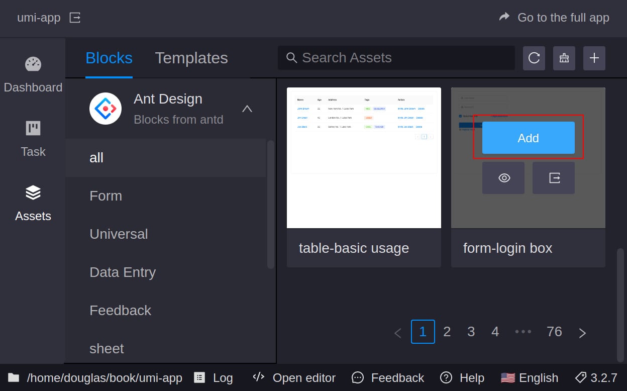
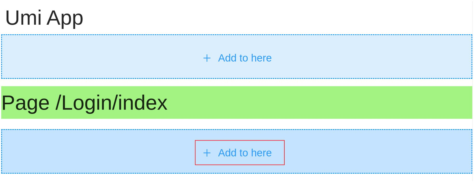
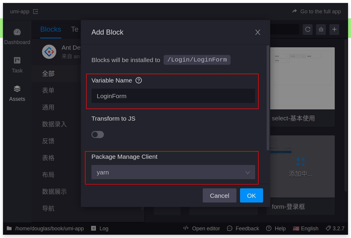
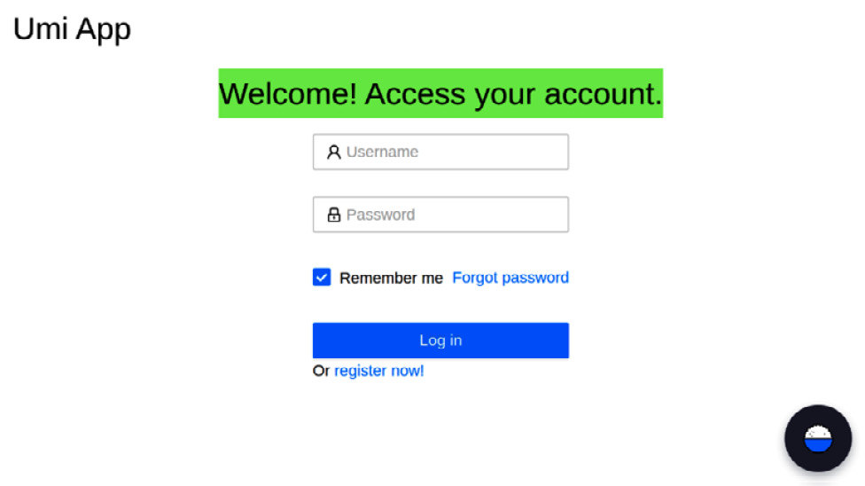
Chapter 2: Creating User Interfaces with Ant Design
Chapter 3: Using Models, Services, and Mocking Data
Part 2: Protecting, Testing, and Deploying Web Applications
Chapter 4: Error Handling, Authentication, and Route Protection
Chapter 5: Code Style and Formatting Tools
Chapter 6: Testing Front-End Applications
Chapter 7: Single-Page Application Deployment
Other Books You May Enjoy


