

-
Book Overview & Buying
-
Table Of Contents

Mastering CSS Grid
By :
Mastering CSS Grid
By:
Overview of this book
CSS Grid has revolutionized web design by filling a long-existing gap in creating real, dynamic grids on the web. This book will help you grasp these CSS Grid concepts in a step-by-step way, empowering you with the knowledge and skills needed to design beautiful and responsive grid-based layouts for your web projects.
This book provides a comprehensive coverage of CSS Grid by taking you through both fundamental and advanced concepts with practical exercises. You'll learn how to create responsive layouts and discover best practices for incorporating grids into any design. As you advance, you'll explore the dynamic interplay between CSS Grid and flexbox, culminating in the development of a usable responsive web project as a reference for further improvement. You'll also see how frameworks utilize CSS Grid to construct reusable components and learn to rebuild and polyfill CSS Grid for browsers that don't fully support it yet. The concluding chapters include a quick reference and cheat sheet, making this book an indispensable resource for frontend developers of all skill levels.
By the end of this book, you'll have thoroughly explored all aspects of CSS Grid and gained expert-level proficiency, enabling you to craft beautiful and functional layouts for web projects of any size.
Table of Contents (16 chapters)
Preface

Part 1–Working with CSS Grid
 Free Chapter
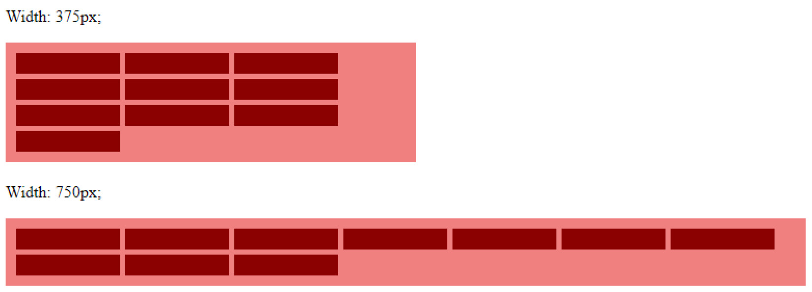
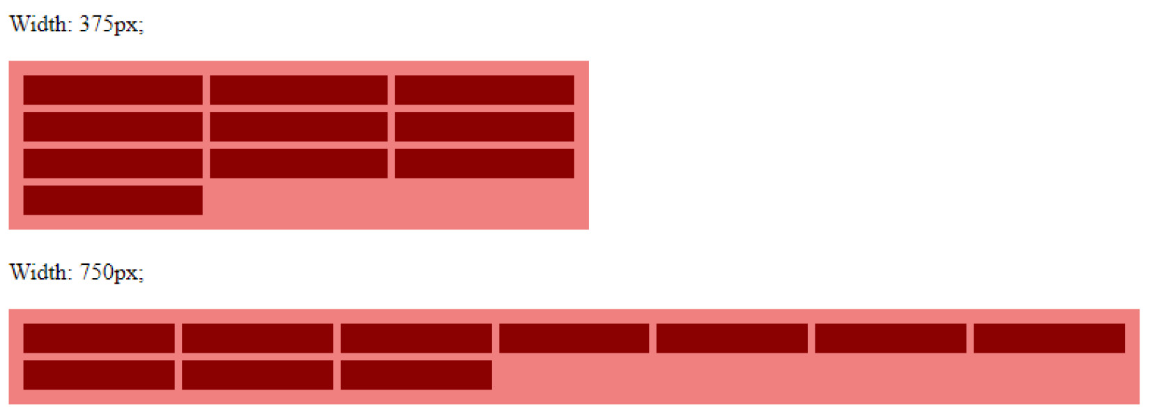
Chapter 1: Understanding the Basic Rules and Structures for CSS Grid
Chapter 2: Project Introduction: What We’ll Work on and First Tasks
Chapter 3: Building Advanced Grid Layouts
Part 2 – Understanding the CSS Grid Periphery
Chapter 4: Understanding and Creating Responsive and Fluid Grid Layouts
Chapter 5: Implementing Layouts with Flexbox and CSS Grid
Chapter 6: Benefits of Grid Layouts and When Not to Use Them
Part 3 – Exploring the Wider Ecosystem
Chapter 7: Polyfilling CSS Grid’s Missing Features
Chapter 8: Grids in the Wild – How Frameworks Implement Grids
Part 4 – A Quick Reference
Chapter 9: Quick Reference and Cheat Sheet
Index
Other Books You May Enjoy


