First, we need an easy way to access GitHub data via its Representational State Transfer (REST) application programming interface (API). Fortunately, an developer named Octokit has made a JavaScript client that lets us access the GitHub REST API with an access token that we create. We just need to import the package from the content distribution network (CDN) that it is served from to get access to the GitHub REST API from our browser. It also has a Node package that we can install and import. However, the Node package only supports Node.js apps, so it can't be used in our Vue 3 app.
Vue 3 is a client-side web framework, which means that it mainly runs on the browser. We shouldn't confuse packages that only run on Node with packages that support the browser, otherwise we will get errors when we use unsupported packages in the browser.
To get started, we make a few changes to the existing files. First, we remove the styling code from index.css. We are focused on the functionality of our app for this project and not so much on the styles. Also, we rename the title tag's inner text to GitHub App in the index.html file.
Then, to make our built app a PWA, we must run another command to add the service worker, to incorporate things such as hardware access support, installation, and support for offline usage. To do this, we use the @vue/cli-plugin-pwa plugin. We can add this by running the following command:
vue add pwa
This will add all the files and configurations we need to incorporate to make our Vue 3 project a PWA project.
Vue CLI creates a Vue project that uses single-file components and uses ECMAScript 6 (ES6) modules for most of our app. When we build the project, these are bundled together into files that are served on the web server and run on the browser. A project created with Vue CLI consists of main.js as its entry point, which runs all the code that is needed to create our Vue app.
Our main.js file should contain the following code:
import { createApp } from 'vue'
import App from './App.vue'
import './registerServiceWorker'
createApp(App).mount('#app')
This file is located at the root of the src folder, and Vue 3 will automatically run this when the app first loads or refreshes. The createApp function will create the Vue 3 app by passing in the entry-point component. The entry-point component is the component that is first run when we first load our app. In our project, we imported App and passed it into createApp.
Also, the index.css file is imported from the same folder. This has the global styles of our app, which is optional, so if we don't want any global styles, we can omit it. The registerServiceWorker.js file is then imported. An import with the filename only means that the code in the file is run directly, rather than us importing anything from the module.
The registerServiceWorker.js file should contain the following code:
/* eslint-disable no-console */
import { register } from 'register-service-worker'
if (process.env.NODE_ENV === 'production') {
...
    offline () {
      console.log('No internet connection found. App is running          in offline mode.')
    },
    error (error) {
      console.error('Error during service worker          registration:', error)
    }
  })
}
This is what we created when we ran vue add pwa. We call the register function to register the service worker if the app is in production mode. When we run the npm run build command, the service worker will be created, and we can use the service worker that is created to let users access features—such as caching and hardware access—from the built code that we serve. The service worker is only created in production mode since we don't want anything to be cached in the development environment. We always want to see the latest data displayed so that we can create code and debug it without being confused by the caching.
One more thing we need to do is to remove the HelloWorld.vue component from the src/components folder, since we don't need this in our app. We will also remove any reference to the HelloWorld component in App.vue later.
Now that we have made the edits to the existing code files, we can create the new files. To do this, we carry out the following steps:
- In the
components folder, we add a repo folder; and in the repo folder, we add an issue folder. In the repo folder, we add the Issues.vue component file.
- In the
components/repo/issue folder, we add the Comments.vue file. Issues.vue is used to display the issues of a GitHub code repository. Comments.vue is used to display the comments that are added to an issue of the code repository.
- In the
components folder itself, we add the GitHubTokenForm.vue file to let us enter and store the GitHub token.
- We also add the
Repos.vue file to the same folder to display the code repositories of the user that the GitHub access token refers to. Then, finally, we add the User.vue file to the components folder to let us display the user information.
- Create a
mixins folder in the src folder to add a mixin, to let us create the Octokit GitHub client with the GitHub access token.
We add the octokitMixin.js file to the mixins folder to add the empty mixin. Now, we leave them all empty, as we are ready to add the files.
Creating the GitHub client for our app
We start the project by creating the GitHub Client object that we will use throughout the app.
First, in the src/mixins/octokitMixin.js file, we add the following code:
import { Octokit } from "https://cdn.skypack.dev/@octokit/rest";
export const octokitMixin = {
  methods: {
    createOctokitClient() {
      return new Octokit({
        auth: localStorage.getItem("github-token"),
      });
    }
  }
}
The preceding file is a mixin, which is an object that we merge into components so that we can use it correctly in our components. Mixins have the same structure as components. The methods property is added so that we can create methods that we incorporate into components. To avoid naming conflicts, we should avoid naming any method with the name createOctokitClient in our components, otherwise we may get errors or behaviors that we don't expect. The createOctokitClient() method uses the Octokit client to create the client by getting the github-token local storage item and then setting that as the auth property. The auth property is our GitHub access token.
The Octokit constructor comes from the octokit-rest.min.js file that we add from https://github.com/octokit/rest.js/releases?after=v17.1.0. We find the v16.43.1 heading, click on Assets, download the octokit-rest.min.js file, and add it to the public folder. Then, in public/index.html, we add a script tag to reference the file. We should have the following code in the index.html file:
<!DOCTYPE html>
<html lang="en">
  <head>
    <meta charset="utf-8">
    <meta http-equiv="X-UA-Compatible" content="IE=edge">
    <meta name="viewport" content="width=device-
      width,initial-scale=1.0">
    <link rel="icon" href="<%= BASE_URL %>favicon.ico">
    <title><%= htmlWebpackPlugin.options.title %></title>
    <script src="<%= BASE_URL %>octokit-rest.min.js">
      </script>
  </head>
  <body>
    <noscript>
      <strong>We're sorry but <%= htmlWebpackPlugin.
          options.title %> doesn't work properly without
           JavaScript enabled. Please enable it to
            continue.</strong>
    </noscript>
    <div id="app"></div>
    <!-- built files will be auto injected -->
  </body>
</html>
Adding a display for issues and comments
Then, in the src/components/repo/issue/Comments.vue file, we add the following code:
<template>
  <div>
    <div v-if="comments.length > 0">
      <h4>Comments</h4>
      <div v-for="c of comments" :key="c.id">
        {{c.user && c.user.login}} - {{c.body}}
      </div>
    </div>
  </div>
...
        repo,
        issue_number: issueNumber,
      });
      this.comments = comments;
    }
  },
  watch: {
    owner() {
      this.getIssueComments();
    },
    repo() {
      this.getIssueComments();
    },
    issueNumber() {
      this.getIssueComments();
    }
  }
};
</script>
In this component, we have a template section and a script section. The script section has our logic to get the comments from an issue. The name property has the name of our component. We reference our component with this name in our other components, if needed. The props property has the props that the component accepts, as shown in the following code snippet:
  props: {
    owner: {
      type: String,
      required: true,
    },
    repo: {
      type: String,
      required: true,
    },
    issueNumber: {
      type: Number,
      required: true,
    },
  },
The component takes the owner, repo, and issueNumber props. We use an object to define the props so that we can validate the type easily with the type property. The type for owner and repo has the value String, so they must be strings. The issueNumber property has the type value set to Number, so it must be a number.
The required property is set to true, which means that the prop must be set when we use the Comments component in another component.
The data() method is used to return an object that has the initial values of reactive properties. The comments reactive property is set to an empty array as its initial value.
The mixins property lets us set the mixins that we want to incorporate into our app. Since octokitMixin has a methods property, whatever is inside will be added into the methods property of our component so that we can call the components directly, as we will do in the methods property of this component.
We incorporate our mixin into our component object, as follows:
mixins: [octokitMixin],
In the methods property, we have one method in our Comments component. We use the getIssueComments() method to get the comments of an issue. The code for this is shown in the following snippet:
  ...
  methods: {
    ...
    async getIssueComments(owner, repo, issueNumber) {
      if (
        typeof owner !== "string" ||
        typeof repo !== "string" ||
        typeof issueNumber !== "number"
      ) {
        return;
      }
      const octokit = this.createOctokitClient();
      const { data: comments } = await
        octokit.issues.listComments({
        owner,
        repo,
        issue_number: issueNumber,
      });
      this.comments = comments;
    },
    ...
  }
  ...
}
We need the owner, repo, and issueNumber properties. The owner parameter is the username of the user who owns the repository, the repo parameter is the repository name, and the issueNumber parameter is the issue number of the issue.
We check for the types of each to make sure that they are what we expect before we make a request to get the issue, with the octokit.issue.listComments() method. The Octokit client is created by the createOctokitClient() method of our mixin. The listComments() method returns a promise that resolves the issue with the comments data.
After that, we have the watch property to add our watchers. The keys of the properties are the names of the props that we are watching. Each object has an immediate property, which makes the watchers start watching as soon as the component loads. The handler methods have the handlers that are run when the prop value changes or when the component loads, since we have the immediate property set to true.
We pass in the required values from the properties of this, along with val to call the getIssueComments() method. The val parameter has the latest value of whatever prop that we are watching. This way, we always get the latest comments if we have values of all the props set.
In the template, we load the comments by referencing the comments reactive property. The values are set by the getIssueComments() method that is run in the watcher. With the v-for directive, we loop through each item and render the values. The c.user.login property has the username of the user who posted the comment, and c.body has the body of the comment.
Next, we add the following code to the src/components/Issues.vue file:
...
<script>
import { octokitMixin } from "../../mixins/octokitMixin";
import IssueComments from "./issue/Comments.vue";
export default {
  name: "RepoIssues",
  components: {
    IssueComments,
  },
  props: {
    owner: {
      type: String,
      required: true,
    },
    repo: {
      type: String,
      required: true,
    },
  },
  mixins: [octokitMixin],
  ...
};
</script>
The preceding code adds a component for displaying the issues. We have similar code in the Comments.vue component. We use the same octokitMixin mixin to incorporate the createOctokitClient() method from the mixin.
The difference is that we have the getRepoIssues() method to get the issues for a given GitHub repository instead of the comments of a given issue, and we have two props instead of three. The owner and repo props are both strings, and we make them required and validate their types in the same way.
In the data() method, we have the issues array, which is set when we call getRepoIssues. This is shown in the following code snippet:
src/components/Issues.vue
  data() {
    return {
      issues: [],
      showIssues: false,
    };
  },
The octokit.issues.listForRepo() method returns a promise that resolves the issues for a given repository. The showIssue reactive property lets us toggle whether to show the issues or not.
We also have methods to get the GitHub issues, as illustrated in the following code snippet:
src/components/Issues.vue
  methods: {
    async getRepoIssues(owner, repo) {
      const octokit = this.createOctokitClient();
      const { data: issues } = await
        octokit.issues.listForRepo({
        owner,
        repo,
      });
      this.issues = issues;
    },
  },
The showIssues reactive property is controlled by the Show issues button. We use the v-if directive to show the issues when the showIssues reactive property is true. The outer div tag is used for checking the length property of issues so that we only show the Show issues button and the issues list when the length is greater than 0.
The method is triggered by the watchers, as follows:
src/components/Issues.vue
  watch: {
    owner: {
      handler(val) {
        this.getRepoIssues(val, this.repo);
      },
    },
    repo: {
      handler(val) {
        this.getRepoIssues(this.owner, val);
      },
    },
  },
  created () {
    this.getRepoIssues(this.owner, this.repo);
  }
In the components property, we put the IssueComments component we imported (the one we created earlier) into our component object. If we put the component in the components property, it is then registered in the component and we can use it in the template.
Next, we add the template into the file, as follows:
src/components/Issues.vue
<template>
  <div v-if="issues.length > 0">
    <button @click="showIssues = !showIssues">{{showIssues
       ? 'Hide' : 'Show'}} issues</button>
    <div v-if="showIssues">
      <div v-for="i of issues" :key="i.id">
        <h3>{{i.title}}</h3>
        <a :href="i.url">Go to issue</a>
        <IssueComments :owner="owner" :repo="repo"
          :issueNumber="i.number" />
      </div>
    </div>
  </div>
</template>
When we use the v-for directive, we need to include the key prop so that the entries are displayed correctly, for Vue 3 to keep track of them. The value of key must be a unique ID. We reference the IssueComments component we registered in the template and pass in the props to it. The : symbol is short for the v-bind directive, to indicate that we are passing props to a component instead of setting an attribute.
Letting users access GitHub data with a GitHub token
Next, we work on the src/components/GitHubTokenForm.vue file, as follows:
<template>
  <form @submit.prevent="saveToken">
    <div>
      <label for="githubToken">Github Token</label>
      <br />
      <input id="githubToken" v-model="githubToken" />
    </div>
    <div>
      <input type="submit" value="Save token" />
      <button type="button" @click="clearToken">Clear token
         </button>
...
    clearToken() {
      localStorage.clear();
    },
  },
};
</script>
We have a form that has an input to let us enter the GitHub access token. This way, we can save it when we submit the form. Also, we have the input, with type submit. The value attribute of it is shown as the text for the Submit button. We also have a button that lets us clear the token. The @submit.prevent directive lets us run the saveToken submit handler and call event.preventDefault() at the same time. The @ symbol is short for the v-on directive, which listens to the submit event emitted by the form.
The text input has a v-model directive to bind the input value to the githubToken reactive property. To make our input accessible for screen readers, we have a label with a for attribute that references the ID of the input. The text between the tags is displayed in the label.
Once the form is submitted, the saveToken() method runs to save the inputted value to local storage with the github-token string as the key. The created() method is a lifecycle hook that lets us get the value from local storage. The item with the github-token key is accessed to get the saved token.
The clearToken() method clears the token and is run when we click on the Clear token button.
Next, we add the following code to the src/components/Repos.vue component:
<template>
  <div>
    <h1>Repos</h1>
    <div v-for="r of repos" :key="r.id">
      <h2>{{r.owner.login}}/{{r.name}}</h2>
      <Issues :owner="r.owner.login" :repo="r.name" />
    </div>
  </div>
</template>
<script>
import Issues from "./repo/Issues.vue";
import { octokitMixin } from "../mixins/octokitMixin";
export default {
  name: "Repos",
  components: {
    Issues,
  },
  data() {
    return {
      repos: [],
    };
  },
  mixins: [octokitMixin],
  async mounted() {
    const octokit = this.createOctokitClient();
    const { data: repos } = await
       octokit.request("/user/repos");
    this.repos = repos;
  },
};
</script>
We make a request to the /user/repos endpoint of the GitHub REST API with the octokit.request() method. Once again, the octokit object is created with the same mixin that we used before. We register the Issues component so that we can use it to display the issues of the code repository. We loop through the repos reactive property, which is assigned the values from the octokit.request() method.
The data is rendered in the template. The r.owner.login property has the username of the owner of the GitHub repository, and the r.name property has the repository name. We pass both values as props to the Issues component so that the Issues component loads the issues of the given repository.
Similarly, in the src/components/User.vue file, we write the following code:
<template>
  <div>
    <h1>User Info</h1>
    <ul>
      <li>
        <img :src="userData.avatar_url" id="avatar" />
      </li>
      <li>username: {{userData.login}}</li>
      <li>followers: {{userData.followers}}</li>
      <li>plan: {{userData.pla && userData.plan.name}}</li>
    </ul>
  </div>
...
    const { data: userData } = await
      octokit.request("/user");
    this.userData = userData;
  },
};
</script>
<style scoped>
#avatar {
  width: 50px;
  height: 50px;
}
</style>
The scoped keyword means the styles are only applied to the current component.
This component is used to display the user information that we can access from the GitHub access token. We use the same mixin to create the octokit object for the Octokit client. The request() method is called to get the user data by making a request to the user endpoint.
Then, in the template, we show the user data by using the avatar_url property. The username.login property has the username of the owner of the token, the userData.followers property has the number of followers of the user, and the userData.plan.name property has the plan name.
Then, finally, to put the whole app together, we use the GitHubTokenForm, User, and Repo components in the App.vue component. The App.vue component is the root component that is loaded when we load the app.
In src/App.vue file, we write the following code:
<template>
  <div>
    <h1>Github App</h1>
    <GitHubTokenForm />
    <User />
    <Repos />
  </div>
</template>
<script>
import GitHubTokenForm from "./components/GitHubTokenForm.vue";
import Repos from "./components/Repos.vue";
import User from "./components/User.vue";
export default {
  name: "App",
  components: {
    GitHubTokenForm,
    Repos,
    User,
  },
};
</script>
We register all three components by putting them in the components property to register them. Then, we use all of them in the template.
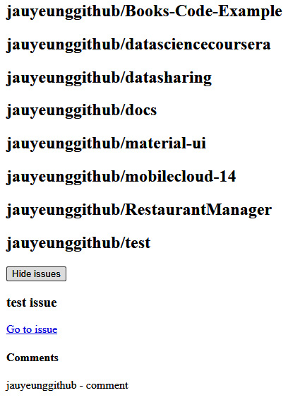
Now, we should see the following screen:
Figure 2.1 – List of repositories
We see a list of repositories displayed, and if there are any issues recorded for them, we see the Show issues button, which lets us see any issues for the given repository. This can be seen in the following screenshot:
Figure 2.2 – Show issues button
We can click Hide issues to hide them. If there are any comments, then we should see them below the issues.


 Free Chapter


