-
Book Overview & Buying

-
Table Of Contents

Responsive Web Design with HTML5 and CSS - Third Edition
By :

Responsive Web Design with HTML5 and CSS
By:
Overview of this book
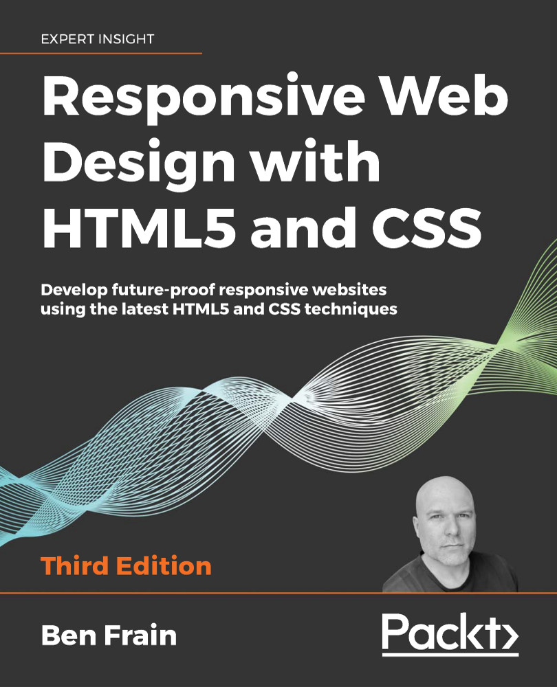
Responsive Web Design with HTML5 and CSS, Third Edition is a renewed and extended version of one of the most comprehensive and bestselling books on the latest HTML5 and CSS tools and techniques for responsive web design.
Written in the author's signature friendly and informal style, this edition covers all the newest developments and improvements in responsive web design including better user accessibility, variable fonts and font loading, CSS Scroll Snap, and much, much more. With a new chapter dedicated to CSS Grid, you will understand how it differs from the Flexbox layout mechanism and when you should use one over the other.
Furthermore, you will acquire practical knowledge of SVG, writing accessible HTML markup, creating stunning aesthetics and effects with CSS, applying transitions, transformations, and animations, integrating media queries, and more. The book concludes by exploring some exclusive tips and approaches for front-end development from the author.
By the end of this book, you will not only have a comprehensive understanding of responsive web design and what is possible with the latest HTML5 and CSS, but also the knowledge of how to best implement each technique.
Table of Contents (14 chapters)
Preface
The Essentials of Responsive Web Design
 Free Chapter
Writing HTML Markup
Media Queries – Supporting Differing Viewports
Fluid Layout, Flexbox, and Responsive Images
Layout with CSS Grid
CSS Selectors, Typography, Color Modes, and More
Stunning Aesthetics with CSS
Using SVGs for Resolution Independence
Transitions, Transformations, and Animations
Conquer Forms with HTML5 and CSS
Bonus Techniques and Parting Advice
Other Books You May Enjoy
Index
