
The area at the bottom of the primary application window can be used for a status bar control that is suited for displaying the current state of the window and accompanying actions, background tasks, or some other contextual information.
In this recipe, I will demonstrate how to add the StatusBar control to our WPF application and share some guidelines regarding the implementation and usage of this pattern.
Start your Expression Blend 4 and then select New project... From the dialog that appears, select WPF and then WPF Application. Make sure that Language is set to C# and Version is 4.0. At the end hit OK..
1. Once your new WPF project has been created, you should notice that under the Objects and Timeline pane, Window and LayoutRoot grid controls are visible.
2. Go to Asset Library and from there click on the StatusBar control. Draw it onto your artboard. Note that the StatusBar control will probably be hidden, so you should make sure that the Show All option, located at the Asset Library dialog, is checked.
3. Select StatusBar by clicking on it. Now we will set up some properties. Go to the Properties pane and under the Layout section change the following:
Set Width to Auto and Height to 24
Set HorizontalAlignment to Stretch (last icon in the row)
Set VerticalAlignment to Bottom (third icon in the row)
Set all values for Margin to 0
4. Your StatusBar should now appear docked to the bottom of your window and stretched from side-to- side.
5. As you can notice, StatusBar looks completely blank. Let's add a single line at the top of our StatusBar just to make it appear more distinct from the rest of the window surface.
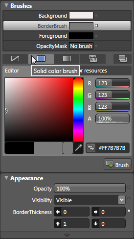
6. Under the Appearance section, set 1 for the Top Border value. Now under Brushes section, locate the BorderBrush, and click on it. Now click on the Solid color brush icon and pick some kind of dark gray. You can also enter RGB values: 123,123,123 or HEX: #FF7B7B7B.
 |
7. Your StatusBar should now have a simple gray border at the top.
Let's add some controls to our StatusBar. However, note that I am just adding random controls now and not following specific guidelines; those can be found under the There's more... section and you should refer to them when designing and implementing the status bar pattern.
8. Right-click on the StatusBar control and from the drop-down menu, select Add StatusBarItem; this will add the simplest possible item to your StatusBar.
9. Now, click on StatusBarItem to select it and under the Properties pane locate the Common Properties section. Enter Ready for the Content property.
10. In order to change the Content property of StatusBarItem during the run-time, we need to assign it a name. At the top of the Properties pane, you will find the Name field; type myFirstItem in that field.
 |
11. Now add a Button control on top of the LayoutRoot control. To do that, select LayoutRoot under the Object and Timeline pane and then from the toolbox or Asset Library draw a simple button on your artboard.
12. Give it a name btnChangeStatus (follow the same directions given under Step 26).
13. Set its Content to Change Status (This property is located under the Properties pane, in the Common Properties section).
14. The next step is adding an event handler that will change the Content property of StatusBarItem.
15. With Button selected, click on the Events icon under the Properties pane and you will be presented with a number of events. Let's add our event handlers for the Click event. To do that, you will just have to type in the name for those event handlers and once you hit Enter, Visual Studio will start and allow you to add code logic. You can use btnChangeStatus_Clicked as a name for your event.
 |
16. Add the following code:
private void btnChangeStatus_Clicked(object sender, RoutedEventArgs e)
{
this.myFirstItem.Content = "Status has been changed!";
}
17. Press F5 and your application will start. Click on Change Status and note that the text in your status bar area has changed.
 |
After the StatusBar control was added, I set several of its properties. I've set the height to 24 (it was fairly arbitrarily defined in this particular case), and I've also set the HorizontalAlignment to Stretch (to ensure that the StatusBar will consume all the horizontally available space). Also, VerticalAlignment has been set to Bottom (to ensure that StatusBar will dock to the bottom). By setting values of all margins to zero, I've ensured that there will be no empty space around the status bar when docked and stretched.
In order to make the StatusBar a bit more distinct (and to show a really simple way of customizing the control), I've changed the top border width and color.
With all the positioning and the look set, the next step was to add a very simple element to the StatusBar StatusBarItem. Later, I will demonstrate how you can add a number of other different elements to StatusBar, but StatusBarItem was the simplest to do and it served me well to show you how to update its Content property via code.
This pattern might be used in real applications to update status messages during runtime, but in case your development knowledge is more advanced, you can take it to a more advanced level. But the idea remains the same: give the name to StatusBarItem and change its Content property.
Status bar can be used to host more different controls to help you build better and more solid user experience for your users. In this section, you will learn how to do exactly that but you will also gain knowledge and valuable guidelines for implementing and designing user interfaces which are utiling StatusBar control.
The previous example showed how to add the simplest of all elements to StatusBar. However, Blend enables you to add a number of other different controls to your StatusBar.
You can take it from the last point in the first example.
1. Select the StatusBar control and under the Properties tab, locate the Common Properties section. Click on the ellipses button near Items(Collection) and the Collection Editor (Items) dialog will appear. At the bottom, click on the arrow pointing downwards near Add another item. From the list, select Separator, and press Enter.
2. Repeat the procedure but this time select Button control from the list.
3. In the right-hand part, scroll down to Common Properties and type Button Content in the Content property. Press Enter.
 |
4. Click on OK and now press F5 to start and test your application. Now you should be able to see a button with the Button Content label in your StatusBar control.
5. If your button is not completely visible, try changing the StatusBar Height property to, let's say 32. Press F5 now and your application should like the one in the following screenshot:
 |
6. Under Objects and Timeline pane, select the StatusBar control. Now go to Asset Library and pick the ProgressBar control. The next step is just to draw the ProgressBar control on top of your StatusBar control.
Alternatively, you can just draw the ProgressBar control on your artboard and simply drag-and -drop it on top of the StatusBar. If you press the Alt key while dragging, ProgressBar will be added as an element of the StatusBar.
 |
Take into account, if you want to be able to set or get properties from objects added to StatusBar control, you need to name them and use that name when referencing them from code.
Size grip is a commonly seen and used pattern: it enables you to grab a corner of your window and pull it to resize the window. Here is how to add a size grip to your status bar and enable resizing.
I will just continue from the last example. So, return to Expression Blend.
1. Under Objects and Timeline, select Window.
2. Go to the Properties pane and locate the Common Properties section. You will find the ResizeMode property there.
3. Click on the drop-down list and select CanResizeWithGrip.
4. You will now notice the size grip at the bottom-right corner of your window, on top of the StatusBar control.
5. Press F5 to start your application. Position your mouse cursor over the size grip and try resizing the form. As simple as that, zero lines of code!
 |
A status bar should be used in cases where you want to provide status information to your users but without harsh interruption of their main activities. It is generally located at the very bottom of the main (primary) application window and stretches from left to right with no margins, though specific exceptions might occur.
Information provided in a status bar is usually related to the current window's state, possible tasks in the background, or some contextual information.
The single most important thing is that a status bar should be used to provide information to the end users without interrupting them, which also means that information provided in a status bar should not be extremely critical or something that requires immediate attention. So, displaying status of loading a web page is fine, but letting the user know that a virus has been found on their C drive is something that requires immediate attention and should not be communicated through status bars.
Usually, a status bar uses simple text or images (icons) to communicate information, but a number of other controls can be also used. A progress bar (indicator) is one of them and it is often seen in web browsers showing the loading process of a web page. Also, menus for commands and options can be used in status bars.
However, status bars have one disadvantage: they are not easily discoverable. It is fairly easy to overlook them or even to completely ignore them. What can you do to "fix" this? I hope you are not thinking about using some aggressive animations, blinking, vivid icons, or some other means of grabbing users' attention. Recall what I said a few lines earlier: information provided in the status bar should not be extremely critical or something that requires immediate attention.
Ensure that the information you are placing into the status bar is relevant and useful and if that is not the case, well, then don't use the status bar. Also, if a user must see the information, then don't put it in the status bar the status bar is not for critical information.
So, to summarize, use the status bar for relevant and useful information, but never for critical information!
As always, throughout this book, the implementation and other guidelines provided here are not 100% comprehensive, rather they are suggestions and proven practices extracted from various resources. However, the ones presented in this book are those most commonly used and by following them you will avoid common pitfalls and ensure solid quality.
A status bar should be presented only on the primary window of your application. You should never use status bars on all of the windows of your application.
Don't use status bars as places to describe usage of controls on your UI. In the past (and I still see that sometimes), there was a trend to display information relevant to specific controls in the status bar. For example, if you positioned your mouse pointer over the printer icon, you would get something like Click here to print current document in your status bar. You should use tooltips for this pattern, never the status bar. Same holds true for menu items.
Is the information that you want to display in the status bar critical and/or does it require immediate action? If so, then don't use the status bar for it. Consider a dialog or message box, they will break the flow and grab user's attention.
Although it's not a rule (because of their relatively low discoverability), status bars might not be suitable for programs intended primarily for users who are beginners.