Book Image

jQuery UI 1.7: The User Interface Library for jQuery

Book Image

jQuery UI 1.7: The User Interface Library for jQuery

Overview of this book

Modern web application user interface design requires rapid development and proven results. jQuery UI, a trusted suite of official plug-ins for the jQuery JavaScript library, gives you a solid platform on which to build rich and engaging interfaces with maximum compatibility and stability, and minimum time and effort. jQuery UI has a series of ready-made, great-looking user interface widgets and a comprehensive set of core interaction helpers designed to be implemented in a consistent and developer-friendly way. With all this, the amount of code that you need to write personally to take a project from conception to completion is drastically reduced. Specially revised for version 1.7 of jQuery UI, this book has been written to maximize your experience with the library by breaking down each component and walking you through examples that progressively build upon your knowledge, taking you from beginner to advanced usage in a series of easy-to-follow steps. In this book, you'll learn how each component can be initialized in a basic default implementation and then see how easy it is to customize its appearance and configure its behavior to tailor it to the requirements of your application. You'll look at the configuration options and the methods exposed by each component's API to see how these can be used to bring out the best of the library. Events play a key role in any modern web application if it is to meet the expected minimum requirements of interactivity and responsiveness, and each chapter will show you the custom events fired by the component covered and how these events can be intercepted and acted upon.
Table of Contents (19 chapters)
jQuery UI 1.7
Credits
About the Author
About the Reviewers
Preface
Index

Chapter 3. Tabs

Now that we've been formally introduced to the jQuery UI library and the CSS framework we can move on to begin looking at the components included in the library. Over the next six chapters, we'll be looking at the widgets. These are a set of visually engaging, highly configurable user interface widgets built on top of the foundation provided by the low-level interaction helpers.

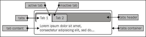
The UI tabs widget is used to toggle visibility across a set of different elements, each element containing content that can be accessed by clicking on its heading which appears as an individual tab.

The tabs are structured so that they line up next to each other, whereas the content sections are layered on top of each other, with only the top one visible. Clicking a tab will highlight the tab and bring its associated content panel to the top of the stack. Only one content panel can be open at a time.

The following screenshot shows the different components of a set of UI tabs:

In this chapter, we will...