Book Image

WordPress Mobile Web Development: Beginner's Guide

By : RACHEL MCCOLLIN
Book Image

WordPress Mobile Web Development: Beginner's Guide

By: RACHEL MCCOLLIN

Overview of this book

The chances are that more of your WordPress website visitors are using mobiles, or more clients are demanding responsive or mobile sites. If you can use WordPress to build mobile-friendly sites you can win more business from clients and more traffic for your site. "WordPress Mobile Web Development Beginner's Guide" will benefit you whether you've dabbled in WordPress or worked with it for years. It will help you identify which approach to mobile is most appropriate for your site (responsive, mobile, or web app) and learn how to make each one work, demonstrating a variety of techniques from the simple to the more complex, working through clear practical examples and applying these to your own website. Start by quickly making a WordPress site mobile-friendly, using off the shelf plugins and responsive themes, choosing the best ones for you and customising them. This leads into responsive theme design, with advice on layout, images and navigation. Finally, learn how to build a web app in WordPress, making use of plugins, APIs and custom code. If you need to hit the ground running with mobile WordPress development, then this book is for you. With practical examples and exercises from the beginning, it will help you build your first mobile WordPress site without having to learn aspects of WordPress or mobile development that aren't relevant. It will also help you understand which approaches work and why, so you can apply this knowledge to future projects.
Table of Contents (18 chapters)
WordPress Mobile Web Development Beginner's Guide
Credits
About the Author
About the Reviewers
Acknowledgement
www.PacktPub.com
Preface

Time for action—setting up our mobile menus


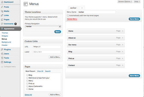
We already have one menu set up here, which is the navbar menu. Let's set up two new ones for mobiles—one for the area just below the header and one for the bottom of the page

To set up our mobile menus, we will perform the following steps:

  1. 1. First, we will click on the + tab to the right of the navbar tab. In the Menu name field, we will type in the name of our menu—let's call it mobile-top. We will then click on Save Menu.

  2. 2. We will tick the checkbox next to any pages we want to include in this menu from the list on the left-hand side. If we can't see all of them in the list, we will just click on View all above the list of pages. Let's select the pages called Find us, We'd love to hear from you!, Opening hours, and Order online.

  3. 3. We will click on Add to menu to see the pages displayed in our new navigation menu:

  4. 4. We will move the menu items into the correct order by dragging-and-dropping them. We will then click on Save menu to save our changes...