
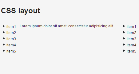
Another nice feature of the CSS layout is that components are wrapped when they reach the width of the layout. This feature can be used to create layouts for small displays, for example, mobile phones or some tablets. We will create a simple layout with a header, two menus, and content in the middle of them.
As we can see in the following screenshot, if the user opens our application on a wide screen, components are displayed side by side. Except the header that takes up the whole width of the page.
If the user opens our application on a narrow screen, for example, on a mobile device, then all components will be aligned into the one column.

Carry out the following steps to create an application with a flexible layout for mobile devices:
Create a project with the main UI class called, for example,
Demo.public class Demo extends UI {…}We create a
MobileLayoutclass that extendsCssLayout.public class MobileLayout extends CssLayout {…}At first...