Book Image

PrimeFaces Cookbook

Book Image

PrimeFaces Cookbook

Overview of this book

PrimeFaces is the de facto standard in the Java web development. PrimeFaces is a lightweight library with one jar, zero-configuration, and no required dependencies. You just need to download PrimeFaces, add the primefaces-{version}.jar to your classpath and import the namespace to get started. This cookbook provides a head start by covering all the knowledge needed for working with PrimeFaces components in the real world. "PrimeFaces Cookbook" covers over 100 effective recipes for PrimeFaces 3.x which is a leading component suite to boost JSF applications. The book's range is wide‚Äí from AJAX basics, theming, and input components to advanced usage of datatable, menus, drag & drop, and charts. It also includes creating custom components and PrimeFaces Extensions.You will start with the basic concepts such as installing PrimeFaces, configuring it, and writing a first simple page. You will learn PrimeFaces' theming concept and common inputs and selects components. After that more advanced components and use cases will be discussed. The topics covered are grouping content with panels, data iteration components, endless menu variations, working with files and images, using drag & drop, creating charts, and maps. The last chapters describe solutions for frequent, advanced scenarios and give answers on how to write custom components based on PrimeFaces and also show the community-driven open source project PrimeFaces Extension in action.
Table of Contents (17 chapters)
PrimeFaces Cookbook
Credits
About the Authors
About the Reviewers
www.PacktPub.com
Preface
Index

Advanced editing with in-place editor


The inplace component provides easy in-place editing and inline content display. in-place consists of two members:

  • The display element that is the initial clickable label

  • The inline element, which is the hidden content that'll be displayed when the display element is toggled

How to do it...

The basic declaration of the component would be as follows:

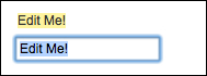
<p:inplace>
  <h:inputText value="Edit Me!" />
</p:inplace>

This would render an input text field that could be clicked by the user to go into the edit mode. To go out of the edit mode, the user needs to click on the enter button after typing.

By default, the inplace component displays its first child's value as the label; this can also be customized with the label attribute. This attribute defines the label that will be shown in the display mode regardless of the text input by the user.

<p:inplace label="My Input Field">
  <h:inputText value="Edit Me!" />
</p:inplace>

The emptyLabel...