
Now we will lay out the main window of our application:
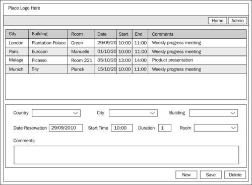
This window lets the user see the meeting room reservations which are already made, as well as edit them, or create new ones.
First, we must create a new project, and then edit the XAML code of the MainPage file.
We must now define three rows to the grid layout container:
The resulting user control includes the grid and rows created:
<UserControl x:Class="ReservationLayout.MainPage"
  xmlns="http://schemas.microsoft.com/winfx/2006/xaml/presentation"
  xmlns:x="http://schemas.microsoft.com/winfx/2006/xaml"
  xmlns:d="http://schemas.microsoft.com/expression/blend/2008"
  xmlns:mc="http://schemas.openxmlformats.org/markup-compatibility/2006"
  mc:Ignorable="d"
  d:DesignHeight="300" d:DesignWidth="400">

  <Grid x:Name="LayoutRoot" Background="White">
    <Grid.RowDefinitions>
      <RowDefinition Height="300"/>
      <RowDefinition Height="300"/>
      <RowDefinition Height="90"/>
    </Grid.RowDefinitions>
  </Grid>

</UserControl>
Next, we must add a DataGrid control to the layout and indicate the row in which its parent container will be assigned:
<UserControl
  x:Class="ReservationLayout.MainPage"
  xmlns="http://schemas.microsoft.com/winfx/2006/xaml/presentation"
  xmlns:x="http://schemas.microsoft.com/winfx/2006/xaml"
  xmlns:d="http://schemas.microsoft.com/expression/blend/2008"
  xmlns:mc="http://schemas.openxmlformats.org/markup-compatibility/2006"
  xmlns:sdk="http://schemas.microsoft.com/winfx/2006/xaml/presentation/sdk"
  mc:Ignorable="d"
  d:DesignHeight="300" d:DesignWidth="400">

  <Grid x:Name="LayoutRoot" Background="White">
    <Grid.RowDefinitions>
      <RowDefinition Height="200"/>
      <RowDefinition Height="150"/>
      <RowDefinition Height="90"/>
    </Grid.RowDefinitions>

    <sdk:DataGrid Grid.Row="0"/>
  </Grid>
</UserControl>
Note
The easiest way to insert DataGrid control is by dragging it directly from the Toolbox window in Visual Studio and then dropping it in our layout (it adds all the necessary references for us). After that, we only have to jump to the XAML of the application and define the row and/or column where we want it to appear.
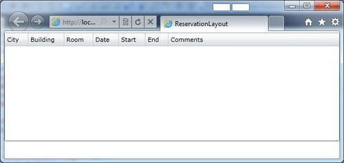
If we execute the application, the result is not very appealing. We will only see a white rectangle that represents the DataGrid control. We will learn how to manage this control in subsequent chapters. For now, we will add some column definitions to make it look more similar to the following example screen.
To make it easier, we have to select the DataGrid object and use the Properties tab.
On the one hand, we disable auto-generation of columns.

On the other hand, we will define the columns manually, clicking on the property Columns.

The following is the XAML that we get:
<sdk:DataGrid Grid.Row="0" AutoGenerateColumns="False">
  <sdk:DataGrid.Columns>
    <sdk:DataGridTextColumn
      CanUserReorder="True"
      CanUserResize="True"
      CanUserSort="True"
      Header="City"
      Width="Auto"
    />
    <sdk:DataGridTextColumn
      CanUserReorder="True"
      CanUserResize="True"
      CanUserSort="True"
      Header="Building"
      Width="Auto"
    />
    <sdk:DataGridTextColumn
      CanUserReorder="True"
      CanUserResize="True"
      CanUserSort="True"
      Header="Room"
      Width="Auto"
    />
    <sdk:DataGridTextColumn
      CanUserReorder="True"
      CanUserResize="True"
      CanUserSort="True"
      Header="Date"
      Width="Auto"
    />
    <sdk:DataGridTextColumn
      CanUserReorder="True"
      CanUserResize="True"
      CanUserSort="True"
      Header="Start"
      Width="Auto"
    />
    <sdk:DataGridTextColumn
      CanUserReorder="True"
      CanUserResize="True"
      CanUserSort="True"
      Header="End"
      Width="Auto"
    />
    <sdk:DataGridTextColumn
      CanUserReorder="True"
      CanUserResize="True"
      CanUserSort="True"
      Header="Comments"
      Width="*"
    />
  </sdk:DataGrid.Columns>
</sdk:DataGrid>
Let's take a look at the final result:
We now move to the detailed area. The easiest thing to do here will be to design the page using Expression Blend or Visual Studio. We will use the knowledge acquired in this chapter to design the window manually using grid control. To do this, we must define the following area of rows and columns:
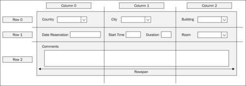
The generated XAML can be seen in the code that follows. A few things should be taken care of. They are:
The grid container which we insert is inside the parent layout grid
We use
Marginproperties to assign space between grid rows, as well as between labels and controlsTo lay out labels and controls, we will use a
StackPanelcontrol and adjust theorientationproperty, setting it to vertical or horizontal, as applicable (another valid approach to position them is to play with eachMarginproperty of each control, this margin being related to its container cell)For the Comments textbox to occupy all of the grid width, we add a property called
ColSpan
<Grid Grid.Row="1" HorizontalAlignment="Center" MinWidth="670" Margin="5">
<Grid.RowDefinitions>
<RowDefinition Height="25"/>
<RowDefinition Height="30"/>
<RowDefinition Height="80"/>
</Grid.RowDefinitions>
<Grid.ColumnDefinitions>
<ColumnDefinition Width="200"/>
<ColumnDefinition Width="250"/>
<ColumnDefinition Width="220"/>
</Grid.ColumnDefinitions>
<StackPanel
Orientation="Horizontal"
Grid.Row="0"
Grid.Column="0">
<TextBlock
Text="Country"
Margin="0,5,5,0"/>
<ComboBox Width="143"/>
</StackPanel>
<StackPanel
Orientation="Horizontal"
Grid.Row="0"
Grid.Column="1">
<TextBlock
Text="City"
Margin="0,5,5,0"
/>
<ComboBox Width="221"/>
</StackPanel>
<StackPanel
Orientation="Horizontal"
Grid.Row="0"
Grid.Column="2">
<TextBlock
Text="Building"
Margin="0,5,5,0"/>
<ComboBox Width="100"/>
</StackPanel>
<StackPanel
Orientation="Horizontal"
Grid.Row="1"
Grid.Column="0"
Margin="0,5,0,0"
>
<TextBlock
Text="Date Reservation" Margin="0,5,5,0"
/>
<TextBox Width="90"/>
</StackPanel>
<StackPanel
Orientation="Horizontal"
Grid.Row="1"
Grid.Column="1"
Margin="0,5,0,0"
>
<TextBlock
Text="Start Time"
Margin="0,5,5,0"
/>
<TextBox Width="70"/>
<TextBlock
Text="Duration"
Margin="0,5,5,0"
/>
<TextBox Width="61"/>
</StackPanel>
<StackPanel
Orientation="Horizontal"
Grid.Row="1"
Grid.Column="2"
Margin="0,5,0,0"
>
<TextBlock
Text="Room"
Margin="0,5,5,0"/>
<ComboBox Width="113"/>
</StackPanel>
<StackPanel
Orientation="Vertical"
HorizontalAlignment="Left"
Grid.Row="3"
Grid.Column="0" Grid.ColumnSpan="3"
Margin="0,5,0,0"
>
<TextBlock
Text="Comments"
Margin="0,5,5,0"/>
<TextBox
Width="599"
Height="50"/>
</StackPanel>
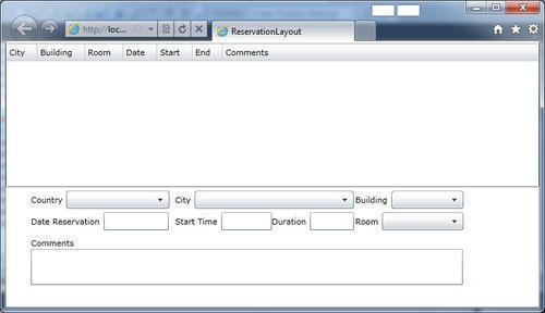
</Grid>The result of the page layout is as follows:
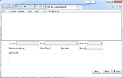
We will add the control panel in the lower part of the window to complete the layout. We will use a StackPanel container with horizontal orientation to do so.
<StackPanel
  Grid.Row="2"
  Orientation="Horizontal" HorizontalAlignment="Right">
  <Button Content="New"
    Width="60" Height="30"/>
  <Button Content="Save"
    Margin="5,0,0,0"
    Width="60" Height="30"/>
  <Button Content="Delete"
    Margin="5,0,0,0"
    Width="60" Height="30"/>
</StackPanel>
We have now laid out our window as shown in the following screenshot: