Book Image

jQuery UI 1.10: The User Interface Library for jQuery - Fourth Edition

Book Image

jQuery UI 1.10: The User Interface Library for jQuery - Fourth Edition

Overview of this book

jQuery UI, the official UI widget library for jQuery, gives you a solid platform on which to build rich and engaging interfaces quickly, with maximum compatibility, stability, and effort. jQuery UI's ready-made widgets help to reduce the amount of code that you need to write to take a project from conception to completion. jQuery UI 1.10: The User Interface Library for jQuery has been specially revised for Version 1.10 of jQuery UI. It is written to maximize your experience with the library by breaking down each component and walking you through examples that progressively build up your knowledge, taking you from beginner to advanced user in a series of easy-to-follow steps. Throughout the book, you'll learn how to create a basic implementation of each component, then customize and configure the components to tailor them to your application. Each chapter will also show you the custom events fired by the components covered and how these events can be intercepted and acted upon to bring out the best of the library. We will then go on to cover the use of visually engaging, highly configurable user interface widgets. At the end of this book, we'll look at the functioning of all of the UI effects available in the jQuery UI library.
Table of Contents (22 chapters)
jQuery UI 1.10: The User Interface Library for jQuery
Credits
About the Authors
About the Reviewers
www.PacktPub.com
Preface
Index

Changing the elements in the datepicker UI


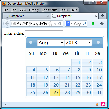
The datepicker API exposes a number of options directly related to adding or removing additional UI elements within the datepicker. To show <select> elements that allow the visitor to choose the month and year, we can use the changeMonth and changeYear configuration options:

$("#date").datepicker({
  changeMonth: true,
  changeYear: true
});

Save this as datePicker4.html. Using the month and year <select> elements, gives the user a much quicker way to navigate to dates that may be far in the past or future. The following screenshot shows how the widget will appear with these two options enabled:

By default, the year select box will include the previous and next 10 years, covering a total range of 20 years. We can navigate further than this using the previous/next arrow links, but if we know beforehand that visitors may be choosing dates very far in the past or future, we can change the range of years using the yearRange option:

$("#date...