
A grid system itself may be labeled as a development kit or a small collection of CSS files that will help us develop websites quickly. Some of them have a fixed width of columns (that may vary depending on the tool used). Columns are a grid system's smallest unit of measurement. Most grid systems contain 12-16 columns. Gutters are margins used to create space between columns.
In addition, grid systems save development time if the design is made grid-based. Sometimes, the layout creation may be limited by the use of columns, but this is not too common. The advantages of grid systems are that they help us achieve better readability and balance the visual weight, flexibility, and overall page cohesiveness.
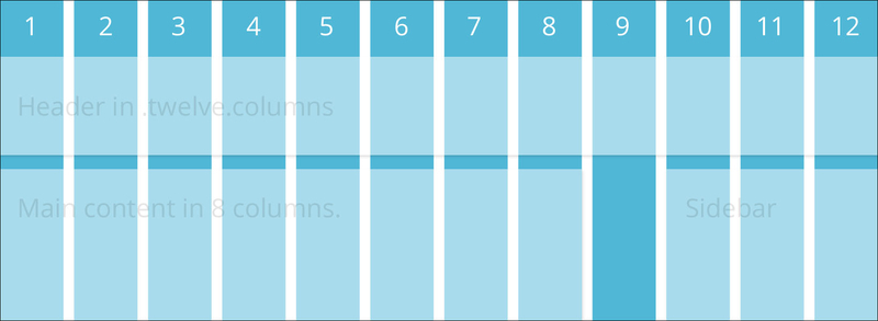
To better understand how the grid system works, look at the following screenshot and notice that the header region's width could be measured as 12 columns (full width) and the Sidebar region as only 3 columns: