
We could have just brought over Bootstrap's default bootstrap.css file, but let's use this opportunity to take a trial run at compiling the LESS files. This will ensure we've got the fundamentals ready for doing more serious work to come.
If you've worked with LESS before, this will be a familiar territory. If you have not worked with LESS before, I'll help you along. However, I highly recommend that you stop and refer to the documentation at http://lesscss.org. Additionally, you may want to find a good basic LESS tutorial and work through it. As you'll soon see, working with LESS is powerful and fun, and the time spent learning will reward well.
For this first step, we won't be writing any LESS files, only compiling.
Navigate to less/bootstrap.less and open it in your editor. You'll see that this file imports all the other files from the less folder. When compiled, this file generates the complete bootstrap.css stylesheet. This is what we want for our first step.
If you've not compiled LESS files before, you'll need to download and install one of the following compilers:
For Windows users, download and install the following compiler:
WinLess (a free desktop application), which can be found at http://winless.org
For Mac users, download and install the following compilers:
The LESS app (free), which can be found at http://incident57.com/less/
CodeKit (not free), which can be found at http://incident57.com/codekit/
Once your chosen LESS compiler is downloaded, installed, and ready for action, the following are your steps to be performed:
Create a new folder named
cssin the main directory at the same level as thefonts,img,js, andlessfolders.
Use one of the following two methods to add your project's main folder (the parent folder of
css,fonts,img,less, and so on) to your compiler:Drag-and-drop the folder into the application window
Alternatively, navigate to the application's File | New Project menu to add the parent folder
You should see that the application loads the LESS files (and perhaps other files) into its window. Search or scan for the
less/bootstrap.lessfile.Right-click on
bootstrap.less. Select Set output path (or your application's similar option). Navigate to thecssfolder you created earlier. The file should automatically be namedbootstrap.css. Click on Select.With the output path set, now click on Compile.
Check to see that
bootstrap.csswas created in thecssfolder.Note
If you run into problems, check your compiler's log to ensure it was successful, then double-check your output path. In addition, you may run into a situation where your chosen compiler runs into an error because it has not been updated to stay in sync with the development of LESS. I have recently found this with another free compiler. If your compiler refuses to compile the default Bootstrap LESS files, it's an indication that the compiler needs updating.
Once the file is in place in the
cssfolder, we only need to coordinate our file's name with the stylesheet link in ourindex.htmlfile.In
index.html, remove the stylesheet link tocss/normalize.css, as normalize is included in Bootstrap (normalize.lessis the first file imported bybootstrap.less).The remaining stylesheet link looks for the
css/main.cssfile. Because we'll be customizing Bootstrap to generate our own custom stylesheet, let's leave this link as it is. In the forthcoming steps, we'll usemain.cssfor the custom styles we generate.For now, let's cheat by making a copy of
bootstrap.css. In thecssfolder, create a copy ofboostrap.css. Name the copy asmain.css(in the future steps, we'll overwrite this file with our customizations) as shown in the following screenshot:
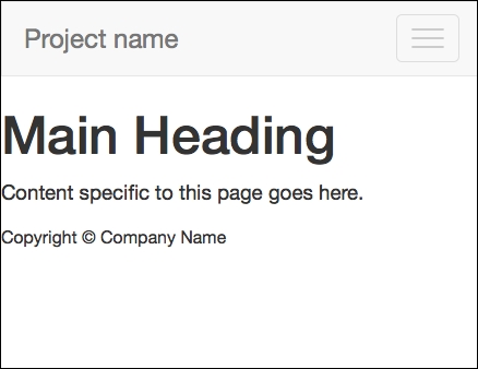
Refresh your browser. You should now see Bootstrap 3's default navigation styles, and you'll see some typographic enhancements as shown in the following screenshot. This is Bootstrap CSS at work. Congratulations!

We now have the default Bootstrap styles in place. Now, let's complete our navbar by making it responsive. As a bonus, this will test to ensure that Bootstrap's JavaScript plugins are working as they should.
To complete our navbar to take advantage of Bootstrap's responsive navbar solution, we need to add two new elements, with appropriate classes and data attributes. You'll find this documented under Bootstrap's Components page, under the Navbar tab at http://getbootstrap.com/components/#navbar.
We'll begin by adding the necessary additional markup as follows:
Search for
<div class="navbar-header">. Inside this element, we'll add thenavbar-togglebutton, which will be used to slide the responsive navbar open and closed. The following is what you'll need (and I will include thenavbar-headeras the parent element):<div class="navbar-header"> <button type="button" class="navbar-toggle" data-toggle="collapse" data-target=".navbar-collapse"> <span class="icon-bar"></span> <span class="icon-bar"></span> <span class="icon-bar"></span> </button> <a class="navbar-brand" href="index.html">Project name</a> </div>A few notes about the preceding code are as follows:
The button includes a class of
navbar-togglefor CSS styles.The data attributes are used by Bootstrap's collapse JavaScript plugin to indicate its desired behavior and its desired target, namely an element with the
navbar-collapseclass. This element is coming in the next step.The spans of the
icon-barclass are used by the CSS to create the small horizontal bars in the toggle button.
Now to wrap the navigation items within a collapsing div, wrap
<ul class="nav navbar-nav">with a div with the appropriate Bootstrap classes as follows:<div class="navbar-collapse collapse"> <ul class="nav navbar-nav"> <li class="active"><a href="index.html">Home</a></li> <li><a href="#">Link</a></li> <li><a href="#">Link</a></li> </ul> </div><!--/.nav-collapse -->
In the preceding two steps, I've divided the resulting code into two halves and all within <div class="container">. To double-check your work, see the full code in the sample code for this chapter.
Note
The tag structure, class names, or data attributes may change with future versions of Bootstrap. If yours does not work as it should, be sure to check Bootstrap's own documentation. As a fallback option, you can start with the starting files provided with the sample code for this book.
Now save the file and refresh your browser. Using a modern browser (such as IE9 or a recent version of Firefox, Google Chrome, or Safari), click on and drag the edge of the browser window to make the window narrower than 980px.
If all works as it should, you should see a collapsed version of the navbar, as shown in the following screenshot, with the site name or logo and a toggle button.
This is a good sign! Now click on the toggle button, and it should slide open, as shown in the following screenshot:
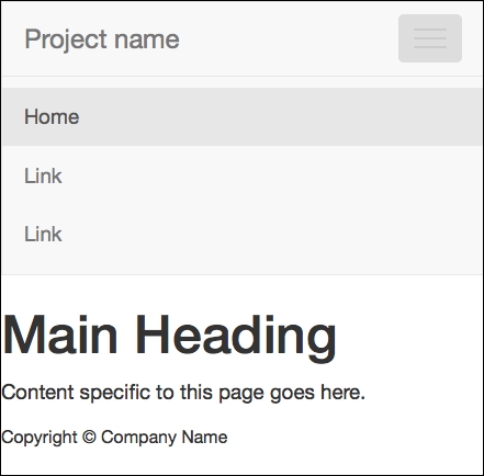
Success! Congratulations!
If things are running smoothly at this point, it means that you've successfully compiled Bootstrap's CSS from LESS, and you've also successfully included Bootstrap's JavaScript plugins.
If things are not running smoothly, you should double-check the following things:
Is your markup properly structured? Any unclosed, incomplete, or malformed tags, classes, and so on present?
Did you successfully compile Bootstrap's LESS to CSS? And did the resulting CSS file wind up in the correct folder under the proper name?
Is the CSS link in the head of
index.htmlupdated as it should be?Have you successfully included Bootstrap's JavaScript plugins?
You might find it helpful to do the following:
Work back through the preceding steps, double-checking things along the way.
Validate your HTML to ensure it's well formed.
Compare the completed version of the exercise files with your own.
Refer to the Bootstrap documentation for new updates to the relevant tag structures and attributes.
Place your code in a snippet at http://jsfiddle.net/ or http://www.codepen.com/, and share it with the good folks at http://stackoverflow.com/ for help.
When we have so many moving parts to work with, things do happen. And these are some of our best survival methods!
Now, assuming things are working, let's move on to take care of one more potential problem. We intend to support Internet Explorer 8 in our designs. To do this, we need to help this older browser out a little.
To support Internet Explorer 8, we need to add a bit of JavaScript that equips the browser to respond to media queries. This is the respond.js polyfill by Scott Jehl.
Bootstrap's own documentation recommends this step for IE8 compatibility. You'll find it referenced briefly in the Bootstrap 3 documentation at http://getbootstrap.com/getting-started/#browsers.
You'll also find respond.js linked in the example HTML templates found in the bootstrap-master download under the examples folder, which is found in the docs folder. There you'll see respond.js linked in the head of the document within an IE conditional comment that limits its use to IE browsers lower than IE9. The HTML5 shiv is also included as follows:
<!--[if lt IE 9]>
  <script src="../../assets/js/html5shiv.js"></script>
  <script src="../../assets/js/respond.min.js"></script>
<![endif]-->
Because we have already included the HTML5 shiv with Modernizr, we can leave that out here. In addition, Andy Clarke has recommended an improved conditional comment that excludes IE mobile browsers to ensure that we do not unnecessarily feed the script to Windows mobile devices that don't need it. See his repository, 320andup, at https://github.com/malarkey/320andup/.
Clarke's recommended code works as follows:
<!--[if (lt IE 9) & (!IEMobile)]>
...
<![endif]-->
Armed with these starting points, we're ready to implement it in our site template files as follows:
Navigate to https://github.com/scottjehl/Respond (you may also search
respond.jsand find the GitHub link). If you'd like, take a few minutes to scroll down the page and read the documentation to learn more about how it works.
Now to get the file and download the ZIP repository.

Extract the directory, and find the minified version of the file named as
respond.min.js.Copy the file to your project files in the
js/vendordirectory, right alongside the scripts for jQuery and Modernizr.
Then, add the following lines of code to load the
respond.jsfile, which is wrapped in the targeted IE conditional comment. We'll do this is in the head ofindex.html, directly beneath the line loading Modernizr.<!-- Modernizr --> <script src="js/vendor/modernizr-2.6.2.min.js"></script> <!-- Respond.js for IE 8 or less only --> <!--[if (lt IE 9) & (!IEMobile)]> <script src="js/vendor/respond.min.js"></script> <![endif]-->
That's it! We've successfully provided IE8 with what it needs so that it responds, as it should, to our mobile-first responsive websites.
Note
If you want to test this and do not have IE8 available, you might use an online service such as Browsershots that is available at http://browsershots.org (free) or BrowserStack that is available at http://www.browserstack.com (premium with free trial).
Our site template is almost complete. Let's pause to take stock before moving on.