
Our utility-nav class runs into problems when the navbar collapses for small screens. The most immediate problem is that it disappears:

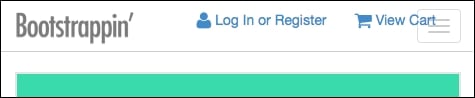
We can make our utility-nav class visible again by assigning it a z-index value greater than that of the navbar's, which is set to 1000 by a variable in _variables.less. In _banner.less, set the z-index property of .utility-nav to 1999.
.utility-nav {
  ...
  z-index: 1999;
This will bring our utility navigation back to the foreground as seen in the following screenshot:
Now the problem is that it overlaps our navbar-toggle button. We need to move the toggle to the left side of our navbar. This can be done as follows:
Open
less/_navbar.lessin your editor.Search for the comment
// Navbar toggle. We'll edit the lines within the.navbar-toggleselector immediately beneath this comment, changing thefloatvalue fromrighttoleftandmargin-righttomargin-left:.navbar-toggle { position: relative; float: left; // edited margin...