
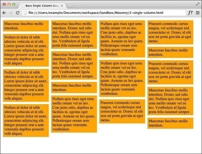
In case you haven't already noticed, Masonry works by arranging elements in a grid-based structure. By using a grid, Masonry tiles will flow and get stacked in a very neat and organized manner, which will give us the brick-like appearance we want to achieve. In this section, we will learn how to set up Masonry, at the very minimum, for a single-column system.
To perform the steps listed in this recipe, we will need a text editor, a browser, and a copy of the Masonry plugin. Any text editor will do, but my browser of choice is Google Chrome, as the V8 JavaScript engine that ships with it generally performs better and supports CSS3 transitions (as you'll see later in the book), and as a result we see smoother animations when resizing the browser window. We need to make sure we have a copy of the most recent version of Masonry, which was Version 2.1.08 at the time of writing this book. This version is compatible with the most recent version of jQuery, which is Version 1.9.1. A production copy of Masonry can be found on the GitHub repository at the following address:
https://github.com/desandro/masonry/blob/master/jquery.masonry.min.js
For jQuery, we will be using a content delivery network (CDN) for ease of development. In the code bundle for this book, open the basic single-column HTML file to follow along.
Set up the styling for the
masonry-itemclass with the proper width, padding, and margins. We want our items to have a total width of 200 pixels, including the padding and margins.<style> .masonry-item { background: #FFA500; float: left; margin: 5px; padding: 5px; width: 180px; } </style>Set up the HTML structure on which you are going to use Masonry. At a minimum, we need a tagged Masonry container with the elements inside tagged as Masonry items.
<div id='masonry-container'>
  <div class='masonry-item '>
    Maecenas faucibus mollis interdum.
  </div>
  <div class='masonry-item '>
    Maecenas faucibus mollis interdum. Donec sed odio dui. Nullam quis risus eget urna mollis ornare vel eu leo. Vestibulum id ligula porta felis euismod semper.
  </div>
  <div class='masonry-item '>
    Nullam quis risus eget urna mollis ornare vel eu leo. Cras justo odio, dapibus ac facilisis in, egestas eget quam. Aenean eu leo quam. Pellentesque ornare sem lacinia quam venenatis vestibulum.
  </div>
</div>
All Masonry options need not be included, but it is recommended (by David DeSandro, the creator of Masonry) to set
itemSelectorfor single-column usage. We will be setting this every time we use Masonry.<script> $(function() { $('#masonry-container').masonry({ // options itemSelector : '.masonry-item', }); }); </script>
Using jQuery, we select our Masonry container and use the itemSelector option to select the elements that will be affected by Masonry. The size of the columns will be determined by the CSS code.
Using the box model, we set our Masonry items to a width of 90 px (80-px wide, with a 5-px padding all around the item). The margin is our gutter between elements, which is also 5-px wide. With this setup, we can confirm that we have built the basic single-column grid system, with each column being 100-px wide. The end result should look like the following screenshot: