
Setting up a Masonry multi-width column instance is not that different from the procedure to set up a single-column instance. The main difference to know when using a multi-width column system is that elements can span across multiple columns; that is, we will have more than one column size defined in our CSS.
In the code bundle for this book, open the 2-Multicolumn.html file in your preferred text editor to follow along.
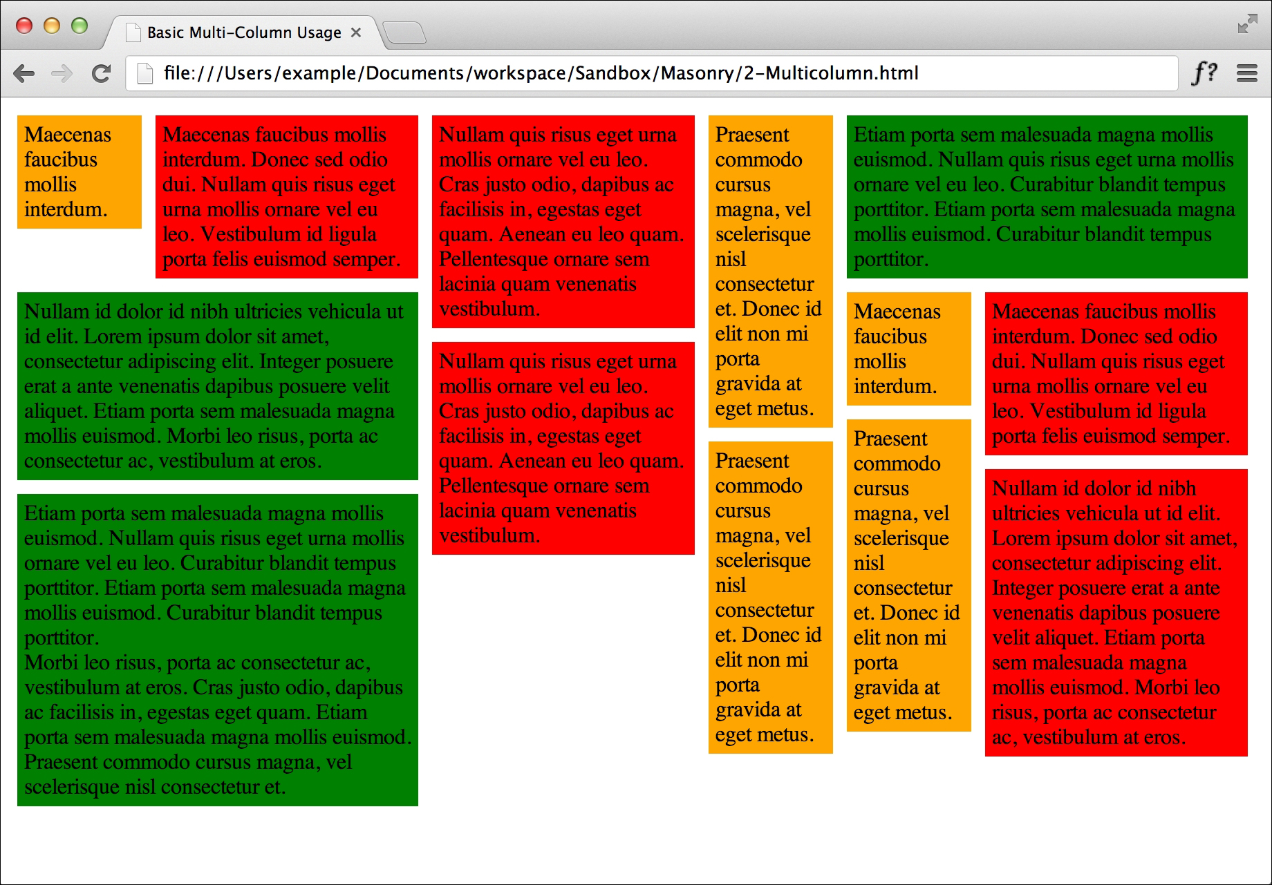
Using CSS, we need to set up multiple classes for different column sizes. Every element's total width (which includes the padding and margins) needs to be evenly divisible by the column width we define in Masonry. If we have two elements of different sizes, such as 60-px and 100-px elements, we should choose our Masonry width to be 20 px. If we want the column width to be 100 px, all elements' widths need to be divisible by 100. Just to see the visual effect, let's render the columns in different colors, as follows:
<style>
  .masonry-item {
    margin: 5px;
    padding: 5px;
    float: left;
  }
  .column-1 {
    background: orange;
    width: 80px;
  }
  .column-2 {
    background: red;
    width: 180px;
  }
  .column-3 {
    background: green;
    width: 280px;
  }
</style>
The HTML structure is the same as a single-column structure, but we will now add the additional column classes that we created, to the Masonry items.
<div id='masonry-container'>
  <div class='masonry-item column-1'>
    Maecenas faucibus mollis interdum.
  </div>
  <div class='masonry-item column-3'>
    Maecenas faucibus mollis interdum.
  </div>
  <div class='masonry-item column-2'>
    Nullam quis risus eget urna mollis.
  </div>
</div>
The Masonry script is also the same as the single-column version, but we are going to add the
columnWidthoption and set it to100. Units are not required.<script> $(function() { $('#masonry-container').masonry({ // options itemSelector : '.masonry-item', columnWidth : 100 }); }); </script>
Since we are being a little festive with the background colors, we can see that by setting a specific column width, the elements line up nicely across the defined columns (which you can see in the next screenshot). By setting multiple column classes, we can really mix it up and have fun with Masonry when we have lots of content.
In this example, we kept the size of the elements defined by the CSS divisible by the column width we set in Masonry. If you set the column width to a size that isn't a multiple of the base column width, Masonry becomes inefficient because there is wasted space between the column width defined in CSS and the column width defined in Masonry. You can play around with various widths to understand how it works, but this is why it is important to know how CSS and Masonry work together.