
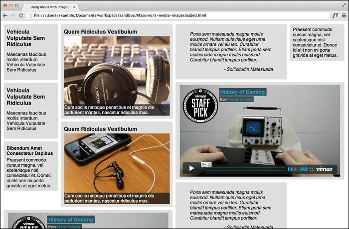
Using Masonry with images and media is relatively simple, but it is not that straightforward when it comes to integrating media with multi-width columns. To implement integration with multiple widths, we need to look back at the multi-column technique and apply the same principles.
In the code bundle for this book, open the 3-images-loaded.html file in your preferred text editor to follow along. There is a lot of additional styling used for various types of elements, so I will only be going over what directly affects the use of Masonry.
We only need to set the width of the various column classes we will be using with CSS.
<style>
  .masonry-item {
    background: #DEDEDE;
    border-radius: 5px;
    margin: 5px;
    padding: 10px;
    float: left;
  }
  .masonry-item img {
    display: block;
    height: auto;
    max-width: 100%;
    margin: 0 auto;
  }
  .column-1 {
    width: 170px;
  }
  .column-2 {
    width: 370px;
  }
  .column-3 {
    width: 570px;
  }
</style>
We will set up our HTML code with various types of media, such as images and videos.
<div id='masonry-container'>
  <div class='masonry-item column-1'>
    <h3>Vehicula Vulputate Sem Ridiculus</h3>
    <p>Maecenas faucibus mollis interdum. Vehicula Vulputate Sem Ridiculus</p>
  </div>
  <div class='masonry-item column-2'>
    <h3>Quam Ridiculus Vestibulum</h3>
    <div class="image-caption">
    <img src="http://lorempixel.com/400/300/technics" alt="random" />
    <span class="caption">Cum sociis natoque penatibus et magnis dis parturient montes, nascetur ridiculus mus.</span>
    </div>
  </div>
  <div class='masonry-item column-2'>
    <blockquote>
    Porta sem malesuada magna mollis euismod. Nullam quis risus eget urna mollis ornare vel eu leo. Curabitur blandit tempus porttitor. Etiam porta sem malesuada magna mollis euismod. </span>
    </blockquote>
  </div>
  <div class='masonry-item column-1'>
    Praesent commodo cursus magna, vel scelerisque nisl consectetur et. Donec id elit non mi porta gravida at eget metus.
  </div>
  <div class='masonry-item column-3'>
    <iframe src="http://player.vimeo.com/video/18743950" width="560" height="320" frameborder="0" webkitAllowFullScreen mozallowfullscreen allowFullScreen></iframe>
  </div>
</div>
The Masonry script in this exercise will use
imagesLoadedin conjunction with thecolumnWidthoption.<script> $container = $('#masonry-container'); $container.imagesLoaded(function() { $container.masonry({ itemSelector : '.masonry-item', columnWidth : 200 }); }); </script>