
Responsive web design is one of the most discussed topics in the web design and development community. So, I believe many of you have heard about it to a certain extent.
Ethan Marcotte was the one who coined the term "responsive web design". He suggests in his article Responsive Web Design (http://alistapart.com/article/responsive-web-design/), that the Web should seamlessly adjust and adapt to the environment where the users view the website rather than addressing it exclusively for a specific platform. In other words, the website should be responsive, it should be presentable on any screen size, regardless of the platform on which it is viewed.
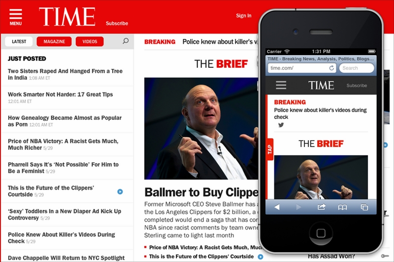
Take the Time website (http://time.com/) as an example. The web page fits nicely on a desktop browser with a large screen size and also on a mobile browser with a limited viewable area. The layout shifts and adapts as the viewport size changes. As you can see in the following screenshot, on the mobile browser, the background color of the header is dark grey, the image is scaled down proportionally, and the Tap bar appears where Time hides the latest news, magazine, and videos sections:
There are two components to build responsive websites, namely, viewport meta tag and media queries.
Before smartphones, such as the iPhone, became mainstream, every website was built to be around 1000 px in width or 980 px wide and it was zoomed out to fit into the mobile phone screen, which eventually made the website unreadable. Hence, the <meta name="viewport"> was created.
In a nutshell, the viewport meta tag is used to define the web page scale and its visible area (viewport) in the browser. The following code is an example of a viewport meta tag in action:
<meta name="viewport" content="width=device-width, initial-scale=1">
The preceding viewport meta tag specification defines the web page viewport width to follow the device. It also defines the web page scale upon opening the web page for the first time at 1:1, in a way that the sizes and the dimensions of the web page content should be persistent; they should not be scaled up or scaled down.
In favor of comprehending how the viewport meta tag would affect a web page layout, I have created two web pages for comparison; one with the viewport meta tag added in and the other one without it. You can see the difference in the following screenshot:

The first website shown in the preceding image is issued with the viewport meta tag using the exact same specification as in our previous code example. As we have specified width=device-width, the browser acknowledges that the website viewport is at the same size as the device screen, so that it will not squish the web page to fit in the entire screen. The initial-scale=1 will retain the title and the paragraph in their original size.
In the second website's example, as we did not add the viewport meta tag, the browser assumed that the web page should be displayed entirely. So, the browser forced the whole website down to fit within the whole screen area, making the title and the text totally unreadable.
You may have found on many web design forums or blogs that viewport and screen size are mentioned interchangeably quite often. But, as a matter of fact, they are two different things.
Screen size refers to the device's actual screen size. A 13-inch laptop, for example, commonly has a screen size of 1280*800 pixels. The viewport, on the other hand, describes the viewable area in the browser where it displays websites. The following diagram illustrates this:

The media types module in CSS enables us to target style rules to specific media. If you have created a print style sheet before, you certainly are familiar with the concept of media types. CSS3 introduced a new media type called media queries, which allow us to apply styles within the specified range of the viewport width, also known as breakpoints.
The following is one simple example; we decrease the p font size from 16px to 14px of the website when the website's viewport size is at 480px or lower.
p {
font-size: 16px;
}
@media screen and (max-width: 480px) {
p {
    font-size: 14px;
}
}
The following diagram illustrates the preceding code:

We can also combine multiple ranges of viewport widths by using the and operator. Following our preceding example, we can set the p font size to 14px when the viewport size is between 480px and 320px in the following manner:
@media screen and (min-width: 320px) and (max-width: 480px) {
p {
font-size: 11px;
  }
}
Note
Viewport and media queries references
We will be dealing with viewport meta tag and media queries while building responsive websites. Packt Publishing has published a dedicated book, Responsive Web Design with HTML5 and CSS3, Ben Frein, Packt Publishing, which covers these two in greater detail. I would like to suggest reading it as a companion and complement to this book.