
Now that we've created our Hello World application, and everything is working as expected, it's time to get involved with Bootstrap and add a bit of style and structure to our app. At the time of writing this book Bootstrap 4 was in alpha version, so bear in mind that the code and markup of your application might be slightly different. We need to add the Bootstrap 4 style sheet into the index.html file:
<meta name="viewport" content="width=device-width, initial-scale=1">
<link rel="stylesheet" href="node_modules/bootstrap/dist/css/bootstrap.css">
<link rel="stylesheet" href="styles.css">
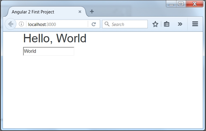
The application is currently misaligned to the left, and everything is looking cramped, so let's sort that out first with a bit of scaffolding. Bootstrap comes with a great mobile first responsive grid system that we can utilize with the inclusion of a few div elements and classes. First, though, let's get a container around our content to clean it up immediately:
Note
Mobile first is a way of designing/developing for the smallest screens first and adding to the design rather than taking elements away.
<div class="container">
  <h1>Hello, {{name || 'World'}}</h1>
  <input type="text" [(ngModel)]="name">
</div>
If you resize your browser window, you should start to notice some of the responsiveness of the framework coming through and see it collapsing:

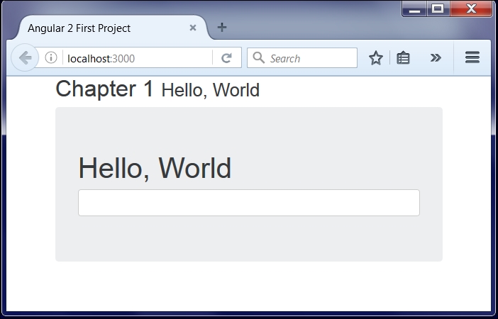
Now, I think it's a good idea to wrap this in what Bootstrap calls a Jumbotron (in previous versions of Bootstrap this was a hero unit). It'll make our headline stand out a lot more. We can do this by wrapping our H1 and input tags in a new div with the jumbotron class:
<div class="container">
  <div class="jumbotron">
    <h1>Hello, {{name || 'World'}}</h1>
   <input type="text" ng-model="name">
  </div>
</div>
It's starting to look a lot better, but I'm not too happy about our content touching the top of the browser like that. We can make it look a lot nicer with a page header, but that input field still looks out of place to me.
First, let's sort out that page header:
<div class="container">
  <div class="page-header">
    <h2>Chapter 1 <small>Hello, World</small></h2>
  </div>
  <div class="jumbotron">
    <h1>Hello, {{name || 'World'}}</h1>
    <input type="text" [(ng-model)]="name">
  </div>
</div>
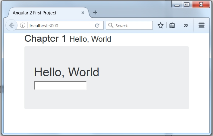
I've included the chapter number and title here. The <small> tag within our <h2> tag gives us a nice differentiation between the chapter number and the title. The page-header class itself just gives us some additional margin and padding as well as a subtle border along the bottom.
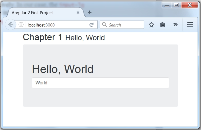
The utmost thing I think we could improve upon is that input box. Bootstrap comes with some cool input styles so let's include those. First, we need to add the class of form-control to the text input. This will set the width to 100% and also bring out some beautiful styling such as rounded corners and glowing when we focus on the element:
<input type="text" [(ngModel)]="name" class="form-control">
Much better, but to me it looks a little small when you compare it with the heading. Bootstrap provides two additional classes we can include that will either make the element smaller or larger: form-control-lg and form-control-sm respectively. In our case, the form-control-lg class is the one we want, so go ahead and add that to the input.
<input type="text" [(ngModel)]="name"
       class="form-control form-control-lg">