Book Image

Learning Bootstrap 4 - Second Edition

By : Matt Lambert
Book Image

Learning Bootstrap 4 - Second Edition

By: Matt Lambert

Overview of this book

Bootstrap, the most popular front-end framework built to design elegant, powerful, and responsive interfaces for professional-level web pages has undergone a major overhaul. Bootstrap 4 introduces a wide range of new features that make front-end web design even simpler and exciting. In this gentle and comprehensive book, we'll teach you everything that you need to know to start building websites with Bootstrap 4 in a practical way. You'll learn about build tools such as Node, Grunt, and many others. You'll also discover the principles of mobile-first design in order to ensure your pages can fit any screen size and meet the responsive requirements. Learn to play with Bootstrap's grid system and base CSS to ensure your designs are robust and that your development process is speedy and efficient. Then, you'll find out how you can extend your current build with some cool JavaScript Plugins, and throw in some Sass to spice things up and customize your themes. This book will make sure you're geared up and ready to build amazingly beautiful and responsive websites in a jiffy.
Table of Contents (15 chapters)
Learning Bootstrap 4 - Second Edition
Credits
About the Author
About the Reviewer
www.PacktPub.com
Preface
Free Chapter
1
Introducing Bootstrap 4

How to use the List Group component


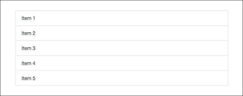
This is the last main content component we need to go over for this chapter. Let's get right into it by reviewing the code needed to render a List Group:

<ul class="list-group"> 
  <li class="list-group-item">Item 1</li> 
  <li class="list-group-item">Item 2</li> 
  <li class="list-group-item">Item 3</li> 
  <li class="list-group-item">Item 4</li> 
</ul> 

Like the components before it, this one is based off of an unordered list:

  • The <ul> tag needs a class of .list-group on it to start

  • Each <li> needs a class of .list-group-item on it

Once you're done, your List Group should look like this in the browser:

As you can see, with some minimal coding you can render a decent looking component. You may have missed it, but we actually already used this component when we were building our sidebar on the index and blog post page templates. Open up one of them in a text...