
Now, it is time to create our first visualization. In HTML5, we have plenty of options to create graphics in the browser itself:
Canvas API (or using, for example,
Paper.js,Processing.js, and more)WebGL API (or using, for example,
Three.js,Pixi.js, and more)SVG specification (or using for example
RaphaëlJS,D3.js, and more)
To better understand which technology suits the best for our purpose of implementing responsive visualizations, we need to take a closer look and discuss their advantages and disadvantages.
Canvas is a JavaScript API used to create Raster Graphics (often called Pixel Graphics) in the browser. As we can see in the following figure, it is supported in all major browsers and Internet Explorer starting from version 9:
Note
You can find detailed information about the Canvas API on MDN at https://developer.mozilla.org/en/docs/Web/API/Canvas_API.

Cross-browser compatibility Canvas from http://caniuse.com/#feat=canvas
A Pixel Graphic is an image that contains all the information about the color of each pixel of the image for a certain resolution. Let's assume we have an image with 8 x 8 pixels where each of these 64 pixels contains the information about its color; we draw a circle in this image:
<canvas id="canvas"></canvas>
<script>
  var canvas = document.getElementById("canvas");
  var ctx = canvas.getContext("2d");
  var centerX = 10, centerY = 10, radius = 10;
  ctx.beginPath();
  ctx.arc(centerX, centerY, radius, 0, 2 * Math.PI, false);
  ctx.fillStyle = "red";
  ctx.fill();
</script>
In the following figure, one can see how the so-called rasterization process defines which pixels of this image gets colored (pixels in the blue region) for the circle shape and which pixels stays transparent (pixels in the white region):
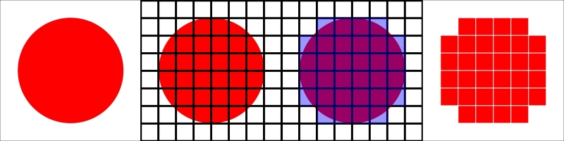
Rasterization of a 8 x 8 pixel circle shape
If we display this image with a high resolution (see the following figure at the left), we see a small circle with crisp edges. On the other hand, if we zoom into the image, we see a very pixelated 8 x 8 pixel image (see the following figure on the right); this effect is the direct cause of the resolution-dependent rasterization process:
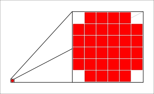
Pixel graphic, left: high resolution, right: zoomed
This effect makes it really difficult to use Pixel Graphics for Responsive Design; we have to always generate and reload our visualization for the current resolution and screen size.
Another drawback is that the final image is composed of pixels, which make it very difficult to attach event listeners, such as mouseover or click events, to certain components of the image. The reason for this is that there are no shapes or components encoded in the image but only color values for each pixel.
WebGL is a JavaScript API based on OpenGL ES 2 to create hardware-accelerated 3D Pixel Graphics in the browser. This technology is very powerful and allows access to the client's GPUs via so-called Shaders; the final visualization is exposed in the browser via the Canvas element. However, browser support is not very good, as we can see in the following figure; mobile devices support the API only partially and Internet Explorer only from version 11.
Note
You can find more detailed information about the WebGL API on MDN at https://developer.mozilla.org/en/docs/Web/API/WebGL_API.

Cross-browser compatibility WebGL from http://caniuse.com/#feat=webgl
Due to WebGL's use of the Canvas element, it doesn't solve any of the limitations of Pixel Graphics that we discussed in the Canvas section. Thus, we will look at a different type of image representation next.
SVG is an XML specification used to create and compose Vector Graphics. Thanks to HTML5, these graphics can simply be embedded into an HTML page, rendered and displayed perfectly sharp by the browser in every screen resolution. As we can see in the following figure, cross-browser compatibility is very good across all the major browsers and Internet Explorer starting from version 9:

Cross-browser compatibility SVG from http://caniuse.com/#feat=svg
Vector Graphics are images where all the information about the image is encoded as numerical expressions of geometric shapes (such as rectangles, circles, ellipses, paths, and texts) of the elements of the image. The browser always uses this information to draw and render the graphic in the best resolution possible. In the following figure, we can see a Vector Graphic of a circle with a high resolution, whereas on the right, we see a zoom of the image. It's easy to see that the zoomed image is displayed with perfectly crisp edges; this effect of lossless scaling results from the resolution-dependent rendering of the browser.
Note
You can find detailed information about the SVG specification on the W3 website: http://www.w3.org/Graphics/SVG/.
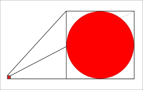
Vector Graphic, left: high resolution, right: zoomed
More advantages result from the fact that the visualization's elements are simply embedded in the HTML page. Now, we can easily attach native JavaScript event listeners, such as the mouseover or click events, on every component of the graphic and use CSS to style them together with the rest of the application.
Another great benefit is that we can simply look into the Developer Console of the web browser, play around, and debug the visualization. We can click on each element of the image to see its attached event handlers, and we can modify the CSS styling in real time. Anyone who has ever dealt with OpenGL or WebGL debugging will agree that this is a comfort that you can't miss while developing visualizations for the web.
Now, we already have many arguments in favor of using SVG for responsive cross-browser visualizations:
Simple debugging because the source code of the graphic is simply embedded in the HTML document
Sharp rendering on all screen resolutions because the browser renders the graphic according to the client's screen resolution
Cross-browser compatibility in all major browsers
Styling the visualization with CSS
Native JavaScript event handlers can be attached to all elements of the image
Debugging and live editing of the visualization in the Developer Tools