
Although Bourbon does add a degree of responsivity to our code, it's not quite enough for our needs. If we try resizing our demo, it soon becomes apparent that the elements don't quite go where we would want them, to say the least!
The quickest way to see just how the design looks when resized for smaller devices is to use Google Chrome. Press Shift +
Ctrl
+
I to enable Chrome's developer tools:
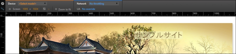
The design works well when viewed at 1280px x 1024px, but this soon changes if we change the available viewing estate to suit an Apple iPhone 6 at 375px by 627px:

See what I mean? It just doesn't look right, does it? Fortunately, it's easy to fix using PostCSS, so let's dive in and see what is required to get our design working again.
Getting our design to work properly for smaller devices such as iPhones is easy when working with PostCSS: we can use the postcss-media-minmax plugin available from https://github.com/postcss/postcss-media-minmax.
"How...