
Nowadays e-commerce stores must be responsive and mobile friendly to increase sales according to the huge number of people using mobile devices to buy products and services. It's very important to know the right tools to provide a mobile-friendly Magento theme for your project. Let's go mobile with Magento!
The following topics will be covered in this chapter:
- Why mobile and responsive?
- Testing the website on different devices
- The Google Chrome DevTools device mode
- Responsive web designer tester extension
- Adjusting the CompStore theme for mobile devices
- Adjusting tweets for mobile devices
According to a research called State of Mobile Commerce Growing like a weed Q1 2015 conducted by Criteo (http://www.criteo.com/), a digital marketing company, mobile accounts for 29% of e-commerce transactions in the US and 34% globally. By the end of 2015, mobile share is forecast to reach 33% in the US and 40% globally. This research is available at http://www.criteo.com/media/1894/criteo-state-of-mobile-commerce-q1-2015-ppt.pdf.
This is one of the main reasons for which all Magento developers must create responsive designs. We started this process indirectly by creating a new theme with Webcomm Magento Boilerplate. Despite its basic mobile support, we have to make some adjustments to create a completely responsive Magento theme. Let's return to work!
In order to test your website in different devices and, consequently, different screen sizes, it is recommended to use a specific software or service to simulate the screen sizes of devices. If you perform a search on the web, you may find a great number of online test tools, but these tools work only with published websites. Our Magento site works, for now, on our local development environment.
To take advantage of our local development environment, let's work with the Google Chrome DevTools Device Mode and the Responsive Web Designer Tester extensions. In this book, we'll have two options to work with mobile theme development. You choose both of them!
If you don't have Google Chrome installed, download it from the URL https://www.google.com/intl/en/chrome/browser/desktop/ to install it on your operating system.
Google Chrome DevTools is a native tool of Google Chrome that provides a bunch of tools for web developers. By working with DevTools, you can optimize your frontend code, including HTML, CSS, and JavaScript.
Before accessing the DevTools extensions, access your Magento CompStore website at the http://localhost/packt URL.
To access DevTools, in the Google Chrome browser, follow these steps:
- Click on the Google Chrome menu.
- Click on the More Tools option.
- Click on the Developer Tools option.

Now, you can see the DevTools window, as in the preceding screenshot.
To activate Device Mode, click on the smartphone icon next to the Elements menu item. Now, you can see the page rendering with different options, as in the following screenshot:

According to the Google DevTools official page available at https://developers.google.com/web/tools/chrome-devtools/iterate/device-mode/, you can use the DevTools device mode to do the following:
The DevTools extension has the following options to enhance developer experience:
To change the device preset, click on the Device options:

You can choose from among iPhone, Google Nexus, Samsung Galaxy, and Blackberry, and you can create custom devices to test the screen size.


The media queries are responsible for defining the CSS rule for each screen size. You can access all of these using DevTools. To access media queries, click on the icon in the upper-left corner:


Now, open the Google Chrome browser and navigate to the address https://chrome.google.com/webstore/category/apps to access Chrome Web Store. Conduct a search to find the Responsive Web Designer Tester extension and then add the extension to Google Chrome, as follows:
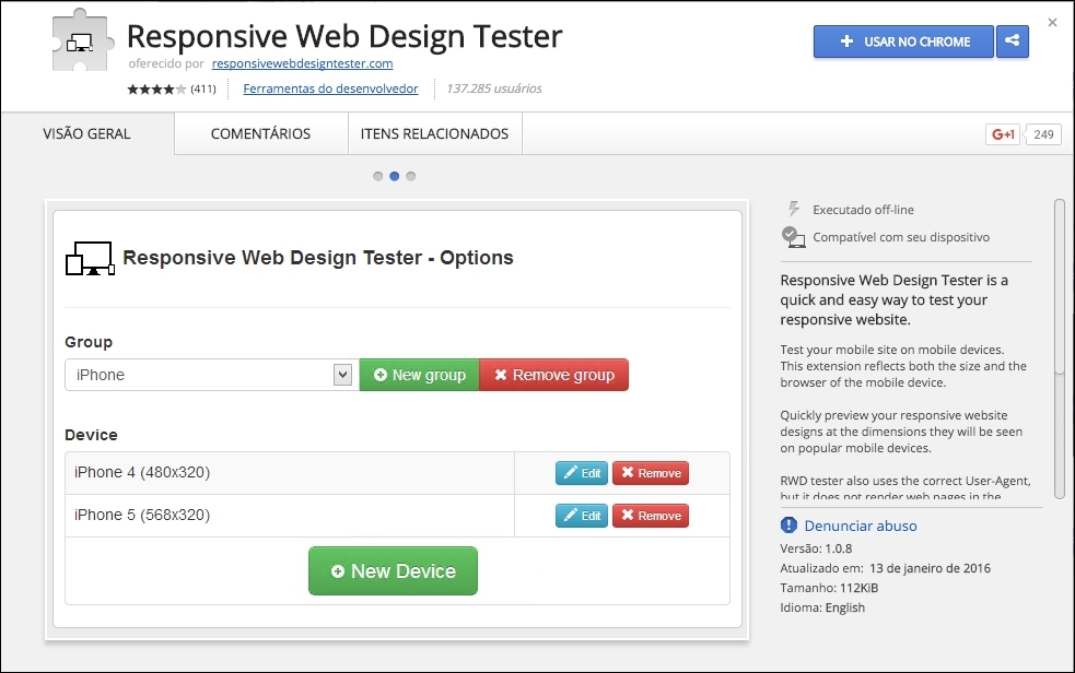
Great work! Now, let's take a look at how this extension works. On your browser, go to your Magento local site, also known as CompStore, by accessing http://localhost/packt. Remember that you have to turn on Apache Service in XAMMP to test the local website.
Click on the button of the Responsive Web Designer Tester extension shown on the right-hand side of your screen (generally near the end of the browser address bar) and select the iPhone 5—Portrait option for the first test:

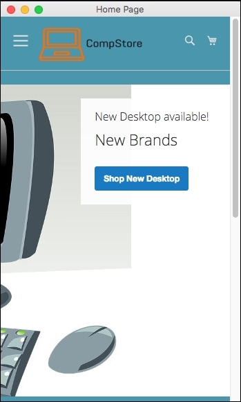
After you select the device, you will see a pop-up window having the size of iPhone 5 screen. Navigating on the page, you will see also that the layout is not fully responsive. We have some issues in the home page presentation:
Now we have a tool to test site behavior between the different devices. It is time to make our CompStore theme 100% compatible with multiple devices!
Both the Magento 2.0 native themes, Blank and Luma, use Responsive Web Design (RWD) to provide good visualization in different devices, such as desktops, tablets, and mobiles.
In spite of the fact that the CompStore theme inherited the Luma theme, you can customize the template and CSS codes, as we discussed in Chapter 6, Write Magento 2.0 Extensions – a Great Place to Go. So, what do you think about improving the CompStore theme to make it more user friendly?
The actual mobile version of CompStore has some differences in the desktop version, including colors, elements positioning, and image size. Before creating some mobile standards for the CompStore theme, it's important to fix some CSS responsive design concepts of Magento. Let's get to work!
To handle accessibility for different devices, the Magento 2.0 native themes (Blank and Luma) work with an RWD engine, as we discussed in the Chapter 4, Magento 2.0 Theme Development – the Developers' Holy Grail, and Chapter 5, Creating a Responsive Magento 2.0 Theme. The stylesheets engine provided by the LESS preprocessor is the main utility responsible for this design approach.
The Magento 2.0 native themes were built based on the Magento UI library. The Magento UI library works with CSS 3 media queries to render a page with predefined rules according to the device, which requests the page. An example of media queries would be one that applies a specific rule for screens with a maximum width of 640 px; take a look at the following code:
@media only screen and (max-width: 640px) {
…
}
With media queries, the themes apply breakpoints to handle different screen-width rules for different screen sizes of devices in a progression scale of pixels, as follows:
- 320 px (mobile)
- 480 px (mobile)
- 640 px (tablet)
- 768 px (tablet to desktop)
- 1024 px (desktop)
- 1440 px (desktop)
For further information about media queries, refer to the W3C official documentation available at https://www.w3.org/TR/css3-mediaqueries/.
The Magento 2.0 system works with the LESS CSS preprocessor to extend the features of CSS and enable the opportunity to create theme inheritance with minimal and organized effort. With this premise, to help theme developers, we have the Magento UI library in Magento 2.0.
The Magento UI library is based on LESS and provides a set of components to develop themes and frontend solutions:
- Actions toolbar
- Breadcrumbs
- Buttons
- Drop-down menus
- Forms
- Icons
- Layout
- Loaders
- Messages
- Pagination
- Popups
- Ratings
- Sections
- Tabs and accordions
- Tables
- Tooltips
- Typography
- A list of theme variables
Another important resource of the Magento UI and of LESS is the mixin capability. The mixin allows developers to group style rules to work with different devices.
For example, consider that you declared the following CSS code in one determined file:
.media-width(@extremum, @break) when (@extremum = 'max') and (@break = @screen__m) {
    .example-responsive-block {
        background: #ffc;
    }
    .example-responsive-block:before {
        content: 'Mobile styles ';
        font-weight: bold;
    }
}
Then, you executed this CSS code in a different file:
.media-width(@extremum, @break) when (@extremum = 'min') and (@break = @screen__m) {
    .example-responsive-block {
        background: #ccf;
    }
    .example-responsive-block:before {
        content: 'Desktop styles ';
        font-weight: bold;
    }
}
In spite of the two files declaring a mixin named .media-width to the .example-responsive-block class in different files, the mixin allows LESS to make a single query, grouping the rules instead of making multiple calls according to the device rule applied.
You can access the local Magento UI documentation by accessing the URL http://<magento_local_url>/pub/static/frontend/Magento/blank/en_US/css/docs/responsive.html.
Note
For further information about the Magento UI, take a look at the Magento official readme.md file available at https://github.com/magento/magento2/blob/2.0.0/lib/web/css/docs/source/README.md.
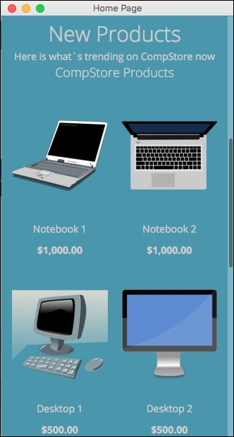
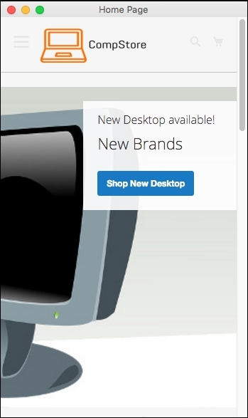
First of all, let's take a look at the current mobile version of the CompStore theme. Using Chrome DevTools or Responsive Web Designer Tester, select an Apple iPhone 5 (portrait) device to test the site. You will probably be redirected to home page:
In spite of the previous adjustment in the CompStore theme, when a mobile device accesses a theme, CSS rules don't apply some important features, such as colors and the positioning of elements. As a suggestion, let's create a standard declaration of color approach and configure CSS to show only one product when the mobile device accesses the site. How can we implement these new features? Using media queries, of course!
In your favorite code editor, open the compstore.less file available under the app/design/frontend/Packt/compstore/web/css/source directory and use the following CSS 3 code:
@color-compstore: #F6F6F6;

body{
  background: @color-compstore;
}

.media-width(@extremum, @break) when (@extremum = 'max') and (@break = @screen__s) {
  body{
    background: @color-compstore;
  }
  .widget .block-promo img{
    height: 600px;
  }

  .products-grid .product-item {
    width: 100%;
    display: inline-block;
  }
}

.media-width(@extremum, @break) when (@extremum = 'min') and (@break = @screen__s) {
  body{
    background: @color-compstore;
  }
  .widget .block-promo img{
    height: 600px;
  }
  .products-grid .product-item {
    width: 100%;
    display: inline-block;
  }
}
The Magento UI break points predefined variables to identify the scope of media queries, which are as follows:
@screen__xxs: 320 px@screen__xs: 480 px@screen__s: 640 px@screen__m: 768 px@screen__l: 1024 px@screen__xl: 1440 px
So, in the CSS 3 new proposal, the media queries use the @screen_s variable to define the application of new rules. We will propose via mixin to change the background color, promo image size, and product size inside mobile rules for portrait and landscape purposes.
To apply the changes, follow this recipe:
- Save the file.
- Open the terminal or command prompt.
- Delete the
packt/pub/static/frontend/<Vendor>/<theme>/<locale>directory. - Delete the
var/cachedirectory. - Then, delete the
var/view_preprocesseddirectory. - Access the
packt/bindirectory. - Next, run the
php magento setup:static-content:deploycommand. - In some cases, it is necessary to give
writepermissions again to the directories.
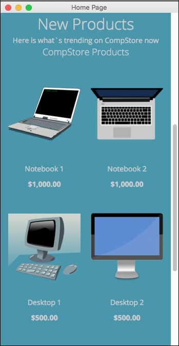
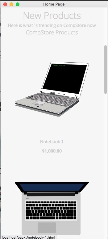
Test the site again to get the new home page, as in the following screenshot:
The extension that we created in Chapter 6, Write Magento 2.0 Extensions – a Great Place to Go, tweets about extension and has the following appearance:

Let's improve the CSS extension rules to turn it into a mobile-friendly one.
Using Chrome DevTools or Responsive Web Designer Tester, select an Apple iPhone 5—portrait device to test our code optimization.
Open the module.less file available under the packt/app/code/Packt/TweetsAbout/view/frontend/web/css/source directory and add the following code:
/*Tweets About Style*/

@media (min-width: 960px){
#wrapper {
width: 90%;
max-width: 1100px;
min-width: 800px;
margin: 50px auto;
  }

  #columns {
    -webkit-column-count: 3;
    -webkit-column-gap: 10px;
    -webkit-column-fill: auto;
    -moz-column-count: 3;
    -moz-column-gap: 10px;
    -moz-column-fill: auto;
    column-count: 3;
    column-gap: 15px;
    column-fill: auto;
  }
}

.tweet {
    display: inline-block;
    background: #FEFEFE;
    border: 2px solid #FAFAFA;
    box-shadow: 0 1px 2px rgba(34, 25, 25, 0.4);
    margin: 0 2px 15px;
    -webkit-column-break-inside: avoid;
    -moz-column-break-inside: avoid;
    column-break-inside: avoid;
    padding: 15px;
    padding-bottom: 5px;
    background: -webkit-linear-gradient(45deg, #FFF, #F9F9F9);
    opacity: 1;

    -webkit-transition: all .2s ease;
    -moz-transition: all .2s ease;
    -o-transition: all .2s ease;
    transition: all .2s ease;
}

.tweetimg {
    width: 15%;
    display:block;
    float:left;
    margin: 0px 5px 0px 0px;
}

.tweet p {
    font: 12px/18px Arial, sans-serif;
    color: #333;
    margin: 0;
}

#columns:hover .img:not(:hover) {
    opacity: 0.4;
}
After saving the module.less file, change the tweets.phtml code available under packt/app/code/Packt/TweetsAbout/view/frontend/templates, change the file with this new code, and save it, as follows:
<?php
  $tweets = $block->searchTweets();
?>

<div id="wrapper">
  <div id="columns">
    <?php foreach ($tweets as $tweet){ ?>
      <div class="tweet">
        <p>
          <a href="https://twitter.com/intent/user?user_id=<?php echo $tweet->user->id; ?>" target="_blank">
            <img src="<?php echo $tweets->user->profile_image_url; ?>" alt="profile">
            <?php echo $tweet->user->name; ?>
          </a>
          <br />
          Created: <?php echo $tweets->created_at; ?>
          <br /><br />
          <a href="<?php echo isset($tweet->entities->urls[0]->url) ? $tweet->entities->urls[0]->url : "#"; ?>" target="_blank"><?php echo $tweet->text;?></a>
            <?php echo $tweets->text;?>
          </a>
        </p>
      </div>
    <?php } ?>
  </div>
</div>
To deploy the module update, follow this recipe:
- Open the terminal or command prompt.
- Access the
packt/bindirectory. - Then, run the
php magento module:enable --clear-static-content Packt_TweetsAboutcommand. - Run the
php magento setup:upgradecommand. - Next, run the
php magento setup:static-content:deploycommand. - In some cases, it is necessary to give
writepermissions again to the directories (varandpub).
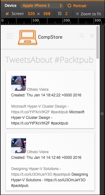
Now, test the tweets about extension by accessing http://localhost/packt/tweetsabout to see the new responsive look, as shown in the following screenshot:

If you activate DevTools and choose an iPhone 5 device, you will see a result similar to the following screenshot:
In this chapter, you learned about tools that provide you with a great environment to develop Magento frontend themes.
You also increased the power of CompStore CSS to handle access from specific mobile devices. Of course, you can modify the code constantly to have a better experience by fine-tuning in your code. However, this is only the beginning.
In the next chapter, we will start configuring our Magento software, on which we have been working until now, to improve its speed. We will installing solutions and configure the already native Magento options.