
In this chapter, we will complete the elements of our web app with the use of other Bootstrap elements and components. By the end of this chapter, we will have covered the majority of elements present in Bootstrap, making you almost an expert as well as answering this question from the last chapter: can you build a web app? Of course you can!
We will cover some more complex Bootstrap components and elements. These are the key points of this chapter, and you will learn how to:
- Use Bootstrap alerts
- Customize alerts
- Progress bars
- CSS key frames
- Navigation components
- Tabs
- Labels and badges
- List groups
Even though these seem to be a lot of key points, they are easy to learn and master. So, I am sure you will be able to nail all of them.
In the last chapter, we did almost everything related to page components. Now we will create some components that interact with the user. To start this, we will introduce alerts, which are very common components of every web app.
In order to learn about alerts, we should create some of them. The pattern for creation is pretty simple; just remember to import Bootstrap JavaScript as we have been doing all throughout the book.
The main class needed to create alerts is .alert. You can just follow this class with some other, regarding the type of alert, such as .alert-success for a success message. There are other classes available as well, such as .alert-info and .alert-danger. Just replace the suffix of .alert with the one that you want to use.
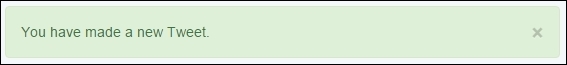
It's time to create our first alert! Keeping the same code of the web app from the last chapter, right before div#main, you must have your ol.breadcrumb. Replace ol.breadcrumb with your .alert, like what is shown in this screenshot:

The HTML code for creating this alert is really simple:
<div class="alert alert-success" role="alert">
  You have made a new Tweet.
</div>
As mentioned before, just create an element with the .alert class in combination with the state of the alert, .alert-success in this case.
Tip
Why do we use the role attribute?
In the preceding example, we made use of the role="alert" attribute in our .alert component. The role attribute was incorporated into HTML 5, coming from the ARIA 1.0 specification. The reason for using that is to keep the semantics for different items, for example, in this case, where we used a common <div> to describe a more semantic element that is an alert.
Bootstrap is incredible! Did you realize that? We created an alert with just three lines of code!
Well, another reason to think about that is to create dismissible alerts. Just add the highlighted line to the alert component and you will get the expected result:
<div class="alert alert-success" role="alert">
<button type="button" class="close" data-dismiss="alert" aria-label="Close"><span aria-hidden="true">×</span></button>
You have made a new Tweet.
</div>This will create a close button that will dismiss the component using the data-dismiss="alert" attribute. Refresh the web page and you will see the alert like this:
Now, it's time for us to create our recipe for the alert. We have two tasks: add a title to .alert and use the links inside it.
First, create a heading element inside the alert:
<div class="alert alert-success" role="alert">
<button type="button" class="close" data-dismiss="alert" aria-label="Close"><span aria-hidden="true">×</span></button>
<h3>Tweet alert</h3>
You have made a new Tweet.
</div>Then, adjust the CSS for the heading inside the alert:
.alert h3 {
  margin: 0  0 1rem;
  font-size: 1.4em;
}
The final result of adding the title must be like what is shown in this screenshot:

For the second task, we have to add some links inside the component. Bootstrap can give us a little shortcut for this using the .alert-link class in the link. The class will give the correctly matching color for the link in response to the kind of the alert shown.
Therefore, the HTML code is simple:
<div class="alert alert-success" role="alert">
<button type="button" class="close" data-dismiss="alert" aria-label="Close"><span aria-hidden="true">×</span></button>
<h3>Tweet alert</h3>
You have made a new Tweet.
<a href="#" class="alert-link">Click here to review your tweets.</a>
</div>To finish our first alert usage, let's just add one last fancy thing in the CSS, refresh the browser after that, and check the final result, as shown in the next screenshot:
.alert {
  border-left-width: 0.5rem;
}
Progress bars are very useful in web applications in cases where, for example, you need to wait for an action to be sent to the server while maintaining a feedback for the user that something is being done in the background.
For instance, we can create a progress bar to present the user that a new tweet is being posted. Likewise, other scenarios can suit well for a progress bar, for example, when you are uploading a file on the server or when the web client is loading some information.
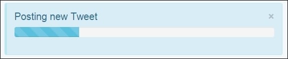
To exemplify this, we will create another alert that will contain a progress bar inside for a new tweet post feedback, subliminally saying "Hey, wait until I finish my task!"
We replace the .alert code that we just created with the new one presented here:
<div class="alert alert-info" role="alert"> <button type="button" class="close" data-dismiss="alert" aria-label="Close"><span aria-hidden="true">×</span></button> <h3>Posting new Tweet</h3> </div>
This will produce a blue alert using the colors from .alert-info. In the new element, create the following code for the progress bar:
<div class="alert alert-info" role="alert"> <button type="button" class="close" data-dismiss="alert" aria-label="Close"><span aria-hidden="true">×</span></button> <h3>Posting new Tweet</h3> <div class="progress"> <div class="progress-bar progress-bar-info" role="progressbar" aria-valuenow="25" aria-valuemin="0" aria-valuemax="100" style="width: 25%"> </div> </div> </div>
The result of the progress bar in shown in the next screenshot. Let's understand each part of the new component:

We created a div.progress inside our alert component, which is the gray rectangle to be filled during the progress. Inside it, we have another tag, div.progress-bar, to create the inside filler that contains the .progress-bar-info class to make the bar blue, following the .info contextual color.
The progress bar also has some aria-* attributes and its size is set by the width: 25% style. To change its size, just change the width style.
Just like alerts, progress bars have the same contextual colors of Bootstrap. Just use the .progress-bar-* prefix while using the suffix of one of the contextual colors. It is also possible to apply stripe marks to the progress bar with the .progress-bar-striped class:
<div class="alert alert-info" role="alert">
<button type="button" class="close" data-dismiss="alert" aria-label="Close"><span aria-hidden="true">×</span></button>
<h3>Posting new Tweet</h3>
<div class="progress">
<div class="progress-bar progress-bar-info progress-bar-striped active" role="progressbar" aria-valuenow="25" aria-valuemin="0" aria-valuemax="100" style="width: 25%">
</div>
</div>
</div>Finally, you can also animate the strip using the .active class in conjunction with the .progress-bar-striped class. Check out the next screenshot to see the result of addition of the classes:
Now we have a good opportunity to use the CSS @keyframes animations.
If you check out the CSS code when you add the .progress-bar-striped and .active classes, Bootstrap will load the following animation:
.progress-bar.active {
    animation: progress-bar-stripes 2s linear infinite;
}
This animation applies to the CSS selector, the @keyframe defined at progress-bar-stripes:
@keyframes progress-bar-stripes {
  from {
    background-position: 40px 0;
  }
  to {
    background-position: 0 0;
  }
}
This means that the striped background will move from a position of 40 pixels to 0, repeating it every 2 seconds.
Well, nice to meet you progress-bar-stripes, but I can do another animation! Create the following @keyframe:
@keyframes w70 {
  from { width: 0%; }
  to { width: 70%; }
}
The goal of this key frame is to change the width of our progress bar from 0% to 70% of the maximum when the page loads. Now apply the new animation to .progress-bar.active:
.progress-bar.active {
  animation: w70 1s ease forwards,
             progress-bar-stripes 2s linear infinite;
}
So, our animation will last 1 second and execute just once, since we defined it to be just forwards. Note that we must override the animations, so after the new animation, which is w70, add the current animation, which is progress-bar-stripes. Refresh the page and see this fancy effect.
Progress bar options
Just like alerts, progress bars have the same contextual colors of Bootstrap. Just use the .progress-bar-* prefix while using the suffix of one of the contextual colors. It is also possible to apply stripe marks to the progress bar with the .progress-bar-striped class:
<div class="alert alert-info" role="alert">
<button type="button" class="close" data-dismiss="alert" aria-label="Close"><span aria-hidden="true">×</span></button>
<h3>Posting new Tweet</h3>
<div class="progress">
<div class="progress-bar progress-bar-info progress-bar-striped active" role="progressbar" aria-valuenow="25" aria-valuemin="0" aria-valuemax="100" style="width: 25%">
</div>
</div>
</div>Finally, you can also animate the strip using the .active class in conjunction with the .progress-bar-striped class. Check out the next screenshot to see the result of addition of the classes:
Now we have a good opportunity to use the CSS @keyframes animations.
If you check out the CSS code when you add the .progress-bar-striped and .active classes, Bootstrap will load the following animation:
.progress-bar.active {
    animation: progress-bar-stripes 2s linear infinite;
}
This animation applies to the CSS selector, the @keyframe defined at progress-bar-stripes:
@keyframes progress-bar-stripes {
  from {
    background-position: 40px 0;
  }
  to {
    background-position: 0 0;
  }
}
This means that the striped background will move from a position of 40 pixels to 0, repeating it every 2 seconds.
Well, nice to meet you progress-bar-stripes, but I can do another animation! Create the following @keyframe:
@keyframes w70 {
  from { width: 0%; }
  to { width: 70%; }
}
The goal of this key frame is to change the width of our progress bar from 0% to 70% of the maximum when the page loads. Now apply the new animation to .progress-bar.active:
.progress-bar.active {
  animation: w70 1s ease forwards,
             progress-bar-stripes 2s linear infinite;
}
So, our animation will last 1 second and execute just once, since we defined it to be just forwards. Note that we must override the animations, so after the new animation, which is w70, add the current animation, which is progress-bar-stripes. Refresh the page and see this fancy effect.
Animating the progress bar
Now we have a good opportunity to use the CSS @keyframes animations.
If you check out the CSS code when you add the .progress-bar-striped and .active classes, Bootstrap will load the following animation:
.progress-bar.active {
    animation: progress-bar-stripes 2s linear infinite;
}
This animation applies to the CSS selector, the @keyframe defined at progress-bar-stripes:
@keyframes progress-bar-stripes {
  from {
    background-position: 40px 0;
  }
  to {
    background-position: 0 0;
  }
}
This means that the striped background will move from a position of 40 pixels to 0, repeating it every 2 seconds.
Well, nice to meet you progress-bar-stripes, but I can do another animation! Create the following @keyframe:
@keyframes w70 {
  from { width: 0%; }
  to { width: 70%; }
}
The goal of this key frame is to change the width of our progress bar from 0% to 70% of the maximum when the page loads. Now apply the new animation to .progress-bar.active:
.progress-bar.active {
  animation: w70 1s ease forwards,
             progress-bar-stripes 2s linear infinite;
}
So, our animation will last 1 second and execute just once, since we defined it to be just forwards. Note that we must override the animations, so after the new animation, which is w70, add the current animation, which is progress-bar-stripes. Refresh the page and see this fancy effect.
Moving on with our web app example, it is time to create a settings page for the application. We have already created a link for this in the navigation bar, inside the button group. Do you remember?
So, in the same folder as that of the web app HTML file, create another one named settings.html and update the link at the navigation bar:
<div id="nav-options" class="btn-group pull-right hidden-xs">
  <button type="button" class="btn btn-default dropdown-toggle thumbnail" data-toggle="dropdown" aria-haspopup="true" aria-expanded="false">
    <img src="imgs/jon.png">
  </button>
  <ul class="dropdown-menu">
    <li><a href="#">Profile</a></li>
    <li><a href="settings.html">Setting</a></li>
    <li role="separator" class="divider"></li>
    <li><a href="#">Logout</a></li>
  </ul>
</div>
In this page, we use the same template that we used in the web application, copying the navigation bar, the grid layout, and the left-hand side #profile column. So, the settings page will look like this:
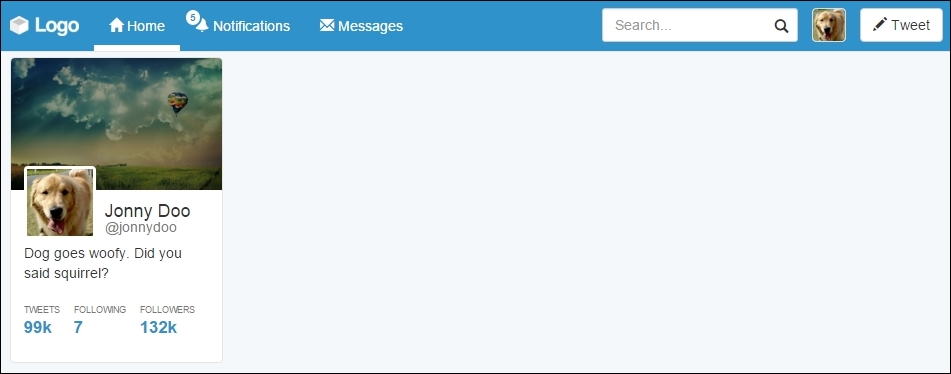
Now we will add some content to this page. Our main goal here is to use some other navigation Bootstrap components that will be handy for us.
The first navigation menu that we will use here is Pills, using the vertical stack option. Pills are a Bootstrap component used to create menus that can be horizontal or vertical. Many web apps use them for side menus, just as we will soon do.
The basic usage for navigation components is the use of the .nav class followed by another one regarding the navigation option. In our case, we will use the .nav-pills class to create the desired effect in conjunction with the .nav-stacked class to vertically stack the pills. Create a .card element just after #profile and add the code related to the pills navigation:
<div id="profile-settings" class="card">
  <ul class="nav nav-pills nav-stacked">
    <li role="presentation" class="active">
      <a href="#">
        Account
        <span class="glyphicon glyphicon-chevron-right pull-right" aria-hidden="true"></span>
      </a>
    </li>
    <li role="presentation">
      <a href="#">
        Security
        <span class="glyphicon glyphicon-chevron-right pull-right" aria-hidden="true"></span>
      </a>
    </li>
    <li role="presentation">
      <a href="#">
        Notifications
        <span class="glyphicon glyphicon-chevron-right pull-right" aria-hidden="true"></span>
      </a>
    </li>
    <li role="presentation">
      <a href="#">
        Design
        <span class="glyphicon glyphicon-chevron-right pull-right" aria-hidden="true"></span>
      </a>
    </li>
  </ul>
</div>
In the CSS file, also add the following rule:
.row .card + .card {
  margin-top: 2rem;
}
With this, every .card element followed by another .card element will automatically create a margin, because of the use of the + selector. Open the settings page, and you will see the result like what is shown in the following screenshot:
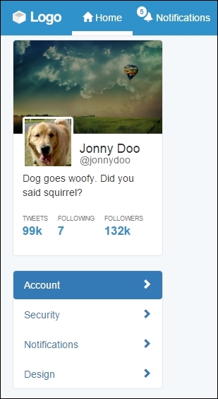
Basically, we created a list with the mentioned classes: .nav, .nav-pills, and .nav-stacked. The list is composed of four items, containing a link and a left arrow icon. To place the arrows at the right-hand side, we again used the .pull-right helper together with the .glyphicon-chevron-right icon. In the first item, we added the .active class, which turned this item blue and changed the colors of both the text and the icon.
This is almost awesome! It just needs some adjustments in the CSS to look perfect. Let's use some :nth-child selectors to style some elements based on their position, such as the first item in the menu (:first-child) and the last item (:last-child). Add the following CSS:
#profile-settings .nav-stacked li {
  border-bottom: 1px solid #e5e5e5;
  margin: 0;
}

#profile-settings .nav-stacked a {
  border-radius: 0;
}

#profile-settings .nav-stacked li:first-child a {
  border-radius: 0.4rem 0.4rem 0 0;
}


#profile-settings .nav-stacked li:last-child {
  border-bottom: 0;
}


#profile-settings .nav-stacked li:last-child a {
  border-radius: 0 0 0.4rem 0.4rem;
}
We just removed unwanted margins and the border radius, while adding a border bottom to all elements in the list, except the last one. This is because of the #profile-settings .nav-stacked li:last-child selector, where we a specific rule only for the last item element.
We also changed border-radius for the first element and the last element to create a rounded border in the pill list. The .nav-pill menu will appear like what is shown in the next screenshot:

In the #main column, we must create a tab option with the settings content. Bootstrap also offers a tabs component with the navigation components. First, we will work with the markup and CSS style and use it with JavaScript.
Therefore, inside the #main tag, place the following markup, corresponding to the Bootstrap tabs:
<ul id="account-tabs" class="nav nav-tabs nav-justified">
<li role="presentation" class="active">
<a href="#account-user">User info</a>
</li>
<li role="presentation">
<a href="#account-language">Language</a>
</li>
<li role="presentation">
<a href="#account-mobile">Mobile</a>
</li>
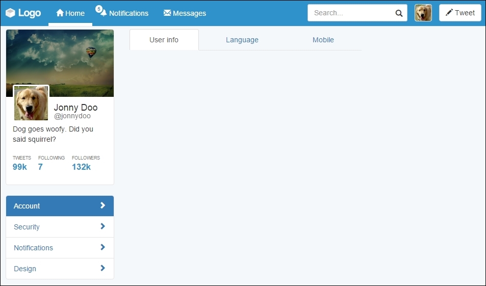
</ul>Just like the Pills, to use tabs, create a list with the .nav and .nav-tabs classes. We used the .nav-justified class as well to make the tabs equally distributed over the component.
Moreover, we populated the list with some items. Each link of the item contains an identifier, which will be used to link each tab to the corresponding content. Keep that information at the moment.
Let's add some CSS rules to keep the same border colors that we are using:
#account-tabs > li {
  border-bottom: 0.1rem solid #e5e5e5;
}

#account-tabs a {
  border-bottom: 0;
}

#account-tabs li.active {
  border-bottom: 0;
}
Refresh the web page and you should see it like this:
To add the tab content, we use the named tab panes. Each tab must be placed in an element with the .tab-pane class and have the corresponding identifier in the tab component. After the tab list, add the HTML code for the tab panes:
 <ul id="account-tabs" class="nav nav-tabs nav-justified">
  <li role="presentation" class="active">
    <a href="#account-user">User info</a>
  </li>
  <li role="presentation">
    <a href="#account-language">Language</a>
  </li>
  <li role="presentation">
    <a href="#account-mobile">Mobile</a>
  </li>
</ul>

<div class="tab-content">
  <div role="tabpanel" class="tab-pane active" id="account-user">
    User info tab pane
  </div>
  <div role="tabpanel" class="tab-pane" id="account-language">
    Language tab pane
  </div>
  <div role="tabpanel" class="tab-pane" id="account-mobile">
    Mobile tab pane
  </div>
</div>
Refresh the web page and you will see only the content of #account-user appearing, although clicking on other tabs will not cause any switch between them. This is because we have not initialized the component through JavaScript yet.
We can initialize the tabs with simple JavaScript code, like what is presented next. However, we will do that in a smarter way using data markup:
$('#account-tabs a').click(function (e) {
  e.preventDefault()
  $(this).tab('show')
})
For data markup, we must add the data-toggle="tab" attribute on the link elements, inside the list. Change the list markup for the following:
<ul id="account-tabs" class="nav nav-tabs nav-justified">
  <li role="presentation" class="active">
    <a href="#account-user" data-toggle="tab">User info</a>
  </li>
  <li role="presentation">
    <a href="#account-language" data-toggle="tab">Language</a>
  </li>
  <li role="presentation">
    <a href="#account-mobile" data-toggle="tab">Mobile</a>
  </li>
</ul>Refresh the web browser and switch between the tabs. It works like a charm! To make it even fancier, add the .fade class to each .tab-pane to create a fade effect when changing tabs.
Inside the .tab-pane identified by #account-user, let's add some content. Since it is a configuration menu, we will create a form to set the user settings. Again, we will work with some forms in Bootstrap. Do you remember how to use them?
In the form, we will have three inputs (name, username, and e-mail) followed by a button to save the changes. We will use the .form-horizontal class to make each form input next its label and stacked by each other. So, place the following code inside the #account-user element:
<div id="account-user" role="tabpanel" class="tab-pane active" >
  <form class="form-horizontal">
    <div class="form-group">
      <label class="col-sm-3 control-label">Name</label>
      <div class="col-sm-9">
        <input type="text" class="form-control" value="Jonny Doo">
      </div>
    </div>
    <div class="form-group">
      <label class="col-sm-3 control-label">Username</label>
      <div class="col-sm-9">
        <div class="input-group">
          <div class="input-group-addon">@</div>
          <input type="text" class="form-control" value="jonnydoo">
        </div>
      </div>
    </div>
    <div class="form-group">
      <label class="col-sm-3 control-label">Email</label>
      <div class="col-sm-9">
        <input type="email" class="form-control" value="[email protected]">
      </div>
    </div>
    <div class="form-group">
      <div class="col-sm-offset-3 col-sm-9">
        <button type="submit" class="btn btn-primary">
          Save changes
        </button>
      </div>
    </div>
  </form>
</div>
Break through the code, we set the labels to fill a quarter of the form row, while the input fills the rest. We again used the input groups to add the @ sign before the username field.
Each label has the .col-sm-3 class and the input the .col-sm-9 class. As we said, the forms respect the grid system layout, so we can apply the same classes here. We also added the .col-sm-offset-3 class to the submit button for a correct offset.
Right now, the page should look like the following screenshot. Isn't it looking nicer?

CSS turn! We must make it look prettier, so let's play with some paddings. However, before anything, add the class to .card to the .tab-content. Next, let's fix the borders and margins in .tab-content by adding some padding and some negative margin, as follows:
#main .tab-content {
  padding: 2em;
  margin-top: -0.1rem;
}
Then, remove the border from the tab list and change the z-index of the tabs:
#account-tabs > li {
  border-bottom: 0;
}

#account-tabs {
  position: relative;
  z-index: 99;
}
Finally, remove the margin from the save changes button using another nth recipe, as follows:
#main .form-horizontal .form-group:last-child {
  margin-bottom: 0;
}
Nice! Refresh the web app and see the result, like this:
With these changes, we have made the form from .tab-content look like a card. We also added some margins and padding to correct the designs. Lastly, with the margin top and z-index, we make the selected tab blend correctly with the content.
To finalize the settings page, we must fill the right column of the web app. To do this, we will create a menu that presents some general statistics about the user.
In order to do that, we will use the Bootstrap List group component. List group is powerful in Bootstrap as it can seem similar to Bootstrap Cards, but it has more specific options for menu list generation, such as headers, disabled items, and much more.
So let's start doing this! Create the HTML markup at the #right-content element:
<div id="right-content" class="col-md-3 hidden-sm hidden-xs">
  <ul class="list-group">
    <li class="list-group-item list-group-item-info">
      Dog stats
    </li>
    <li class="list-group-item">
      Number of day rides
    </li>
    <li class="list-group-item">
      Captured mice
    </li>
    <li class="list-group-item">
      Postmen frightened
    </li>
    <li class="list-group-item">
      Always alert badge
    </li>
  </ul>
</div>
It is a simple list and we just added the .list-group class to the list, while adding the .list-group-item class for each item in the list. For the first item, we used the .list-group-item-info contextual color class to make it blue, according to the Bootstrap contextual colors.
Before we continue, we have to change the colors of the borders from list group to respect the same border color that we have been using:
.list-group-item {
  border-color: #e5e5e5;
}
The result that you should see right know is like the one presented in the next screenshot. List groups is a very handy component that we can use to achieve almost the same effect that we got using Pills, but here we are using fewer CSS rules.

Labels and badges are Bootstrap components that can easily highlight some text or information. They can be used in any place, as we did in the navigation bar, on the notification item.
Just like most of Bootstrap's components, labels follow the contextual colors of Bootstrap, while badges do not have this option. To consolidate their utilization, let's add some of them to the right menu, regarding the statistics, because after all we want to know our stats!
It will be pretty easy since we have worked with this before. For the three first items, we will use labels, and for the last one, we will use a badge with an icon. Just add the highlighted code to the current .list-group:
<div id="right-content" class="col-md-3 hidden-sm hidden-xs">
  <ul class="list-group">
    <li class="list-group-item list-group-item-info">
      Dog stats
    </li>
    <li class="list-group-item">
      Number of day rides
      <span class="label label-success">3</span>
    </li>
    <li class="list-group-item">
      Captured mice
      <span class="label label-danger">87</span>
    </li>
    <li class="list-group-item">
      Postmen frightened
      <span class="label label-default">2</span>
    </li>
    <li class="list-group-item">
      Always alert badge
      <span class="badge glyphicon glyphicon-star" aria-hidden="true">
      </span>
    </li>
  </ul>
</div>
We must pay attention to some points here. The first is that we used the .label class together with the contextual color class, like this: .label-*. Here, * is the name of the contextual class.
The second thing is that if you refresh your web page right now, you will see that Bootstrap does have a CSS for aligning all badges on the right, but it does not apply the same rule for labels. So, add the next CSS:
#right-content .list-group .label {
  float: right;
}
The third point is that we used badges and icons in the same span. This is possible, and then we just need to adjust the CSS render:
#right-content .list-group .label {
  padding: 0.3rem 0.6rem;
}

#right-content .list-group .badge.glyphicon-star {
  background-color: #f0ad4e;
  padding: 0.4rem;
  padding-left: 0.5rem;
}
By adding these rules, we adjusted the padding for the labels, adjusted the padding for the badge, and correctly set the yellow background for the star badge. See the result in the browser; it must look like this:

Cool! We've done another page for our web app. The stats menu looks cute. We will not cover the other page settings menus in this book, since they follow almost the same structure that we showed in this example. Try doing that as homework.
Pills of stack
The first navigation menu that we will use here is Pills, using the vertical stack option. Pills are a Bootstrap component used to create menus that can be horizontal or vertical. Many web apps use them for side menus, just as we will soon do.
The basic usage for navigation components is the use of the .nav class followed by another one regarding the navigation option. In our case, we will use the .nav-pills class to create the desired effect in conjunction with the .nav-stacked class to vertically stack the pills. Create a .card element just after #profile and add the code related to the pills navigation:
<div id="profile-settings" class="card">
  <ul class="nav nav-pills nav-stacked">
    <li role="presentation" class="active">
      <a href="#">
        Account
        <span class="glyphicon glyphicon-chevron-right pull-right" aria-hidden="true"></span>
      </a>
    </li>
    <li role="presentation">
      <a href="#">
        Security
        <span class="glyphicon glyphicon-chevron-right pull-right" aria-hidden="true"></span>
      </a>
    </li>
    <li role="presentation">
      <a href="#">
        Notifications
        <span class="glyphicon glyphicon-chevron-right pull-right" aria-hidden="true"></span>
      </a>
    </li>
    <li role="presentation">
      <a href="#">
        Design
        <span class="glyphicon glyphicon-chevron-right pull-right" aria-hidden="true"></span>
      </a>
    </li>
  </ul>
</div>
In the CSS file, also add the following rule:
.row .card + .card {
  margin-top: 2rem;
}
With this, every .card element followed by another .card element will automatically create a margin, because of the use of the + selector. Open the settings page, and you will see the result like what is shown in the following screenshot:
Basically, we created a list with the mentioned classes: .nav, .nav-pills, and .nav-stacked. The list is composed of four items, containing a link and a left arrow icon. To place the arrows at the right-hand side, we again used the .pull-right helper together with the .glyphicon-chevron-right icon. In the first item, we added the .active class, which turned this item blue and changed the colors of both the text and the icon.
This is almost awesome! It just needs some adjustments in the CSS to look perfect. Let's use some :nth-child selectors to style some elements based on their position, such as the first item in the menu (:first-child) and the last item (:last-child). Add the following CSS:
#profile-settings .nav-stacked li {
  border-bottom: 1px solid #e5e5e5;
  margin: 0;
}

#profile-settings .nav-stacked a {
  border-radius: 0;
}

#profile-settings .nav-stacked li:first-child a {
  border-radius: 0.4rem 0.4rem 0 0;
}


#profile-settings .nav-stacked li:last-child {
  border-bottom: 0;
}


#profile-settings .nav-stacked li:last-child a {
  border-radius: 0 0 0.4rem 0.4rem;
}
We just removed unwanted margins and the border radius, while adding a border bottom to all elements in the list, except the last one. This is because of the #profile-settings .nav-stacked li:last-child selector, where we a specific rule only for the last item element.
We also changed border-radius for the first element and the last element to create a rounded border in the pill list. The .nav-pill menu will appear like what is shown in the next screenshot:
In the #main column, we must create a tab option with the settings content. Bootstrap also offers a tabs component with the navigation components. First, we will work with the markup and CSS style and use it with JavaScript.
Therefore, inside the #main tag, place the following markup, corresponding to the Bootstrap tabs:
<ul id="account-tabs" class="nav nav-tabs nav-justified">
  <li role="presentation" class="active">
    <a href="#account-user">User info</a>
  </li>
  <li role="presentation">
    <a href="#account-language">Language</a>
  </li>
  <li role="presentation">
    <a href="#account-mobile">Mobile</a>
  </li>
</ul>
Just like the Pills, to use tabs, create a list with the .nav and .nav-tabs classes. We used the .nav-justified class as well to make the tabs equally distributed over the component.
Moreover, we populated the list with some items. Each link of the item contains an identifier, which will be used to link each tab to the corresponding content. Keep that information at the moment.
Let's add some CSS rules to keep the same border colors that we are using:
#account-tabs > li {
  border-bottom: 0.1rem solid #e5e5e5;
}

#account-tabs a {
  border-bottom: 0;
}

#account-tabs li.active {
  border-bottom: 0;
}
Refresh the web page and you should see it like this:
To add the tab content, we use the named tab panes. Each tab must be placed in an element with the .tab-pane class and have the corresponding identifier in the tab component. After the tab list, add the HTML code for the tab panes:
 <ul id="account-tabs" class="nav nav-tabs nav-justified">
  <li role="presentation" class="active">
    <a href="#account-user">User info</a>
  </li>
  <li role="presentation">
    <a href="#account-language">Language</a>
  </li>
  <li role="presentation">
    <a href="#account-mobile">Mobile</a>
  </li>
</ul>

<div class="tab-content">
  <div role="tabpanel" class="tab-pane active" id="account-user">
    User info tab pane
  </div>
  <div role="tabpanel" class="tab-pane" id="account-language">
    Language tab pane
  </div>
  <div role="tabpanel" class="tab-pane" id="account-mobile">
    Mobile tab pane
  </div>
</div>
Refresh the web page and you will see only the content of #account-user appearing, although clicking on other tabs will not cause any switch between them. This is because we have not initialized the component through JavaScript yet.
We can initialize the tabs with simple JavaScript code, like what is presented next. However, we will do that in a smarter way using data markup:
$('#account-tabs a').click(function (e) {
  e.preventDefault()
  $(this).tab('show')
})
For data markup, we must add the data-toggle="tab" attribute on the link elements, inside the list. Change the list markup for the following:
<ul id="account-tabs" class="nav nav-tabs nav-justified">
  <li role="presentation" class="active">
    <a href="#account-user" data-toggle="tab">User info</a>
  </li>
  <li role="presentation">
    <a href="#account-language" data-toggle="tab">Language</a>
  </li>
  <li role="presentation">
    <a href="#account-mobile" data-toggle="tab">Mobile</a>
  </li>
</ul>Refresh the web browser and switch between the tabs. It works like a charm! To make it even fancier, add the .fade class to each .tab-pane to create a fade effect when changing tabs.
Inside the .tab-pane identified by #account-user, let's add some content. Since it is a configuration menu, we will create a form to set the user settings. Again, we will work with some forms in Bootstrap. Do you remember how to use them?
In the form, we will have three inputs (name, username, and e-mail) followed by a button to save the changes. We will use the .form-horizontal class to make each form input next its label and stacked by each other. So, place the following code inside the #account-user element:
<div id="account-user" role="tabpanel" class="tab-pane active" >
  <form class="form-horizontal">
    <div class="form-group">
      <label class="col-sm-3 control-label">Name</label>
      <div class="col-sm-9">
        <input type="text" class="form-control" value="Jonny Doo">
      </div>
    </div>
    <div class="form-group">
      <label class="col-sm-3 control-label">Username</label>
      <div class="col-sm-9">
        <div class="input-group">
          <div class="input-group-addon">@</div>
          <input type="text" class="form-control" value="jonnydoo">
        </div>
      </div>
    </div>
    <div class="form-group">
      <label class="col-sm-3 control-label">Email</label>
      <div class="col-sm-9">
        <input type="email" class="form-control" value="[email protected]">
      </div>
    </div>
    <div class="form-group">
      <div class="col-sm-offset-3 col-sm-9">
        <button type="submit" class="btn btn-primary">
          Save changes
        </button>
      </div>
    </div>
  </form>
</div>
Break through the code, we set the labels to fill a quarter of the form row, while the input fills the rest. We again used the input groups to add the @ sign before the username field.
Each label has the .col-sm-3 class and the input the .col-sm-9 class. As we said, the forms respect the grid system layout, so we can apply the same classes here. We also added the .col-sm-offset-3 class to the submit button for a correct offset.
Right now, the page should look like the following screenshot. Isn't it looking nicer?
CSS turn! We must make it look prettier, so let's play with some paddings. However, before anything, add the class to .card to the .tab-content. Next, let's fix the borders and margins in .tab-content by adding some padding and some negative margin, as follows:
#main .tab-content {
  padding: 2em;
  margin-top: -0.1rem;
}
Then, remove the border from the tab list and change the z-index of the tabs:
#account-tabs > li {
  border-bottom: 0;
}

#account-tabs {
  position: relative;
  z-index: 99;
}
Finally, remove the margin from the save changes button using another nth recipe, as follows:
#main .form-horizontal .form-group:last-child {
  margin-bottom: 0;
}
Nice! Refresh the web app and see the result, like this:
With these changes, we have made the form from .tab-content look like a card. We also added some margins and padding to correct the designs. Lastly, with the margin top and z-index, we make the selected tab blend correctly with the content.
To finalize the settings page, we must fill the right column of the web app. To do this, we will create a menu that presents some general statistics about the user.
In order to do that, we will use the Bootstrap List group component. List group is powerful in Bootstrap as it can seem similar to Bootstrap Cards, but it has more specific options for menu list generation, such as headers, disabled items, and much more.
So let's start doing this! Create the HTML markup at the #right-content element:
<div id="right-content" class="col-md-3 hidden-sm hidden-xs">
  <ul class="list-group">
    <li class="list-group-item list-group-item-info">
      Dog stats
    </li>
    <li class="list-group-item">
      Number of day rides
    </li>
    <li class="list-group-item">
      Captured mice
    </li>
    <li class="list-group-item">
      Postmen frightened
    </li>
    <li class="list-group-item">
      Always alert badge
    </li>
  </ul>
</div>
It is a simple list and we just added the .list-group class to the list, while adding the .list-group-item class for each item in the list. For the first item, we used the .list-group-item-info contextual color class to make it blue, according to the Bootstrap contextual colors.
Before we continue, we have to change the colors of the borders from list group to respect the same border color that we have been using:
.list-group-item {
  border-color: #e5e5e5;
}
The result that you should see right know is like the one presented in the next screenshot. List groups is a very handy component that we can use to achieve almost the same effect that we got using Pills, but here we are using fewer CSS rules.
Labels and badges are Bootstrap components that can easily highlight some text or information. They can be used in any place, as we did in the navigation bar, on the notification item.
Just like most of Bootstrap's components, labels follow the contextual colors of Bootstrap, while badges do not have this option. To consolidate their utilization, let's add some of them to the right menu, regarding the statistics, because after all we want to know our stats!
It will be pretty easy since we have worked with this before. For the three first items, we will use labels, and for the last one, we will use a badge with an icon. Just add the highlighted code to the current .list-group:
<div id="right-content" class="col-md-3 hidden-sm hidden-xs">
  <ul class="list-group">
    <li class="list-group-item list-group-item-info">
      Dog stats
    </li>
    <li class="list-group-item">
      Number of day rides
      <span class="label label-success">3</span>
    </li>
    <li class="list-group-item">
      Captured mice
      <span class="label label-danger">87</span>
    </li>
    <li class="list-group-item">
      Postmen frightened
      <span class="label label-default">2</span>
    </li>
    <li class="list-group-item">
      Always alert badge
      <span class="badge glyphicon glyphicon-star" aria-hidden="true">
      </span>
    </li>
  </ul>
</div>
We must pay attention to some points here. The first is that we used the .label class together with the contextual color class, like this: .label-*. Here, * is the name of the contextual class.
The second thing is that if you refresh your web page right now, you will see that Bootstrap does have a CSS for aligning all badges on the right, but it does not apply the same rule for labels. So, add the next CSS:
#right-content .list-group .label {
  float: right;
}
The third point is that we used badges and icons in the same span. This is possible, and then we just need to adjust the CSS render:
#right-content .list-group .label {
  padding: 0.3rem 0.6rem;
}

#right-content .list-group .badge.glyphicon-star {
  background-color: #f0ad4e;
  padding: 0.4rem;
  padding-left: 0.5rem;
}
By adding these rules, we adjusted the padding for the labels, adjusted the padding for the badge, and correctly set the yellow background for the star badge. See the result in the browser; it must look like this:
Cool! We've done another page for our web app. The stats menu looks cute. We will not cover the other page settings menus in this book, since they follow almost the same structure that we showed in this example. Try doing that as homework.
Tabs in the middle
In the #main column, we must create a tab option with the settings content. Bootstrap also offers a tabs component with the navigation components. First, we will work with the markup and CSS style and use it with JavaScript.
Therefore, inside the #main tag, place the following markup, corresponding to the Bootstrap tabs:
<ul id="account-tabs" class="nav nav-tabs nav-justified">
  <li role="presentation" class="active">
    <a href="#account-user">User info</a>
  </li>
  <li role="presentation">
    <a href="#account-language">Language</a>
  </li>
  <li role="presentation">
    <a href="#account-mobile">Mobile</a>
  </li>
</ul>
Just like the Pills, to use tabs, create a list with the .nav and .nav-tabs classes. We used the .nav-justified class as well to make the tabs equally distributed over the component.
Moreover, we populated the list with some items. Each link of the item contains an identifier, which will be used to link each tab to the corresponding content. Keep that information at the moment.
Let's add some CSS rules to keep the same border colors that we are using:
#account-tabs > li {
  border-bottom: 0.1rem solid #e5e5e5;
}

#account-tabs a {
  border-bottom: 0;
}

#account-tabs li.active {
  border-bottom: 0;
}
Refresh the web page and you should see it like this:
To add the tab content, we use the named tab panes. Each tab must be placed in an element with the .tab-pane class and have the corresponding identifier in the tab component. After the tab list, add the HTML code for the tab panes:
 <ul id="account-tabs" class="nav nav-tabs nav-justified">
  <li role="presentation" class="active">
    <a href="#account-user">User info</a>
  </li>
  <li role="presentation">
    <a href="#account-language">Language</a>
  </li>
  <li role="presentation">
    <a href="#account-mobile">Mobile</a>
  </li>
</ul>

<div class="tab-content">
  <div role="tabpanel" class="tab-pane active" id="account-user">
    User info tab pane
  </div>
  <div role="tabpanel" class="tab-pane" id="account-language">
    Language tab pane
  </div>
  <div role="tabpanel" class="tab-pane" id="account-mobile">
    Mobile tab pane
  </div>
</div>
Refresh the web page and you will see only the content of #account-user appearing, although clicking on other tabs will not cause any switch between them. This is because we have not initialized the component through JavaScript yet.
We can initialize the tabs with simple JavaScript code, like what is presented next. However, we will do that in a smarter way using data markup:
$('#account-tabs a').click(function (e) {
  e.preventDefault()
  $(this).tab('show')
})
For data markup, we must add the data-toggle="tab" attribute on the link elements, inside the list. Change the list markup for the following:
<ul id="account-tabs" class="nav nav-tabs nav-justified">
  <li role="presentation" class="active">
    <a href="#account-user" data-toggle="tab">User info</a>
  </li>
  <li role="presentation">
    <a href="#account-language" data-toggle="tab">Language</a>
  </li>
  <li role="presentation">
    <a href="#account-mobile" data-toggle="tab">Mobile</a>
  </li>
</ul>Refresh the web browser and switch between the tabs. It works like a charm! To make it even fancier, add the .fade class to each .tab-pane to create a fade effect when changing tabs.
Inside the .tab-pane identified by #account-user, let's add some content. Since it is a configuration menu, we will create a form to set the user settings. Again, we will work with some forms in Bootstrap. Do you remember how to use them?
In the form, we will have three inputs (name, username, and e-mail) followed by a button to save the changes. We will use the .form-horizontal class to make each form input next its label and stacked by each other. So, place the following code inside the #account-user element:
<div id="account-user" role="tabpanel" class="tab-pane active" >
  <form class="form-horizontal">
    <div class="form-group">
      <label class="col-sm-3 control-label">Name</label>
      <div class="col-sm-9">
        <input type="text" class="form-control" value="Jonny Doo">
      </div>
    </div>
    <div class="form-group">
      <label class="col-sm-3 control-label">Username</label>
      <div class="col-sm-9">
        <div class="input-group">
          <div class="input-group-addon">@</div>
          <input type="text" class="form-control" value="jonnydoo">
        </div>
      </div>
    </div>
    <div class="form-group">
      <label class="col-sm-3 control-label">Email</label>
      <div class="col-sm-9">
        <input type="email" class="form-control" value="[email protected]">
      </div>
    </div>
    <div class="form-group">
      <div class="col-sm-offset-3 col-sm-9">
        <button type="submit" class="btn btn-primary">
          Save changes
        </button>
      </div>
    </div>
  </form>
</div>
Break through the code, we set the labels to fill a quarter of the form row, while the input fills the rest. We again used the input groups to add the @ sign before the username field.
Each label has the .col-sm-3 class and the input the .col-sm-9 class. As we said, the forms respect the grid system layout, so we can apply the same classes here. We also added the .col-sm-offset-3 class to the submit button for a correct offset.
Right now, the page should look like the following screenshot. Isn't it looking nicer?
CSS turn! We must make it look prettier, so let's play with some paddings. However, before anything, add the class to .card to the .tab-content. Next, let's fix the borders and margins in .tab-content by adding some padding and some negative margin, as follows:
#main .tab-content {
  padding: 2em;
  margin-top: -0.1rem;
}
Then, remove the border from the tab list and change the z-index of the tabs:
#account-tabs > li {
  border-bottom: 0;
}

#account-tabs {
  position: relative;
  z-index: 99;
}
Finally, remove the margin from the save changes button using another nth recipe, as follows:
#main .form-horizontal .form-group:last-child {
  margin-bottom: 0;
}
Nice! Refresh the web app and see the result, like this:
With these changes, we have made the form from .tab-content look like a card. We also added some margins and padding to correct the designs. Lastly, with the margin top and z-index, we make the selected tab blend correctly with the content.
To finalize the settings page, we must fill the right column of the web app. To do this, we will create a menu that presents some general statistics about the user.
In order to do that, we will use the Bootstrap List group component. List group is powerful in Bootstrap as it can seem similar to Bootstrap Cards, but it has more specific options for menu list generation, such as headers, disabled items, and much more.
So let's start doing this! Create the HTML markup at the #right-content element:
<div id="right-content" class="col-md-3 hidden-sm hidden-xs">
  <ul class="list-group">
    <li class="list-group-item list-group-item-info">
      Dog stats
    </li>
    <li class="list-group-item">
      Number of day rides
    </li>
    <li class="list-group-item">
      Captured mice
    </li>
    <li class="list-group-item">
      Postmen frightened
    </li>
    <li class="list-group-item">
      Always alert badge
    </li>
  </ul>
</div>
It is a simple list and we just added the .list-group class to the list, while adding the .list-group-item class for each item in the list. For the first item, we used the .list-group-item-info contextual color class to make it blue, according to the Bootstrap contextual colors.
Before we continue, we have to change the colors of the borders from list group to respect the same border color that we have been using:
.list-group-item {
  border-color: #e5e5e5;
}
The result that you should see right know is like the one presented in the next screenshot. List groups is a very handy component that we can use to achieve almost the same effect that we got using Pills, but here we are using fewer CSS rules.
Labels and badges are Bootstrap components that can easily highlight some text or information. They can be used in any place, as we did in the navigation bar, on the notification item.
Just like most of Bootstrap's components, labels follow the contextual colors of Bootstrap, while badges do not have this option. To consolidate their utilization, let's add some of them to the right menu, regarding the statistics, because after all we want to know our stats!
It will be pretty easy since we have worked with this before. For the three first items, we will use labels, and for the last one, we will use a badge with an icon. Just add the highlighted code to the current .list-group:
<div id="right-content" class="col-md-3 hidden-sm hidden-xs">
  <ul class="list-group">
    <li class="list-group-item list-group-item-info">
      Dog stats
    </li>
    <li class="list-group-item">
      Number of day rides
      <span class="label label-success">3</span>
    </li>
    <li class="list-group-item">
      Captured mice
      <span class="label label-danger">87</span>
    </li>
    <li class="list-group-item">
      Postmen frightened
      <span class="label label-default">2</span>
    </li>
    <li class="list-group-item">
      Always alert badge
      <span class="badge glyphicon glyphicon-star" aria-hidden="true">
      </span>
    </li>
  </ul>
</div>
We must pay attention to some points here. The first is that we used the .label class together with the contextual color class, like this: .label-*. Here, * is the name of the contextual class.
The second thing is that if you refresh your web page right now, you will see that Bootstrap does have a CSS for aligning all badges on the right, but it does not apply the same rule for labels. So, add the next CSS:
#right-content .list-group .label {
  float: right;
}
The third point is that we used badges and icons in the same span. This is possible, and then we just need to adjust the CSS render:
#right-content .list-group .label {
  padding: 0.3rem 0.6rem;
}

#right-content .list-group .badge.glyphicon-star {
  background-color: #f0ad4e;
  padding: 0.4rem;
  padding-left: 0.5rem;
}
By adding these rules, we adjusted the padding for the labels, adjusted the padding for the badge, and correctly set the yellow background for the star badge. See the result in the browser; it must look like this:
Cool! We've done another page for our web app. The stats menu looks cute. We will not cover the other page settings menus in this book, since they follow almost the same structure that we showed in this example. Try doing that as homework.
Adding the tab content
To add the tab content, we use the named tab panes. Each tab must be placed in an element with the .tab-pane class and have the corresponding identifier in the tab component. After the tab list, add the HTML code for the tab panes:
 <ul id="account-tabs" class="nav nav-tabs nav-justified">
  <li role="presentation" class="active">
    <a href="#account-user">User info</a>
  </li>
  <li role="presentation">
    <a href="#account-language">Language</a>
  </li>
  <li role="presentation">
    <a href="#account-mobile">Mobile</a>
  </li>
</ul>

<div class="tab-content">
  <div role="tabpanel" class="tab-pane active" id="account-user">
    User info tab pane
  </div>
  <div role="tabpanel" class="tab-pane" id="account-language">
    Language tab pane
  </div>
  <div role="tabpanel" class="tab-pane" id="account-mobile">
    Mobile tab pane
  </div>
</div>
Refresh the web page and you will see only the content of #account-user appearing, although clicking on other tabs will not cause any switch between them. This is because we have not initialized the component through JavaScript yet.
We can initialize the tabs with simple JavaScript code, like what is presented next. However, we will do that in a smarter way using data markup:
$('#account-tabs a').click(function (e) {
  e.preventDefault()
  $(this).tab('show')
})
For data markup, we must add the data-toggle="tab" attribute on the link elements, inside the list. Change the list markup for the following:
<ul id="account-tabs" class="nav nav-tabs nav-justified">
  <li role="presentation" class="active">
    <a href="#account-user" data-toggle="tab">User info</a>
  </li>
  <li role="presentation">
    <a href="#account-language" data-toggle="tab">Language</a>
  </li>
  <li role="presentation">
    <a href="#account-mobile" data-toggle="tab">Mobile</a>
  </li>
</ul>Refresh the web browser and switch between the tabs. It works like a charm! To make it even fancier, add the .fade class to each .tab-pane to create a fade effect when changing tabs.
Inside the .tab-pane identified by #account-user, let's add some content. Since it is a configuration menu, we will create a form to set the user settings. Again, we will work with some forms in Bootstrap. Do you remember how to use them?
In the form, we will have three inputs (name, username, and e-mail) followed by a button to save the changes. We will use the .form-horizontal class to make each form input next its label and stacked by each other. So, place the following code inside the #account-user element:
<div id="account-user" role="tabpanel" class="tab-pane active" >
  <form class="form-horizontal">
    <div class="form-group">
      <label class="col-sm-3 control-label">Name</label>
      <div class="col-sm-9">
        <input type="text" class="form-control" value="Jonny Doo">
      </div>
    </div>
    <div class="form-group">
      <label class="col-sm-3 control-label">Username</label>
      <div class="col-sm-9">
        <div class="input-group">
          <div class="input-group-addon">@</div>
          <input type="text" class="form-control" value="jonnydoo">
        </div>
      </div>
    </div>
    <div class="form-group">
      <label class="col-sm-3 control-label">Email</label>
      <div class="col-sm-9">
        <input type="email" class="form-control" value="[email protected]">
      </div>
    </div>
    <div class="form-group">
      <div class="col-sm-offset-3 col-sm-9">
        <button type="submit" class="btn btn-primary">
          Save changes
        </button>
      </div>
    </div>
  </form>
</div>
Break through the code, we set the labels to fill a quarter of the form row, while the input fills the rest. We again used the input groups to add the @ sign before the username field.
Each label has the .col-sm-3 class and the input the .col-sm-9 class. As we said, the forms respect the grid system layout, so we can apply the same classes here. We also added the .col-sm-offset-3 class to the submit button for a correct offset.
Right now, the page should look like the following screenshot. Isn't it looking nicer?
CSS turn! We must make it look prettier, so let's play with some paddings. However, before anything, add the class to .card to the .tab-content. Next, let's fix the borders and margins in .tab-content by adding some padding and some negative margin, as follows:
#main .tab-content {
  padding: 2em;
  margin-top: -0.1rem;
}
Then, remove the border from the tab list and change the z-index of the tabs:
#account-tabs > li {
  border-bottom: 0;
}

#account-tabs {
  position: relative;
  z-index: 99;
}
Finally, remove the margin from the save changes button using another nth recipe, as follows:
#main .form-horizontal .form-group:last-child {
  margin-bottom: 0;
}
Nice! Refresh the web app and see the result, like this:
With these changes, we have made the form from .tab-content look like a card. We also added some margins and padding to correct the designs. Lastly, with the margin top and z-index, we make the selected tab blend correctly with the content.
To finalize the settings page, we must fill the right column of the web app. To do this, we will create a menu that presents some general statistics about the user.
In order to do that, we will use the Bootstrap List group component. List group is powerful in Bootstrap as it can seem similar to Bootstrap Cards, but it has more specific options for menu list generation, such as headers, disabled items, and much more.
So let's start doing this! Create the HTML markup at the #right-content element:
<div id="right-content" class="col-md-3 hidden-sm hidden-xs">
  <ul class="list-group">
    <li class="list-group-item list-group-item-info">
      Dog stats
    </li>
    <li class="list-group-item">
      Number of day rides
    </li>
    <li class="list-group-item">
      Captured mice
    </li>
    <li class="list-group-item">
      Postmen frightened
    </li>
    <li class="list-group-item">
      Always alert badge
    </li>
  </ul>
</div>
It is a simple list and we just added the .list-group class to the list, while adding the .list-group-item class for each item in the list. For the first item, we used the .list-group-item-info contextual color class to make it blue, according to the Bootstrap contextual colors.
Before we continue, we have to change the colors of the borders from list group to respect the same border color that we have been using:
.list-group-item {
  border-color: #e5e5e5;
}
The result that you should see right know is like the one presented in the next screenshot. List groups is a very handy component that we can use to achieve almost the same effect that we got using Pills, but here we are using fewer CSS rules.
Labels and badges are Bootstrap components that can easily highlight some text or information. They can be used in any place, as we did in the navigation bar, on the notification item.
Just like most of Bootstrap's components, labels follow the contextual colors of Bootstrap, while badges do not have this option. To consolidate their utilization, let's add some of them to the right menu, regarding the statistics, because after all we want to know our stats!
It will be pretty easy since we have worked with this before. For the three first items, we will use labels, and for the last one, we will use a badge with an icon. Just add the highlighted code to the current .list-group:
<div id="right-content" class="col-md-3 hidden-sm hidden-xs">
  <ul class="list-group">
    <li class="list-group-item list-group-item-info">
      Dog stats
    </li>
    <li class="list-group-item">
      Number of day rides
      <span class="label label-success">3</span>
    </li>
    <li class="list-group-item">
      Captured mice
      <span class="label label-danger">87</span>
    </li>
    <li class="list-group-item">
      Postmen frightened
      <span class="label label-default">2</span>
    </li>
    <li class="list-group-item">
      Always alert badge
      <span class="badge glyphicon glyphicon-star" aria-hidden="true">
      </span>
    </li>
  </ul>
</div>
We must pay attention to some points here. The first is that we used the .label class together with the contextual color class, like this: .label-*. Here, * is the name of the contextual class.
The second thing is that if you refresh your web page right now, you will see that Bootstrap does have a CSS for aligning all badges on the right, but it does not apply the same rule for labels. So, add the next CSS:
#right-content .list-group .label {
  float: right;
}
The third point is that we used badges and icons in the same span. This is possible, and then we just need to adjust the CSS render:
#right-content .list-group .label {
  padding: 0.3rem 0.6rem;
}

#right-content .list-group .badge.glyphicon-star {
  background-color: #f0ad4e;
  padding: 0.4rem;
  padding-left: 0.5rem;
}
By adding these rules, we adjusted the padding for the labels, adjusted the padding for the badge, and correctly set the yellow background for the star badge. See the result in the browser; it must look like this:
Cool! We've done another page for our web app. The stats menu looks cute. We will not cover the other page settings menus in this book, since they follow almost the same structure that we showed in this example. Try doing that as homework.
Using the Bootstrap tabs plugin
We can initialize the tabs with simple JavaScript code, like what is presented next. However, we will do that in a smarter way using data markup:
$('#account-tabs a').click(function (e) {
  e.preventDefault()
  $(this).tab('show')
})
For data markup, we must add the data-toggle="tab" attribute on the link elements, inside the list. Change the list markup for the following:
<ul id="account-tabs" class="nav nav-tabs nav-justified">
  <li role="presentation" class="active">
    <a href="#account-user" data-toggle="tab">User info</a>
  </li>
  <li role="presentation">
    <a href="#account-language" data-toggle="tab">Language</a>
  </li>
  <li role="presentation">
    <a href="#account-mobile" data-toggle="tab">Mobile</a>
  </li>
</ul>Refresh the web browser and switch between the tabs. It works like a charm! To make it even fancier, add the .fade class to each .tab-pane to create a fade effect when changing tabs.
Inside the .tab-pane identified by #account-user, let's add some content. Since it is a configuration menu, we will create a form to set the user settings. Again, we will work with some forms in Bootstrap. Do you remember how to use them?
In the form, we will have three inputs (name, username, and e-mail) followed by a button to save the changes. We will use the .form-horizontal class to make each form input next its label and stacked by each other. So, place the following code inside the #account-user element:
<div id="account-user" role="tabpanel" class="tab-pane active" >
  <form class="form-horizontal">
    <div class="form-group">
      <label class="col-sm-3 control-label">Name</label>
      <div class="col-sm-9">
        <input type="text" class="form-control" value="Jonny Doo">
      </div>
    </div>
    <div class="form-group">
      <label class="col-sm-3 control-label">Username</label>
      <div class="col-sm-9">
        <div class="input-group">
          <div class="input-group-addon">@</div>
          <input type="text" class="form-control" value="jonnydoo">
        </div>
      </div>
    </div>
    <div class="form-group">
      <label class="col-sm-3 control-label">Email</label>
      <div class="col-sm-9">
        <input type="email" class="form-control" value="[email protected]">
      </div>
    </div>
    <div class="form-group">
      <div class="col-sm-offset-3 col-sm-9">
        <button type="submit" class="btn btn-primary">
          Save changes
        </button>
      </div>
    </div>
  </form>
</div>
Break through the code, we set the labels to fill a quarter of the form row, while the input fills the rest. We again used the input groups to add the @ sign before the username field.
Each label has the .col-sm-3 class and the input the .col-sm-9 class. As we said, the forms respect the grid system layout, so we can apply the same classes here. We also added the .col-sm-offset-3 class to the submit button for a correct offset.
Right now, the page should look like the following screenshot. Isn't it looking nicer?
CSS turn! We must make it look prettier, so let's play with some paddings. However, before anything, add the class to .card to the .tab-content. Next, let's fix the borders and margins in .tab-content by adding some padding and some negative margin, as follows:
#main .tab-content {
  padding: 2em;
  margin-top: -0.1rem;
}
Then, remove the border from the tab list and change the z-index of the tabs:
#account-tabs > li {
  border-bottom: 0;
}

#account-tabs {
  position: relative;
  z-index: 99;
}
Finally, remove the margin from the save changes button using another nth recipe, as follows:
#main .form-horizontal .form-group:last-child {
  margin-bottom: 0;
}
Nice! Refresh the web app and see the result, like this:
With these changes, we have made the form from .tab-content look like a card. We also added some margins and padding to correct the designs. Lastly, with the margin top and z-index, we make the selected tab blend correctly with the content.
To finalize the settings page, we must fill the right column of the web app. To do this, we will create a menu that presents some general statistics about the user.
In order to do that, we will use the Bootstrap List group component. List group is powerful in Bootstrap as it can seem similar to Bootstrap Cards, but it has more specific options for menu list generation, such as headers, disabled items, and much more.
So let's start doing this! Create the HTML markup at the #right-content element:
<div id="right-content" class="col-md-3 hidden-sm hidden-xs">
  <ul class="list-group">
    <li class="list-group-item list-group-item-info">
      Dog stats
    </li>
    <li class="list-group-item">
      Number of day rides
    </li>
    <li class="list-group-item">
      Captured mice
    </li>
    <li class="list-group-item">
      Postmen frightened
    </li>
    <li class="list-group-item">
      Always alert badge
    </li>
  </ul>
</div>
It is a simple list and we just added the .list-group class to the list, while adding the .list-group-item class for each item in the list. For the first item, we used the .list-group-item-info contextual color class to make it blue, according to the Bootstrap contextual colors.
Before we continue, we have to change the colors of the borders from list group to respect the same border color that we have been using:
.list-group-item {
  border-color: #e5e5e5;
}
The result that you should see right know is like the one presented in the next screenshot. List groups is a very handy component that we can use to achieve almost the same effect that we got using Pills, but here we are using fewer CSS rules.
Labels and badges are Bootstrap components that can easily highlight some text or information. They can be used in any place, as we did in the navigation bar, on the notification item.
Just like most of Bootstrap's components, labels follow the contextual colors of Bootstrap, while badges do not have this option. To consolidate their utilization, let's add some of them to the right menu, regarding the statistics, because after all we want to know our stats!
It will be pretty easy since we have worked with this before. For the three first items, we will use labels, and for the last one, we will use a badge with an icon. Just add the highlighted code to the current .list-group:
<div id="right-content" class="col-md-3 hidden-sm hidden-xs">
  <ul class="list-group">
    <li class="list-group-item list-group-item-info">
      Dog stats
    </li>
    <li class="list-group-item">
      Number of day rides
      <span class="label label-success">3</span>
    </li>
    <li class="list-group-item">
      Captured mice
      <span class="label label-danger">87</span>
    </li>
    <li class="list-group-item">
      Postmen frightened
      <span class="label label-default">2</span>
    </li>
    <li class="list-group-item">
      Always alert badge
      <span class="badge glyphicon glyphicon-star" aria-hidden="true">
      </span>
    </li>
  </ul>
</div>
We must pay attention to some points here. The first is that we used the .label class together with the contextual color class, like this: .label-*. Here, * is the name of the contextual class.
The second thing is that if you refresh your web page right now, you will see that Bootstrap does have a CSS for aligning all badges on the right, but it does not apply the same rule for labels. So, add the next CSS:
#right-content .list-group .label {
  float: right;
}
The third point is that we used badges and icons in the same span. This is possible, and then we just need to adjust the CSS render:
#right-content .list-group .label {
  padding: 0.3rem 0.6rem;
}

#right-content .list-group .badge.glyphicon-star {
  background-color: #f0ad4e;
  padding: 0.4rem;
  padding-left: 0.5rem;
}
By adding these rules, we adjusted the padding for the labels, adjusted the padding for the badge, and correctly set the yellow background for the star badge. See the result in the browser; it must look like this:
Cool! We've done another page for our web app. The stats menu looks cute. We will not cover the other page settings menus in this book, since they follow almost the same structure that we showed in this example. Try doing that as homework.
Creating content in the user info tab
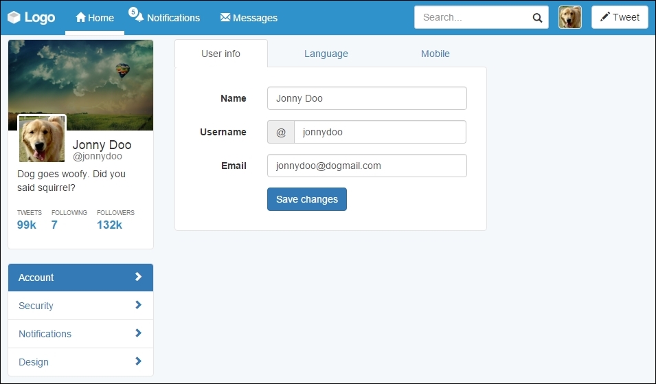
Inside the .tab-pane identified by #account-user, let's add some content. Since it is a configuration menu, we will create a form to set the user settings. Again, we will work with some forms in Bootstrap. Do you remember how to use them?
In the form, we will have three inputs (name, username, and e-mail) followed by a button to save the changes. We will use the .form-horizontal class to make each form input next its label and stacked by each other. So, place the following code inside the #account-user element:
<div id="account-user" role="tabpanel" class="tab-pane active" >
  <form class="form-horizontal">
    <div class="form-group">
      <label class="col-sm-3 control-label">Name</label>
      <div class="col-sm-9">
        <input type="text" class="form-control" value="Jonny Doo">
      </div>
    </div>
    <div class="form-group">
      <label class="col-sm-3 control-label">Username</label>
      <div class="col-sm-9">
        <div class="input-group">
          <div class="input-group-addon">@</div>
          <input type="text" class="form-control" value="jonnydoo">
        </div>
      </div>
    </div>
    <div class="form-group">
      <label class="col-sm-3 control-label">Email</label>
      <div class="col-sm-9">
        <input type="email" class="form-control" value="[email protected]">
      </div>
    </div>
    <div class="form-group">
      <div class="col-sm-offset-3 col-sm-9">
        <button type="submit" class="btn btn-primary">
          Save changes
        </button>
      </div>
    </div>
  </form>
</div>
Break through the code, we set the labels to fill a quarter of the form row, while the input fills the rest. We again used the input groups to add the @ sign before the username field.
Each label has the .col-sm-3 class and the input the .col-sm-9 class. As we said, the forms respect the grid system layout, so we can apply the same classes here. We also added the .col-sm-offset-3 class to the submit button for a correct offset.
Right now, the page should look like the following screenshot. Isn't it looking nicer?
CSS turn! We must make it look prettier, so let's play with some paddings. However, before anything, add the class to .card to the .tab-content. Next, let's fix the borders and margins in .tab-content by adding some padding and some negative margin, as follows:
#main .tab-content {
  padding: 2em;
  margin-top: -0.1rem;
}
Then, remove the border from the tab list and change the z-index of the tabs:
#account-tabs > li {
  border-bottom: 0;
}

#account-tabs {
  position: relative;
  z-index: 99;
}
Finally, remove the margin from the save changes button using another nth recipe, as follows:
#main .form-horizontal .form-group:last-child {
  margin-bottom: 0;
}
Nice! Refresh the web app and see the result, like this:
With these changes, we have made the form from .tab-content look like a card. We also added some margins and padding to correct the designs. Lastly, with the margin top and z-index, we make the selected tab blend correctly with the content.
To finalize the settings page, we must fill the right column of the web app. To do this, we will create a menu that presents some general statistics about the user.
In order to do that, we will use the Bootstrap List group component. List group is powerful in Bootstrap as it can seem similar to Bootstrap Cards, but it has more specific options for menu list generation, such as headers, disabled items, and much more.
So let's start doing this! Create the HTML markup at the #right-content element:
<div id="right-content" class="col-md-3 hidden-sm hidden-xs">
  <ul class="list-group">
    <li class="list-group-item list-group-item-info">
      Dog stats
    </li>
    <li class="list-group-item">
      Number of day rides
    </li>
    <li class="list-group-item">
      Captured mice
    </li>
    <li class="list-group-item">
      Postmen frightened
    </li>
    <li class="list-group-item">
      Always alert badge
    </li>
  </ul>
</div>
It is a simple list and we just added the .list-group class to the list, while adding the .list-group-item class for each item in the list. For the first item, we used the .list-group-item-info contextual color class to make it blue, according to the Bootstrap contextual colors.
Before we continue, we have to change the colors of the borders from list group to respect the same border color that we have been using:
.list-group-item {
  border-color: #e5e5e5;
}
The result that you should see right know is like the one presented in the next screenshot. List groups is a very handy component that we can use to achieve almost the same effect that we got using Pills, but here we are using fewer CSS rules.
Labels and badges are Bootstrap components that can easily highlight some text or information. They can be used in any place, as we did in the navigation bar, on the notification item.
Just like most of Bootstrap's components, labels follow the contextual colors of Bootstrap, while badges do not have this option. To consolidate their utilization, let's add some of them to the right menu, regarding the statistics, because after all we want to know our stats!
It will be pretty easy since we have worked with this before. For the three first items, we will use labels, and for the last one, we will use a badge with an icon. Just add the highlighted code to the current .list-group:
<div id="right-content" class="col-md-3 hidden-sm hidden-xs">
  <ul class="list-group">
    <li class="list-group-item list-group-item-info">
      Dog stats
    </li>
    <li class="list-group-item">
      Number of day rides
      <span class="label label-success">3</span>
    </li>
    <li class="list-group-item">
      Captured mice
      <span class="label label-danger">87</span>
    </li>
    <li class="list-group-item">
      Postmen frightened
      <span class="label label-default">2</span>
    </li>
    <li class="list-group-item">
      Always alert badge
      <span class="badge glyphicon glyphicon-star" aria-hidden="true">
      </span>
    </li>
  </ul>
</div>
We must pay attention to some points here. The first is that we used the .label class together with the contextual color class, like this: .label-*. Here, * is the name of the contextual class.
The second thing is that if you refresh your web page right now, you will see that Bootstrap does have a CSS for aligning all badges on the right, but it does not apply the same rule for labels. So, add the next CSS:
#right-content .list-group .label {
  float: right;
}
The third point is that we used badges and icons in the same span. This is possible, and then we just need to adjust the CSS render:
#right-content .list-group .label {
  padding: 0.3rem 0.6rem;
}

#right-content .list-group .badge.glyphicon-star {
  background-color: #f0ad4e;
  padding: 0.4rem;
  padding-left: 0.5rem;
}
By adding these rules, we adjusted the padding for the labels, adjusted the padding for the badge, and correctly set the yellow background for the star badge. See the result in the browser; it must look like this:
Cool! We've done another page for our web app. The stats menu looks cute. We will not cover the other page settings menus in this book, since they follow almost the same structure that we showed in this example. Try doing that as homework.
The stats column
To finalize the settings page, we must fill the right column of the web app. To do this, we will create a menu that presents some general statistics about the user.
In order to do that, we will use the Bootstrap List group component. List group is powerful in Bootstrap as it can seem similar to Bootstrap Cards, but it has more specific options for menu list generation, such as headers, disabled items, and much more.
So let's start doing this! Create the HTML markup at the #right-content element:
<div id="right-content" class="col-md-3 hidden-sm hidden-xs">
  <ul class="list-group">
    <li class="list-group-item list-group-item-info">
      Dog stats
    </li>
    <li class="list-group-item">
      Number of day rides
    </li>
    <li class="list-group-item">
      Captured mice
    </li>
    <li class="list-group-item">
      Postmen frightened
    </li>
    <li class="list-group-item">
      Always alert badge
    </li>
  </ul>
</div>
It is a simple list and we just added the .list-group class to the list, while adding the .list-group-item class for each item in the list. For the first item, we used the .list-group-item-info contextual color class to make it blue, according to the Bootstrap contextual colors.
Before we continue, we have to change the colors of the borders from list group to respect the same border color that we have been using:
.list-group-item {
  border-color: #e5e5e5;
}
The result that you should see right know is like the one presented in the next screenshot. List groups is a very handy component that we can use to achieve almost the same effect that we got using Pills, but here we are using fewer CSS rules.
Labels and badges are Bootstrap components that can easily highlight some text or information. They can be used in any place, as we did in the navigation bar, on the notification item.
Just like most of Bootstrap's components, labels follow the contextual colors of Bootstrap, while badges do not have this option. To consolidate their utilization, let's add some of them to the right menu, regarding the statistics, because after all we want to know our stats!
It will be pretty easy since we have worked with this before. For the three first items, we will use labels, and for the last one, we will use a badge with an icon. Just add the highlighted code to the current .list-group:
<div id="right-content" class="col-md-3 hidden-sm hidden-xs">
  <ul class="list-group">
    <li class="list-group-item list-group-item-info">
      Dog stats
    </li>
    <li class="list-group-item">
      Number of day rides
      <span class="label label-success">3</span>
    </li>
    <li class="list-group-item">
      Captured mice
      <span class="label label-danger">87</span>
    </li>
    <li class="list-group-item">
      Postmen frightened
      <span class="label label-default">2</span>
    </li>
    <li class="list-group-item">
      Always alert badge
      <span class="badge glyphicon glyphicon-star" aria-hidden="true">
      </span>
    </li>
  </ul>
</div>
We must pay attention to some points here. The first is that we used the .label class together with the contextual color class, like this: .label-*. Here, * is the name of the contextual class.
The second thing is that if you refresh your web page right now, you will see that Bootstrap does have a CSS for aligning all badges on the right, but it does not apply the same rule for labels. So, add the next CSS:
#right-content .list-group .label {
  float: right;
}
The third point is that we used badges and icons in the same span. This is possible, and then we just need to adjust the CSS render:
#right-content .list-group .label {
  padding: 0.3rem 0.6rem;
}

#right-content .list-group .badge.glyphicon-star {
  background-color: #f0ad4e;
  padding: 0.4rem;
  padding-left: 0.5rem;
}
By adding these rules, we adjusted the padding for the labels, adjusted the padding for the badge, and correctly set the yellow background for the star badge. See the result in the browser; it must look like this:
Cool! We've done another page for our web app. The stats menu looks cute. We will not cover the other page settings menus in this book, since they follow almost the same structure that we showed in this example. Try doing that as homework.
Labels and badges
Labels and badges are Bootstrap components that can easily highlight some text or information. They can be used in any place, as we did in the navigation bar, on the notification item.
Just like most of Bootstrap's components, labels follow the contextual colors of Bootstrap, while badges do not have this option. To consolidate their utilization, let's add some of them to the right menu, regarding the statistics, because after all we want to know our stats!
It will be pretty easy since we have worked with this before. For the three first items, we will use labels, and for the last one, we will use a badge with an icon. Just add the highlighted code to the current .list-group:
<div id="right-content" class="col-md-3 hidden-sm hidden-xs">
  <ul class="list-group">
    <li class="list-group-item list-group-item-info">
      Dog stats
    </li>
    <li class="list-group-item">
      Number of day rides
      <span class="label label-success">3</span>
    </li>
    <li class="list-group-item">
      Captured mice
      <span class="label label-danger">87</span>
    </li>
    <li class="list-group-item">
      Postmen frightened
      <span class="label label-default">2</span>
    </li>
    <li class="list-group-item">
      Always alert badge
      <span class="badge glyphicon glyphicon-star" aria-hidden="true">
      </span>
    </li>
  </ul>
</div>
We must pay attention to some points here. The first is that we used the .label class together with the contextual color class, like this: .label-*. Here, * is the name of the contextual class.
The second thing is that if you refresh your web page right now, you will see that Bootstrap does have a CSS for aligning all badges on the right, but it does not apply the same rule for labels. So, add the next CSS:
#right-content .list-group .label {
  float: right;
}
The third point is that we used badges and icons in the same span. This is possible, and then we just need to adjust the CSS render:
#right-content .list-group .label {
  padding: 0.3rem 0.6rem;
}

#right-content .list-group .badge.glyphicon-star {
  background-color: #f0ad4e;
  padding: 0.4rem;
  padding-left: 0.5rem;
}
By adding these rules, we adjusted the padding for the labels, adjusted the padding for the badge, and correctly set the yellow background for the star badge. See the result in the browser; it must look like this:
Cool! We've done another page for our web app. The stats menu looks cute. We will not cover the other page settings menus in this book, since they follow almost the same structure that we showed in this example. Try doing that as homework.
In this chapter, we covered a bunch of Bootstrap components. Now you can say that you know all of the most important Bootstrap components, even the new ones in version 4. This chapter was a challenging one, since you had to learn so many details about different components, so congratulations!
First, we started working with alerts. We only used the component alert with data attributes, but in the coming chapters, we will use it as a JavaScript plugin, with more options and animations. Don't worry! This is a glimpse of future chapters.
Next, you learned about progress bars and made use of some customization, and using animations by CSS. With that, we achieved a cool result at the end and are now able to use progress bars when needed.
After that, we switched to the settings page. There, taking advantage of the same web application structure, we changed the layout. We did this by creating a menu using the pills navigator, and created a main component that used tabs.
For tabs, that was the first time we presented how to use a Bootstrap plugin by using JavaScript, but do not worry about this either. We will go deep into this subject in the next chapter.
To finish the chapter, we worked with other component, called list group. This component offers some more capabilities for creating stacked menus.
Inside the items, we studied the use of labels and badges, which are nice things that Bootstrap offers to us.
In the next chapter, we will start working with some Bootstrap JavaScript plugins. We will go back to the main web application page and play with some posts on the timeline. It will be fun. See you there!