
Alright, there is no more time to spend on testing our skills. Now it's time to truly test ourselves with a big challenge: creating an admin dashboard using Bootstrap. Now Bootstrap can help us, but we must know how to handle the majority of the framework to deliver professional work.
We need a plan to build this dashboard from scratch to its final form. Therefore, we will follow a designer template and recreate it from an image to a web page. Following this concept, you will learn about:
- The fluid container
- The flexbox layout
- Bootstrap custom stacked navigation
- The collapse plugin
- Bootstrap and advanced CSS
- External plugin integration
- Single-page application loading
This is the final example of the book. Let's face it and nail the Bootstrap framework. I know you are thoroughly able to defeat this final boss!
As I mentioned, this is a professional job and it deserves a professional treatment. Now we will have a design guideline to follow. Up next is a screenshot of the dashboard that we have to reproduce by code:
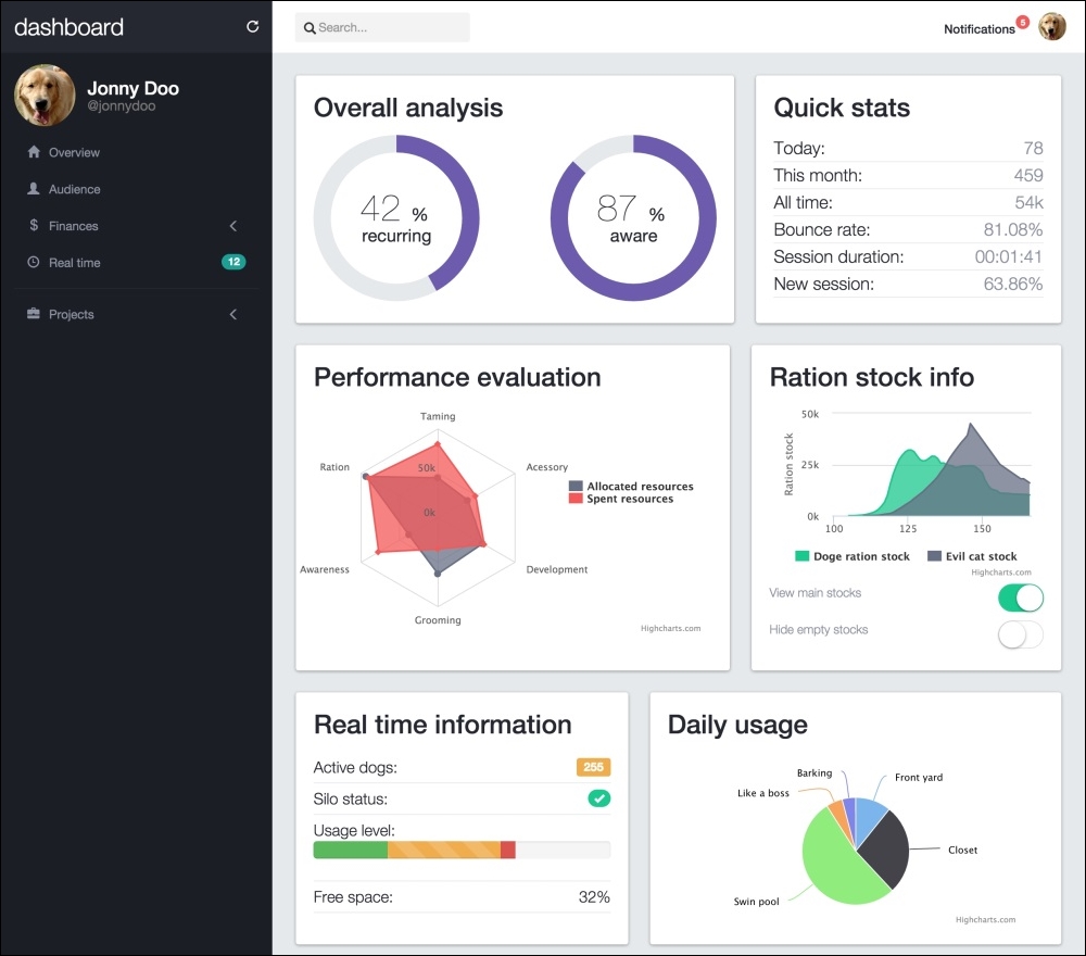
As you can see, the dashboard is composed of a navigation header containing some information, a search bar, and notifications. On the left-hand side is a menu with the sections of the web application. In the center is a set of charts about the page status. It looks good in the screenshot and will look even better in the browser!
The page scaffolding consists of the following:
First of all, before you create any element, create a new file using the same structure that we pointed out for starting every example in the book (refer to the Bootstrap required tags section in Chapter 1, Getting Started, for more information). Create a file named dashboard.html and apply the default starter HTML to the file. Now we are ready to go!
You may be bored of doing navigation bars; however, because of the acquired experience, we will do this one very quickly, taking advantage of the code written in previous examples.
Create a <nav> element, and inside it, create a .container-fluid and a .row:
<nav class="navbar navbar-fixed-top">
  <div class="container-fluid">
    <div class="row">
    </div>
  </div>
</nav>
This .row element will have two columns, just as we mentioned that will be done for the main container. On the first one, let's create the dashboard title and a refresh button, as follows:
<nav class="navbar navbar-fixed-top">
  <div class="container-fluid">
    <div class="row">
      <div class="col-sm-3 top-left-menu">
        <div class="navbar-header">
          <a class="navbar-brand" href="webapp.html">
            <h1>dashboard</h1>
          </a>

        </div>
        <a href="#" data-toggle="tooltip" data-placement="bottom" data-delay="500" title="Refresh data" class="header-refresh pull-right">
          <span class="glyphicon glyphicon-repeat" aria-hidden="true"></span>
        </a>
      </div>
    </div>
  </div>
</nav>
Note that for the refresh button, we have used .glyphicon and added a tooltip. Do not forget to activate the tooltip in the main.js file that you have loaded:
$(document).ready(function() {
    $('[data-toggle="tooltip"]').tooltip();
});
In the tooltip, we added a delay to it show up with the data-delay="500" attribute. We mentioned this as an option for tooltip, but haven't made use of it so far. This will just delay the appearance of the tooltip for 500 milliseconds, while hovering the refresh link.
Inside .nav-header, add .navbar-toggle, which will be displayed for small screens and collapse the menu:
<nav class="navbar navbar-fixed-top">
  <div class="container-fluid">
    <div class="row">
      <div class="col-sm-3 top-left-menu">
        <div class="navbar-header">
          <a class="navbar-brand" href="webapp.html">
            <h1>dashboard</h1>
          </a>
          <button type="button" class="navbar-toggle collapsed" data-toggle="collapse" data-target="#nav-menu" aria-expanded="false">
            <span class="sr-only">Toggle navigation</span>
            <span class="icon-bar"></span>
            <span class="icon-bar"></span>
            <span class="icon-bar"></span>
          </button>
        </div>
        <a href="#" data-toggle="tooltip" data-placement="bottom" data-delay="500" title="Refresh data" class="header-refresh pull-right">
          <span class="glyphicon glyphicon-repeat" aria-hidden="true"></span>
        </a>
      </div>
    </div>
  </div>
</nav>
So far, we have no secrets. We have just replicated components that we used before. Following our pipeline, we should create some CSS rules to style our page, although first let's create some common CSS style. At the beginning of base.css, which is loaded in our HTML, we add the style:
.transition,
.transition:hover,
.transition:focus {

  -webkit-transition: all 150ms ease-in-out;
  -moz-transition: all 150ms ease-in-out;
  -ms-transition: all 150ms ease-in-out;
  -o-transition: all 150ms ease-in-out;
  transition: all 150ms ease-in-out;
}

html, body {
  position: relative;
  height: 100%;
  background-color: #e5e9ec;
}
First, we created a common .transition class to be used in multiples cases (we will use it in the chapter). Transitions were introduced in CSS3 and they allow us to create transition effects. In this case, it's an effect of ease-in-out for any element that has this class.
Also, for html and body, we changed the background and set the position and height to fill the entire screen.
Next, we must add the CSS for the navigation header:
nav.navbar-fixed-top {
  background-color: #FFF;
  border: none;
}

nav .top-left-menu {
  background-color: #252830;
  display: -webkit-flex;
  display: flex;
  align-items: center;
}

.navbar-brand {
  height: auto;
}

.navbar-brand h1 {
  margin: 0;
  font-size: 1.5em;
  font-weight: 300;
  color: #FFF;
}

nav .header-refresh {
  margin-left: auto;
  color: #FFF;
}
Here, we changed the color of the elements. But the most important thing here is the usage of the flexbox rules (do you remember flexbox, which we discussed in Chapter 5, Making It Fancy, in the Understanding flexbox section?). Remember that Bootstrap 4 will support flex display, so it is nice to keep using it, since it should be the standard in the near future for every browser.
The result of this part must look like what is shown in the following screenshot:
Following our design, we have to create a search form. So, just after the closure of .top-left-menu, add the form code, such as the portion in bold:
<nav class="navbar navbar-fixed-top">
  <div class="container-fluid">
    <div class="row">
      <div class="col-sm-3 top-left-menu">
        ...
      </div>

      <form id="search" role="search" class="hidden-xs col-sm-3">
        <div class="input-group">
          <span class="glyphicon glyphicon-search" aria-hidden="true"></span>
          <input type="text" class="form-control transition" placeholder="Search...">
        </div>
      </form>

    </div>
  </div>
</nav>
As usual, it's CSS time:
nav form#search {
  padding: 0.9em;
}

nav form#search .input-group {
  display: -webkit-flex;
  display: flex;
  align-items: center;
}

nav form#search .input-group .form-control {
  border-radius: 0.25em;
  border: none;
  width: 70%;
  padding-left: 1.9em;
  background-color: #F3F3F3;
  box-shadow: none;
}

nav form#search .input-group .form-control:focus {
  width: 100%;
  box-shadow: none;
}

nav form#search .glyphicon-search {
  z-index: 99;
  left: 1.7em;
}
In this CSS, we have again used the display: flex property. In addition to this, we created a pseudo-class rule for .form-control. The :focus, which is activated whenever the input has focus, in other words, is receiving some text. This :focus rule will change the width of the input when you focus the input, which happens when you click on it.
Refresh the web page and click on the input on the search form. Note that we applied the .transition class in this element, so when we focus it, the change of width is smoothed in a transition. The result should look like this:

To finish the navigation bar, we have to create the right-hand-side content of the navigation bar, which we call #nav-menu. This menu will hold the notification list, placed as a button dropdown.
After <form>, place the presented HTML:
<div id="nav-menu" class="collapse navbar-collapse pull-right">
  <ul class="nav navbar-nav">
  </ul>
</div>
Inside this <ul> tag, we will place the notifications. Right now, we just have this option, but with this list, we can add multiple items in the navigation bar. So, add the following code for the item:
<div id="nav-menu" class="collapse navbar-collapse pull-right">
  <ul class="nav navbar-nav">
    <li>
      <div id="btn-notifications" class="btn-group">
        <span class="badge">3</span>
        <button type="button" class="btn btn-link dropdown-toggle" data-toggle="dropdown" aria-haspopup="true" aria-expanded="false">
          Notifications
        </button>
      </div>
    </li>
  </ul>
</div>
Explaining this item, we can say that it is a button for the notification. There is a wrapper element named #btn-notifications. Inside it is a .badge to verbalize the number of new notifications, and a button.btn that must seem like a link, so we applied the .btn-link class to it. The button also contains the tags needed for a Bootstrap drop-down button, such as the .dropdown-toggle class and the data-toggle="dropdown" data property.
Therefore, every
button.dropdown-toggle button needs a ul.dropdown-menu. Just after <button>, create the list:
<div id="nav-menu" class="collapse navbar-collapse pull-right">
  <ul class="nav navbar-nav">
    <li>
      <div id="btn-notifications" class="btn-group">
        <span class="badge">3</span>
        <button type="button" class="btn btn-link dropdown-toggle" data-toggle="dropdown" aria-haspopup="true" aria-expanded="false">
          Notifications
        </button>
        <ul id="notification-list" class="dropdown-menu pull-right">
          <li>
            <a href="#">
              <span class="badge"></span>
              <img src="imgs/laika.jpg" class="img-circle">
              <div class="notification-message">
                <strong>Laika</strong>
                <p>Hey! How are you?</p>
                <em class="since">2h ago</em>
              </div>
            </a>
          </li>
          <li>
            <a href="#">
              <span class="badge"></span>
              <img src="imgs/cat.jpg" class="img-circle">
              <div class="notification-message">
                <strong>Devil cat</strong>
                <p>I will never forgive you...</p>
                <em class="since">6h ago</em>
              </div>
            </a>
          </li>
          <li>
            <a href="#">
              <span class="badge"></span>
              <img src="imgs/doge.jpg" class="img-circle">
              <div class="notification-message">
                <strong>Doge</strong>
                <p>What are you doing? So scare. It's alright now.</p>
                <em class="since">yesterday</em>
              </div>
            </a>
          </li>
        </ul>
      </div>
    </li>
  </ul>
</div>
The new list element is pointed out in bold. Even though the content seems long, it is just a repetition of three items with different contents inside our notification list.
Refresh the page, open the dropdown, and you will feel an uncontrollable desire to add some CSS and stop the dropdown from being ugly anymore:
/*nav menu*/
nav #nav-menu {
  padding: 0.4em;
  padding-right: 1em;
}

/*nav menu and notifications*/
#nav-menu #btn-notifications > .badge {
  color: #FFF;
  background-color: #f35958;
  font-size: 0.7em;
  padding: 0.3rem 0.55rem 0.3rem 0.5rem;
  position: absolute;
  right: -0.4rem;
  top: 1rem;
  z-index: 99;
}

#btn-notifications .btn-link {
  padding-top: 1.5rem;
  color: #252830;
  font-weight: 500;
}

#btn-notifications .btn-link:hover {
  text-decoration: none;
}
Great! This will make the button and notification badge appear more beautiful. Then it's time for #notification-list:
#notification-list {
  max-height: 20em;
  overflow: auto;
}

#notification-list a {
  display: -webkit-flex;
  display: flex;
  opacity: 0.7;
  margin: 1.5rem;
  border-radius: 0.5rem;
  padding: 0.5rem 1.3rem;
  background-color: #EFEFEF;
  position: relative;
}

#notification-list a:hover {
  color: #262626;
  text-decoration: none;
  opacity: 1;
}

#notification-list img {
  display: inline-block;
  height: 35px;
  width: 35px;
  margin-right: 1em;
  margin-top: 1em;
}

#notification-list .notification-message {
  display: inline-block;
  white-space: normal;
  min-width: 25rem;
}

#notification-list .badge:empty {
  display: inline-block;
  position: absolute;
  right: 0.5rem;
  top: 0.5rem;
  background-color: #f35958;
  height: 1.4rem;
}

#notification-list em.since {
  font-size: 0.7em;
  color: #646C82;
}
For the notification, we did just some common rules, such as spacing, color, and so on. The only different thing is, again, the use of flexbox to align the content. See this screenshot for the final result of the navigation bar:

In the navigation bar, the last present component is a picture that, when you click on it, opens a user menu, just like what we did in the example of the web application. With no further delay, place the next HTML just after the <ul> of #nav-menu:
<div id="nav-menu" class="collapse navbar-collapse pull-right">
  <ul class="nav navbar-nav">
    …
  </ul>

  <div id="nav-profile" class="btn-group pull-right">
    <button type="button" class="btn btn-link dropdown-toggle thumbnail" data-toggle="dropdown" aria-haspopup="true" aria-expanded="false">
      <img src="imgs/jon.png" class="img-circle">
    </button>
    <ul class="dropdown-menu">
      <li><a href="#">Profile</a></li>
      <li><a href="settings.html">Setting</a></li>
      <li role="separator" class="divider"></li>
      <li><a href="#">Logout</a></li>
    </ul>
  </div>
</div>
So, it is another button dropdown. The CSS for this HTML is as follows:
#nav-profile {
  margin: 0.5em;
  margin-left: 1em;
}

#nav-profile button.thumbnail {
  margin: 0;
  padding: 0;
  border: 0;
}

#nav-profile img {
  max-height: 2.3em;
}
We are done! Refresh the web browser and see the result, which should be like what is shown in this screenshot:

The navigation search
Following our design, we have to create a search form. So, just after the closure of .top-left-menu, add the form code, such as the portion in bold:
<nav class="navbar navbar-fixed-top">
  <div class="container-fluid">
    <div class="row">
      <div class="col-sm-3 top-left-menu">
        ...
      </div>

      <form id="search" role="search" class="hidden-xs col-sm-3">
        <div class="input-group">
          <span class="glyphicon glyphicon-search" aria-hidden="true"></span>
          <input type="text" class="form-control transition" placeholder="Search...">
        </div>
      </form>

    </div>
  </div>
</nav>
As usual, it's CSS time:
nav form#search {
  padding: 0.9em;
}

nav form#search .input-group {
  display: -webkit-flex;
  display: flex;
  align-items: center;
}

nav form#search .input-group .form-control {
  border-radius: 0.25em;
  border: none;
  width: 70%;
  padding-left: 1.9em;
  background-color: #F3F3F3;
  box-shadow: none;
}

nav form#search .input-group .form-control:focus {
  width: 100%;
  box-shadow: none;
}

nav form#search .glyphicon-search {
  z-index: 99;
  left: 1.7em;
}
In this CSS, we have again used the display: flex property. In addition to this, we created a pseudo-class rule for .form-control. The :focus, which is activated whenever the input has focus, in other words, is receiving some text. This :focus rule will change the width of the input when you focus the input, which happens when you click on it.
Refresh the web page and click on the input on the search form. Note that we applied the .transition class in this element, so when we focus it, the change of width is smoothed in a transition. The result should look like this:
To finish the navigation bar, we have to create the right-hand-side content of the navigation bar, which we call #nav-menu. This menu will hold the notification list, placed as a button dropdown.
After <form>, place the presented HTML:
<div id="nav-menu" class="collapse navbar-collapse pull-right">
  <ul class="nav navbar-nav">
  </ul>
</div>
Inside this <ul> tag, we will place the notifications. Right now, we just have this option, but with this list, we can add multiple items in the navigation bar. So, add the following code for the item:
<div id="nav-menu" class="collapse navbar-collapse pull-right">
  <ul class="nav navbar-nav">
    <li>
      <div id="btn-notifications" class="btn-group">
        <span class="badge">3</span>
        <button type="button" class="btn btn-link dropdown-toggle" data-toggle="dropdown" aria-haspopup="true" aria-expanded="false">
          Notifications
        </button>
      </div>
    </li>
  </ul>
</div>
Explaining this item, we can say that it is a button for the notification. There is a wrapper element named #btn-notifications. Inside it is a .badge to verbalize the number of new notifications, and a button.btn that must seem like a link, so we applied the .btn-link class to it. The button also contains the tags needed for a Bootstrap drop-down button, such as the .dropdown-toggle class and the data-toggle="dropdown" data property.
Therefore, every
button.dropdown-toggle button needs a ul.dropdown-menu. Just after <button>, create the list:
<div id="nav-menu" class="collapse navbar-collapse pull-right">
  <ul class="nav navbar-nav">
    <li>
      <div id="btn-notifications" class="btn-group">
        <span class="badge">3</span>
        <button type="button" class="btn btn-link dropdown-toggle" data-toggle="dropdown" aria-haspopup="true" aria-expanded="false">
          Notifications
        </button>
        <ul id="notification-list" class="dropdown-menu pull-right">
          <li>
            <a href="#">
              <span class="badge"></span>
              <img src="imgs/laika.jpg" class="img-circle">
              <div class="notification-message">
                <strong>Laika</strong>
                <p>Hey! How are you?</p>
                <em class="since">2h ago</em>
              </div>
            </a>
          </li>
          <li>
            <a href="#">
              <span class="badge"></span>
              <img src="imgs/cat.jpg" class="img-circle">
              <div class="notification-message">
                <strong>Devil cat</strong>
                <p>I will never forgive you...</p>
                <em class="since">6h ago</em>
              </div>
            </a>
          </li>
          <li>
            <a href="#">
              <span class="badge"></span>
              <img src="imgs/doge.jpg" class="img-circle">
              <div class="notification-message">
                <strong>Doge</strong>
                <p>What are you doing? So scare. It's alright now.</p>
                <em class="since">yesterday</em>
              </div>
            </a>
          </li>
        </ul>
      </div>
    </li>
  </ul>
</div>
The new list element is pointed out in bold. Even though the content seems long, it is just a repetition of three items with different contents inside our notification list.
Refresh the page, open the dropdown, and you will feel an uncontrollable desire to add some CSS and stop the dropdown from being ugly anymore:
/*nav menu*/
nav #nav-menu {
  padding: 0.4em;
  padding-right: 1em;
}

/*nav menu and notifications*/
#nav-menu #btn-notifications > .badge {
  color: #FFF;
  background-color: #f35958;
  font-size: 0.7em;
  padding: 0.3rem 0.55rem 0.3rem 0.5rem;
  position: absolute;
  right: -0.4rem;
  top: 1rem;
  z-index: 99;
}

#btn-notifications .btn-link {
  padding-top: 1.5rem;
  color: #252830;
  font-weight: 500;
}

#btn-notifications .btn-link:hover {
  text-decoration: none;
}
Great! This will make the button and notification badge appear more beautiful. Then it's time for #notification-list:
#notification-list {
  max-height: 20em;
  overflow: auto;
}

#notification-list a {
  display: -webkit-flex;
  display: flex;
  opacity: 0.7;
  margin: 1.5rem;
  border-radius: 0.5rem;
  padding: 0.5rem 1.3rem;
  background-color: #EFEFEF;
  position: relative;
}

#notification-list a:hover {
  color: #262626;
  text-decoration: none;
  opacity: 1;
}

#notification-list img {
  display: inline-block;
  height: 35px;
  width: 35px;
  margin-right: 1em;
  margin-top: 1em;
}

#notification-list .notification-message {
  display: inline-block;
  white-space: normal;
  min-width: 25rem;
}

#notification-list .badge:empty {
  display: inline-block;
  position: absolute;
  right: 0.5rem;
  top: 0.5rem;
  background-color: #f35958;
  height: 1.4rem;
}

#notification-list em.since {
  font-size: 0.7em;
  color: #646C82;
}
For the notification, we did just some common rules, such as spacing, color, and so on. The only different thing is, again, the use of flexbox to align the content. See this screenshot for the final result of the navigation bar:
In the navigation bar, the last present component is a picture that, when you click on it, opens a user menu, just like what we did in the example of the web application. With no further delay, place the next HTML just after the <ul> of #nav-menu:
<div id="nav-menu" class="collapse navbar-collapse pull-right">
  <ul class="nav navbar-nav">
    …
  </ul>

  <div id="nav-profile" class="btn-group pull-right">
    <button type="button" class="btn btn-link dropdown-toggle thumbnail" data-toggle="dropdown" aria-haspopup="true" aria-expanded="false">
      <img src="imgs/jon.png" class="img-circle">
    </button>
    <ul class="dropdown-menu">
      <li><a href="#">Profile</a></li>
      <li><a href="settings.html">Setting</a></li>
      <li role="separator" class="divider"></li>
      <li><a href="#">Logout</a></li>
    </ul>
  </div>
</div>
So, it is another button dropdown. The CSS for this HTML is as follows:
#nav-profile {
  margin: 0.5em;
  margin-left: 1em;
}

#nav-profile button.thumbnail {
  margin: 0;
  padding: 0;
  border: 0;
}

#nav-profile img {
  max-height: 2.3em;
}
We are done! Refresh the web browser and see the result, which should be like what is shown in this screenshot:
The menu needs navigation
To finish the navigation bar, we have to create the right-hand-side content of the navigation bar, which we call #nav-menu. This menu will hold the notification list, placed as a button dropdown.
After <form>, place the presented HTML:
<div id="nav-menu" class="collapse navbar-collapse pull-right">
  <ul class="nav navbar-nav">
  </ul>
</div>
Inside this <ul> tag, we will place the notifications. Right now, we just have this option, but with this list, we can add multiple items in the navigation bar. So, add the following code for the item:
<div id="nav-menu" class="collapse navbar-collapse pull-right">
  <ul class="nav navbar-nav">
    <li>
      <div id="btn-notifications" class="btn-group">
        <span class="badge">3</span>
        <button type="button" class="btn btn-link dropdown-toggle" data-toggle="dropdown" aria-haspopup="true" aria-expanded="false">
          Notifications
        </button>
      </div>
    </li>
  </ul>
</div>
Explaining this item, we can say that it is a button for the notification. There is a wrapper element named #btn-notifications. Inside it is a .badge to verbalize the number of new notifications, and a button.btn that must seem like a link, so we applied the .btn-link class to it. The button also contains the tags needed for a Bootstrap drop-down button, such as the .dropdown-toggle class and the data-toggle="dropdown" data property.
Therefore, every
button.dropdown-toggle button needs a ul.dropdown-menu. Just after <button>, create the list:
<div id="nav-menu" class="collapse navbar-collapse pull-right">
  <ul class="nav navbar-nav">
    <li>
      <div id="btn-notifications" class="btn-group">
        <span class="badge">3</span>
        <button type="button" class="btn btn-link dropdown-toggle" data-toggle="dropdown" aria-haspopup="true" aria-expanded="false">
          Notifications
        </button>
        <ul id="notification-list" class="dropdown-menu pull-right">
          <li>
            <a href="#">
              <span class="badge"></span>
              <img src="imgs/laika.jpg" class="img-circle">
              <div class="notification-message">
                <strong>Laika</strong>
                <p>Hey! How are you?</p>
                <em class="since">2h ago</em>
              </div>
            </a>
          </li>
          <li>
            <a href="#">
              <span class="badge"></span>
              <img src="imgs/cat.jpg" class="img-circle">
              <div class="notification-message">
                <strong>Devil cat</strong>
                <p>I will never forgive you...</p>
                <em class="since">6h ago</em>
              </div>
            </a>
          </li>
          <li>
            <a href="#">
              <span class="badge"></span>
              <img src="imgs/doge.jpg" class="img-circle">
              <div class="notification-message">
                <strong>Doge</strong>
                <p>What are you doing? So scare. It's alright now.</p>
                <em class="since">yesterday</em>
              </div>
            </a>
          </li>
        </ul>
      </div>
    </li>
  </ul>
</div>
The new list element is pointed out in bold. Even though the content seems long, it is just a repetition of three items with different contents inside our notification list.
Refresh the page, open the dropdown, and you will feel an uncontrollable desire to add some CSS and stop the dropdown from being ugly anymore:
/*nav menu*/
nav #nav-menu {
  padding: 0.4em;
  padding-right: 1em;
}

/*nav menu and notifications*/
#nav-menu #btn-notifications > .badge {
  color: #FFF;
  background-color: #f35958;
  font-size: 0.7em;
  padding: 0.3rem 0.55rem 0.3rem 0.5rem;
  position: absolute;
  right: -0.4rem;
  top: 1rem;
  z-index: 99;
}

#btn-notifications .btn-link {
  padding-top: 1.5rem;
  color: #252830;
  font-weight: 500;
}

#btn-notifications .btn-link:hover {
  text-decoration: none;
}
Great! This will make the button and notification badge appear more beautiful. Then it's time for #notification-list:
#notification-list {
  max-height: 20em;
  overflow: auto;
}

#notification-list a {
  display: -webkit-flex;
  display: flex;
  opacity: 0.7;
  margin: 1.5rem;
  border-radius: 0.5rem;
  padding: 0.5rem 1.3rem;
  background-color: #EFEFEF;
  position: relative;
}

#notification-list a:hover {
  color: #262626;
  text-decoration: none;
  opacity: 1;
}

#notification-list img {
  display: inline-block;
  height: 35px;
  width: 35px;
  margin-right: 1em;
  margin-top: 1em;
}

#notification-list .notification-message {
  display: inline-block;
  white-space: normal;
  min-width: 25rem;
}

#notification-list .badge:empty {
  display: inline-block;
  position: absolute;
  right: 0.5rem;
  top: 0.5rem;
  background-color: #f35958;
  height: 1.4rem;
}

#notification-list em.since {
  font-size: 0.7em;
  color: #646C82;
}
For the notification, we did just some common rules, such as spacing, color, and so on. The only different thing is, again, the use of flexbox to align the content. See this screenshot for the final result of the navigation bar:
In the navigation bar, the last present component is a picture that, when you click on it, opens a user menu, just like what we did in the example of the web application. With no further delay, place the next HTML just after the <ul> of #nav-menu:
<div id="nav-menu" class="collapse navbar-collapse pull-right">
  <ul class="nav navbar-nav">
    …
  </ul>

  <div id="nav-profile" class="btn-group pull-right">
    <button type="button" class="btn btn-link dropdown-toggle thumbnail" data-toggle="dropdown" aria-haspopup="true" aria-expanded="false">
      <img src="imgs/jon.png" class="img-circle">
    </button>
    <ul class="dropdown-menu">
      <li><a href="#">Profile</a></li>
      <li><a href="settings.html">Setting</a></li>
      <li role="separator" class="divider"></li>
      <li><a href="#">Logout</a></li>
    </ul>
  </div>
</div>
So, it is another button dropdown. The CSS for this HTML is as follows:
#nav-profile {
  margin: 0.5em;
  margin-left: 1em;
}

#nav-profile button.thumbnail {
  margin: 0;
  padding: 0;
  border: 0;
}

#nav-profile img {
  max-height: 2.3em;
}
We are done! Refresh the web browser and see the result, which should be like what is shown in this screenshot:
Checking the profile
In the navigation bar, the last present component is a picture that, when you click on it, opens a user menu, just like what we did in the example of the web application. With no further delay, place the next HTML just after the <ul> of #nav-menu:
<div id="nav-menu" class="collapse navbar-collapse pull-right">
  <ul class="nav navbar-nav">
    …
  </ul>

  <div id="nav-profile" class="btn-group pull-right">
    <button type="button" class="btn btn-link dropdown-toggle thumbnail" data-toggle="dropdown" aria-haspopup="true" aria-expanded="false">
      <img src="imgs/jon.png" class="img-circle">
    </button>
    <ul class="dropdown-menu">
      <li><a href="#">Profile</a></li>
      <li><a href="settings.html">Setting</a></li>
      <li role="separator" class="divider"></li>
      <li><a href="#">Logout</a></li>
    </ul>
  </div>
</div>
So, it is another button dropdown. The CSS for this HTML is as follows:
#nav-profile {
  margin: 0.5em;
  margin-left: 1em;
}

#nav-profile button.thumbnail {
  margin: 0;
  padding: 0;
  border: 0;
}

#nav-profile img {
  max-height: 2.3em;
}
We are done! Refresh the web browser and see the result, which should be like what is shown in this screenshot:
After the navigation bar, we must fill the main content using a fluid layout. For that, we create a .container-fluid, just as we did in the <nav>. Inside the container, we create a single .row and two columns with spacing three and nine, respectively:
<div class="container-fluid">
  <div class="row">
    <div id="side-menu" class="col-md-3 hidden-xs">
    </div>

    <div id="main" class="col-md-9">
    </div>
  </div>
</div>
It is a common grid, containing one row. In the row, the first column, #side-menu, is shown from small viewports up to larger ones, while the #main column fills 9 out of 12 grids for medium resolutions.
However, we must not forget that #side-menu is actually an affix component. So, let's add the data properties to make it stitch to the top of the page, as we did in the web application example when you were learning this plugin:
<div class="container-fluid">
  <div class="row">
    <div id="side-menu" class="col-md-3 hidden-xs" data-spy="affix" data-offset-top="0">
    </div>

    <div id="main" class="col-sm-offset-3 col-md-9">
    </div>
  </div>
</div>
Note that because of the addition of the affix, we must set an offset in the #main div with the .col-sm-offset-3 class.
Let's fill #side-menu with content. At first, we have to create the profile block, which contains the user data. Place the following HTML inside the referred element:
<div id="side-menu" class="col-md-3 hidden-xs" data-spy="affix" data-offset-top="0">
  <div class="profile-block">
    <img src="imgs/jon.png" class="img-circle">
    <h4 class="profile-title">Jonny Doo <small>@jonnydoo</small></h4>
  </div>
</div>
Check out the page in the browser, and you will see that it is not displaying nicely. For the CSS, we must follow this style:
#side-menu {
  background-color: #1b1e24;
  padding-top: 7.2rem;
  height: 100%;
  position: fixed;
}

#side-menu .profile-block > * {
  display: inline-block;
}

#side-menu .profile-block img {
  width: 70px;
}

#side-menu .profile-title {
  color: #FFF;
  margin-left: 1rem;
  font-size: 1.5em;
  vertical-align: middle;
}

#side-menu .profile-title small {
  display: block;
}
With that, the #side-menu should fill the entire left height, but if you resize the browser to a smaller resolution, you will see that #nav-header does not resize together with the main content. This is a small challenge. Do you know why it is happening?
That was a little prank! Did I get you? In #side-menu, we applied only the class for medium viewports, that is, the .col-md-3 class. What we should have done was apply the class for small devices as well to make it responsive to small viewports and resize like all the other elements, which needs the .col-sm-* class. In this case, just change the class of #side-menu and in the #main element as well:
<div class="container-fluid">
  <div class="row">
    <div id="side-menu" class="col-sm-3 hidden-xs" data-spy="affix" data-offset-top="0">
    </div>

    <div id="main" class="col-sm-offset-3 col-sm-9">
    </div>
  </div>
</div>
Here is a screenshot that shows the result of the side menu for the moment:

A web application is never a web application if it does not have a menu. After the profile info in #side-menu, we will add a stacked menu.
Hearing the word "stacked" for a menu, what you remember? Of course, the .nav-stacked menu from Bootstrap! Let's create a .nav-stacked component in this menu. Therefore, after #profile-block, append the following HTML:
<ul class="nav nav-pills nav-stacked">
  <li>
    <a href="#" class="transition">
      <span class="glyphicon glyphicon-home" aria-hidden="true"></span>
      Overview
    </a>
  </li>
  <li>
    <a href="#" class="transition">
      <span class="glyphicon glyphicon-user" aria-hidden="true"></span>
      Audience
    </a>
  </li>
  <li>
    <a href="#" class="transition">
      <span class="glyphicon glyphicon-usd" aria-hidden="true"></span>
      Finances
      <span class="glyphicon glyphicon-menu-left pull-right transition" aria-hidden="true"></span>
    </a>
  </li>
  <li>
    <a href="#" class="transition">
      <span class="glyphicon glyphicon-time" aria-hidden="true"></span>
      Real time
      <span class="badge pull-right">12</span>
    </a>
  </li>
  <li class="nav-divider"></li>
  <li>
    <a href="#" class="transition">
      <span class="glyphicon glyphicon-briefcase" aria-hidden="true"></span>
      Projects
      <span class="glyphicon glyphicon-menu-left pull-right transition" aria-hidden="true"></span>
    </a>
  </li>
</ul>
No secrets here! Just create a simple stacked list using the .nav, .nav-pills, and .nav-stacked classes. Bootstrap will do the magic for you. You will learn a little trick now—the collapse Bootstrap plugin.
Collapse is another plugin from Bootstrap that toggles the visualization behavior of an element. It will show or collapse an item regarding the trigger of an action.
To add the collapse event to an element, you should add a data attribute called data-toggle="collapse". If the element is a link <a>, point the anchor to the identifier of the element, like this: href="#my-collapsed-element". If it is a <button>, add the data attribute pointing the identifier, like this for instance: data-target="#my-collapsed-element". The difference between using href for a link and data-target for a button is because of the semantics of the element. Naturally, every link is expected to have a reference in the href, although we do not have this requirement in buttons. So, Bootstrap binds the element through a data-target data attribute.
We will create a sublist in our menu using the collapse plugin for the Finances and Projects entries. After the link of each one of these items, create a secondary list, as is pointed in the following highlighted HTML. Also, since we are using <a> tags, we add to the href the identifier of the element that will be collapsed and the data-toggle corresponding to collapse:
<ul class="nav nav-pills nav-stacked">
  <li>
    <a href="#" class="transition">
      <span class="glyphicon glyphicon-home" aria-hidden="true"></span>
      Overview
    </a>
  </li>
  <li>
    <a href="#" class="transition">
      <span class="glyphicon glyphicon-user" aria-hidden="true"></span>
      Audience
    </a>
  </li>
  <li>
    <a href="#finances-opts" class="transition" role="button" data-toggle="collapse" aria-expanded="false" aria-controls="finances-opts">
      <span class="glyphicon glyphicon-usd" aria-hidden="true"></span>
      Finances
      <span class="glyphicon glyphicon-menu-left pull-right transition" aria-hidden="true"></span>
    </a>
    <ul class="collapse list-unstyled" id="finances-opts">
      <li>
        <a href="#" class="transition">
          Incomes
        </a>
      </li>
      <li>
        <a href="#" class="transition">
          Outcomes
        </a>
      </li>
    </ul>
  </li>
  <li>
    <a href="#" class="transition">
      <span class="glyphicon glyphicon-time" aria-hidden="true"></span>
      Real time
      <span class="badge pull-right">12</span>
    </a>
  </li>
  <li class="nav-divider"></li>
  <li>
    <a href="#projects-opts" class="transition" role="button" data-toggle="collapse" aria-expanded="false" aria-controls="projects-opts">
      <span class="glyphicon glyphicon-briefcase" aria-hidden="true"></span>
      Projects
      <span class="glyphicon glyphicon-menu-left pull-right transition" aria-hidden="true"></span>
    </a>
    <ul class="collapse list-unstyled" id="projects-opts">
      <li>
        <a href="#" class="transition">
          Free ration nation
        </a>
      </li>
      <li>
        <a href="#" class="transition">
          Cats going crazy
        </a>
      </li>
    </ul>
  </li>
</ul>
To make it clear, take as an example the first collapsed menu from Finances. Below the Finances link, we created the list to be collapsed, identified by #finances-opt. We also added the .collapse class, which is a Bootstrap class used to collapse elements.
Going back to the Finances link, add to the href the ID of the collapsed list, #finances-opt. Also, we added the data-toggle="collapse" required to Bootstrap Collapse work. Finally, we added the aria attributes, aria-controls and aria-controls, for semantic notation.
Refresh the browser and you will see how Bootstrap does almost the entire job for us. In the CSS, we need to add some simple styles for color and spacing:
#side-menu ul.nav {
  margin-top: 1rem;
}

#side-menu ul.nav a {
  color: #8b91a0;
}

#side-menu ul.nav a:hover,
#side-menu ul.nav a:focus {
  color: #FFF;
  background-color: inherit;
}

#side-menu ul.nav a .glyphicon {
  margin-right: 0.7rem;
}

#side-menu ul.nav a .glyphicon.pull-right {
  margin-top: 0.2rem;
}

#side-menu ul.nav a .badge {
  background-color: #1ca095;
}

#side-menu ul.nav .nav-divider {
  background-color: #252830;
}

#side-menu ul.nav ul {
  margin-left: 10%;
}

#side-menu ul.nav ul a {
  display: block;
  background-color: #2b303b;
  padding: 1rem;
  margin-bottom: 0.3rem;
  border-radius: 0.25em;
}

#side-menu ul.nav ul a:hover {
  text-decoration: none;
  background-color: #434857;
}
Go to the browser and refresh it to see the result. It should look like what is shown in this screenshot:

Let's add a cherry to this pie while learning other CSS properties. What do you think if we could rotate the arrow of the items that have collapsed menus by 90 degrees anticlockwise to create an opening effect? It would be awesome—even more if we did that with only CSS.
Add the next CSS rule for the effect using the transform property:
#side-menu ul.nav a:focus .glyphicon.pull-right {
  -moz-transform: rotate(-90deg);
  -webkit-transform: rotate(-90deg);
  -o-transform: rotate(-90deg);
  -ms-transform: rotate(-90deg);
  transform: rotate(-90deg);
}
This transform property will do exactly what we want; when the link is in focus (which means it is clicked on), the icon from the arrow will rotate 90 degrees anticlockwise, because of the minus signal.
To be more pro, let's use a supernew property called will-change. Add the style to the following selector:
#side-menu ul.nav a .glyphicon.pull-right {
  margin-top: 0.2rem;
  will-change: transform;
}
Tip
The will-change property
The will-change property optimizes animations by letting the browser know which elements will change and need careful treatment. Currently, this property is not supported by all browsers, but soon it will be. Check out its availability at http://caniuse.com/#feat=will-change.
Click to open a submenu and see the opening menu animation with the arrow rotation. The next screenshot presents an open menu:

From the side stacked menu
Let's fill #side-menu with content. At first, we have to create the profile block, which contains the user data. Place the following HTML inside the referred element:
<div id="side-menu" class="col-md-3 hidden-xs" data-spy="affix" data-offset-top="0">
  <div class="profile-block">
    <img src="imgs/jon.png" class="img-circle">
    <h4 class="profile-title">Jonny Doo <small>@jonnydoo</small></h4>
  </div>
</div>
Check out the page in the browser, and you will see that it is not displaying nicely. For the CSS, we must follow this style:
#side-menu {
  background-color: #1b1e24;
  padding-top: 7.2rem;
  height: 100%;
  position: fixed;
}

#side-menu .profile-block > * {
  display: inline-block;
}

#side-menu .profile-block img {
  width: 70px;
}

#side-menu .profile-title {
  color: #FFF;
  margin-left: 1rem;
  font-size: 1.5em;
  vertical-align: middle;
}

#side-menu .profile-title small {
  display: block;
}
With that, the #side-menu should fill the entire left height, but if you resize the browser to a smaller resolution, you will see that #nav-header does not resize together with the main content. This is a small challenge. Do you know why it is happening?
That was a little prank! Did I get you? In #side-menu, we applied only the class for medium viewports, that is, the .col-md-3 class. What we should have done was apply the class for small devices as well to make it responsive to small viewports and resize like all the other elements, which needs the .col-sm-* class. In this case, just change the class of #side-menu and in the #main element as well:
<div class="container-fluid">
  <div class="row">
    <div id="side-menu" class="col-sm-3 hidden-xs" data-spy="affix" data-offset-top="0">
    </div>

    <div id="main" class="col-sm-offset-3 col-sm-9">
    </div>
  </div>
</div>
Here is a screenshot that shows the result of the side menu for the moment:
A web application is never a web application if it does not have a menu. After the profile info in #side-menu, we will add a stacked menu.
Hearing the word "stacked" for a menu, what you remember? Of course, the .nav-stacked menu from Bootstrap! Let's create a .nav-stacked component in this menu. Therefore, after #profile-block, append the following HTML:
<ul class="nav nav-pills nav-stacked">
  <li>
    <a href="#" class="transition">
      <span class="glyphicon glyphicon-home" aria-hidden="true"></span>
      Overview
    </a>
  </li>
  <li>
    <a href="#" class="transition">
      <span class="glyphicon glyphicon-user" aria-hidden="true"></span>
      Audience
    </a>
  </li>
  <li>
    <a href="#" class="transition">
      <span class="glyphicon glyphicon-usd" aria-hidden="true"></span>
      Finances
      <span class="glyphicon glyphicon-menu-left pull-right transition" aria-hidden="true"></span>
    </a>
  </li>
  <li>
    <a href="#" class="transition">
      <span class="glyphicon glyphicon-time" aria-hidden="true"></span>
      Real time
      <span class="badge pull-right">12</span>
    </a>
  </li>
  <li class="nav-divider"></li>
  <li>
    <a href="#" class="transition">
      <span class="glyphicon glyphicon-briefcase" aria-hidden="true"></span>
      Projects
      <span class="glyphicon glyphicon-menu-left pull-right transition" aria-hidden="true"></span>
    </a>
  </li>
</ul>
No secrets here! Just create a simple stacked list using the .nav, .nav-pills, and .nav-stacked classes. Bootstrap will do the magic for you. You will learn a little trick now—the collapse Bootstrap plugin.
Collapse is another plugin from Bootstrap that toggles the visualization behavior of an element. It will show or collapse an item regarding the trigger of an action.
To add the collapse event to an element, you should add a data attribute called data-toggle="collapse". If the element is a link <a>, point the anchor to the identifier of the element, like this: href="#my-collapsed-element". If it is a <button>, add the data attribute pointing the identifier, like this for instance: data-target="#my-collapsed-element". The difference between using href for a link and data-target for a button is because of the semantics of the element. Naturally, every link is expected to have a reference in the href, although we do not have this requirement in buttons. So, Bootstrap binds the element through a data-target data attribute.
We will create a sublist in our menu using the collapse plugin for the Finances and Projects entries. After the link of each one of these items, create a secondary list, as is pointed in the following highlighted HTML. Also, since we are using <a> tags, we add to the href the identifier of the element that will be collapsed and the data-toggle corresponding to collapse:
<ul class="nav nav-pills nav-stacked">
  <li>
    <a href="#" class="transition">
      <span class="glyphicon glyphicon-home" aria-hidden="true"></span>
      Overview
    </a>
  </li>
  <li>
    <a href="#" class="transition">
      <span class="glyphicon glyphicon-user" aria-hidden="true"></span>
      Audience
    </a>
  </li>
  <li>
    <a href="#finances-opts" class="transition" role="button" data-toggle="collapse" aria-expanded="false" aria-controls="finances-opts">
      <span class="glyphicon glyphicon-usd" aria-hidden="true"></span>
      Finances
      <span class="glyphicon glyphicon-menu-left pull-right transition" aria-hidden="true"></span>
    </a>
    <ul class="collapse list-unstyled" id="finances-opts">
      <li>
        <a href="#" class="transition">
          Incomes
        </a>
      </li>
      <li>
        <a href="#" class="transition">
          Outcomes
        </a>
      </li>
    </ul>
  </li>
  <li>
    <a href="#" class="transition">
      <span class="glyphicon glyphicon-time" aria-hidden="true"></span>
      Real time
      <span class="badge pull-right">12</span>
    </a>
  </li>
  <li class="nav-divider"></li>
  <li>
    <a href="#projects-opts" class="transition" role="button" data-toggle="collapse" aria-expanded="false" aria-controls="projects-opts">
      <span class="glyphicon glyphicon-briefcase" aria-hidden="true"></span>
      Projects
      <span class="glyphicon glyphicon-menu-left pull-right transition" aria-hidden="true"></span>
    </a>
    <ul class="collapse list-unstyled" id="projects-opts">
      <li>
        <a href="#" class="transition">
          Free ration nation
        </a>
      </li>
      <li>
        <a href="#" class="transition">
          Cats going crazy
        </a>
      </li>
    </ul>
  </li>
</ul>
To make it clear, take as an example the first collapsed menu from Finances. Below the Finances link, we created the list to be collapsed, identified by #finances-opt. We also added the .collapse class, which is a Bootstrap class used to collapse elements.
Going back to the Finances link, add to the href the ID of the collapsed list, #finances-opt. Also, we added the data-toggle="collapse" required to Bootstrap Collapse work. Finally, we added the aria attributes, aria-controls and aria-controls, for semantic notation.
Refresh the browser and you will see how Bootstrap does almost the entire job for us. In the CSS, we need to add some simple styles for color and spacing:
#side-menu ul.nav {
  margin-top: 1rem;
}

#side-menu ul.nav a {
  color: #8b91a0;
}

#side-menu ul.nav a:hover,
#side-menu ul.nav a:focus {
  color: #FFF;
  background-color: inherit;
}

#side-menu ul.nav a .glyphicon {
  margin-right: 0.7rem;
}

#side-menu ul.nav a .glyphicon.pull-right {
  margin-top: 0.2rem;
}

#side-menu ul.nav a .badge {
  background-color: #1ca095;
}

#side-menu ul.nav .nav-divider {
  background-color: #252830;
}

#side-menu ul.nav ul {
  margin-left: 10%;
}

#side-menu ul.nav ul a {
  display: block;
  background-color: #2b303b;
  padding: 1rem;
  margin-bottom: 0.3rem;
  border-radius: 0.25em;
}

#side-menu ul.nav ul a:hover {
  text-decoration: none;
  background-color: #434857;
}
Go to the browser and refresh it to see the result. It should look like what is shown in this screenshot:
Let's add a cherry to this pie while learning other CSS properties. What do you think if we could rotate the arrow of the items that have collapsed menus by 90 degrees anticlockwise to create an opening effect? It would be awesome—even more if we did that with only CSS.
Add the next CSS rule for the effect using the transform property:
#side-menu ul.nav a:focus .glyphicon.pull-right {
  -moz-transform: rotate(-90deg);
  -webkit-transform: rotate(-90deg);
  -o-transform: rotate(-90deg);
  -ms-transform: rotate(-90deg);
  transform: rotate(-90deg);
}
This transform property will do exactly what we want; when the link is in focus (which means it is clicked on), the icon from the arrow will rotate 90 degrees anticlockwise, because of the minus signal.
To be more pro, let's use a supernew property called will-change. Add the style to the following selector:
#side-menu ul.nav a .glyphicon.pull-right {
  margin-top: 0.2rem;
  will-change: transform;
}
Tip
The will-change property
The will-change property optimizes animations by letting the browser know which elements will change and need careful treatment. Currently, this property is not supported by all browsers, but soon it will be. Check out its availability at http://caniuse.com/#feat=will-change.
Click to open a submenu and see the opening menu animation with the arrow rotation. The next screenshot presents an open menu:
I heard that the left menu is great!
A web application is never a web application if it does not have a menu. After the profile info in #side-menu, we will add a stacked menu.
Hearing the word "stacked" for a menu, what you remember? Of course, the .nav-stacked menu from Bootstrap! Let's create a .nav-stacked component in this menu. Therefore, after #profile-block, append the following HTML:
<ul class="nav nav-pills nav-stacked">
  <li>
    <a href="#" class="transition">
      <span class="glyphicon glyphicon-home" aria-hidden="true"></span>
      Overview
    </a>
  </li>
  <li>
    <a href="#" class="transition">
      <span class="glyphicon glyphicon-user" aria-hidden="true"></span>
      Audience
    </a>
  </li>
  <li>
    <a href="#" class="transition">
      <span class="glyphicon glyphicon-usd" aria-hidden="true"></span>
      Finances
      <span class="glyphicon glyphicon-menu-left pull-right transition" aria-hidden="true"></span>
    </a>
  </li>
  <li>
    <a href="#" class="transition">
      <span class="glyphicon glyphicon-time" aria-hidden="true"></span>
      Real time
      <span class="badge pull-right">12</span>
    </a>
  </li>
  <li class="nav-divider"></li>
  <li>
    <a href="#" class="transition">
      <span class="glyphicon glyphicon-briefcase" aria-hidden="true"></span>
      Projects
      <span class="glyphicon glyphicon-menu-left pull-right transition" aria-hidden="true"></span>
    </a>
  </li>
</ul>
No secrets here! Just create a simple stacked list using the .nav, .nav-pills, and .nav-stacked classes. Bootstrap will do the magic for you. You will learn a little trick now—the collapse Bootstrap plugin.
Collapse is another plugin from Bootstrap that toggles the visualization behavior of an element. It will show or collapse an item regarding the trigger of an action.
To add the collapse event to an element, you should add a data attribute called data-toggle="collapse". If the element is a link <a>, point the anchor to the identifier of the element, like this: href="#my-collapsed-element". If it is a <button>, add the data attribute pointing the identifier, like this for instance: data-target="#my-collapsed-element". The difference between using href for a link and data-target for a button is because of the semantics of the element. Naturally, every link is expected to have a reference in the href, although we do not have this requirement in buttons. So, Bootstrap binds the element through a data-target data attribute.
We will create a sublist in our menu using the collapse plugin for the Finances and Projects entries. After the link of each one of these items, create a secondary list, as is pointed in the following highlighted HTML. Also, since we are using <a> tags, we add to the href the identifier of the element that will be collapsed and the data-toggle corresponding to collapse:
<ul class="nav nav-pills nav-stacked">
  <li>
    <a href="#" class="transition">
      <span class="glyphicon glyphicon-home" aria-hidden="true"></span>
      Overview
    </a>
  </li>
  <li>
    <a href="#" class="transition">
      <span class="glyphicon glyphicon-user" aria-hidden="true"></span>
      Audience
    </a>
  </li>
  <li>
    <a href="#finances-opts" class="transition" role="button" data-toggle="collapse" aria-expanded="false" aria-controls="finances-opts">
      <span class="glyphicon glyphicon-usd" aria-hidden="true"></span>
      Finances
      <span class="glyphicon glyphicon-menu-left pull-right transition" aria-hidden="true"></span>
    </a>
    <ul class="collapse list-unstyled" id="finances-opts">
      <li>
        <a href="#" class="transition">
          Incomes
        </a>
      </li>
      <li>
        <a href="#" class="transition">
          Outcomes
        </a>
      </li>
    </ul>
  </li>
  <li>
    <a href="#" class="transition">
      <span class="glyphicon glyphicon-time" aria-hidden="true"></span>
      Real time
      <span class="badge pull-right">12</span>
    </a>
  </li>
  <li class="nav-divider"></li>
  <li>
    <a href="#projects-opts" class="transition" role="button" data-toggle="collapse" aria-expanded="false" aria-controls="projects-opts">
      <span class="glyphicon glyphicon-briefcase" aria-hidden="true"></span>
      Projects
      <span class="glyphicon glyphicon-menu-left pull-right transition" aria-hidden="true"></span>
    </a>
    <ul class="collapse list-unstyled" id="projects-opts">
      <li>
        <a href="#" class="transition">
          Free ration nation
        </a>
      </li>
      <li>
        <a href="#" class="transition">
          Cats going crazy
        </a>
      </li>
    </ul>
  </li>
</ul>
To make it clear, take as an example the first collapsed menu from Finances. Below the Finances link, we created the list to be collapsed, identified by #finances-opt. We also added the .collapse class, which is a Bootstrap class used to collapse elements.
Going back to the Finances link, add to the href the ID of the collapsed list, #finances-opt. Also, we added the data-toggle="collapse" required to Bootstrap Collapse work. Finally, we added the aria attributes, aria-controls and aria-controls, for semantic notation.
Refresh the browser and you will see how Bootstrap does almost the entire job for us. In the CSS, we need to add some simple styles for color and spacing:
#side-menu ul.nav {
  margin-top: 1rem;
}

#side-menu ul.nav a {
  color: #8b91a0;
}

#side-menu ul.nav a:hover,
#side-menu ul.nav a:focus {
  color: #FFF;
  background-color: inherit;
}

#side-menu ul.nav a .glyphicon {
  margin-right: 0.7rem;
}

#side-menu ul.nav a .glyphicon.pull-right {
  margin-top: 0.2rem;
}

#side-menu ul.nav a .badge {
  background-color: #1ca095;
}

#side-menu ul.nav .nav-divider {
  background-color: #252830;
}

#side-menu ul.nav ul {
  margin-left: 10%;
}

#side-menu ul.nav ul a {
  display: block;
  background-color: #2b303b;
  padding: 1rem;
  margin-bottom: 0.3rem;
  border-radius: 0.25em;
}

#side-menu ul.nav ul a:hover {
  text-decoration: none;
  background-color: #434857;
}
Go to the browser and refresh it to see the result. It should look like what is shown in this screenshot:
Let's add a cherry to this pie while learning other CSS properties. What do you think if we could rotate the arrow of the items that have collapsed menus by 90 degrees anticlockwise to create an opening effect? It would be awesome—even more if we did that with only CSS.
Add the next CSS rule for the effect using the transform property:
#side-menu ul.nav a:focus .glyphicon.pull-right {
  -moz-transform: rotate(-90deg);
  -webkit-transform: rotate(-90deg);
  -o-transform: rotate(-90deg);
  -ms-transform: rotate(-90deg);
  transform: rotate(-90deg);
}
This transform property will do exactly what we want; when the link is in focus (which means it is clicked on), the icon from the arrow will rotate 90 degrees anticlockwise, because of the minus signal.
To be more pro, let's use a supernew property called will-change. Add the style to the following selector:
#side-menu ul.nav a .glyphicon.pull-right {
  margin-top: 0.2rem;
  will-change: transform;
}
Tip
The will-change property
The will-change property optimizes animations by letting the browser know which elements will change and need careful treatment. Currently, this property is not supported by all browsers, but soon it will be. Check out its availability at http://caniuse.com/#feat=will-change.
Click to open a submenu and see the opening menu animation with the arrow rotation. The next screenshot presents an open menu:
Learning the collapse plugin
Collapse is another plugin from Bootstrap that toggles the visualization behavior of an element. It will show or collapse an item regarding the trigger of an action.
To add the collapse event to an element, you should add a data attribute called data-toggle="collapse". If the element is a link <a>, point the anchor to the identifier of the element, like this: href="#my-collapsed-element". If it is a <button>, add the data attribute pointing the identifier, like this for instance: data-target="#my-collapsed-element". The difference between using href for a link and data-target for a button is because of the semantics of the element. Naturally, every link is expected to have a reference in the href, although we do not have this requirement in buttons. So, Bootstrap binds the element through a data-target data attribute.
We will create a sublist in our menu using the collapse plugin for the Finances and Projects entries. After the link of each one of these items, create a secondary list, as is pointed in the following highlighted HTML. Also, since we are using <a> tags, we add to the href the identifier of the element that will be collapsed and the data-toggle corresponding to collapse:
<ul class="nav nav-pills nav-stacked">
  <li>
    <a href="#" class="transition">
      <span class="glyphicon glyphicon-home" aria-hidden="true"></span>
      Overview
    </a>
  </li>
  <li>
    <a href="#" class="transition">
      <span class="glyphicon glyphicon-user" aria-hidden="true"></span>
      Audience
    </a>
  </li>
  <li>
    <a href="#finances-opts" class="transition" role="button" data-toggle="collapse" aria-expanded="false" aria-controls="finances-opts">
      <span class="glyphicon glyphicon-usd" aria-hidden="true"></span>
      Finances
      <span class="glyphicon glyphicon-menu-left pull-right transition" aria-hidden="true"></span>
    </a>
    <ul class="collapse list-unstyled" id="finances-opts">
      <li>
        <a href="#" class="transition">
          Incomes
        </a>
      </li>
      <li>
        <a href="#" class="transition">
          Outcomes
        </a>
      </li>
    </ul>
  </li>
  <li>
    <a href="#" class="transition">
      <span class="glyphicon glyphicon-time" aria-hidden="true"></span>
      Real time
      <span class="badge pull-right">12</span>
    </a>
  </li>
  <li class="nav-divider"></li>
  <li>
    <a href="#projects-opts" class="transition" role="button" data-toggle="collapse" aria-expanded="false" aria-controls="projects-opts">
      <span class="glyphicon glyphicon-briefcase" aria-hidden="true"></span>
      Projects
      <span class="glyphicon glyphicon-menu-left pull-right transition" aria-hidden="true"></span>
    </a>
    <ul class="collapse list-unstyled" id="projects-opts">
      <li>
        <a href="#" class="transition">
          Free ration nation
        </a>
      </li>
      <li>
        <a href="#" class="transition">
          Cats going crazy
        </a>
      </li>
    </ul>
  </li>
</ul>
To make it clear, take as an example the first collapsed menu from Finances. Below the Finances link, we created the list to be collapsed, identified by #finances-opt. We also added the .collapse class, which is a Bootstrap class used to collapse elements.
Going back to the Finances link, add to the href the ID of the collapsed list, #finances-opt. Also, we added the data-toggle="collapse" required to Bootstrap Collapse work. Finally, we added the aria attributes, aria-controls and aria-controls, for semantic notation.
Refresh the browser and you will see how Bootstrap does almost the entire job for us. In the CSS, we need to add some simple styles for color and spacing:
#side-menu ul.nav {
  margin-top: 1rem;
}

#side-menu ul.nav a {
  color: #8b91a0;
}

#side-menu ul.nav a:hover,
#side-menu ul.nav a:focus {
  color: #FFF;
  background-color: inherit;
}

#side-menu ul.nav a .glyphicon {
  margin-right: 0.7rem;
}

#side-menu ul.nav a .glyphicon.pull-right {
  margin-top: 0.2rem;
}

#side-menu ul.nav a .badge {
  background-color: #1ca095;
}

#side-menu ul.nav .nav-divider {
  background-color: #252830;
}

#side-menu ul.nav ul {
  margin-left: 10%;
}

#side-menu ul.nav ul a {
  display: block;
  background-color: #2b303b;
  padding: 1rem;
  margin-bottom: 0.3rem;
  border-radius: 0.25em;
}

#side-menu ul.nav ul a:hover {
  text-decoration: none;
  background-color: #434857;
}
Go to the browser and refresh it to see the result. It should look like what is shown in this screenshot:
Let's add a cherry to this pie while learning other CSS properties. What do you think if we could rotate the arrow of the items that have collapsed menus by 90 degrees anticlockwise to create an opening effect? It would be awesome—even more if we did that with only CSS.
Add the next CSS rule for the effect using the transform property:
#side-menu ul.nav a:focus .glyphicon.pull-right {
  -moz-transform: rotate(-90deg);
  -webkit-transform: rotate(-90deg);
  -o-transform: rotate(-90deg);
  -ms-transform: rotate(-90deg);
  transform: rotate(-90deg);
}
This transform property will do exactly what we want; when the link is in focus (which means it is clicked on), the icon from the arrow will rotate 90 degrees anticlockwise, because of the minus signal.
To be more pro, let's use a supernew property called will-change. Add the style to the following selector:
#side-menu ul.nav a .glyphicon.pull-right {
  margin-top: 0.2rem;
  will-change: transform;
}
Tip
The will-change property
The will-change property optimizes animations by letting the browser know which elements will change and need careful treatment. Currently, this property is not supported by all browsers, but soon it will be. Check out its availability at http://caniuse.com/#feat=will-change.
Click to open a submenu and see the opening menu animation with the arrow rotation. The next screenshot presents an open menu:
Using some advanced CSS
Let's add a cherry to this pie while learning other CSS properties. What do you think if we could rotate the arrow of the items that have collapsed menus by 90 degrees anticlockwise to create an opening effect? It would be awesome—even more if we did that with only CSS.
Add the next CSS rule for the effect using the transform property:
#side-menu ul.nav a:focus .glyphicon.pull-right {
  -moz-transform: rotate(-90deg);
  -webkit-transform: rotate(-90deg);
  -o-transform: rotate(-90deg);
  -ms-transform: rotate(-90deg);
  transform: rotate(-90deg);
}
This transform property will do exactly what we want; when the link is in focus (which means it is clicked on), the icon from the arrow will rotate 90 degrees anticlockwise, because of the minus signal.
To be more pro, let's use a supernew property called will-change. Add the style to the following selector:
#side-menu ul.nav a .glyphicon.pull-right {
  margin-top: 0.2rem;
  will-change: transform;
}
Tip
The will-change property
The will-change property optimizes animations by letting the browser know which elements will change and need careful treatment. Currently, this property is not supported by all browsers, but soon it will be. Check out its availability at http://caniuse.com/#feat=will-change.
Click to open a submenu and see the opening menu animation with the arrow rotation. The next screenshot presents an open menu:
To finish the content of the first step of our dashboard, we will move on to the main content, referred to by the column identified by #main. In this section, we will create a set of cards almost similar to the cards made in the web application demo, along with the use of some external plugins for chart generation.
However, before everything else, we need to create some common CSS in our main content. Add the following style to the base.css file:
#main {
  padding-top: 7.2rem;
  display: -webkit-flex;
  display: flex;
  align-items: stretch;
  flex-flow: row wrap;
}

.card {
  position: relative;
  border-radius: 0.25em;
  box-shadow: 0 1px 4px 0 rgba(0, 0, 0, 0.37);
  background-color: #FFF;
  margin: 1.25rem;
  flex-grow: 5;
}

.card * {
  color: #252830;
}

.card-block {
  padding: 2rem;
}

.card-block h2 {
  margin: 0;
  margin-bottom: 1.5rem;
  color: #252830;
}
As I said, we will play with cards inside this element, so let's create the classes that relate to it almost similarly to what we did in the cards for the web application example. In this case, even though you are using Bootstrap 4, you must add to those classes to correctly style the cards component.
Our first card will be placed inside the #main element. So, create the following HTML. The first card will be an
Overall analysis card:
<div id="main" class="col-sm-offset-3 col-sm-9">
  <div class="card" id="pie-charts">
    <div class="card-block">
      <h2>Overall analysis</h2>

    </div>
  </div>
</div>The first plugin that we will use is called Easy Pie Chart (https://rendro.github.io/easy-pie-chart/). This plugin generates only rounded pie charts. It is a lightweight, single-purpose plugin.
In order to use this plugin, you can get it through bower, through npm, or by simply downloading the ZIP file from the repository. In any case, what you will need to do at the end is load the plugin in the HTML file.
We will use the jQuery version of the plugin, so we place the JavaScript file in our js folder and load the plugin at the end of our file:
<script src="js/jquery-1.11.3.js"></script>
<script src="js/bootstrap.js"></script>
<script src="js/jquery.easypiechart.min.js"></script>
<script src="js/main.js"></script>
Inside our #pie-charts card that we just created, let's add some HTML that is needed for the corresponding plugin:
<div class="card" id="pie-charts">
  <div class="card-block">
    <h2>Overall analysis</h2>
    <div class="round-chart" data-percent="42">
      <span>
        42
        <small>
          % <br>
          recurring
        </small>
      </span>
    </div>
    <div class="round-chart" data-percent="87">
      <span>
        87
        <small>
          % <br>
          aware
        </small>
      </span>
    </div>
  </div>
</div>
To make the Easy Pie Chart plugin work, you must apply it to an element, and you can pass arguments by data attributes. For example, in this case, we have data-percent, which will say the fill of the chart.
Go to your JavaScript file (the main.js file), and inside the ready function (just as we did in Chapter 8, Working with JavaScript, Creating our custom modal), add the following code to initialize the plugin:
$(document).ready(function() {
    $('.round-chart').easyPieChart({
        'scaleColor': false,
        'lineWidth': 20,
        'lineCap': 'butt',
        'barColor': '#6d5cae',
        'trackColor': '#e5e9ec',
        'size': 190
    });
});
What we are telling here is the style of the chart. But we need more style! We append the following CSS to our base.css:
.round-chart {
  display: inline-block;
  position: relative;
}

.round-chart + .round-chart {
  float: right;
}

.round-chart span {
  font-size: 3em;
  font-weight: 100;
  line-height: 1.7rem;
  width: 12rem;
  height: 4.4rem;
  text-align: center;
  position: absolute;
  margin: auto;
  top: 0;
  bottom: 0;
  left: 0;
  right: 0;
}

.round-chart span > small {
  font-size: 2rem;
  font-weight: 400;
}
What we are doing here, besides changing some spacing, is the centralization of the percentage text that we have added. Refresh the page and you should see something like this:

As you can see, the card has filled the entire line. This is because of the flexbox layout that we are using in the #main element. Check out the CSS that we used for this element:
#main {
  padding-top: 7.2rem;
  display: -webkit-flex;
  display: flex;
  align-items: stretch;
  flex-flow: row wrap;
}
With the flex display, if we use align-items: stretch, the layout will stretch to fill the content in the cross axis.
The flex-flow style is a shorthand for flex-direction and flex-wrap. By using this property, we can apply both options to specify the direction of the items, in this case as a row, and set the row to wrap to the next lines.
Also, for each card, we have created the flex-grow: 5 property, which says to the element that it can assume five different sizes inside the #main container.
The next card contains statistical information and we will create it just by using Bootstrap components. So, after the #pie-charts card, create another one in HTML:
<div class="card" id="quick-info">
  <div class="card-block">
    <h2>Quick stats</h2>
    <div class="quick-stats">
      <strong>Today:</strong>
      <span>78</span>
    </div>
    <div class="quick-stats">
      <strong>This month:</strong>
      <span>459</span>
    </div>
    <div class="quick-stats">
      <strong>All time:</strong>
      <span>54k</span>
    </div>
    <div class="quick-stats">
      <strong>Bounce rate:</strong>
      <span>81.08%</span>
    </div>
    <div class="quick-stats">
      <strong>Session duration:</strong>
      <span>00:01:41</span>
    </div>
    <div class="quick-stats">
      <strong>New session:</strong>
      <span>63.86%</span>
    </div>
  </div>
</div>
The #quick-info card contains only the common elements that will be displayed, each one in a line inside .card. Add the next CSS style to correctly display this card:
#quick-info .card-block {
  display: flex;
  flex-direction: column;
}

#quick-info .quick-stats {
  font-size: 2rem;
  line-height: 3rem;
  border-bottom: 0.1rem solid #e5e9ec;
}

#quick-info .quick-stats strong {
  font-weight: 300;
}

#quick-info .quick-stats span {
  font-weight: 300;
  float: right;
  color: #8b91a0;
}
In the web browser, you should see the following result:

But wait! If you look at the initial layout, you will realize that those two cards should be displayed side by side! What happened here?
This is another advantage of using the flexbox! With a flex display, each item inside the container will adapt for the display. The previous screenshot was taken from a medium viewport. If you take it from a large-resolution screen, you will see how the elements appear side by side, like this:

The next chart is called a spider chart. The Highcharts plugin (http://www.highcharts.com/) is one of the most definitive plugins used to create charts. It provides a wide variety of charts divided over different modules, so you can load only the plugins that you will use.
Just like Easy Pie Chart, you can get Highcharts from different sources. After getting it, let's load the first Highcharts module that we need. Load them along with the other JavaScript files (the plugin is loaded using CDN in this case):
<script src="https://code.highcharts.com/highcharts.js"></script>
<script src="https://code.highcharts.com/highcharts-more.js"></script>
Create another .card in the HTML after #quick-info, this new one being identified by #performance-eval:
<div class="card" id="performance-eval">
  <div class="card-block">
    <h2>Performance evaluation</h2>
    <div class="spider-chart"></div>
  </div>
</div>
Highcharts does not require too much HTML, but you need to customize it all over JavaScript. To initialize and customize the plugin, add the following code inside the ready function of the JavaScript:
$('#performance-eval .spider-chart').highcharts({

    chart: {
        polar: true,
        type: 'area'
    },

    title: {
        text: ''
    },

    xAxis: {
        categories: ['Taming', 'Acessory', 'Development', 'Grooming', 'Awareness', 'Ration'],
        tickmarkPlacement: 'on',
        lineWidth: 0
    },

    yAxis: {
        gridLineInterpolation: 'polygon',
        lineWidth: 0,
        min: 0
    },

    tooltip: {
        shared: true,
        pointFormat: '<span style="color:{series.color}">{series.name}: <b>${point.y:,.0f}</b><br/>'
    },

    legend: {
        align: 'right',
        verticalAlign: 'top',
        y: 70,
        layout: 'vertical'
    },

    series: [{
        name: 'Allocated resources',
        data: [45000, 39000, 58000, 63000, 38000, 93000],
        pointPlacement: 'on',
        color: '#676F84'
    },
    {
        name: 'Spent resources',
        data: [83000, 49000, 60000, 35000, 77000, 90000],
        pointPlacement: 'on',
        color: '#f35958'
    }]

});
In this JavaScript code, we called the highcharts function for the selector chart #performance-eval .spider-chart. All the properties are fully described in the official documentation. Just note that we instructed the chart that we want a polar chart with the polar: true key inside the chart key option.
The dashboard application must look and feel like this:

Rounding the charts
The first plugin that we will use is called Easy Pie Chart (https://rendro.github.io/easy-pie-chart/). This plugin generates only rounded pie charts. It is a lightweight, single-purpose plugin.
In order to use this plugin, you can get it through bower, through npm, or by simply downloading the ZIP file from the repository. In any case, what you will need to do at the end is load the plugin in the HTML file.
We will use the jQuery version of the plugin, so we place the JavaScript file in our js folder and load the plugin at the end of our file:
<script src="js/jquery-1.11.3.js"></script>
<script src="js/bootstrap.js"></script>
<script src="js/jquery.easypiechart.min.js"></script>
<script src="js/main.js"></script>
Inside our #pie-charts card that we just created, let's add some HTML that is needed for the corresponding plugin:
<div class="card" id="pie-charts">
  <div class="card-block">
    <h2>Overall analysis</h2>
    <div class="round-chart" data-percent="42">
      <span>
        42
        <small>
          % <br>
          recurring
        </small>
      </span>
    </div>
    <div class="round-chart" data-percent="87">
      <span>
        87
        <small>
          % <br>
          aware
        </small>
      </span>
    </div>
  </div>
</div>
To make the Easy Pie Chart plugin work, you must apply it to an element, and you can pass arguments by data attributes. For example, in this case, we have data-percent, which will say the fill of the chart.
Go to your JavaScript file (the main.js file), and inside the ready function (just as we did in Chapter 8, Working with JavaScript, Creating our custom modal), add the following code to initialize the plugin:
$(document).ready(function() {
    $('.round-chart').easyPieChart({
        'scaleColor': false,
        'lineWidth': 20,
        'lineCap': 'butt',
        'barColor': '#6d5cae',
        'trackColor': '#e5e9ec',
        'size': 190
    });
});
What we are telling here is the style of the chart. But we need more style! We append the following CSS to our base.css:
.round-chart {
  display: inline-block;
  position: relative;
}

.round-chart + .round-chart {
  float: right;
}

.round-chart span {
  font-size: 3em;
  font-weight: 100;
  line-height: 1.7rem;
  width: 12rem;
  height: 4.4rem;
  text-align: center;
  position: absolute;
  margin: auto;
  top: 0;
  bottom: 0;
  left: 0;
  right: 0;
}

.round-chart span > small {
  font-size: 2rem;
  font-weight: 400;
}
What we are doing here, besides changing some spacing, is the centralization of the percentage text that we have added. Refresh the page and you should see something like this:
As you can see, the card has filled the entire line. This is because of the flexbox layout that we are using in the #main element. Check out the CSS that we used for this element:
#main {
  padding-top: 7.2rem;
  display: -webkit-flex;
  display: flex;
  align-items: stretch;
  flex-flow: row wrap;
}
With the flex display, if we use align-items: stretch, the layout will stretch to fill the content in the cross axis.
The flex-flow style is a shorthand for flex-direction and flex-wrap. By using this property, we can apply both options to specify the direction of the items, in this case as a row, and set the row to wrap to the next lines.
Also, for each card, we have created the flex-grow: 5 property, which says to the element that it can assume five different sizes inside the #main container.
The next card contains statistical information and we will create it just by using Bootstrap components. So, after the #pie-charts card, create another one in HTML:
<div class="card" id="quick-info">
  <div class="card-block">
    <h2>Quick stats</h2>
    <div class="quick-stats">
      <strong>Today:</strong>
      <span>78</span>
    </div>
    <div class="quick-stats">
      <strong>This month:</strong>
      <span>459</span>
    </div>
    <div class="quick-stats">
      <strong>All time:</strong>
      <span>54k</span>
    </div>
    <div class="quick-stats">
      <strong>Bounce rate:</strong>
      <span>81.08%</span>
    </div>
    <div class="quick-stats">
      <strong>Session duration:</strong>
      <span>00:01:41</span>
    </div>
    <div class="quick-stats">
      <strong>New session:</strong>
      <span>63.86%</span>
    </div>
  </div>
</div>
The #quick-info card contains only the common elements that will be displayed, each one in a line inside .card. Add the next CSS style to correctly display this card:
#quick-info .card-block {
  display: flex;
  flex-direction: column;
}

#quick-info .quick-stats {
  font-size: 2rem;
  line-height: 3rem;
  border-bottom: 0.1rem solid #e5e9ec;
}

#quick-info .quick-stats strong {
  font-weight: 300;
}

#quick-info .quick-stats span {
  font-weight: 300;
  float: right;
  color: #8b91a0;
}
In the web browser, you should see the following result:
But wait! If you look at the initial layout, you will realize that those two cards should be displayed side by side! What happened here?
This is another advantage of using the flexbox! With a flex display, each item inside the container will adapt for the display. The previous screenshot was taken from a medium viewport. If you take it from a large-resolution screen, you will see how the elements appear side by side, like this:
The next chart is called a spider chart. The Highcharts plugin (http://www.highcharts.com/) is one of the most definitive plugins used to create charts. It provides a wide variety of charts divided over different modules, so you can load only the plugins that you will use.
Just like Easy Pie Chart, you can get Highcharts from different sources. After getting it, let's load the first Highcharts module that we need. Load them along with the other JavaScript files (the plugin is loaded using CDN in this case):
<script src="https://code.highcharts.com/highcharts.js"></script>
<script src="https://code.highcharts.com/highcharts-more.js"></script>
Create another .card in the HTML after #quick-info, this new one being identified by #performance-eval:
<div class="card" id="performance-eval">
  <div class="card-block">
    <h2>Performance evaluation</h2>
    <div class="spider-chart"></div>
  </div>
</div>
Highcharts does not require too much HTML, but you need to customize it all over JavaScript. To initialize and customize the plugin, add the following code inside the ready function of the JavaScript:
$('#performance-eval .spider-chart').highcharts({

    chart: {
        polar: true,
        type: 'area'
    },

    title: {
        text: ''
    },

    xAxis: {
        categories: ['Taming', 'Acessory', 'Development', 'Grooming', 'Awareness', 'Ration'],
        tickmarkPlacement: 'on',
        lineWidth: 0
    },

    yAxis: {
        gridLineInterpolation: 'polygon',
        lineWidth: 0,
        min: 0
    },

    tooltip: {
        shared: true,
        pointFormat: '<span style="color:{series.color}">{series.name}: <b>${point.y:,.0f}</b><br/>'
    },

    legend: {
        align: 'right',
        verticalAlign: 'top',
        y: 70,
        layout: 'vertical'
    },

    series: [{
        name: 'Allocated resources',
        data: [45000, 39000, 58000, 63000, 38000, 93000],
        pointPlacement: 'on',
        color: '#676F84'
    },
    {
        name: 'Spent resources',
        data: [83000, 49000, 60000, 35000, 77000, 90000],
        pointPlacement: 'on',
        color: '#f35958'
    }]

});
In this JavaScript code, we called the highcharts function for the selector chart #performance-eval .spider-chart. All the properties are fully described in the official documentation. Just note that we instructed the chart that we want a polar chart with the polar: true key inside the chart key option.
The dashboard application must look and feel like this:
Creating a quick statistical card
The next card contains statistical information and we will create it just by using Bootstrap components. So, after the #pie-charts card, create another one in HTML:
<div class="card" id="quick-info">
  <div class="card-block">
    <h2>Quick stats</h2>
    <div class="quick-stats">
      <strong>Today:</strong>
      <span>78</span>
    </div>
    <div class="quick-stats">
      <strong>This month:</strong>
      <span>459</span>
    </div>
    <div class="quick-stats">
      <strong>All time:</strong>
      <span>54k</span>
    </div>
    <div class="quick-stats">
      <strong>Bounce rate:</strong>
      <span>81.08%</span>
    </div>
    <div class="quick-stats">
      <strong>Session duration:</strong>
      <span>00:01:41</span>
    </div>
    <div class="quick-stats">
      <strong>New session:</strong>
      <span>63.86%</span>
    </div>
  </div>
</div>
The #quick-info card contains only the common elements that will be displayed, each one in a line inside .card. Add the next CSS style to correctly display this card:
#quick-info .card-block {
  display: flex;
  flex-direction: column;
}

#quick-info .quick-stats {
  font-size: 2rem;
  line-height: 3rem;
  border-bottom: 0.1rem solid #e5e9ec;
}

#quick-info .quick-stats strong {
  font-weight: 300;
}

#quick-info .quick-stats span {
  font-weight: 300;
  float: right;
  color: #8b91a0;
}
In the web browser, you should see the following result:
But wait! If you look at the initial layout, you will realize that those two cards should be displayed side by side! What happened here?
This is another advantage of using the flexbox! With a flex display, each item inside the container will adapt for the display. The previous screenshot was taken from a medium viewport. If you take it from a large-resolution screen, you will see how the elements appear side by side, like this:
The next chart is called a spider chart. The Highcharts plugin (http://www.highcharts.com/) is one of the most definitive plugins used to create charts. It provides a wide variety of charts divided over different modules, so you can load only the plugins that you will use.
Just like Easy Pie Chart, you can get Highcharts from different sources. After getting it, let's load the first Highcharts module that we need. Load them along with the other JavaScript files (the plugin is loaded using CDN in this case):
<script src="https://code.highcharts.com/highcharts.js"></script>
<script src="https://code.highcharts.com/highcharts-more.js"></script>
Create another .card in the HTML after #quick-info, this new one being identified by #performance-eval:
<div class="card" id="performance-eval">
  <div class="card-block">
    <h2>Performance evaluation</h2>
    <div class="spider-chart"></div>
  </div>
</div>
Highcharts does not require too much HTML, but you need to customize it all over JavaScript. To initialize and customize the plugin, add the following code inside the ready function of the JavaScript:
$('#performance-eval .spider-chart').highcharts({

    chart: {
        polar: true,
        type: 'area'
    },

    title: {
        text: ''
    },

    xAxis: {
        categories: ['Taming', 'Acessory', 'Development', 'Grooming', 'Awareness', 'Ration'],
        tickmarkPlacement: 'on',
        lineWidth: 0
    },

    yAxis: {
        gridLineInterpolation: 'polygon',
        lineWidth: 0,
        min: 0
    },

    tooltip: {
        shared: true,
        pointFormat: '<span style="color:{series.color}">{series.name}: <b>${point.y:,.0f}</b><br/>'
    },

    legend: {
        align: 'right',
        verticalAlign: 'top',
        y: 70,
        layout: 'vertical'
    },

    series: [{
        name: 'Allocated resources',
        data: [45000, 39000, 58000, 63000, 38000, 93000],
        pointPlacement: 'on',
        color: '#676F84'
    },
    {
        name: 'Spent resources',
        data: [83000, 49000, 60000, 35000, 77000, 90000],
        pointPlacement: 'on',
        color: '#f35958'
    }]

});
In this JavaScript code, we called the highcharts function for the selector chart #performance-eval .spider-chart. All the properties are fully described in the official documentation. Just note that we instructed the chart that we want a polar chart with the polar: true key inside the chart key option.
The dashboard application must look and feel like this:
Getting a spider chart
The next chart is called a spider chart. The Highcharts plugin (http://www.highcharts.com/) is one of the most definitive plugins used to create charts. It provides a wide variety of charts divided over different modules, so you can load only the plugins that you will use.
Just like Easy Pie Chart, you can get Highcharts from different sources. After getting it, let's load the first Highcharts module that we need. Load them along with the other JavaScript files (the plugin is loaded using CDN in this case):
<script src="https://code.highcharts.com/highcharts.js"></script>
<script src="https://code.highcharts.com/highcharts-more.js"></script>
Create another .card in the HTML after #quick-info, this new one being identified by #performance-eval:
<div class="card" id="performance-eval">
  <div class="card-block">
    <h2>Performance evaluation</h2>
    <div class="spider-chart"></div>
  </div>
</div>
Highcharts does not require too much HTML, but you need to customize it all over JavaScript. To initialize and customize the plugin, add the following code inside the ready function of the JavaScript:
$('#performance-eval .spider-chart').highcharts({

    chart: {
        polar: true,
        type: 'area'
    },

    title: {
        text: ''
    },

    xAxis: {
        categories: ['Taming', 'Acessory', 'Development', 'Grooming', 'Awareness', 'Ration'],
        tickmarkPlacement: 'on',
        lineWidth: 0
    },

    yAxis: {
        gridLineInterpolation: 'polygon',
        lineWidth: 0,
        min: 0
    },

    tooltip: {
        shared: true,
        pointFormat: '<span style="color:{series.color}">{series.name}: <b>${point.y:,.0f}</b><br/>'
    },

    legend: {
        align: 'right',
        verticalAlign: 'top',
        y: 70,
        layout: 'vertical'
    },

    series: [{
        name: 'Allocated resources',
        data: [45000, 39000, 58000, 63000, 38000, 93000],
        pointPlacement: 'on',
        color: '#676F84'
    },
    {
        name: 'Spent resources',
        data: [83000, 49000, 60000, 35000, 77000, 90000],
        pointPlacement: 'on',
        color: '#f35958'
    }]

});
In this JavaScript code, we called the highcharts function for the selector chart #performance-eval .spider-chart. All the properties are fully described in the official documentation. Just note that we instructed the chart that we want a polar chart with the polar: true key inside the chart key option.
The dashboard application must look and feel like this:
Another cool feature from these plugins is that they provide animations for charts, making the final result very user friendly.
By loading the pieces of JavaScript code at the end of the HTML, we will acquire more speed in page rendering for the end user. The side effect of this is that the elements created by the JavaScript libraries will render the page after it is shown to the user, causing some temporary glitches in the screen.
To solve this, many pages use the strategy of creating an overlay loading that will be hidden after the document is ready.
To do this, just after the opening of the <body> tag, create a <div> to keep the loading, as follows:
<body>
  <div class="loading">
  </div>
  … <!—rest of the HTML content -->
</body>
We added a loading animated .svg file in the images folder, so in the CSS, we create the following rules:
.loading {
  position: fixed;
  z-index: 999;
  width: 100%;
  height: 100%;
  background-image: url('../imgs/loading.svg');
  background-repeat: no-repeat;
  background-attachment: fixed;
  background-position: center;
  background-color: #e5e9ec;
}
This will create an overlay element that will appear at the top of all elements, except for the navigation bar. This element will fill the complete width and height of the page, while containing the loading animated image in the center of it.
Refresh the page and you will see the loading on top of your dashboard web application, as follows:

Now we must remove the loading image after the page is ready. So, in the beginning of the JavaScript file, before the first line inside the $(document).ready function, remove the loading element:
$(document).ready(function() {
    // when page is loaded, remove the loading
    $('.loading').remove();
    // below goes the rest of the JavaScript code
});
Done! Refresh the web browser and you may see the loading screen depending on your computer and network.
The loading element may see an overreaction now, because we still do not have too many cards on our dashboard, but we will keep adding them, so it is cautious to start handling this problem.
We created our page using the principles of mobile-first development, although some of the components here are not appearing properly or are simply not appearing, and we must fix that.
First is the toggle button, .navbar-toggle, in the navigation bar. It is actually appearing, but with a really bad colorization. Let's fix that with some CSS:
.navbar-toggle {
  border-color: #252830;
  background-color: #e5e9ec;
  margin-top: 13px
}

.navbar-toggle .icon-bar {
  background-color: #252830;
}
The toggle button should appear like what is shown in the next screenshot, now using gray colors:

As you can see, there are many other things that we can do to improve the visualization in mobiles and small viewports. We will fix all that in the next chapters while adding some more cool effects. Wait and you will see!
In this chapter, we started another example—the dashboard web application.
At first, it may appear a little difficult, but we are breaking down every line of code to explain it while using the top of the methodologies for frontend development.
This time, we have an initial design that we aim to create. This is cool because we do have a guideline on what we must do towards our final goal. Usually, when working in a project, you have this kind of scenario.
First, we created another navigation bar, this one being a little more complicated, using a fluid container. The rest of the navigation was made using almost the same methodology that we used when learning about this Bootstrap component.
On the left-hand-side menu, we customized the Bootstrap stacked navigation component, and you learned how to use the Bootstrap collapse plugin.
In the main content, we started to import external plugins to create nice charts for our dashboard. Also, we used the flex display to increase responsiveness, while using the best of CSS.
Finally, we created a loading element and fixed the first issue regarding viewports. Let's continue fixing this in the upcoming chapters.
Congratulations! The first chapter of the final example is nailed! I am pretty sure that you were able to understand the development concepts and how Bootstrap greatly increases our productivity.
In the next chapter, we will continue the construction of the dashboard—moreover, the main content—adding more external plugins and cards using Bootstrap components. We will also fix known issues for different viewports and explain the remaining Bootstrap plugins.