
At this point, you can be called a Bootstrap master around the world! You nailed the framework as few people do these days—you should be proud of that!
Now, you are about to face a challenge to overpass the boundaries of learning. In this chapter, we will see how to create and customize your own Bootstrap plugin. This could be tough, but if you reached this point you can go a step further to become a true Bootstrap master.
The topics covered are as follows:
- Customizing Bootstrap components
- Customizing Bootstrap plugins
- Creating a Bootstrap plugin
When we finish this chapter, we will also reach the end of the book. I hope this last chapter will help you empower yourself with all the Bootstrap framework skills.
To follow this chapter, create a sandbox.html file and just place the default template that we are using all over the book. We will place all the code snippets of this chapter in this file.
In my years of experience of using Bootstrap, one of the major issues that I received is how can I change a Bootstrap component to appear like I need?
Most of the time, the answer is to take a look at the CSS and see how you can override the style. However, this orientation can be obscure sometimes and the developer will be unable to find a solution.
In this section, we will customize some Bootstrap components. We did some of that in previous chapters, but now we will go a step further into this subject. Let's start customizing a single button.
We must start with a button, because of two factors. First, it is a quite simple component and second we have to customize a button very often.
Let's assume we have a simple button placed in a page that already has the Bootstrap fully loaded. We will call it as the sandbox page. The HTML for it should be like this:
<button type="button" class="btn btn-primary" aria-pressed="false" autocomplete="off">
  This is a simple button
</button>
As we saw so many times, this button is a simple one with the .btn and .btn-default classes that will make the button blue, as shown in the next screenshot:

If you want a different color for the button, you can use one of the others contextual classes provided by Bootstrap (.btn-success, .btn-info, .btn-warning, .btn-danger, and so on) by using them together with the base class .btn class.
If you want to define a new color, the suggestion is to create a new class and define the necessary pseudo-class. Let's assume we want a purple button defined by a class .btn-purple. Define a CSS for it:
.btn-purple {
    color: #fff;
    background-color: #803BDB;
    border-color: #822FBA;
}
This is the base CSS. Now we must define all the pseudo-classes for the button:
.btn-purple:hover,
.btn-purple:focus,
.btn-purple:active,
.btn-purple.active {
    color: #ffffff;
    background-color: #6B39AD;
    border-color: #822FBA;
}
Now, for every interaction with the button (such as hovering over it), the button will have a background color a little darker. Not all same pseudo-classes can have the same style; you can customize it as per your choice.
The next screenshot represents our new button. What we did was replace the .btn-default for the class .btn-purple. The one on the left is .btn-purple and the one on the right is .btn-purple:hover:

Bootstrap has a nice feature for button toggle. It is native from the framework and can be used in different ways. We will take a look at the single toggle button. For that, create a normal button in the sandbox page:
<button type="button" class="btn btn-primary" autocomplete="off">
  Single toggle
</button>
To make this button turn into a single toggle, we have to add the data attribute data-toggle="button" and the attribute aria-pressed="true". This will turn the button into a toggle button. Now when you click on the button, Bootstrap will add a class .active to it, making it appear pressed. The code is as follows:
<button type="button" class="btn btn-default" data-toggle="button" aria-pressed="false" autocomplete="off">
  Single toggle
</button>
The toggle buttons can turn into buttons checkbox or buttons radio. At first, we need to remember the concept of button group. So let's create a simple .btn-group in the HTML:
<div class="btn-group">
  <button class="btn btn-default">
    Laika
  </button>
  <button class="btn btn-default">
    Jonny
  </button>
  <button class="btn btn-default">
    Doge
  </button>
</div>
The concept of using button groups is to create a div with the class .btn-group and insert a bunch of button elements inside it. However, we want a bunch of checkboxes, so let's substitute the button element for a label and input elements with type checkbox:
<div class="btn-group">
  <label class="btn btn-default">
    <input type="checkbox" autocomplete="off"> Laika
  </label>
  <label class="btn btn-default">
    <input type="checkbox" autocomplete="off"> Jonny
  </label>
  <label class="btn btn-default">
    <input type="checkbox" autocomplete="off"> Doge
  </label>
</div>
Refresh the page and you will see that the button list now has a checkbox input on each label, as shown in the following screenshot:

To change it to toggle and hide the checkboxes, we just need to simple add the data attribute data-toggle="buttons".
There is an option to preselect a checkbox, just need to add the .active class to the label and add the attribute checked="checked" to the input:
<div class="btn-group" data-toggle="buttons">
  <label class="btn btn-default">
    <input type="checkbox" autocomplete="off"> Laika
  </label>
  <label class="btn btn-default active">
    <input type="checkbox" autocomplete="off" checked="checked"> Jonny
  </label>
  <label class="btn btn-default">
    <input type="checkbox" autocomplete="off"> Doge
  </label>
</div>
The next image shows the final output of the checkbox with the second checkbox selected on the page reload:

The other option for the toggle button is to become a radio button. The procedure is very similar to the checkbox. We just need to change the input from type="checkbox" to type="radio":
<div class="btn-group" data-toggle="buttons">
  <label class="btn btn-default">
    <input type="radio" autocomplete="off"> Laika
  </label>
  <label class="btn btn-default active">
    <input type="radio" autocomplete="off" checked="checked"> Jonny
  </label>
  <label class="btn btn-default">
    <input type="radio" autocomplete="off"> Doge
  </label>
</div>
This will create a .btn-group formed by radio button, been just one selected at once.
Buttons can be customized using JavaScript as well. For instance, any toggle button can be toggled by calling:
$('button selector').button('toggle')This will toggle the state of the button from active to not active.
Before Version 3.3.6, it was possible to change the text of a button via JavaScript by calling the button passing a string. First, you should define a state text. For instance, let's define a button with the attribute data-statesample-text="What a sample":
<button type="button" class="btn btn-primary" autocomplete="off" data-statesample-text="What a sample">
  Single toggle
</button>
Using JavaScript, you can change the text with the value or the data text by calling:
$('button').button('statesample');Reset the text to original with the following function:
$('button').button('reset');However, this feature is deprecated after Version 3.3.6 and will be removed in Version 4 of Bootstrap.
Just like the customization for components, it is also possible to customize the behavior of the Bootstrap plugins.
To illustrate that, let's consider the Bootstrap Modal. This plugin is one of the most used among the others. The Modal is able to create a separated flow in your web page without changing the context.
Let's create an input and a button and make the button open the modal when clicked. What we are expecting here is when the user inputs the GitHub username at the input, we will get the info in the GitHub open API and show some basic info at the Modal. For this, create the following code in the sandbox page:
<!-- Button trigger modal -->
<input id="github-username" type="text" class="form-control" placeholder="Type your github username here">
<button type="button" class="btn btn-success btn-lg btn-block" data-toggle="modal" data-target="#githubModal">
Launch demo modal
</button>
<!-- Modal -->
<div class="modal fade" id="githubModal" tabindex="-1" role="dialog">
<div class="modal-dialog" role="document">
<div class="modal-content">
<div class="modal-header">
<button type="button" class="close" data-dismiss="modal" aria-label="Close"><span aria-hidden="true">×</span></button>
<h4 class="modal-title"></h4>
</div>
<div class="modal-body">
</div>
<div class="modal-footer">
<button type="button" class="btn btn-default" data-dismiss="modal">Close</button>
<button type="button" class="btn btn-success">Save changes</button>
</div>
</div>
</div>
</div>Refresh the web page and you will see the input followed by a button. When you click on it, the Modal will show. The Modal is completely empty; to interact with that, we will play with some JavaScript.
In the code, let's use the Bootstrap event show.bs.modal, which will be triggered whenever a Modal is shown (like we discussed previously):
$('#githubModal).on('show.bs.modal', function (e) {
    var $element = $(this),
        url = 'https://api.github.com/users/{username}';
});
Inside the function, we defined two variables. The $element corresponds to the triggered element, in this case it is the modal #githubModal. The url is the endpoint for the GitHub API. We will replace the {username} parameter on the string based on the text passed at the input by doing that:
$('#githubModal).on('show.bs.modal', function (e) {
    var $element = $(this),
        url = 'https://api.github.com/users/{username}';

    url = url.replace(/{username}/, $('#github-username').val());
});
Then, we must make a request to the API to retrieve the user info. To do so, we must make a GET request to the API, which will return us a JSON.
To make it clear, JSON is an open standard format to transmit data as a set of key-values. It is widely used to transfer data from web services and APIs, such as GitHub.
Moving on, to make the request to the server, we use the function $.get from jQuery. Pass a URL and a callback function with the JSON data object returned from the server:
$('#githubModal').on('show.bs.modal', function (e) {
    var $element = $(this),
        url = 'https://api.github.com/users/{username}';

    $.get(url, function(data) {
        console.log(data);
    });
});
If everything is working so far, refresh your web browser, type your username on the input, and click on the button. After the modal opens, check your console terminal and you must see the data from the request, as shown in the following screenshot:

Now, it would be good if we parse the data and displayed some information on the modal. For that, let's use the same principle for replace the url variable. Along with the variables, let's add other ones related to the template.
We want to create a template with two columns, the left one the user avatar image from the object and some basic info on the right. So, add the highlighted lines in your JavaScript:
$('#githubModal').on('show.bs.modal', function (e) {
    var $element = $(this),
        url = 'https://api.github.com/users/{username}',
        title = 'Hi, my name is {name}',
        content = '' +
            '<div class="row">' +
                '<img src="{img}" class="col-sm-3">' +
                '<p class="col-sm-9" id="bio">{bio}</p>' +
            '</div>',

        bio = '' +
            'At moment I have {publicRepo} public repos ' +
            'and {followers} followers.\n' +
            'I joined Github on {dateJoin}';

    $.get(url, function(data) {
        console.log(data);
    });
});
Here, we created three template variables that we will replace with the data from the get request. Inside the get function, let's replace the variables and create our final template.
The principle is the same as what we applied to the url, just replace the key, which is surrounded by curly brackets, with the value on data:
$('#githubModal').on('show.bs.modal', function (e) {
    var $element = $(this),
        url = 'https://api.github.com/users/{username}',
        title = 'Hi, my name is {name}',
        content = '' +
            '<div class="row">' +
                '<img src="{img}" class="col-sm-3">' +
                '<p class="col-sm-9" id="bio">{bio}</p>' +
            '</div>',

        bio = '' +
            'At moment I have {publicRepo} public repos ' +
            'and {followers} followers.\n' +
            'I joined Github on {dateJoin}';

    url = url.replace(/{username}/, $('#github-username').val());

    $.get(url, function(data) {
        title = title.replace(/{name}/, data.name);

        bio = bio.replace(/{publicRepo}/, data.public_repos)
                 .replace(/{followers}/, data.followers)
                 .replace(/{dateJoin}/, data.created_at.split('T')[0]);

        content = content.replace(/{img}/, data.avatar_url)
                         .replace(/{bio}/, bio);

        $element.find('.modal-title').text(title);
        $element.find('.modal-body').html(content);
    });
});
After all the replacements, we set the parsed template variables to the modal. We query the title to find the .modal-title and insert the text inside, while we insert the HTML for .modal-body.
The difference here is that we can pass an HTML or a simple text to jQuery. Take care when you pass an HTML to ensure that your HTML is not degenerated. That might cause issues for your client. So, pay attention when you want to set just a text, like for .modal-title, or a valid html, like for .modal-body.
On the browser, type your GitHub username on the input, press the button, and you should see a nice modal, such as the one in the next screenshot:

So, we saw how to interact more with the Bootstrap plugins while customizing it for our own tasty.
Remember that the Bootstrap events exist for every Bootstrap plugin. They are friendly and can be very handy while interacting with the plugins, like in this case, to execute some action when the Modal shows.
Bootstrap has plugins for almost anything. However, there are some missing components and plugins that would be nice to have in our web pages, for example, a data picker, or a color picker, or a select component. Bootstrap does not incorporate these plugins into the framework because they are not that generic for any application, so you should add it if you need.
Knowing that, the Bootstrap developers provide a list of additional Bootstrap resources that can be found at http://expo.getbootstrap.com/resources/.
In the previous chapter, we discussed the Carousel Bootstrap plugin. Do you remember the HTML markup to use the plugin? It is a big markup as you can see from the following code:
<div id="carousel-notification" class="carousel slide" data-ride="carousel">

  <!-- Wrapper for slides -->
  <div class="carousel-inner" role="listbox">
    <div class="item active">
      <img src="imgs/doge.jpg" width="512">
      <div class="carousel-caption">
        <h3>Doge said:</h3>
        <p>What are you doing? So scare. It's alright now.</p>
      </div>
    </div>
    <div class="item">
      <img src="imgs/cat.jpg" width="512">
      <div class="carousel-caption">
        <h3>Crazy cat said:</h3>
        <p>I will never forgive you...</p>
      </div>
    </div>
    <div class="item">
      <img src="imgs/laika.jpg" width="512">
      <div class="carousel-caption">
        <h3>Laika said:</h3>
        <p>Hey! How are you?</p>
      </div>
    </div>
  </div>

  <!-- Indicators -->
  <ol class="carousel-indicators">
    <li data-target="#carousel-notification" data-slide-to="0" class="active"></li>
    <li data-target="#carousel-notification" data-slide-to="1"></li>
    <li data-target="#carousel-notification" data-slide-to="2"></li>
  </ol>

  <!-- Controls -->
  <a class="left carousel-control" href="#carousel-notification" role="button" data-slide="prev">
    <span class="glyphicon glyphicon-chevron-left" aria-hidden="true"></span>
    <span class="sr-only">Previous</span>
  </a>
  <a class="right carousel-control" href="#carousel-notification" role="button" data-slide="next">
    <span class="glyphicon glyphicon-chevron-right" aria-hidden="true"></span>
    <span class="sr-only">Next</span>
  </a>
</div>
There is a reason why the plugin has all these lines of code. With all of that, you are able to customize the plugin for your own use. However, it would be nice if we had a simple carousel with fewer lines of code. Can we do that?
The template that we are trying to create for new plugin will have only the HTML that will reflect the same action as the preceding code:
<div id="carousel-notification" class="bootstrap-carousel">
  <img src="imgs/doge.jpg" data-title="doge" data-content="Hey there!">
  <img src="imgs/laika.jpg" data-title="laika" data-content="Hey …!">
  <img src="imgs/cat.jpg" data-title="cat">
</div>
In the plugin, we will have only one div wrapping up everything. Inside that, we will have a sequence of img elements, each one containing the image source, the title via data-title, and the slide content via data-content.
Building a plugin from scratch is quite difficult, but we will be able to learn the concepts behind Bootstrap and master it when we finish the plugin.
First of all, let's define the directories and files that we are using. For the HTML, we will start a new one that will have the same base template that was used in all the other examples.
Inside the imgs directory, we will keep the pet images that we used in the previous chapter. In this chapter, we will not use any CSS, so do not mind that.
Create a file named bootstrap-carousel.js inside the js folder and import it in the HTML just below the bootstrap.js load (bottom of the page):
<script src="js/jquery-1.11.3.js"></script>
<script src="js/bootstrap.js"></script>
<script src="js/bootstrap-carousel.js"></script>
Let's create the plugin base. Inside the bootstrap-carousel.js file, add the following lines:
+function ($) {
  'use strict';

  // BOOTSTRAP CAROUSEL CLASS DEFINITION
  // ======================
  var BootstrapCarousel   = function (element, options) {
    this.$element = $(element);
    this.options = $.extend({}, BootstrapCarousel.DEFAULTS, options);
  }

  BootstrapCarousel.VERSION = '1.0.0'
  BootstrapCarousel.DEFAULTS = {
  };

  BootstrapCarousel.prototype = {
  };

}(jQuery);
Here, we define a new function for jQuery. First, we define a class called BootstrapCarousel that will be our plugin. The function receives the element that will be applied the carousel and options that will be passed through data attributes or JavaScript initialization.
Tip
Why the plus symbol in the beginning of the function?
The plus (+) symbol forces to treat it as an expression so that any function after it should be called immediately. Instead of this symbol, we could use others unary operators to have the same effect (such as !, ~, or ()). Without the initial symbol, the function can be seen as the declaration of a function rather than an expression, which can create a syntax error.
The variable options are then extended from the BootstrapCarousel.DEFAULT options. So, if an option is not provided, a default value will be used.
Let's define the VERSION of the plugin, the DEFAULT values, and the prototype that contains all the properties and methods for the class. Inside prototype, we will create the plugin methods and classes, and this is where the core logic will be stored.
Before creating the Bootstrap carousel logic, we must finish some tasks for plugin initialization. After prototype, let's create our plugin initialization:
+function ($) {
  'use strict';

  // BOOTSTRAP CAROUSEL CLASS DEFINITION
  // ======================
  var BootstrapCarousel   = function (element, options) {
    this.$element = $(element);
    this.options = $.extend({}, BootstrapCarousel.DEFAULTS, options);
  }

  BootstrapCarousel.VERSION = '1.0.0'
  BootstrapCarousel.DEFAULTS  = {
  };

  BootstrapCarousel.prototype = {
  };

  // BOOTSTRAP CAROUSEL PLUGIN DEFINITION
  // =======================
  function Plugin(option) {

    var args = arguments;
    [].shift.apply(args);

    return this.each(function () {
      var $this = $(this),
          data  = $this.data('bootstrap-carousel'),
          options = $.extend({}, BootstrapCarousel.DEFAULTS, $this.data(), typeof option == 'object' && option),
          value;

      if (!data) {
        $this.data('bootstrap-carousel', (data = new BootstrapCarousel(this, options)));
      }

      if (typeof option == 'string') {
        if (data[option] instanceof Function) {
          value = data[option].apply(data, args);
        } else {
          value = data.options[option];
        }
      }
    })
  }

}(jQuery);
The class Plugin will receive the option called and arguments for the element and call it. Do not worry about this part. This is quite a common plugin initialization that is replicated over almost all plugins.
To end the plugin initialization, add the following highlighted code after the Plugin class:
+function ($) {
  'use strict';

  // BOOTSTRAP CAROUSEL CLASS DEFINITION
  // ======================
  var BootstrapCarousel   = function (element, options) {
    this.$element = $(element);
    this.options = $.extend({}, BootstrapCarousel.DEFAULTS, options);
  }

  BootstrapCarousel.VERSION = '1.0.0'
  BootstrapCarousel.DEFAULTS  = {
  };

  BootstrapCarousel.prototype = {
  };

  // BOOTSTRAP CAROUSEL PLUGIN DEFINITION
  // =======================
  function Plugin(option) {
    …. // the plugin definition
  }

  var old = $.fn.bCarousel;
  $.fn.bCarousel = Plugin;
  $.fn.bCarousel.Constructor = BootstrapCarousel;


  // BOOTSTRAP CAROUSEL NO CONFLICT
  // =================
  $.fn.bCarousel.noConflict = function () {
    $.fn.bCarousel = old;
    return this;
  }


  // BOOTSTRAP CAROUSEL CLASS LOAD
  // ==============
  $(window).on('load', function () {
    $('.bootstrap-carousel').each(function () {
      var $carousel = $(this);
      Plugin.call($carousel, $carousel.data());
    })
  })

}(jQuery);
First, we associate the plugin with jQuery by in the line $.fn.bCarousel = Plugin;. Then, set that the constructor for the class initialization will be called for $.fn.bCarousel.Constructor = BootstrapCarousel;. Here, we named our plugin bCarousel, so we will can the plugin via JavaScript:
$('some element selected').bCarousel();Then, we add the plugin again for conflict cases where you have more than one plugin with the same name.
In the last part of code, we initialize the plugin via data class. So, for each element identified by the class .bootstrap-carousel, the plugin will be initialized passing the data attributes related to it automatically.
Creating the plugin scaffold
First of all, let's define the directories and files that we are using. For the HTML, we will start a new one that will have the same base template that was used in all the other examples.
Inside the imgs directory, we will keep the pet images that we used in the previous chapter. In this chapter, we will not use any CSS, so do not mind that.
Create a file named bootstrap-carousel.js inside the js folder and import it in the HTML just below the bootstrap.js load (bottom of the page):
<script src="js/jquery-1.11.3.js"></script>
<script src="js/bootstrap.js"></script>
<script src="js/bootstrap-carousel.js"></script>
Let's create the plugin base. Inside the bootstrap-carousel.js file, add the following lines:
+function ($) {
  'use strict';

  // BOOTSTRAP CAROUSEL CLASS DEFINITION
  // ======================
  var BootstrapCarousel   = function (element, options) {
    this.$element = $(element);
    this.options = $.extend({}, BootstrapCarousel.DEFAULTS, options);
  }

  BootstrapCarousel.VERSION = '1.0.0'
  BootstrapCarousel.DEFAULTS = {
  };

  BootstrapCarousel.prototype = {
  };

}(jQuery);
Here, we define a new function for jQuery. First, we define a class called BootstrapCarousel that will be our plugin. The function receives the element that will be applied the carousel and options that will be passed through data attributes or JavaScript initialization.
Tip
Why the plus symbol in the beginning of the function?
The plus (+) symbol forces to treat it as an expression so that any function after it should be called immediately. Instead of this symbol, we could use others unary operators to have the same effect (such as !, ~, or ()). Without the initial symbol, the function can be seen as the declaration of a function rather than an expression, which can create a syntax error.
The variable options are then extended from the BootstrapCarousel.DEFAULT options. So, if an option is not provided, a default value will be used.
Let's define the VERSION of the plugin, the DEFAULT values, and the prototype that contains all the properties and methods for the class. Inside prototype, we will create the plugin methods and classes, and this is where the core logic will be stored.
Before creating the Bootstrap carousel logic, we must finish some tasks for plugin initialization. After prototype, let's create our plugin initialization:
+function ($) {
  'use strict';

  // BOOTSTRAP CAROUSEL CLASS DEFINITION
  // ======================
  var BootstrapCarousel   = function (element, options) {
    this.$element = $(element);
    this.options = $.extend({}, BootstrapCarousel.DEFAULTS, options);
  }

  BootstrapCarousel.VERSION = '1.0.0'
  BootstrapCarousel.DEFAULTS  = {
  };

  BootstrapCarousel.prototype = {
  };

  // BOOTSTRAP CAROUSEL PLUGIN DEFINITION
  // =======================
  function Plugin(option) {

    var args = arguments;
    [].shift.apply(args);

    return this.each(function () {
      var $this = $(this),
          data  = $this.data('bootstrap-carousel'),
          options = $.extend({}, BootstrapCarousel.DEFAULTS, $this.data(), typeof option == 'object' && option),
          value;

      if (!data) {
        $this.data('bootstrap-carousel', (data = new BootstrapCarousel(this, options)));
      }

      if (typeof option == 'string') {
        if (data[option] instanceof Function) {
          value = data[option].apply(data, args);
        } else {
          value = data.options[option];
        }
      }
    })
  }

}(jQuery);
The class Plugin will receive the option called and arguments for the element and call it. Do not worry about this part. This is quite a common plugin initialization that is replicated over almost all plugins.
To end the plugin initialization, add the following highlighted code after the Plugin class:
+function ($) {
  'use strict';

  // BOOTSTRAP CAROUSEL CLASS DEFINITION
  // ======================
  var BootstrapCarousel   = function (element, options) {
    this.$element = $(element);
    this.options = $.extend({}, BootstrapCarousel.DEFAULTS, options);
  }

  BootstrapCarousel.VERSION = '1.0.0'
  BootstrapCarousel.DEFAULTS  = {
  };

  BootstrapCarousel.prototype = {
  };

  // BOOTSTRAP CAROUSEL PLUGIN DEFINITION
  // =======================
  function Plugin(option) {
    …. // the plugin definition
  }

  var old = $.fn.bCarousel;
  $.fn.bCarousel = Plugin;
  $.fn.bCarousel.Constructor = BootstrapCarousel;


  // BOOTSTRAP CAROUSEL NO CONFLICT
  // =================
  $.fn.bCarousel.noConflict = function () {
    $.fn.bCarousel = old;
    return this;
  }


  // BOOTSTRAP CAROUSEL CLASS LOAD
  // ==============
  $(window).on('load', function () {
    $('.bootstrap-carousel').each(function () {
      var $carousel = $(this);
      Plugin.call($carousel, $carousel.data());
    })
  })

}(jQuery);
First, we associate the plugin with jQuery by in the line $.fn.bCarousel = Plugin;. Then, set that the constructor for the class initialization will be called for $.fn.bCarousel.Constructor = BootstrapCarousel;. Here, we named our plugin bCarousel, so we will can the plugin via JavaScript:
$('some element selected').bCarousel();Then, we add the plugin again for conflict cases where you have more than one plugin with the same name.
In the last part of code, we initialize the plugin via data class. So, for each element identified by the class .bootstrap-carousel, the plugin will be initialized passing the data attributes related to it automatically.
Now that we have our plugin well declared, we must fill the logic for it. We will create methods inside the prototype to create this behavior. We will only show this portion of the plugin code here.
The first method that we will create is init(). We will call it later to start the plugin. Before that, we have a few steps:
- Initial verifications
- Assigning the plugin elements and prerequisites
- Loading the original Bootstrap template
- Starting the Bootstrap plugin
Actually, we have only one requirement from the Bootstrap original carousel plugin: the outmost div must have an id. Let's create the init function while making this assertion:
BootstrapCarousel.prototype = {
  init: function () {
    if(!this.$element.attr('id')){
      throw 'You must provide an id for the Bootstrap Carousel element.';
    }

    this.$element.addClass('slide carousel');
  }
};
Therefore, we check if the element has the attribute id using this.$element.attr('id'). If not, we throw an error to the console and the developer will properly fix this issue. Note that we can access the plugin element using this.$element because we made this assignment at the start of the plugin.
In the last line of the function, we added some classes needed for the Bootstrap Carousel, in case we do not have it in the $element such as .slide and .carousel.
To load the Bootstrap Carousel template, let's create another function called load inside the init method to start it:
BootstrapCarousel.prototype = {
  init: function () {
    if(!this.$element.attr('id')){
      throw 'You must provide an id for the Bootstrap Carousel element.';
    }

    this.$slides = this.$element.find('> img');
    this.$element.addClass('slide carousel');
    this.load();
  }

  load: function() {
  },
};
First, we must remove any Carousel elements that could be already present inside our $element. The elements that we must remove are the ones with the .carousel-inner, .carousel-indicators, and .carousel-control classes. Also, we have to load and hide the slide images in the variable this.$slides:
load: function() {
  // removing Carousel elements
  this.$element.find('.carousel-inner, .carousel-indicators, .carousel-control').remove();

  // loading and hiding the slide images
  this.$slides = this.$element.find('> img');
  this.$slides.hide();
},
Next, we must make sure that there are not any other associations of Bootstrap Carousel in our plugin element. Append the following lines in the function:
this.$element.carousel('pause');
this.$element.removeData('bs.carousel');
First, we will pause the Carousel to stop any interaction and after use the function removeData in the bs.carousel, which is the name of the Carousel plugin.
To continue, we must load the Bootstrap Carousel template. Inside the class prototype, we have to create a variable to hold the original template. The variable will have the following format:
template: {
  slide: '…',
  carouselInner: '…',
  carouselItem: '…',
  carouselIndicator: '…',
  carouselIndicatorItem: '…',
  carouselControls: '…',
},
We are not going to place the full code of each template because it is quite extensive, and it would be better to you to check the full code attached with the book and see each template. Although there are no secrets in the templates, they are just a big string with some marked parts that we will replace. The marked parts are defined as a string around curly brackets, for example, {keyName}. When creating the template, we just need to replace these parts of the string by calling .replace(/{keyName}/, 'value').
Each key inside the template correspond to a certain part of the template. Let's explain each one:
slide: This is the slide template of the new plugin and it is used to add slides via JavaScriptcarouselInner: This is the element inside the carousel that is parent for the itemscarouselItem: This is the item that contains the image and the caption of a slidecarouselIndicator: This is the set of bullets at the bottom of the carouselcarouselIndicatorItem: This represents each bullet of the indicatorcarouselControls: This is the controls to switch between left and right the carousel slides
At the end of the load method, add two more lines:
load: function() {
  this.$element.find('.carousel-inner, .carousel-indicators, .carousel-control').remove();
  this.$slides = this.$element.find('> img');
  this.$slides.hide();

  this.$element.carousel('pause');
  this.$element.removeData('bs.carousel');

  this.$element.append(this.createCarousel());
  this.initPlugin();
},
So, we will append in the this.$element the template generated in the function createCarousel. After that, we just need to initialize the Bootstrap original Carousel plugin.
The original template will be created in the function createCarousel. It is composed of two steps. The steps are as follows:
- We create the slide deck for the
.carousel-innerelement - Then, we create the indicator and the controls, if needed
Thus, the createCarousel method is composed of the call of these three functions that will append the string template to a variable:
createCarousel: function() {
  var template = '';

  // create slides
  template += this.createSlideDeck();

  // create indicators
  if(this.options.indicators) {
    template += this.createIndicators();
  }

  // create controls
  if(this.options.controls) {
    template += this.createControls();
  }

  return template
},
Note that for the indicator and the controls we made, check before creating the template. We performed a check in the this.options variable to see if the developer passed the argument to add these components or not.
So, we are defining the first two variables of our plugin. They can be passed through data attributes in the element, like data-indicators and data-controls. It defines whether the template will have these elements or not.
The slide deck will be created by the iterating of each this.$slide and loading the image source, the data-title and the data-content in this case. Also, for the first item, we must apply the class .active. The code is as follows:
createSlideDeck: function() {
  var slideTemplate = '',
      slide;

  for (var i = 0; i < this.$slides.length; i++) {
    slide = this.$slides.get(i);

    slideTemplate += this.createSlide(
      i == 0 ? 'active' : '',
      slide.src,
      slide.dataset.title,
      slide.dataset.content
    );
  };

  return this.template.carouselInner.replace(/{innerContent}/, slideTemplate);
},
In each iteration, we are calling another function named createSlide, where we are passing, if the slide is active, the image source, the item title, and the item content. This function will then replace the template using these arguments:
createSlide: function(active, itemImg, itemTitle, itemContent) {
  return this.template.carouselItem
      .replace(/{activeClass}/, active)
      .replace(/{itemImg}/, itemImg)
      .replace(/{itemTitle}/, itemTitle || this.options.defaultTitle)
      .replace(/{itemContent}/, itemContent || this.options.defaultContent);
}
We performed a check for the title and the content. If there is no title or content provided, a default value will be assigned from this.options. Just like the indicators and controls, these options can be passed through data attributes such as data-default-title and data-default-content in the plugin HTML element.
The function
createIndicators is used to create the indicators. In this function, we will perform the same method of the one to create the slide deck. We will create each bullet and then wrap it in the list of .carousel-indicators:
createIndicators: function() {
  var indicatorTemplate = '',
      slide,
      elementId = this.$element.attr('id');

  for (var i = 0; i < this.$slides.length; i++) {
    slide = this.$slides.get(i);

    indicatorTemplate += this.template.carouselIndicatorItem
      .replace(/{elementId}/, elementId)
      .replace(/{slideNumber}/, i)
      .replace(/{activeClass}/, i == 0 ? 'class="active"' : '');
  }

  return this.template.carouselIndicator.replace(/{indicators}/, indicatorTemplate);
},
The only trick here is that each bullet must be enumerated and have a reference to the parent element id. Thus, we made the replacements for each this.$slides and returned the indicator template.
The controls create the arrows to switch slides from left to right. They follow the same methodology as the other templates. Just get a template and replace the keys. This method must be implemented like this:
createControls: function() {
  var elementId = this.$element.attr('id');

  return this.template.carouselControls
    .replace(/{elementId}/g, elementId)
    .replace(/{previousIcon}/, this.options.previousIcon)
    .replace(/{previousText}/, this.options.previousText)
    .replace(/{nextIcon}/, this.options.nextIcon)
    .replace(/{nextText}/, this.options.nextText);
},
Note that in the first replacement for the {elementId}, our regex has an append g. The g on the regex is used to replace all occurrences of the following pattern. If we do not use g, JavaScript will only replace the first attempt. In this template we have two {elementId} keys, using which we replace both at once.
We also have some options passed through plugin initialization for the previous and next icon and the text corresponding to that.
After creating the original template, we must start the original Carousel plugin. We defined a function called initPlugin with the following implementation:
initPlugin: function() {
  this.$element.carousel({
    interval: this.options.interval,
    pause: this.options.pause,
    wrap: this.options.wrap,
    keyboyard: this.options.keyboard
  });
},
It just starts the plugin by calling this.$element.carousel while passing the carousel options on start. The options are loaded just like the others that we presented before. As shown, the options are loaded in the plugin class definition in the following line:
this.options = $.extend({}, BootstrapCarousel.DEFAULTS, options);If any option is passed, it will override the default options present in BootstrapCarousel.DEFAULTS. We must create like this:
BootstrapCarousel.DEFAULTS = {
  indicators: true,
  controls: true,
  defaultTitle: '',
  defaultContent: '',
  nextIcon: 'glyphicon glyphicon-chevron-right',
  nextText: 'Next',
  previousIcon: 'glyphicon glyphicon-chevron-left',
  previousText: 'Previous',
  interval: 5000,
  pause: 'hover',
  wrap: true,
  keyboard: true,
};We are one step away from loading the plugin. To do so, create the following code in the HTML:
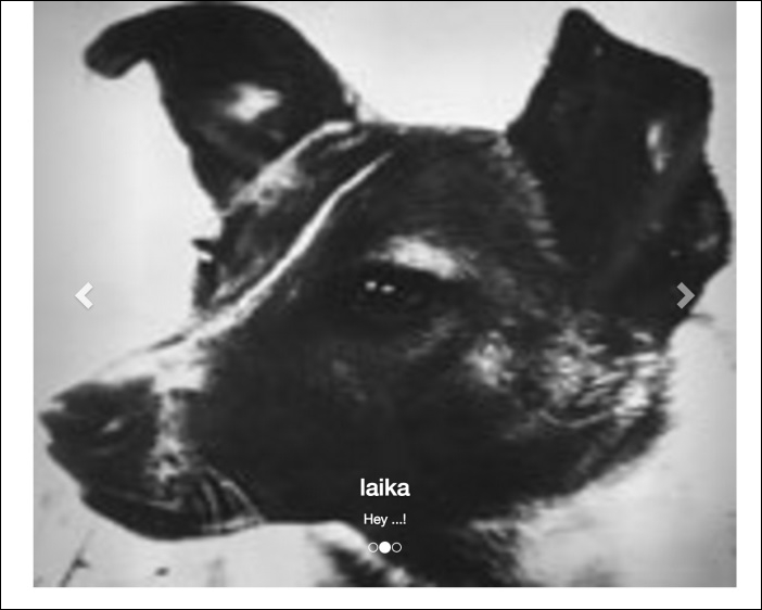
<div id="carousel-notification" class="bootstrap-carousel" data-indicators="true" data-controls="true">
  <img src="imgs/doge.jpg" data-title="doge" data-content="Hey there!">
  <img src="imgs/laika.jpg" data-title="laika" data-content="Hey ...!">
  <img src="imgs/cat.jpg" data-title="cat">
</div>
In our plugin JavaScript, we have to ignite the prototype by calling the init function like this:
var BootstrapCarousel   = function (element, options) {
  this.$element = $(element);
  this.options = $.extend({}, BootstrapCarousel.DEFAULTS, options);

  this.init();
}
Hooray! Open the HTML file in our browser and see the plugin in action, as shown in the next screenshot. In the DOM, you can how we perfectly mime the Bootstrap Carousel plugin, reducing the declaration in almost 35 lines of code:
The initialize method and plugin verifications
Actually, we have only one requirement from the Bootstrap original carousel plugin: the outmost div must have an id. Let's create the init function while making this assertion:
BootstrapCarousel.prototype = {
  init: function () {
    if(!this.$element.attr('id')){
      throw 'You must provide an id for the Bootstrap Carousel element.';
    }

    this.$element.addClass('slide carousel');
  }
};
Therefore, we check if the element has the attribute id using this.$element.attr('id'). If not, we throw an error to the console and the developer will properly fix this issue. Note that we can access the plugin element using this.$element because we made this assignment at the start of the plugin.
In the last line of the function, we added some classes needed for the Bootstrap Carousel, in case we do not have it in the $element such as .slide and .carousel.
To load the Bootstrap Carousel template, let's create another function called load inside the init method to start it:
BootstrapCarousel.prototype = {
  init: function () {
    if(!this.$element.attr('id')){
      throw 'You must provide an id for the Bootstrap Carousel element.';
    }

    this.$slides = this.$element.find('> img');
    this.$element.addClass('slide carousel');
    this.load();
  }

  load: function() {
  },
};
First, we must remove any Carousel elements that could be already present inside our $element. The elements that we must remove are the ones with the .carousel-inner, .carousel-indicators, and .carousel-control classes. Also, we have to load and hide the slide images in the variable this.$slides:
load: function() {
  // removing Carousel elements
  this.$element.find('.carousel-inner, .carousel-indicators, .carousel-control').remove();

  // loading and hiding the slide images
  this.$slides = this.$element.find('> img');
  this.$slides.hide();
},
Next, we must make sure that there are not any other associations of Bootstrap Carousel in our plugin element. Append the following lines in the function:
this.$element.carousel('pause');
this.$element.removeData('bs.carousel');
First, we will pause the Carousel to stop any interaction and after use the function removeData in the bs.carousel, which is the name of the Carousel plugin.
To continue, we must load the Bootstrap Carousel template. Inside the class prototype, we have to create a variable to hold the original template. The variable will have the following format:
template: {
  slide: '…',
  carouselInner: '…',
  carouselItem: '…',
  carouselIndicator: '…',
  carouselIndicatorItem: '…',
  carouselControls: '…',
},
We are not going to place the full code of each template because it is quite extensive, and it would be better to you to check the full code attached with the book and see each template. Although there are no secrets in the templates, they are just a big string with some marked parts that we will replace. The marked parts are defined as a string around curly brackets, for example, {keyName}. When creating the template, we just need to replace these parts of the string by calling .replace(/{keyName}/, 'value').
Each key inside the template correspond to a certain part of the template. Let's explain each one:
slide: This is the slide template of the new plugin and it is used to add slides via JavaScriptcarouselInner: This is the element inside the carousel that is parent for the itemscarouselItem: This is the item that contains the image and the caption of a slidecarouselIndicator: This is the set of bullets at the bottom of the carouselcarouselIndicatorItem: This represents each bullet of the indicatorcarouselControls: This is the controls to switch between left and right the carousel slides
At the end of the load method, add two more lines:
load: function() {
  this.$element.find('.carousel-inner, .carousel-indicators, .carousel-control').remove();
  this.$slides = this.$element.find('> img');
  this.$slides.hide();

  this.$element.carousel('pause');
  this.$element.removeData('bs.carousel');

  this.$element.append(this.createCarousel());
  this.initPlugin();
},
So, we will append in the this.$element the template generated in the function createCarousel. After that, we just need to initialize the Bootstrap original Carousel plugin.
The original template will be created in the function createCarousel. It is composed of two steps. The steps are as follows:
- We create the slide deck for the
.carousel-innerelement - Then, we create the indicator and the controls, if needed
Thus, the createCarousel method is composed of the call of these three functions that will append the string template to a variable:
createCarousel: function() {
  var template = '';

  // create slides
  template += this.createSlideDeck();

  // create indicators
  if(this.options.indicators) {
    template += this.createIndicators();
  }

  // create controls
  if(this.options.controls) {
    template += this.createControls();
  }

  return template
},
Note that for the indicator and the controls we made, check before creating the template. We performed a check in the this.options variable to see if the developer passed the argument to add these components or not.
So, we are defining the first two variables of our plugin. They can be passed through data attributes in the element, like data-indicators and data-controls. It defines whether the template will have these elements or not.
The slide deck will be created by the iterating of each this.$slide and loading the image source, the data-title and the data-content in this case. Also, for the first item, we must apply the class .active. The code is as follows:
createSlideDeck: function() {
  var slideTemplate = '',
      slide;

  for (var i = 0; i < this.$slides.length; i++) {
    slide = this.$slides.get(i);

    slideTemplate += this.createSlide(
      i == 0 ? 'active' : '',
      slide.src,
      slide.dataset.title,
      slide.dataset.content
    );
  };

  return this.template.carouselInner.replace(/{innerContent}/, slideTemplate);
},
In each iteration, we are calling another function named createSlide, where we are passing, if the slide is active, the image source, the item title, and the item content. This function will then replace the template using these arguments:
createSlide: function(active, itemImg, itemTitle, itemContent) {
  return this.template.carouselItem
      .replace(/{activeClass}/, active)
      .replace(/{itemImg}/, itemImg)
      .replace(/{itemTitle}/, itemTitle || this.options.defaultTitle)
      .replace(/{itemContent}/, itemContent || this.options.defaultContent);
}
We performed a check for the title and the content. If there is no title or content provided, a default value will be assigned from this.options. Just like the indicators and controls, these options can be passed through data attributes such as data-default-title and data-default-content in the plugin HTML element.
The function
createIndicators is used to create the indicators. In this function, we will perform the same method of the one to create the slide deck. We will create each bullet and then wrap it in the list of .carousel-indicators:
createIndicators: function() {
  var indicatorTemplate = '',
      slide,
      elementId = this.$element.attr('id');

  for (var i = 0; i < this.$slides.length; i++) {
    slide = this.$slides.get(i);

    indicatorTemplate += this.template.carouselIndicatorItem
      .replace(/{elementId}/, elementId)
      .replace(/{slideNumber}/, i)
      .replace(/{activeClass}/, i == 0 ? 'class="active"' : '');
  }

  return this.template.carouselIndicator.replace(/{indicators}/, indicatorTemplate);
},
The only trick here is that each bullet must be enumerated and have a reference to the parent element id. Thus, we made the replacements for each this.$slides and returned the indicator template.
The controls create the arrows to switch slides from left to right. They follow the same methodology as the other templates. Just get a template and replace the keys. This method must be implemented like this:
createControls: function() {
  var elementId = this.$element.attr('id');

  return this.template.carouselControls
    .replace(/{elementId}/g, elementId)
    .replace(/{previousIcon}/, this.options.previousIcon)
    .replace(/{previousText}/, this.options.previousText)
    .replace(/{nextIcon}/, this.options.nextIcon)
    .replace(/{nextText}/, this.options.nextText);
},
Note that in the first replacement for the {elementId}, our regex has an append g. The g on the regex is used to replace all occurrences of the following pattern. If we do not use g, JavaScript will only replace the first attempt. In this template we have two {elementId} keys, using which we replace both at once.
We also have some options passed through plugin initialization for the previous and next icon and the text corresponding to that.
After creating the original template, we must start the original Carousel plugin. We defined a function called initPlugin with the following implementation:
initPlugin: function() {
  this.$element.carousel({
    interval: this.options.interval,
    pause: this.options.pause,
    wrap: this.options.wrap,
    keyboyard: this.options.keyboard
  });
},
It just starts the plugin by calling this.$element.carousel while passing the carousel options on start. The options are loaded just like the others that we presented before. As shown, the options are loaded in the plugin class definition in the following line:
this.options = $.extend({}, BootstrapCarousel.DEFAULTS, options);If any option is passed, it will override the default options present in BootstrapCarousel.DEFAULTS. We must create like this:
BootstrapCarousel.DEFAULTS = {
  indicators: true,
  controls: true,
  defaultTitle: '',
  defaultContent: '',
  nextIcon: 'glyphicon glyphicon-chevron-right',
  nextText: 'Next',
  previousIcon: 'glyphicon glyphicon-chevron-left',
  previousText: 'Previous',
  interval: 5000,
  pause: 'hover',
  wrap: true,
  keyboard: true,
};We are one step away from loading the plugin. To do so, create the following code in the HTML:
<div id="carousel-notification" class="bootstrap-carousel" data-indicators="true" data-controls="true">
  <img src="imgs/doge.jpg" data-title="doge" data-content="Hey there!">
  <img src="imgs/laika.jpg" data-title="laika" data-content="Hey ...!">
  <img src="imgs/cat.jpg" data-title="cat">
</div>
In our plugin JavaScript, we have to ignite the prototype by calling the init function like this:
var BootstrapCarousel   = function (element, options) {
  this.$element = $(element);
  this.options = $.extend({}, BootstrapCarousel.DEFAULTS, options);

  this.init();
}
Hooray! Open the HTML file in our browser and see the plugin in action, as shown in the next screenshot. In the DOM, you can how we perfectly mime the Bootstrap Carousel plugin, reducing the declaration in almost 35 lines of code:
Adding the Bootstrap template
To load the Bootstrap Carousel template, let's create another function called load inside the init method to start it:
BootstrapCarousel.prototype = {
  init: function () {
    if(!this.$element.attr('id')){
      throw 'You must provide an id for the Bootstrap Carousel element.';
    }

    this.$slides = this.$element.find('> img');
    this.$element.addClass('slide carousel');
    this.load();
  }

  load: function() {
  },
};
First, we must remove any Carousel elements that could be already present inside our $element. The elements that we must remove are the ones with the .carousel-inner, .carousel-indicators, and .carousel-control classes. Also, we have to load and hide the slide images in the variable this.$slides:
load: function() {
  // removing Carousel elements
  this.$element.find('.carousel-inner, .carousel-indicators, .carousel-control').remove();

  // loading and hiding the slide images
  this.$slides = this.$element.find('> img');
  this.$slides.hide();
},
Next, we must make sure that there are not any other associations of Bootstrap Carousel in our plugin element. Append the following lines in the function:
this.$element.carousel('pause');
this.$element.removeData('bs.carousel');
First, we will pause the Carousel to stop any interaction and after use the function removeData in the bs.carousel, which is the name of the Carousel plugin.
To continue, we must load the Bootstrap Carousel template. Inside the class prototype, we have to create a variable to hold the original template. The variable will have the following format:
template: {
  slide: '…',
  carouselInner: '…',
  carouselItem: '…',
  carouselIndicator: '…',
  carouselIndicatorItem: '…',
  carouselControls: '…',
},
We are not going to place the full code of each template because it is quite extensive, and it would be better to you to check the full code attached with the book and see each template. Although there are no secrets in the templates, they are just a big string with some marked parts that we will replace. The marked parts are defined as a string around curly brackets, for example, {keyName}. When creating the template, we just need to replace these parts of the string by calling .replace(/{keyName}/, 'value').
Each key inside the template correspond to a certain part of the template. Let's explain each one:
slide: This is the slide template of the new plugin and it is used to add slides via JavaScriptcarouselInner: This is the element inside the carousel that is parent for the itemscarouselItem: This is the item that contains the image and the caption of a slidecarouselIndicator: This is the set of bullets at the bottom of the carouselcarouselIndicatorItem: This represents each bullet of the indicatorcarouselControls: This is the controls to switch between left and right the carousel slides
At the end of the load method, add two more lines:
load: function() {
  this.$element.find('.carousel-inner, .carousel-indicators, .carousel-control').remove();
  this.$slides = this.$element.find('> img');
  this.$slides.hide();

  this.$element.carousel('pause');
  this.$element.removeData('bs.carousel');

  this.$element.append(this.createCarousel());
  this.initPlugin();
},
So, we will append in the this.$element the template generated in the function createCarousel. After that, we just need to initialize the Bootstrap original Carousel plugin.
The original template will be created in the function createCarousel. It is composed of two steps. The steps are as follows:
- We create the slide deck for the
.carousel-innerelement - Then, we create the indicator and the controls, if needed
Thus, the createCarousel method is composed of the call of these three functions that will append the string template to a variable:
createCarousel: function() {
  var template = '';

  // create slides
  template += this.createSlideDeck();

  // create indicators
  if(this.options.indicators) {
    template += this.createIndicators();
  }

  // create controls
  if(this.options.controls) {
    template += this.createControls();
  }

  return template
},
Note that for the indicator and the controls we made, check before creating the template. We performed a check in the this.options variable to see if the developer passed the argument to add these components or not.
So, we are defining the first two variables of our plugin. They can be passed through data attributes in the element, like data-indicators and data-controls. It defines whether the template will have these elements or not.
The slide deck will be created by the iterating of each this.$slide and loading the image source, the data-title and the data-content in this case. Also, for the first item, we must apply the class .active. The code is as follows:
createSlideDeck: function() {
  var slideTemplate = '',
      slide;

  for (var i = 0; i < this.$slides.length; i++) {
    slide = this.$slides.get(i);

    slideTemplate += this.createSlide(
      i == 0 ? 'active' : '',
      slide.src,
      slide.dataset.title,
      slide.dataset.content
    );
  };

  return this.template.carouselInner.replace(/{innerContent}/, slideTemplate);
},
In each iteration, we are calling another function named createSlide, where we are passing, if the slide is active, the image source, the item title, and the item content. This function will then replace the template using these arguments:
createSlide: function(active, itemImg, itemTitle, itemContent) {
  return this.template.carouselItem
      .replace(/{activeClass}/, active)
      .replace(/{itemImg}/, itemImg)
      .replace(/{itemTitle}/, itemTitle || this.options.defaultTitle)
      .replace(/{itemContent}/, itemContent || this.options.defaultContent);
}
We performed a check for the title and the content. If there is no title or content provided, a default value will be assigned from this.options. Just like the indicators and controls, these options can be passed through data attributes such as data-default-title and data-default-content in the plugin HTML element.
The function
createIndicators is used to create the indicators. In this function, we will perform the same method of the one to create the slide deck. We will create each bullet and then wrap it in the list of .carousel-indicators:
createIndicators: function() {
  var indicatorTemplate = '',
      slide,
      elementId = this.$element.attr('id');

  for (var i = 0; i < this.$slides.length; i++) {
    slide = this.$slides.get(i);

    indicatorTemplate += this.template.carouselIndicatorItem
      .replace(/{elementId}/, elementId)
      .replace(/{slideNumber}/, i)
      .replace(/{activeClass}/, i == 0 ? 'class="active"' : '');
  }

  return this.template.carouselIndicator.replace(/{indicators}/, indicatorTemplate);
},
The only trick here is that each bullet must be enumerated and have a reference to the parent element id. Thus, we made the replacements for each this.$slides and returned the indicator template.
The controls create the arrows to switch slides from left to right. They follow the same methodology as the other templates. Just get a template and replace the keys. This method must be implemented like this:
createControls: function() {
  var elementId = this.$element.attr('id');

  return this.template.carouselControls
    .replace(/{elementId}/g, elementId)
    .replace(/{previousIcon}/, this.options.previousIcon)
    .replace(/{previousText}/, this.options.previousText)
    .replace(/{nextIcon}/, this.options.nextIcon)
    .replace(/{nextText}/, this.options.nextText);
},
Note that in the first replacement for the {elementId}, our regex has an append g. The g on the regex is used to replace all occurrences of the following pattern. If we do not use g, JavaScript will only replace the first attempt. In this template we have two {elementId} keys, using which we replace both at once.
We also have some options passed through plugin initialization for the previous and next icon and the text corresponding to that.
After creating the original template, we must start the original Carousel plugin. We defined a function called initPlugin with the following implementation:
initPlugin: function() {
  this.$element.carousel({
    interval: this.options.interval,
    pause: this.options.pause,
    wrap: this.options.wrap,
    keyboyard: this.options.keyboard
  });
},
It just starts the plugin by calling this.$element.carousel while passing the carousel options on start. The options are loaded just like the others that we presented before. As shown, the options are loaded in the plugin class definition in the following line:
this.options = $.extend({}, BootstrapCarousel.DEFAULTS, options);If any option is passed, it will override the default options present in BootstrapCarousel.DEFAULTS. We must create like this:
BootstrapCarousel.DEFAULTS = {
  indicators: true,
  controls: true,
  defaultTitle: '',
  defaultContent: '',
  nextIcon: 'glyphicon glyphicon-chevron-right',
  nextText: 'Next',
  previousIcon: 'glyphicon glyphicon-chevron-left',
  previousText: 'Previous',
  interval: 5000,
  pause: 'hover',
  wrap: true,
  keyboard: true,
};We are one step away from loading the plugin. To do so, create the following code in the HTML:
<div id="carousel-notification" class="bootstrap-carousel" data-indicators="true" data-controls="true">
  <img src="imgs/doge.jpg" data-title="doge" data-content="Hey there!">
  <img src="imgs/laika.jpg" data-title="laika" data-content="Hey ...!">
  <img src="imgs/cat.jpg" data-title="cat">
</div>
In our plugin JavaScript, we have to ignite the prototype by calling the init function like this:
var BootstrapCarousel   = function (element, options) {
  this.$element = $(element);
  this.options = $.extend({}, BootstrapCarousel.DEFAULTS, options);

  this.init();
}
Hooray! Open the HTML file in our browser and see the plugin in action, as shown in the next screenshot. In the DOM, you can how we perfectly mime the Bootstrap Carousel plugin, reducing the declaration in almost 35 lines of code:
Creating the original template
The original template will be created in the function createCarousel. It is composed of two steps. The steps are as follows:
- We create the slide deck for the
.carousel-innerelement - Then, we create the indicator and the controls, if needed
Thus, the createCarousel method is composed of the call of these three functions that will append the string template to a variable:
createCarousel: function() {
  var template = '';

  // create slides
  template += this.createSlideDeck();

  // create indicators
  if(this.options.indicators) {
    template += this.createIndicators();
  }

  // create controls
  if(this.options.controls) {
    template += this.createControls();
  }

  return template
},
Note that for the indicator and the controls we made, check before creating the template. We performed a check in the this.options variable to see if the developer passed the argument to add these components or not.
So, we are defining the first two variables of our plugin. They can be passed through data attributes in the element, like data-indicators and data-controls. It defines whether the template will have these elements or not.
The slide deck will be created by the iterating of each this.$slide and loading the image source, the data-title and the data-content in this case. Also, for the first item, we must apply the class .active. The code is as follows:
createSlideDeck: function() {
  var slideTemplate = '',
      slide;

  for (var i = 0; i < this.$slides.length; i++) {
    slide = this.$slides.get(i);

    slideTemplate += this.createSlide(
      i == 0 ? 'active' : '',
      slide.src,
      slide.dataset.title,
      slide.dataset.content
    );
  };

  return this.template.carouselInner.replace(/{innerContent}/, slideTemplate);
},
In each iteration, we are calling another function named createSlide, where we are passing, if the slide is active, the image source, the item title, and the item content. This function will then replace the template using these arguments:
createSlide: function(active, itemImg, itemTitle, itemContent) {
  return this.template.carouselItem
      .replace(/{activeClass}/, active)
      .replace(/{itemImg}/, itemImg)
      .replace(/{itemTitle}/, itemTitle || this.options.defaultTitle)
      .replace(/{itemContent}/, itemContent || this.options.defaultContent);
}
We performed a check for the title and the content. If there is no title or content provided, a default value will be assigned from this.options. Just like the indicators and controls, these options can be passed through data attributes such as data-default-title and data-default-content in the plugin HTML element.
The function
createIndicators is used to create the indicators. In this function, we will perform the same method of the one to create the slide deck. We will create each bullet and then wrap it in the list of .carousel-indicators:
createIndicators: function() {
  var indicatorTemplate = '',
      slide,
      elementId = this.$element.attr('id');

  for (var i = 0; i < this.$slides.length; i++) {
    slide = this.$slides.get(i);

    indicatorTemplate += this.template.carouselIndicatorItem
      .replace(/{elementId}/, elementId)
      .replace(/{slideNumber}/, i)
      .replace(/{activeClass}/, i == 0 ? 'class="active"' : '');
  }

  return this.template.carouselIndicator.replace(/{indicators}/, indicatorTemplate);
},
The only trick here is that each bullet must be enumerated and have a reference to the parent element id. Thus, we made the replacements for each this.$slides and returned the indicator template.
The controls create the arrows to switch slides from left to right. They follow the same methodology as the other templates. Just get a template and replace the keys. This method must be implemented like this:
createControls: function() {
  var elementId = this.$element.attr('id');

  return this.template.carouselControls
    .replace(/{elementId}/g, elementId)
    .replace(/{previousIcon}/, this.options.previousIcon)
    .replace(/{previousText}/, this.options.previousText)
    .replace(/{nextIcon}/, this.options.nextIcon)
    .replace(/{nextText}/, this.options.nextText);
},
Note that in the first replacement for the {elementId}, our regex has an append g. The g on the regex is used to replace all occurrences of the following pattern. If we do not use g, JavaScript will only replace the first attempt. In this template we have two {elementId} keys, using which we replace both at once.
We also have some options passed through plugin initialization for the previous and next icon and the text corresponding to that.
After creating the original template, we must start the original Carousel plugin. We defined a function called initPlugin with the following implementation:
initPlugin: function() {
  this.$element.carousel({
    interval: this.options.interval,
    pause: this.options.pause,
    wrap: this.options.wrap,
    keyboyard: this.options.keyboard
  });
},
It just starts the plugin by calling this.$element.carousel while passing the carousel options on start. The options are loaded just like the others that we presented before. As shown, the options are loaded in the plugin class definition in the following line:
this.options = $.extend({}, BootstrapCarousel.DEFAULTS, options);If any option is passed, it will override the default options present in BootstrapCarousel.DEFAULTS. We must create like this:
BootstrapCarousel.DEFAULTS = {
  indicators: true,
  controls: true,
  defaultTitle: '',
  defaultContent: '',
  nextIcon: 'glyphicon glyphicon-chevron-right',
  nextText: 'Next',
  previousIcon: 'glyphicon glyphicon-chevron-left',
  previousText: 'Previous',
  interval: 5000,
  pause: 'hover',
  wrap: true,
  keyboard: true,
};We are one step away from loading the plugin. To do so, create the following code in the HTML:
<div id="carousel-notification" class="bootstrap-carousel" data-indicators="true" data-controls="true">
  <img src="imgs/doge.jpg" data-title="doge" data-content="Hey there!">
  <img src="imgs/laika.jpg" data-title="laika" data-content="Hey ...!">
  <img src="imgs/cat.jpg" data-title="cat">
</div>
In our plugin JavaScript, we have to ignite the prototype by calling the init function like this:
var BootstrapCarousel   = function (element, options) {
  this.$element = $(element);
  this.options = $.extend({}, BootstrapCarousel.DEFAULTS, options);

  this.init();
}
Hooray! Open the HTML file in our browser and see the plugin in action, as shown in the next screenshot. In the DOM, you can how we perfectly mime the Bootstrap Carousel plugin, reducing the declaration in almost 35 lines of code:
The slide deck
The slide deck will be created by the iterating of each this.$slide and loading the image source, the data-title and the data-content in this case. Also, for the first item, we must apply the class .active. The code is as follows:
createSlideDeck: function() {
  var slideTemplate = '',
      slide;

  for (var i = 0; i < this.$slides.length; i++) {
    slide = this.$slides.get(i);

    slideTemplate += this.createSlide(
      i == 0 ? 'active' : '',
      slide.src,
      slide.dataset.title,
      slide.dataset.content
    );
  };

  return this.template.carouselInner.replace(/{innerContent}/, slideTemplate);
},
In each iteration, we are calling another function named createSlide, where we are passing, if the slide is active, the image source, the item title, and the item content. This function will then replace the template using these arguments:
createSlide: function(active, itemImg, itemTitle, itemContent) {
  return this.template.carouselItem
      .replace(/{activeClass}/, active)
      .replace(/{itemImg}/, itemImg)
      .replace(/{itemTitle}/, itemTitle || this.options.defaultTitle)
      .replace(/{itemContent}/, itemContent || this.options.defaultContent);
}
We performed a check for the title and the content. If there is no title or content provided, a default value will be assigned from this.options. Just like the indicators and controls, these options can be passed through data attributes such as data-default-title and data-default-content in the plugin HTML element.
The function
createIndicators is used to create the indicators. In this function, we will perform the same method of the one to create the slide deck. We will create each bullet and then wrap it in the list of .carousel-indicators:
createIndicators: function() {
  var indicatorTemplate = '',
      slide,
      elementId = this.$element.attr('id');

  for (var i = 0; i < this.$slides.length; i++) {
    slide = this.$slides.get(i);

    indicatorTemplate += this.template.carouselIndicatorItem
      .replace(/{elementId}/, elementId)
      .replace(/{slideNumber}/, i)
      .replace(/{activeClass}/, i == 0 ? 'class="active"' : '');
  }

  return this.template.carouselIndicator.replace(/{indicators}/, indicatorTemplate);
},
The only trick here is that each bullet must be enumerated and have a reference to the parent element id. Thus, we made the replacements for each this.$slides and returned the indicator template.
The controls create the arrows to switch slides from left to right. They follow the same methodology as the other templates. Just get a template and replace the keys. This method must be implemented like this:
createControls: function() {
  var elementId = this.$element.attr('id');

  return this.template.carouselControls
    .replace(/{elementId}/g, elementId)
    .replace(/{previousIcon}/, this.options.previousIcon)
    .replace(/{previousText}/, this.options.previousText)
    .replace(/{nextIcon}/, this.options.nextIcon)
    .replace(/{nextText}/, this.options.nextText);
},
Note that in the first replacement for the {elementId}, our regex has an append g. The g on the regex is used to replace all occurrences of the following pattern. If we do not use g, JavaScript will only replace the first attempt. In this template we have two {elementId} keys, using which we replace both at once.
We also have some options passed through plugin initialization for the previous and next icon and the text corresponding to that.
After creating the original template, we must start the original Carousel plugin. We defined a function called initPlugin with the following implementation:
initPlugin: function() {
  this.$element.carousel({
    interval: this.options.interval,
    pause: this.options.pause,
    wrap: this.options.wrap,
    keyboyard: this.options.keyboard
  });
},
It just starts the plugin by calling this.$element.carousel while passing the carousel options on start. The options are loaded just like the others that we presented before. As shown, the options are loaded in the plugin class definition in the following line:
this.options = $.extend({}, BootstrapCarousel.DEFAULTS, options);If any option is passed, it will override the default options present in BootstrapCarousel.DEFAULTS. We must create like this:
BootstrapCarousel.DEFAULTS = {
  indicators: true,
  controls: true,
  defaultTitle: '',
  defaultContent: '',
  nextIcon: 'glyphicon glyphicon-chevron-right',
  nextText: 'Next',
  previousIcon: 'glyphicon glyphicon-chevron-left',
  previousText: 'Previous',
  interval: 5000,
  pause: 'hover',
  wrap: true,
  keyboard: true,
};We are one step away from loading the plugin. To do so, create the following code in the HTML:
<div id="carousel-notification" class="bootstrap-carousel" data-indicators="true" data-controls="true">
  <img src="imgs/doge.jpg" data-title="doge" data-content="Hey there!">
  <img src="imgs/laika.jpg" data-title="laika" data-content="Hey ...!">
  <img src="imgs/cat.jpg" data-title="cat">
</div>
In our plugin JavaScript, we have to ignite the prototype by calling the init function like this:
var BootstrapCarousel   = function (element, options) {
  this.$element = $(element);
  this.options = $.extend({}, BootstrapCarousel.DEFAULTS, options);

  this.init();
}
Hooray! Open the HTML file in our browser and see the plugin in action, as shown in the next screenshot. In the DOM, you can how we perfectly mime the Bootstrap Carousel plugin, reducing the declaration in almost 35 lines of code:
The carousel indicators
The function
createIndicators is used to create the indicators. In this function, we will perform the same method of the one to create the slide deck. We will create each bullet and then wrap it in the list of .carousel-indicators:
createIndicators: function() {
  var indicatorTemplate = '',
      slide,
      elementId = this.$element.attr('id');

  for (var i = 0; i < this.$slides.length; i++) {
    slide = this.$slides.get(i);

    indicatorTemplate += this.template.carouselIndicatorItem
      .replace(/{elementId}/, elementId)
      .replace(/{slideNumber}/, i)
      .replace(/{activeClass}/, i == 0 ? 'class="active"' : '');
  }

  return this.template.carouselIndicator.replace(/{indicators}/, indicatorTemplate);
},
The only trick here is that each bullet must be enumerated and have a reference to the parent element id. Thus, we made the replacements for each this.$slides and returned the indicator template.
The controls create the arrows to switch slides from left to right. They follow the same methodology as the other templates. Just get a template and replace the keys. This method must be implemented like this:
createControls: function() {
  var elementId = this.$element.attr('id');

  return this.template.carouselControls
    .replace(/{elementId}/g, elementId)
    .replace(/{previousIcon}/, this.options.previousIcon)
    .replace(/{previousText}/, this.options.previousText)
    .replace(/{nextIcon}/, this.options.nextIcon)
    .replace(/{nextText}/, this.options.nextText);
},
Note that in the first replacement for the {elementId}, our regex has an append g. The g on the regex is used to replace all occurrences of the following pattern. If we do not use g, JavaScript will only replace the first attempt. In this template we have two {elementId} keys, using which we replace both at once.
We also have some options passed through plugin initialization for the previous and next icon and the text corresponding to that.
After creating the original template, we must start the original Carousel plugin. We defined a function called initPlugin with the following implementation:
initPlugin: function() {
  this.$element.carousel({
    interval: this.options.interval,
    pause: this.options.pause,
    wrap: this.options.wrap,
    keyboyard: this.options.keyboard
  });
},
It just starts the plugin by calling this.$element.carousel while passing the carousel options on start. The options are loaded just like the others that we presented before. As shown, the options are loaded in the plugin class definition in the following line:
this.options = $.extend({}, BootstrapCarousel.DEFAULTS, options);If any option is passed, it will override the default options present in BootstrapCarousel.DEFAULTS. We must create like this:
BootstrapCarousel.DEFAULTS = {
  indicators: true,
  controls: true,
  defaultTitle: '',
  defaultContent: '',
  nextIcon: 'glyphicon glyphicon-chevron-right',
  nextText: 'Next',
  previousIcon: 'glyphicon glyphicon-chevron-left',
  previousText: 'Previous',
  interval: 5000,
  pause: 'hover',
  wrap: true,
  keyboard: true,
};We are one step away from loading the plugin. To do so, create the following code in the HTML:
<div id="carousel-notification" class="bootstrap-carousel" data-indicators="true" data-controls="true">
  <img src="imgs/doge.jpg" data-title="doge" data-content="Hey there!">
  <img src="imgs/laika.jpg" data-title="laika" data-content="Hey ...!">
  <img src="imgs/cat.jpg" data-title="cat">
</div>
In our plugin JavaScript, we have to ignite the prototype by calling the init function like this:
var BootstrapCarousel   = function (element, options) {
  this.$element = $(element);
  this.options = $.extend({}, BootstrapCarousel.DEFAULTS, options);

  this.init();
}
Hooray! Open the HTML file in our browser and see the plugin in action, as shown in the next screenshot. In the DOM, you can how we perfectly mime the Bootstrap Carousel plugin, reducing the declaration in almost 35 lines of code:
The carousel controls
The controls create the arrows to switch slides from left to right. They follow the same methodology as the other templates. Just get a template and replace the keys. This method must be implemented like this:
createControls: function() {
  var elementId = this.$element.attr('id');

  return this.template.carouselControls
    .replace(/{elementId}/g, elementId)
    .replace(/{previousIcon}/, this.options.previousIcon)
    .replace(/{previousText}/, this.options.previousText)
    .replace(/{nextIcon}/, this.options.nextIcon)
    .replace(/{nextText}/, this.options.nextText);
},
Note that in the first replacement for the {elementId}, our regex has an append g. The g on the regex is used to replace all occurrences of the following pattern. If we do not use g, JavaScript will only replace the first attempt. In this template we have two {elementId} keys, using which we replace both at once.
We also have some options passed through plugin initialization for the previous and next icon and the text corresponding to that.
After creating the original template, we must start the original Carousel plugin. We defined a function called initPlugin with the following implementation:
initPlugin: function() {
  this.$element.carousel({
    interval: this.options.interval,
    pause: this.options.pause,
    wrap: this.options.wrap,
    keyboyard: this.options.keyboard
  });
},
It just starts the plugin by calling this.$element.carousel while passing the carousel options on start. The options are loaded just like the others that we presented before. As shown, the options are loaded in the plugin class definition in the following line:
this.options = $.extend({}, BootstrapCarousel.DEFAULTS, options);If any option is passed, it will override the default options present in BootstrapCarousel.DEFAULTS. We must create like this:
BootstrapCarousel.DEFAULTS = {
  indicators: true,
  controls: true,
  defaultTitle: '',
  defaultContent: '',
  nextIcon: 'glyphicon glyphicon-chevron-right',
  nextText: 'Next',
  previousIcon: 'glyphicon glyphicon-chevron-left',
  previousText: 'Previous',
  interval: 5000,
  pause: 'hover',
  wrap: true,
  keyboard: true,
};We are one step away from loading the plugin. To do so, create the following code in the HTML:
<div id="carousel-notification" class="bootstrap-carousel" data-indicators="true" data-controls="true">
  <img src="imgs/doge.jpg" data-title="doge" data-content="Hey there!">
  <img src="imgs/laika.jpg" data-title="laika" data-content="Hey ...!">
  <img src="imgs/cat.jpg" data-title="cat">
</div>
In our plugin JavaScript, we have to ignite the prototype by calling the init function like this:
var BootstrapCarousel   = function (element, options) {
  this.$element = $(element);
  this.options = $.extend({}, BootstrapCarousel.DEFAULTS, options);

  this.init();
}
Hooray! Open the HTML file in our browser and see the plugin in action, as shown in the next screenshot. In the DOM, you can how we perfectly mime the Bootstrap Carousel plugin, reducing the declaration in almost 35 lines of code:
Initializing the original plugin
After creating the original template, we must start the original Carousel plugin. We defined a function called initPlugin with the following implementation:
initPlugin: function() {
  this.$element.carousel({
    interval: this.options.interval,
    pause: this.options.pause,
    wrap: this.options.wrap,
    keyboyard: this.options.keyboard
  });
},
It just starts the plugin by calling this.$element.carousel while passing the carousel options on start. The options are loaded just like the others that we presented before. As shown, the options are loaded in the plugin class definition in the following line:
this.options = $.extend({}, BootstrapCarousel.DEFAULTS, options);If any option is passed, it will override the default options present in BootstrapCarousel.DEFAULTS. We must create like this:
BootstrapCarousel.DEFAULTS = {
  indicators: true,
  controls: true,
  defaultTitle: '',
  defaultContent: '',
  nextIcon: 'glyphicon glyphicon-chevron-right',
  nextText: 'Next',
  previousIcon: 'glyphicon glyphicon-chevron-left',
  previousText: 'Previous',
  interval: 5000,
  pause: 'hover',
  wrap: true,
  keyboard: true,
};We are one step away from loading the plugin. To do so, create the following code in the HTML:
<div id="carousel-notification" class="bootstrap-carousel" data-indicators="true" data-controls="true">
  <img src="imgs/doge.jpg" data-title="doge" data-content="Hey there!">
  <img src="imgs/laika.jpg" data-title="laika" data-content="Hey ...!">
  <img src="imgs/cat.jpg" data-title="cat">
</div>
In our plugin JavaScript, we have to ignite the prototype by calling the init function like this:
var BootstrapCarousel   = function (element, options) {
  this.$element = $(element);
  this.options = $.extend({}, BootstrapCarousel.DEFAULTS, options);

  this.init();
}
Hooray! Open the HTML file in our browser and see the plugin in action, as shown in the next screenshot. In the DOM, you can how we perfectly mime the Bootstrap Carousel plugin, reducing the declaration in almost 35 lines of code:
Making the plugin alive
We are one step away from loading the plugin. To do so, create the following code in the HTML:
<div id="carousel-notification" class="bootstrap-carousel" data-indicators="true" data-controls="true">
  <img src="imgs/doge.jpg" data-title="doge" data-content="Hey there!">
  <img src="imgs/laika.jpg" data-title="laika" data-content="Hey ...!">
  <img src="imgs/cat.jpg" data-title="cat">
</div>
In our plugin JavaScript, we have to ignite the prototype by calling the init function like this:
var BootstrapCarousel   = function (element, options) {
  this.$element = $(element);
  this.options = $.extend({}, BootstrapCarousel.DEFAULTS, options);

  this.init();
}
Hooray! Open the HTML file in our browser and see the plugin in action, as shown in the next screenshot. In the DOM, you can how we perfectly mime the Bootstrap Carousel plugin, reducing the declaration in almost 35 lines of code:
We are almost finishing our plugin. Now, it's time to add some methods to be called in the plugin, just like you can call .carousel('pause') on Bootstrap Carousel for instance.
When we were creating the plugin base, we created a class Plugin, which is the definition of the plugin. This part of the code is pretty common across the plugins and it is used on every native Bootstrap plugin:
function Plugin(option) {

  var args = arguments;
  [].shift.apply(args);

  return this.each(function () {
    var $this = $(this),
        data  = $this.data('bootstrap-carousel'),
        options = $.extend({}, BootstrapCarousel.DEFAULTS, $this.data(), typeof option == 'object' && option),
        value;

    if (!data) {
      $this.data('bootstrap-carousel', (data = new BootstrapCarousel(this, options)));
    }

    if (typeof option == 'string') {
      if (data[option] instanceof Function) {
        value = data[option].apply(data, args);
      } else {
        value = data.options[option];
      }
    }
  })
}
If you take a look at the highlighted lines of code, here we check the option variable that is passed. If it is a string, we apply the function, calling the option function on the plugin.
After that, we need to expose the function of the BootstrapCarousel class definition. So let's add two options, one to reload the plugin and another to add a slide to the carousel:
var BootstrapCarousel   = function (element, options) {
  this.$element = $(element);
  this.options = $.extend({}, BootstrapCarousel.DEFAULTS, options);

  // Expose public methods
  this.addSlide = BootstrapCarousel.prototype.addSlide;
  this.reload = BootstrapCarousel.prototype.load;

  this.init();
}
The highlighted lines represent the exposed methods. Now we need to implement them on the prototype.
Although one of the methods has already been implemented, the BootstrapCarousel.prototype.load when exposing it we renamed the expose from load to reload. Calling this method will erase all the Bootstrap Carousel original plugin, create the template again based on the images passed through our plugin, and generate the plugin again.
We need to implement the method BootstrapCarousel.prototype.addSlide. So, inside Bootstrap.prototype, create the following function:
addSlide: function(itemImg, itemTitle, itemContent) {
  var newSlide = this.template.slide
    .replace(/{itemImg}/, itemImg)
    .replace(/{itemTitle}/, itemTitle)
    .replace(/{itemContent}/, itemContent);
  this.$element.append(newSlide);
  this.load();
},
This function will receive itemImg, which is the source of an image; itemTitle, for the slide title caption; and itemContent for the paragraph on the caption as well.
To create a new slide, we first use the template for a new one that can be found in the template variable this.template.slide:
template: {
      slide: '<img class="hide" src="{itemImg}" data-title="{itemTitle}" data-content="{itemContent}">',
… // others template variable
}
Like creating the slide deck, indicators, and controls, we set a multiple keys identified around curly brackets and do a replace of them in the function.
After the replacements, the new slide is appended to this.$element, which also contains the others slides. Finally, we need to call the load function, which will do all the hard work to assign variables, hide elements, and start the original plugin.
Then, when you want to add a slide to the plugin, you just need to call:
$('.bootstrap-carousel').bCarousel('addSlide', 'imgs/jon.png', 'New title image', 'This is awesome!');With this plugin function, we are done! See, it is not too difficult to create a new plugin. We can now start incrementing it with more options for automation and customization.
In my opinion, this last chapter was awesome! We saw more about Bootstrap customization in terms of both components style and plugin interaction. Bootstrap is a great framework, but what makes it great is the extensibility potential that it has. It matches the perfect world where premade components and customization live in symbiosis.
To finish the book with a flourish, we developed a new Bootstrap plugin, the wrapper for Bootstrap Carousel. The plugin contemplates almost every pattern for the Bootstrap plugin, and it has been very helpful in creating a simple carousel with minimal verbosity.
The plugin is available on GitHub at github.com/silviomoreto/bootstrap-carousel. Take a look at it and create a pull-request! There are a bunch of improvements and new features that could be added to the plugin—perhaps a method to remove slides?
Also, the goal of creating a plugin is to make you able to create a new one in the future or understand a Bootstrap plugin if you need to adjust some part of it. I think you can now see the plugin's code with more familiarity and improve them.
I would like to congratulate you for reaching the end of the book. Understanding a complete framework such as Bootstrap is not a simple task and it is completed by just a small group of developers in the world. Be proud of your achievement.
The understanding of the plugin goes from the basic usage of the scaffolding from the creation of a plugin to the components, elements, and more. All of that was achieved using very useful examples that will be useful some day in your work.
The cherry on top of the pie is that you also learned about Bootstrap 4, which was released recently. This means you are one of the few people who are completely ready to use the new version of the Bootstrap framework.
I hope you liked the journey through the world of Bootstrap and were able to learn a lot from this book. Now it is your turn! You must go and nail every frontend Bootstrap task that you face. I believe that with all the knowledge acquired from the examples covered in this book, you are more than ready to be a true Bootstrap master.