
A breakpoint is used by Material-UI to determine at what point to break the flow of content on the screen and continue it on the next line. Understanding how to apply breakpoints with Grid components is fundamental to implementing layouts in Material-UI applications.
Applying breakpoints
How to do it...
Let's say that you have four elements that you want to lay out on the screen so that they're evenly spaced and occupy all available horizontal space. The code for this is as follows:
import React from 'react';
import { withStyles } from '@material-ui/core/styles';
import Paper from '@material-ui/core/Paper';
import Grid from '@material-ui/core/Grid';

const styles = theme => ({
  root: {
    flexGrow: 1
  },
  paper: {
    padding: theme.spacing(2),
    textAlign: 'center',
    color: theme.palette.text.secondary
  }
});

const UnderstandingBreakpoints = withStyles(styles)(({ classes }) => (
  <div className={classes.root}>
    <Grid container spacing={4}>
      <Grid item xs={12} sm={6} md={3}>
        <Paper className={classes.paper}>xs=12 sm=6 md=3</Paper>
      </Grid>
      <Grid item xs={12} sm={6} md={3}>
        <Paper className={classes.paper}>xs=12 sm=6 md=3</Paper>
      </Grid>
      <Grid item xs={12} sm={6} md={3}>
        <Paper className={classes.paper}>xs=12 sm=6 md=3</Paper>
      </Grid>
      <Grid item xs={12} sm={6} md={3}>
        <Paper className={classes.paper}>xs=12 sm=6 md=3</Paper>
      </Grid>
    </Grid>
  </div>
));

export default UnderstandingBreakpoints;
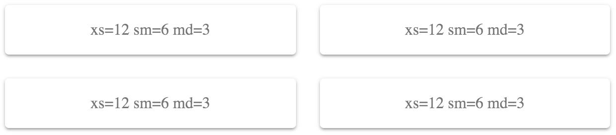
This renders four Paper components. The labels indicate the values used for the xs, sm, and md properties. Here's what the result looks like:
How it works...
Each of the breakpoint properties that you can pass to Grid components correspond to screen widths, as follows:
- xs >= 0px
- sm >= 600px
- md >= 960px
- lg >= 1280px
- xl >= 1920px
The screen shown previously had a pixel width of 725, which means that the Grid components used the sm breakpoint. The value passed to this property was 6. This can be a number from 1 to 12 and defines how many items will fit into the grid. This can be confusing, so it's helpful to think of these numbers in terms of percentages. For example, 6 would be 50% and, as the preceding screenshot shows, the Grid items take up 50% of the width.
For example, let's say that you want the width of each Grid item to take up 75% of the screen width when the small breakpoint is active. You could set the sm value to 9 (9/12 = 0.75), as follows:
<div className={classes.root}>
  <Grid container spacing={4}>
    <Grid item xs={12} sm={9} md={3}>
      <Paper className={classes.paper}>xs=12 sm=9 md=3</Paper>
    </Grid>
    <Grid item xs={12} sm={9} md={3}>
      <Paper className={classes.paper}>xs=12 sm=9 md=3</Paper>
    </Grid>
    <Grid item xs={12} sm={9} md={3}>
      <Paper className={classes.paper}>xs=12 sm=9 md=3</Paper>
    </Grid>
    <Grid item xs={12} sm={9} md={3}>
      <Paper className={classes.paper}>xs=12 sm=9 md=3</Paper>
    </Grid>
  </Grid>
</div>
Here's the result when the screen width is still at 725 pixels:
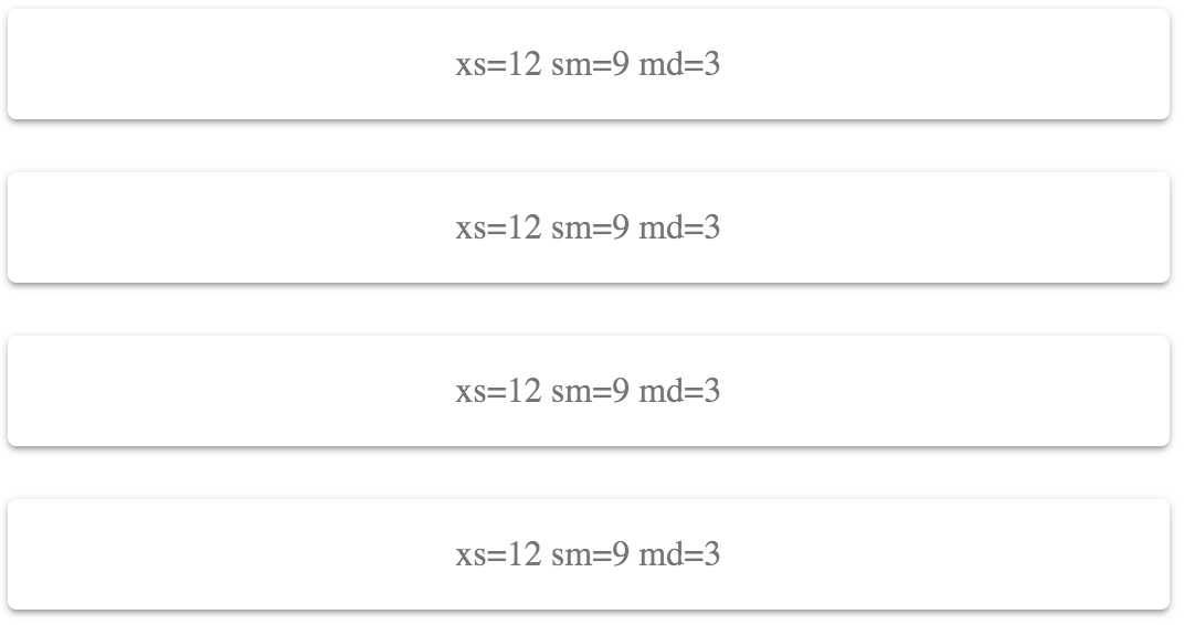
This combination of screen width and breakpoint value isn't optimal – there's a lot of wasted space to the right. By experimenting, you could make the sm value greater so that there's less wasted space, or you could make the value smaller so that more items fit on the row. For example, 6 looked better because exactly 2 items fit on the screen.
Let's take the screen width down to 575 pixels. This will activate the xs breakpoint with a value of 12 (100%):
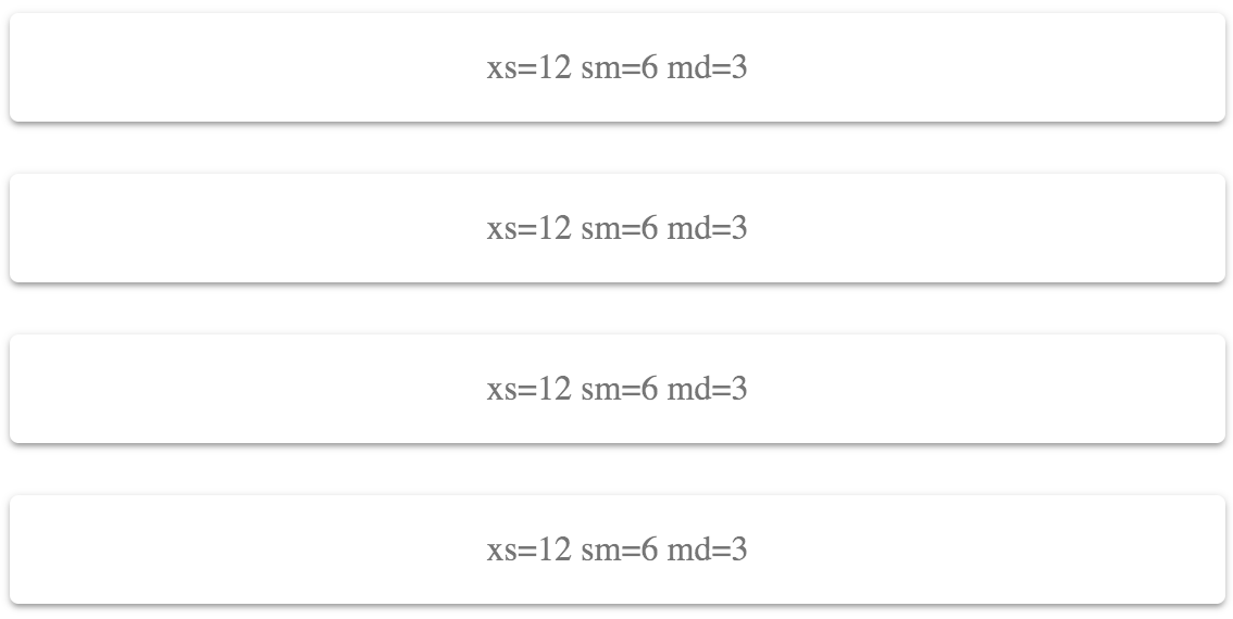
This layout works on smaller screens, because it doesn't try to fit too many grid items on one row.
There's more...
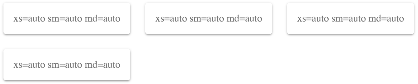
You can use the auto value for every breakpoint value if you're unsure of which value to use:
<div className={classes.root}>
  <Grid container spacing={4}>
    <Grid item xs="auto" sm="auto" md="auto">
      <Paper className={classes.paper}>
        xs=auto sm=auto md=auto
      </Paper>
    </Grid>
    <Grid item xs="auto" sm="auto" md="auto">
      <Paper className={classes.paper}>
        xs=auto sm=auto md=auto
      </Paper>
    </Grid>
    <Grid item xs="auto" sm="auto" md="auto">
      <Paper className={classes.paper}>
        xs=auto sm=auto md=auto
      </Paper>
    </Grid>
    <Grid item xs="auto" sm="auto" md="auto">
      <Paper className={classes.paper}>
        xs=auto sm=auto md=auto
      </Paper>
    </Grid>
  </Grid>
</div>
This will try to fit as many items as possible on each row. As the screen size changes, items are rearranged so that they fit on the screen accordingly. Here's what this looks like at a screen width of 725 pixels:
I would recommend replacing auto with a value from 1–12 at some point. The auto value is good enough that you can get started on other things without worrying too much about layout, but it's far from perfect for your production app. At least by setting up auto this way, you have all of your Grid components and breakpoint properties in place. You just need to play with the numbers until everything looks good.
See also
- Grid API documentation: https://material-ui.com/api/grid/
- Grid demos: https://material-ui.com/layout/grid/
- Breakpoint documentation: https://material-ui.com/layout/breakpoints/