
With some layouts, it is impossible to have your grid items occupy the entire width of the screen. Using the justify property, you can control how grid items fill the available space in the row.
Filling space
How to do it...
Let's say that you have four Paper components to render in a grid. Inside each of these Paper components, you have three Chip components, which are nested grid items.
Here's what the code looks like:
import React from 'react';

import { withStyles } from '@material-ui/core/styles';
import Paper from '@material-ui/core/Paper';
import Grid from '@material-ui/core/Grid';
import Chip from '@material-ui/core/Chip';

const styles = theme => ({
  root: {
    flexGrow: 1
  },
  paper: {
    padding: theme.spacing(2),
    textAlign: 'center',
    color: theme.palette.text.secondary
  }
});

const FillingSpace = withStyles(styles)(({ classes, justify }) => (
  <div className={classes.root}>
    <Grid container spacing={4}>
      <Grid item xs={12} sm={6} md={3}>
        <Paper className={classes.paper}>
          <Grid container justify={justify}>
            <Grid item>
              <Chip label="xs=12" />
            </Grid>
            <Grid item>
              <Chip label="sm=6" />
            </Grid>
            <Grid item>
              <Chip label="md=3" />
            </Grid>
          </Grid>
        </Paper>
      </Grid>
    </Grid>
  </div>
));

export default FillingSpace;
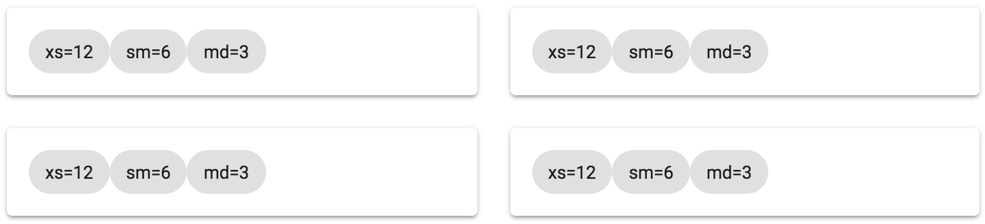
The justify property is specified on container Grid components. In this example, it's the container that contains the Chip components as items. Each container is using the flex-start value, which will align the Grid items at the start of the container. The result is as follows:
How it works...
The flex-start value of the justify property aligns all of the Grid items at the start of the container. In this case, the three Chip components in each of the four containers are all crammed to the left of the row. None of the space to the left of the items is filled. Instead of changing the breakpoint property values of these items, which results in changed widths, you can change the justify property value to tell the Grid container how to fill empty spaces.
For example, you could use the center value to align Grid items in the center of the container as follows:
<div className={classes.root}>
  <Grid container spacing={4}>
    <Grid item xs={12} sm={6} md={3}>
      <Paper className={classes.paper}>
        <Grid container justify="center">
          <Grid item>
            <Chip label="xs=12" />
          </Grid>
          <Grid item>
            <Chip label="sm=6" />
          </Grid>
          <Grid item>
            <Chip label="md=3" />
          </Grid>
        </Grid>
      </Paper>
    </Grid>
  </Grid>
</div>
The following screenshot shows what this change to the justify property value results in:
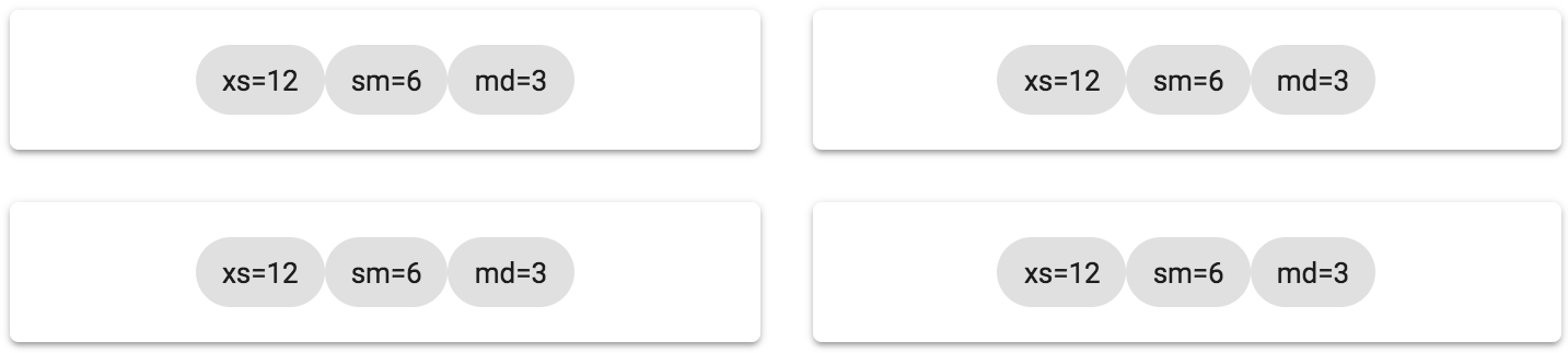
This does a good job of evenly distributing the empty space to the left and right of the Grid items. But the items still feel crowded because there's no space in between them. Here's what it looks like if you use the space-around value of the justify property:
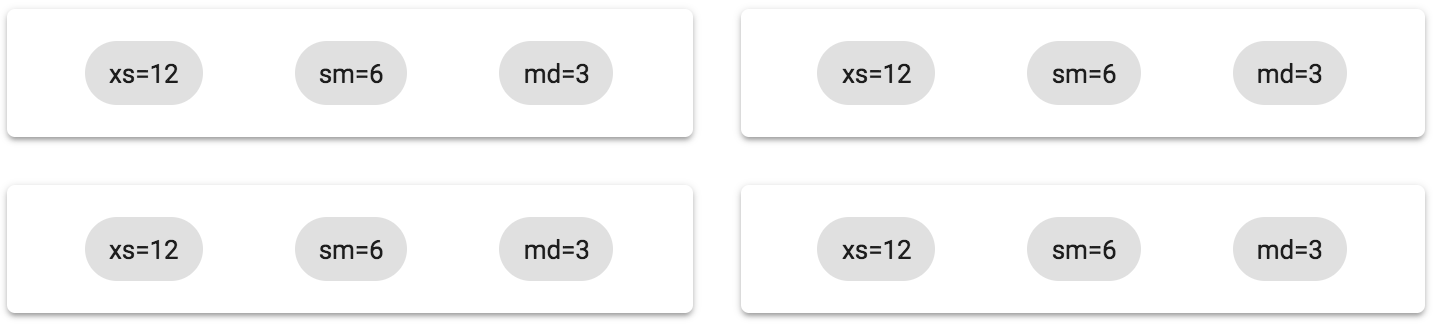
This value does the best job of filling all the available space in the Grid container, without having to change the width of the Grid items.
There's more...
A variation on the space-around value is the space-between value. The two are similar in that they're effective at filling all of the space in the row. Here's what the example in the preceding section looks like using space-between:
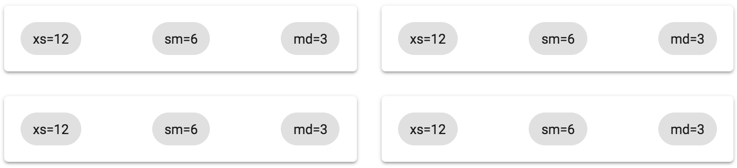
All of the excess space in the row goes in between the Grid items instead of around them. In other words, use this value when you want to make sure that there's no empty space to the left and right of each row.
See also
- Grid demos: https://material-ui.com/layout/grid/
- Grid API documentation: https://material-ui.com/api/grid/