
You have lots of screens in your app, each with lots of Grid components, used to create complex layouts. Trying to read source code that has a ton of <Grid> elements in it can be daunting. Especially when a Grid component is used for both containers and for items.
Abstracting containers and items
How to do it...
The container or the item property of Grid components determines the role of the element. You can create two components that use these properties and create an element name that's easier to read when you have lots of layout components:
import React from 'react';

import { withStyles } from '@material-ui/core/styles';
import Paper from '@material-ui/core/Paper';
import Grid from '@material-ui/core/Grid';

const styles = theme => ({
  root: {
    flexGrow: 1
  },
  paper: {
    padding: theme.spacing(2),
    textAlign: 'center',
    color: theme.palette.text.secondary
  }
});

const Container = props => <Grid container {...props} />;
const Item = props => <Grid item {...props} />;

const AbstractingContainersAndItems = withStyles(styles)(
  ({ classes }) => (
    <div className={classes.root}>
      <Container spacing={4}>
        <Item xs={12} sm={6} md={3}>
          <Paper className={classes.paper}>xs=12 sm=6 md=3</Paper>
        </Item>
        <Item xs={12} sm={6} md={3}>
          <Paper className={classes.paper}>xs=12 sm=6 md=3</Paper>
        </Item>
        <Item xs={12} sm={6} md={3}>
          <Paper className={classes.paper}>xs=12 sm=6 md=3</Paper>
        </Item>
        <Item xs={12} sm={6} md={3}>
          <Paper className={classes.paper}>xs=12 sm=6 md=3</Paper>
        </Item>
      </Container>
    </div>
  )
);

export default AbstractingContainersAndItems;
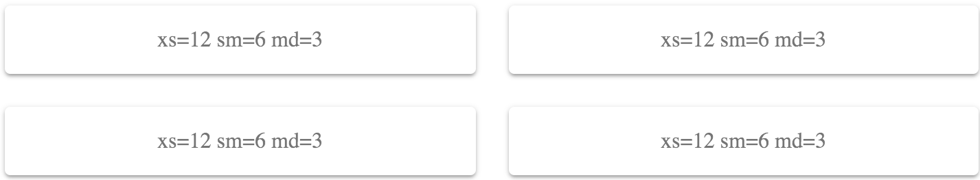
Here's what the resulting layout looks like:
How it works...
Let's take a closer look at the Container and Item components:
const Container = props => <Grid container {...props} />;
const Item = props => <Grid item {...props} />;
The Container component renders a Grid component with the container property set to true, and the Item component does the same, except with the item property set to true. Each component passes any additional properties to the Grid component, such as xs and sm breakpoints.
When you have lots of Grid containers and items that make up your layout, being able to see the difference between <Container> and <Item> elements makes your code that much easier to read. Contrast this with having <Grid> elements everywhere.
There's more...
If you find that you're using the same breakpoints over and over in your layouts, you can include them in in your higher-order Item component. Let's rewrite the example so that, in addition to the Item property, the xs, sm, and md properties are included as well:
const Container = props => <Grid container {...props} />;
const Item = props => <Grid item xs={12} sm={6} md={3} {...props} />;

const AbstractingContainersAndItems = withStyles(styles)(
  ({ classes }) => (
    <div className={classes.root}>
      <Container spacing={4}>
        <Item>
          <Paper className={classes.paper}>xs=12 sm=6 md=3</Paper>
        </Item>
        <Item>
          <Paper className={classes.paper}>xs=12 sm=6 md=3</Paper>
        </Item>
        <Item>
          <Paper className={classes.paper}>xs=12 sm=6 md=3</Paper>
        </Item>
        <Item>
          <Paper className={classes.paper}>xs=12 sm=6 md=3</Paper>
        </Item>
      </Container>
    </div>
  )
);
Now, instead of four instances of <Item xs={12} sm={6} md={3}>, you have four instances of <Item>. Component abstractions are a great tool for removing excess syntax from your JavaScript XML (JSX) markup.
Any time you need to override any of the breakpoint properties that you've set in the Item component, you just need to pass the property to Item. For example, if you have a specific case where you need md to be 6, you can just write <Item md={6}>. This works because, in the Item component, {...props} is passed after the default values, meaning that they override any properties with the same name.
See also
- Grid demos: https://material-ui.com/layout/grid/
- Grid API documentation: https://material-ui.com/api/grid/