
When you use Grid components to build your layout, they often result in changes to your layout, depending on your breakpoint settings and the width of the screen. For example, if the user makes the browser window smaller, your layout might change from two columns to three. There might be times, however, when you would prefer a fixed number of columns, and that the width of each column changes in response to the screen size.
Fixed column layout
How to do it...
Let's say that you have eight Paper components that you want to render, but you also want to make sure that there are no more than four columns. Use the following code to do this:
import React from 'react';

import { withStyles } from '@material-ui/core/styles';
import Paper from '@material-ui/core/Paper';
import Grid from '@material-ui/core/Grid';

const styles = theme => ({
  root: {
    flexGrow: 1
  },
  paper: {
    padding: theme.spacing(2),
    textAlign: 'center',
    color: theme.palette.text.secondary
  }
});

const FixedColumnLayout = withStyles(styles)(({ classes, width }) => (
  <div className={classes.root}>
    <Grid container spacing={4}>
      <Grid item xs={width}>
        <Paper className={classes.paper}>xs={width}</Paper>
      </Grid>
      <Grid item xs={width}>
        <Paper className={classes.paper}>xs={width}</Paper>
      </Grid>
      <Grid item xs={width}>
        <Paper className={classes.paper}>xs={width}</Paper>
      </Grid>
      <Grid item xs={width}>
        <Paper className={classes.paper}>xs={width}</Paper>
      </Grid>
      <Grid item xs={width}>
        <Paper className={classes.paper}>xs={width}</Paper>
      </Grid>
      <Grid item xs={width}>
        <Paper className={classes.paper}>xs={width}</Paper>
      </Grid>
      <Grid item xs={width}>
        <Paper className={classes.paper}>xs={width}</Paper>
      </Grid>
      <Grid item xs={width}>
        <Paper className={classes.paper}>xs={width}</Paper>
      </Grid>
    </Grid>
  </div>
));

export default FixedColumnLayout;
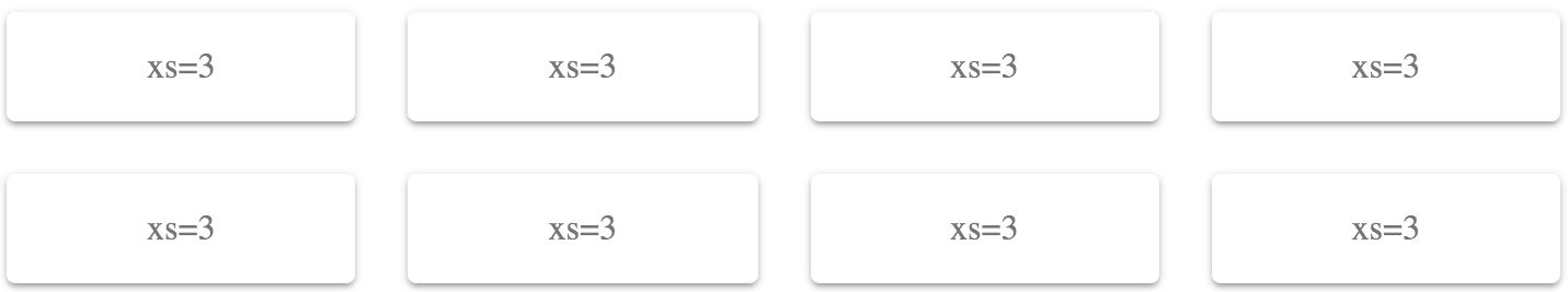
Here's what the result looks like with a pixel width of 725:
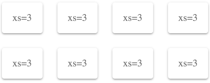
Here's what the result looks like with a pixel width of 350:
How it works...
If you want a fixed number of columns, you should only specify the xs breakpoint property. In this example, 3 is 25% of the screen width – or 4 columns. This will never change because xs is the smallest breakpoint there is. Anything larger is applied to xs as well, unless you specify a larger breakpoint.
Let's say that you want two columns. You can set the xs value to 6 as follows:
<div className={classes.root}>
  <Grid container spacing={4}>
    <Grid item xs={6}>
      <Paper className={classes.paper}>xs=6</Paper>
    </Grid>
    <Grid item xs={6}>
      <Paper className={classes.paper}>xs=6</Paper>
    </Grid>
    <Grid item xs={6}>
      <Paper className={classes.paper}>xs=6</Paper>
    </Grid>
    <Grid item xs={6}>
      <Paper className={classes.paper}>xs=6</Paper>
    </Grid>
    <Grid item xs={6}>
      <Paper className={classes.paper}>xs=6</Paper>
    </Grid>
    <Grid item xs={6}>
      <Paper className={classes.paper}>xs=6</Paper>
    </Grid>
    <Grid item xs={6}>
      <Paper className={classes.paper}>xs=6</Paper>
    </Grid>
    <Grid item xs={6}>
      <Paper className={classes.paper}>xs=6</Paper>
    </Grid>
  </Grid>
</div>
Here's what the result looks like at a pixel screen width of 960:
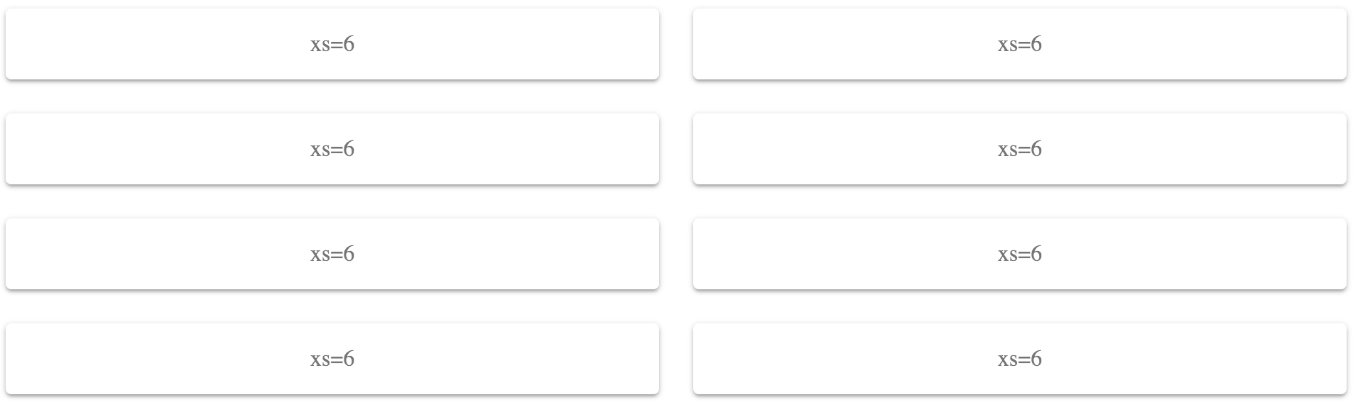
Because you've set the xs value to 6 (50%), these Grid items will only ever use two columns. The items themselves will change their width to accommodate the screen width, rather than changing the number of items per row.
There's more...
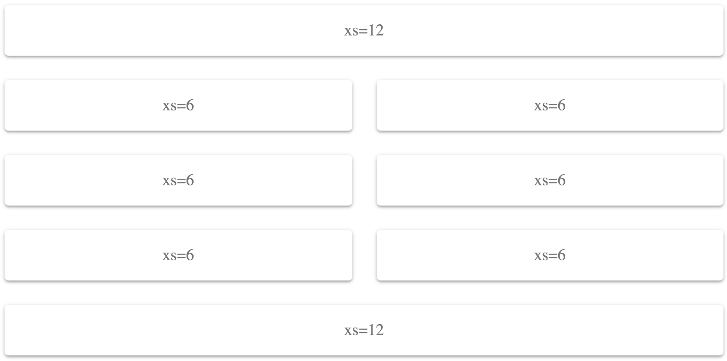
You can combine different widths in a fixed way. For example, you could have header and footer Grid items that use a full-width layout, while the Grid items in between use two columns:
<div className={classes.root}>
  <Grid container spacing={4}>
    <Grid item xs={12}>
      <Paper className={classes.paper}>xs=12</Paper>
    </Grid>
    <Grid item xs={6}>
      <Paper className={classes.paper}>xs=6</Paper>
    </Grid>
    <Grid item xs={6}>
      <Paper className={classes.paper}>xs=6</Paper>
    </Grid>
    <Grid item xs={6}>
      <Paper className={classes.paper}>xs=6</Paper>
    </Grid>
    <Grid item xs={6}>
      <Paper className={classes.paper}>xs=6</Paper>
    </Grid>
    <Grid item xs={6}>
      <Paper className={classes.paper}>xs=6</Paper>
    </Grid>
    <Grid item xs={6}>
      <Paper className={classes.paper}>xs=6</Paper>
    </Grid>
    <Grid item xs={12}>
      <Paper className={classes.paper}>xs=12</Paper>
    </Grid>
  </Grid>
</div>
The first and last Grid components have an xs value of 12 (100%), while the other Grid items have xs values of 6 (50%) for a two-column layout. Here's what the result looks like at a pixel width of 725:
See also
- Grid demos: https://material-ui.com/layout/grid/
- Grid API documentation: https://material-ui.com/api/grid/