
The next sample course you will see is not part of the download that comes with this book. Instead, you will use one of the sample applications that is included in Captivate. Use the following steps to open it:
- Close every open file (without saving) and return to the Captivate Welcome screen.
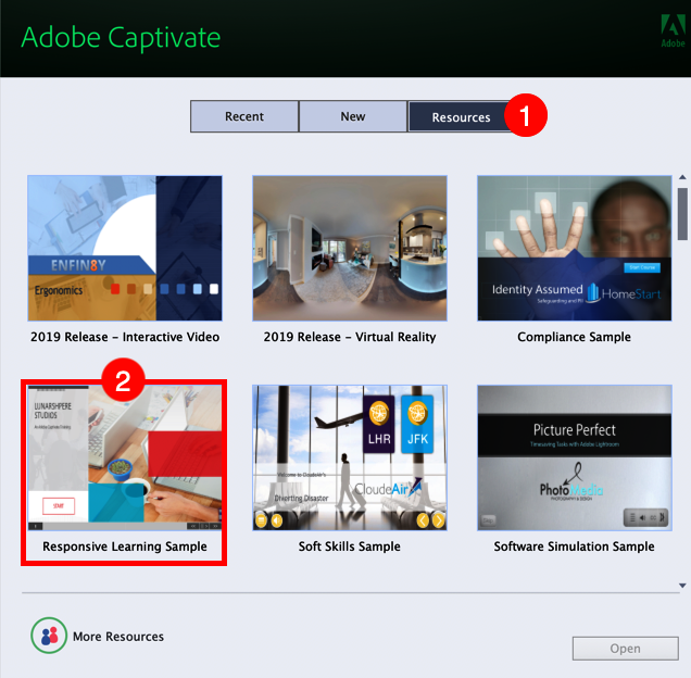
- Click the Resources tab of the Captivate Welcome screen (see 1 on the following screenshot).
As shown in the following screenshot, you can access various sample files and tutorials right from the Welcome Screen of Captivate:
You will now open one of the sample files provided by Adobe.
- Double-click the thumbnail image on the Welcome Screen to open the Responsive Learning Sample project (see 2 in the preceding screenshot).
- Click OK to clear the message telling you that there are lots of unused assets in the Library.
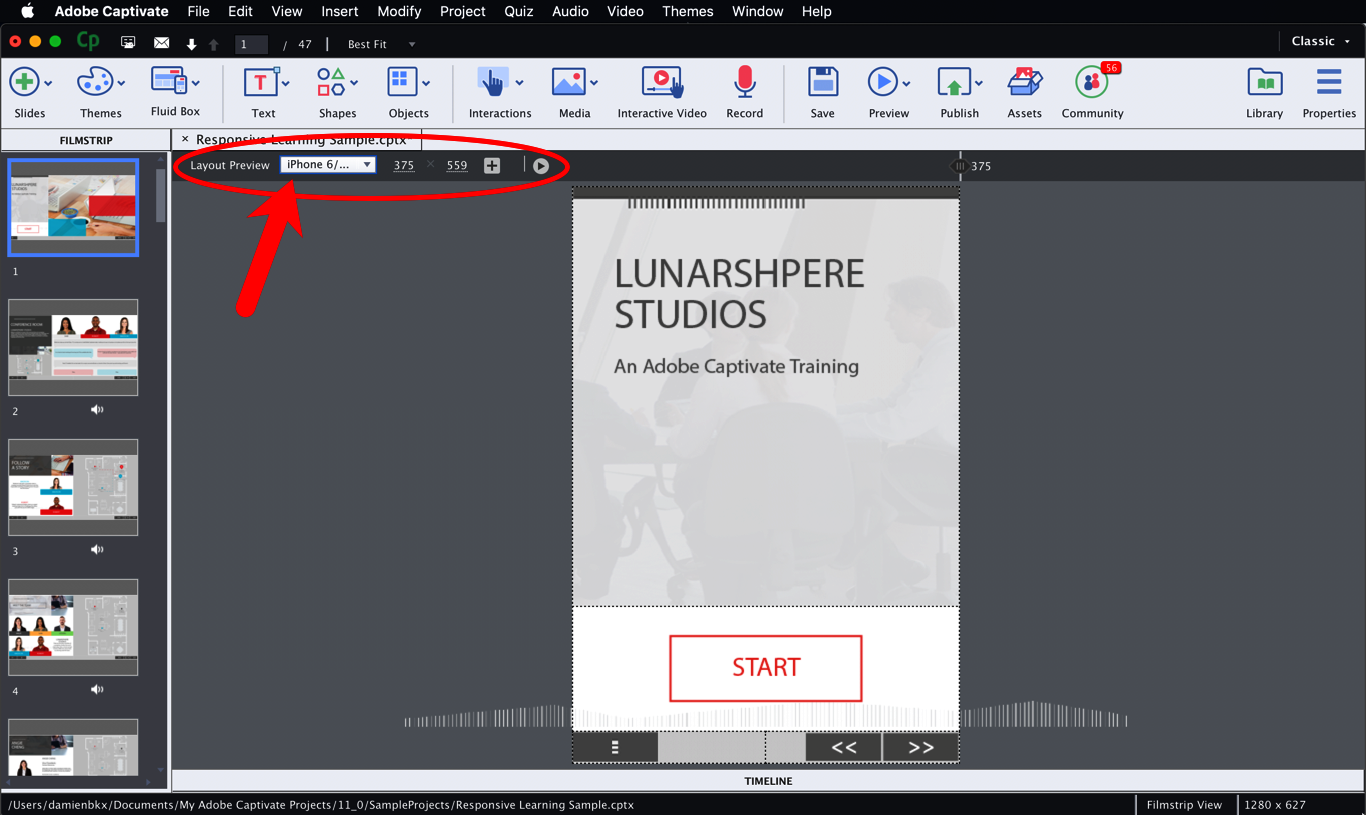
The project you just opened is a Responsive Project. This means that it can adapt itself to the screen it is viewed on. Note the extra toolbar at the top of the stage. This extra toolbar lets you switch between different devices in order to check how the project is displayed on screens of different sizes.
- In the top-left corner of the stage, open the Custom drop-down menu.
- Choose iPhone 6/7/8 in the list of available devices.
This action resizes the Stage to the size of an iPhone 6 (375 px by 559 px). As shown in the following screenshot, the elements of the current slide are rearranged to fit the new size of the Stage. Some elements (such as the big image that was on the right side of the stage) have even been completely removed to accommodate the reduced screen real estate of a smartphone:
You will now preview this project in a web browser, using the following steps.
- Click the Preview | Project icon on the Toolbar.
There are a lot of differences in the way you preview a Responsive Project, compared to the way you preview a non-responsive Captivate project:
- Firstly, the Preview icon on the Toolbar contains different options than usual (including the all-new Live Preview on Devices feature)
- Secondly, a Responsive Project is always previewed in the default browser installed on your computer and not in the Preview pane of Captivate
- Thirdly, in the web browser, there is a slider just above the preview to let you change the size of the Stage as you preview your project
All these changes have a single root cause: a Responsive Project can only be published in HTML5. That's why you need a browser to preview the project.
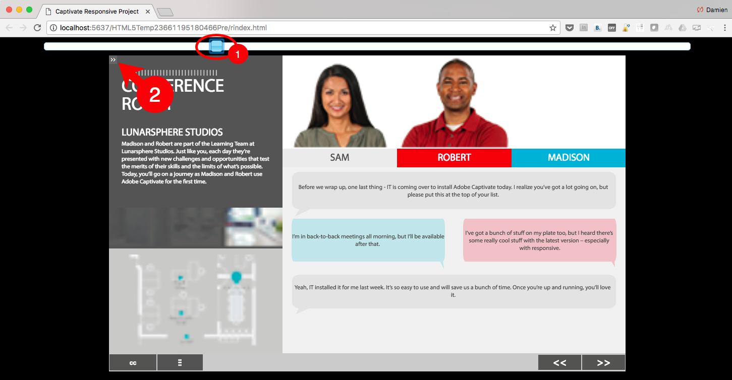
- Preview the whole project in the web browser and use the slider above the preview to change the size of the stage (see 1 in the following screenshot). Note how the elements of the various slides of the project are rearranged on the smaller screen sizes.
- During the preview, also note the very small double arrow icon in the top left corner of the preview (see 2 in the following screenshot). This icon is used to toggle the Table of Contents on and off.
- When the preview is finished, close the web browser and return to Captivate.
To make this project responsive, we have used Fluid Boxes to define the slide layouts for the different screen sizes. You will learn more about Responsive Projects and Fluid Boxes in Chapter 10, Creating a Responsive Project.
The special previewing features of the Responsive Projects let you test the responsiveness of your project during the development phase, but they have one major disadvantage. Because you preview the project using the default browser of your desktop or laptop computer, you can't experience the course on an actual mobile device.