
Creating the Demo Blazor WebAssembly project
The Demo project that we are creating is based on one of the many sample projects that are provided by the Blazor WebAssembly App project template. After we have used the template to create the project, we will examine the files in the sample project and update some of the files to demonstrate how to use Razor components. Finally, we will separate the code block of one of the components into a separate file to demonstrate how to use the code-behind technique to separate the markup from the code.
Creating the Demo project
Visual Studio comes with quite a few project templates. We are going to use the Blazor WebAssembly App project template to create our first Blazor WebAssembly project. Since this project template can be used to create many different types of Blazor projects, it is important to follow the instructions carefully:
- Open Visual Studio 2019.
- Click the Create a new project button.
- In the Search for templates (Alt+S) textbox, enter
Blazorand hit the Enter key.The following screenshot shows the Blazor WebAssembly App project template that we will be using:

Figure 2.7 – Blazor WebAssembly App project template
- Select the Blazor WebAssembly App project template and click the Next button.
- Enter
Demoin the Project name textbox and click the Next button.This is a screenshot of the dialog used to configure our new project:

Figure 2.8 – The Configure your new project dialog
Tip
In the preceding example, we placed the
Demoproject into theE:\Blazorfolder. However, the location of this project is not important. - Select .NET 5.0 as the version of the .NET Framework to use.
This is a screenshot of the dialog used to create our new Blazor WebAssembly app:

Figure 2.9 – Additional information for the Blazor WebAssembly App dialog
- Click the Create button.
You have created the Demo Blazor WebAssembly project.
Running the Demo project
Once the project has been created, you need to run it to get an understanding of what it does. The Demo project contains three pages: Home, Counter, and Fetch data:
- From the Debug menu, select the Start Without Debugging (Ctrl+F5) option to run the
Demoproject.This is a screenshot of the Home page from the
Demoproject:
Figure 2.10 – The Home page
The Home page is split into two sections. The navigation menu is on the left side of the page and the body is on the right side of the page. The body of the Home page consists of some static text and a link to a survey.
- Click the Counter option on the navigation menu to navigate to the Counter page.
This is a screenshot of the Counter page from the
Demoproject:
Figure 2.11 – The Counter page
The body of the Counter page includes a counter and a Click me button. Each time the button on the Counter page is clicked, the counter is incremented without a page refresh.
Important note
Since this is a Single-Page Application (SPA), only the section of the page that needs to be updated is updated.
- Click the Fetch data option on the navigation menu to navigate to the Fetch data page.
This is a screenshot of the Fetch data page from the
Demoproject:
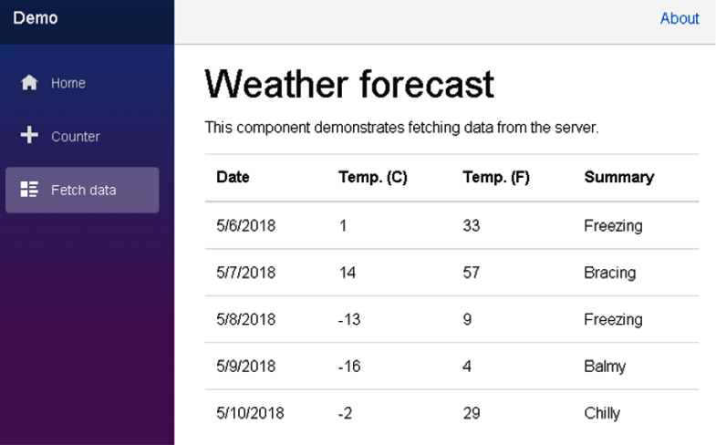
Figure 2.12 – The Fetch data page
The body of the Fetch data page includes a table that shows the weather forecast for a few days in 2018. As you will see, the data displayed in the table is static data from the wwwroot\sample-data\weather.json file.
Examining the Demo project's structure
Now let's return to Visual Studio to examine the files in the Demo project.
The following figure shows the project's structure:
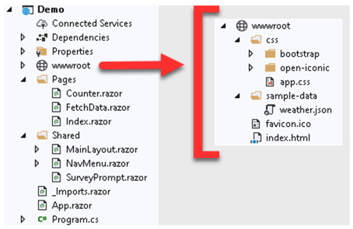
Figure 2.13 – Project structure
The project includes quite a few files with some of them divided into their own folders. Let's examine them.
The wwwroot folder
The wwwroot folder is the application's web root. Only the files in this folder are web-addressable. The wwwroot folder contains a collection of Cascading Style Sheets (CSS) files, a sample data file, an icon file, and index.html. Later in this book, in addition to these types of files, we will use this folder for public static resources such as images and JavaScript files.
The index.html file is the root page of the web application. Whenever a page is initially requested, the contents of the index.html page are rendered and returned in the response. The head element of the index.html file includes links to each of the CSS files in the css folder and specifies the base path to use for the web app. The body element of the index.html file includes two div elements and a reference to the blazor.webassembly.js file.
This is the code in the body element of the index.html file:
<body>
    <div id="app">Loading...</div>
    <div id="blazor-error-ui">
        An unhandled error has occurred.
        <a href="" class="reload">Reload</a>
        <a class="dismiss">x</a>
    </div>
    <script
      src="_framework/blazor.webassembly.js"></script>
</body>
The highlighted div element in the preceding code loads the App component.
The blazor-error-ui div element is for displaying unhandled exceptions. The styling for this div element is in the wwwroot\css\app.css file. The blazor.webassembly.js file is the script that downloads the .NET runtime, your application's assemblies, and your application's dependencies. It also initializes the runtime to run the web app.
The App component
The App component is defined in the App.razor file:
App.razor
<Router AppAssembly="@typeof(Program).Assembly"
        PreferExactMatches="@true">
    <Found Context="routeData">
        <RouteView RouteData="@routeData"
                   DefaultLayout="@typeof(MainLayout)" />
    </Found>
    <NotFound>
        <LayoutView Layout="@typeof(MainLayout)">
            <p>Sorry, there's nothing at this address.</p>
        </LayoutView>
    </NotFound>
</Router>
The App component is the root component of a Blazor WebAssembly application. It uses the Router component to set up the routing for the web app. In the preceding code, if the route is found, the RouteView component receives RouteData and renders the specified component using the indicated DefaultLayout. If the route is not found, the NotFound template is used and LayoutView is rendered using the indicated Layout.
As you can see, in the Demo project, both the Found template and the NotFound template are using the same layout. They are both using the MainLayout component. However, they do not need to use the same layout component.
The Shared folder
The Shared folder in the Demo project includes the shared user interface Razor components, including the MainLayout component. Each of these components may be used one or more times by other Razor components.
The Pages folder
The Pages folder includes the routable Razor components used by the project. The routable components are Counter, FetchData, and Index. Each of these components includes an @page directive that is used to route the user to the page.
The _Imports.razor file
This file includes Razor directives such as the @using directive for namespaces. Your project can include multiple _Imports.razor files. Each one is applied to its current folder and subfolders. Any @using directives in the _Imports.razor file are only applied to Razor (RAZOR) files. They are not applied to C# (CS) files. This distinction is important when using the code-behind technique.
The Program.cs file
The Program.cs file is the entry point for the application.
Examining the shared Razor components
The shared Razor components are in the Shared folder. There are three shared Razor components in the Demo project:
- The
MainLayoutcomponent - The
NavMenucomponent - The
SurveyPromptcomponent
The MainLayout component
The MainLayout component is used to define the page layout for the web app:
Pages/MainLayout.razor
@inherits LayoutComponentBase
<div class="page">
    <div class="sidebar">
        <NavMenu />
    </div>
    <div class="main">
        <div class="top-row px-4">
            <a href="http://blazor.net"
               target="_blank"
               class="ml-md-auto">About</a>
        </div>
        <div class="content px-4">
            @Body
        </div>
    </div>
</div>
The MainLayout component inherits from the LayoutComponentBase class. LayoutComponentBase represents a layout and has only one property, which is the Body property. The Body property gets the content to be rendered inside the layout.
The following diagram illustrates the layout of a page as defined by the MainLayout component:
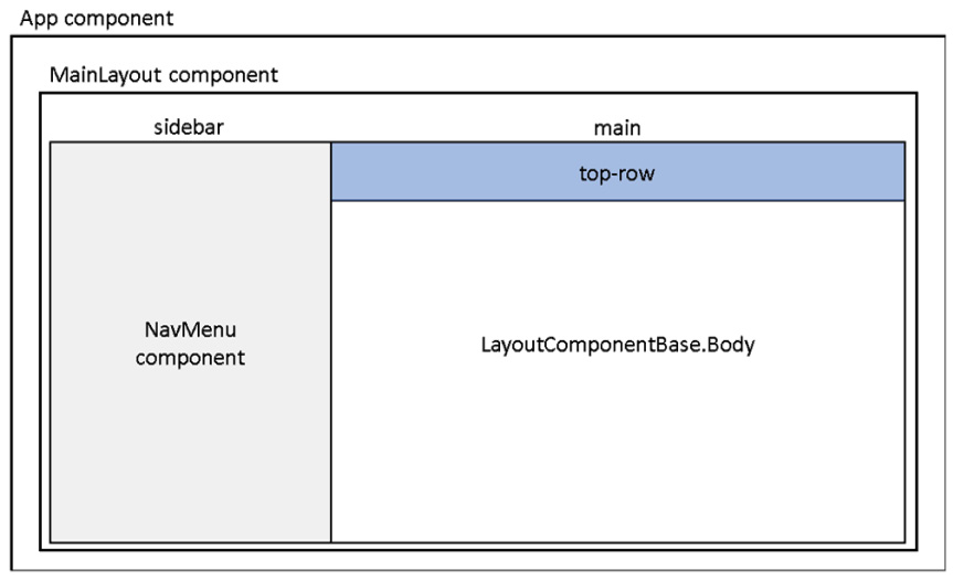
Figure 2.14 – Screen layout
Tip
The Blazor WebAssembly App project template uses Bootstrap 4 to style its pages. If you are unfamiliar with Bootstrap 4, you should refer to https://getbootstrap.com to familiarize yourself with its syntax.
The NavMenu component
The NavMenu component defines the navigation menu for the Demo project. It uses multiple NavLink components to define the various menu options. This is the section of the NavMenu component that references the NavLink components used for the project's navigation:
<div class="@NavMenuCssClass" @onclick="ToggleNavMenu">
    <ul class="nav flex-column">
        <li class="nav-item px-3">
            <NavLink class="nav-link" href=""
                     Match="NavLinkMatch.All">
                <span class="oi oi-home"
                      aria-hidden="true"></span> Home
            </NavLink>
        </li>
        <li class="nav-item px-3">
            <NavLink class="nav-link" href="counter">
                <span class="oi oi-plus"
                      aria-hidden="true"></span> Counter
            </NavLink>
        </li>
        <li class="nav-item px-3">
            <NavLink class="nav-link" href="fetchdata">
                <span class="oi oi-list-rich"
                      aria-hidden="true"></span> Fetch data
            </NavLink>
        </li>
    </ul>
</div>
The NavLink component is defined in the Microsoft.AspNetCore.Components.Routing namespace. It behaves like an a element, except it has added functionality that highlights the current URL. This is the HTML that is rendered by NavLink for the Counter component when the Counter component is selected:
<a href="counter" class="nav-link active">
    <span class="oi oi-plus" aria-hidden="true"></span>
    Counter
</a>
The style used for the nav-link class is from Bootstrap. The style used for the active class is defined in the wwwroot\css\app.css file:
.sidebar .nav-item a.active {
    background-color: rgba(255,255,255,0.25);
    color: white;
}
The SurveyPrompt component
The SurveyPrompt component creates a link to a brief survey on Blazor.
Examining the routable Razor components
The routable Razor components are in the Pages folder. There are three routable Razor components in the Demo project:
- The
Indexcomponent - The
Countercomponent - The
FetchDatacomponent
The Index component
The Home page of the Demo project uses the Index component that is defined in the Pages\Index.razor file:
Pages\Index.razor
@page "/"
<h1>Hello, world!</h1>
Welcome to your new app.
<SurveyPrompt Title="How is Blazor working for you?" />
The preceding code includes an @page directive that references the root of the web app and some markup. The markup includes a SurveyPrompt component.
The Counter component
The Counter component is more complex than the Index component. Similar to the Index component, it contains an @page directive that is used for routing and some markup. However, it also contains a C# code block:
Pages\Counter.razor
@page "/counter"
<h1>Counter</h1>
<p>Current count: @currentCount</p>
<button class="btn btn-primary" @onclick="IncrementCount">
    Click me
</button>
<a href="counter" class="nav-link active">
    <span class="oi oi-plus" aria-hidden="true"></span>
    Counter
</a>
@code {
    private int currentCount = 0;
    private void IncrementCount()
    {
        currentCount++;
    }
}
In the preceding code block, a private currentCount variable is used to hold the number of clicks. Each time the Counter button is clicked, the Counter component's registered @onclick handler is called. In this case, it is the IncrementCount method.
The IncrementCount method increments the value of the currentCount variable and the Counter component regenerates its render tree. Blazor compares the new render tree against the previous one and applies any modifications to the browser's DOM. This results in the displayed count being updated.
The FetchData component
The FetchData component is by far the most complex component in the Demo project.
These are the directives in the Pages\FetchData.razor file:
@page "/fetchdata"
@inject HttpClient Http
The @page directive is used for routing and the @inject directive is used for dependency injection. In this component, HttpClient that is defined in the Program.cs file is being injected into the view. For more information on dependency injection, refer to Chapter 6, Building a Shopping Cart Using Application State.
The following markup demonstrates the use of a very important pattern that you will often use when developing a Blazor WebAssembly application. Because the application runs on the browser, all data access must be asynchronous. That means that when the page first loads, the data will be null. For that reason, you need to test for the null case before attempting to process the data.
This is the markup in the Pages\FetchData.razor file:
<h1>Weather forecast</h1>
<p>This component demonstrates fetching data from the server.</p>
@if (forecasts == null)
{
    <p><em>Loading...</em></p>
}
else
{
    <table class="table">
        <thead>
            <tr>
                <th>Date</th>
                <th>Temp. (C)</th>
                <th>Temp. (F)</th>
                <th>Summary</th>
            </tr>
        </thead>
        <tbody>
            @foreach (var forecast in forecasts)
            {
                <tr>
                   <td>@forecast.Date.ToShortDateString()
                      </td>
                   <td>@forecast.TemperatureC</td>
                   <td>@forecast.TemperatureF</td>
                   <td>@forecast.Summary</td>
                </tr>
            }
        </tbody>
    </table>
}
The preceding markup includes an if statement and a foreach loop. While the value of forecasts is null, a Loading message is displayed. If you do not handle the case when the value of forecasts is null, the framework will throw an exception. Once the value of forecasts is no longer null, all of the items in the array are presented in a table.
Important note
The value of forecasts will be null the first time that the page is rendered.
As previously mentioned, Blazor components have a well-defined life cycle. The OnInitializedAsync method is invoked when the component is rendered. After the OnInitializedAsync method completes, the component is re-rendered.
This is the code block in the Pages\FetchData.razor file:
@code {
    private WeatherForecast[] forecasts;
    protected override async Task OnInitializedAsync()
    {
        forecasts = await
            Http.GetFromJsonAsync<WeatherForecast[]>
            ("sample-data/weather.json");
    }
    public class WeatherForecast
    {
        public DateTime Date { get; set; }
        public int TemperatureC { get; set; }
        public string Summary { get; set; }
        public int TemperatureF =>
            32 + (int)(TemperatureC / 0.5556);
    }
}
First, the preceding code block declares a parameter to contain an array of the type WeatherForecast. Next, it uses the OnInitializedAsync asynchronous method to populate the array. In order to populate the array, the GetFromJsonAsync method of the HttpClient service is used. For more information on HttpClient, refer to Chapter 8, Building a Task Manager Using the ASP.NET Web API.
Using a component
Razor components are used by including them in the markup of another component. We will add a Counter component to the Home page. We do this as follows:
- Return to Visual Studio.
- Open the
Pages\Index.razorfile. - Delete all of the markup. Be sure you do not remove the
@pagedirective at the top of the file. - Add the following markup below the
@pagedirective:<Counter />
- From the Build menu, select the Rebuild Solution option.
- Return to the browser and navigate to the Home page. If the
Demoproject is not still running, from the Debug menu, select the Start Without Debugging (Ctrl+F5) option to run it. - Use Ctrl + R to refresh the browser.
Tip
Whenever you update your C# code, you need to refresh the browser for the browser to load the updated DLL.
- Click the Click me button to test the
Countercomponent.
Adding a parameter to a component
Most components require parameters. To add a parameter to a component, use the Parameter attribute. We will add a parameter to specify the increment used by the IncrementCount method. We do this as follows:
- Return to Visual Studio.
- Open the
Pages\Counter.razorfile. - Add the following code to the top of the code block to define the new parameter:
[Parameter] public int? Increment { get; set; } private int increment = 1; - Update the
IncrementCountmethod to the following:private void IncrementCount() { currentCount += increment; } - Add the following
OnParametersSetmethod to set the value ofincrementto the value of theIncrementparameter:protected override void OnParametersSet() { if (Increment.HasValue) increment = Increment.Value; } - Add the highlighted text to the markup of the Click me button to display the current value of the
incrementvariable:<button class="btn btn-primary" @onclick="IncrementCount"> Click me (@increment) </button>
Using a parameter with an attribute
We will add another instance of the Counter component to the Home page that uses the new parameter. We do this as follows:
- Open the
Pages\Index.razorfile. - Add the following markup to the bottom of the
Index.razorfile:<Counter Increment="5"/>
As you add the markup, IntelliSense is provided for the new
Incrementparameter:
Figure 2.15 – IntelliSense
- From the Build menu, select the Build Solution option.
- Return to the browser.
- Use Ctrl + R to refresh the browser.
- Navigate to the Home page.
The Home page now contains two instances of the
Countercomponent. If you click the first Click me button, the first counter will be incremented by 1; if you click the second Click me button, the second counter will be incremented by 5:
Figure 2.16 – The Home page
- Click each of the Click me buttons to verify they both work as intended.
Adding a route parameter
Components can have multiple @page directives. We will add an @page directive to the Counter component that uses a parameter. We do this as follows:
- Return to Visual Studio.
- Open the
Pages/Counter.razorfile. - Add the following
@pagedirective to the top of the file:@page "/counter/{increment:int}"The
Countercomponent now includes two@pagedirectives. - From the Build menu, select the Build Solution option.
- Return to the browser.
- Navigate to the Counter page.
- Update the URL to the following:
/counter/4
Important note
Since the page is automatically reloaded when you change the URL, you do not need to refresh the browser in order to reload the page.
- Click the Click me button.
- Update the URL to an invalid route:
/counter/a
Since this is not a valid route, you will be directed to the
NotFoundcontent defined in theAppcomponent:
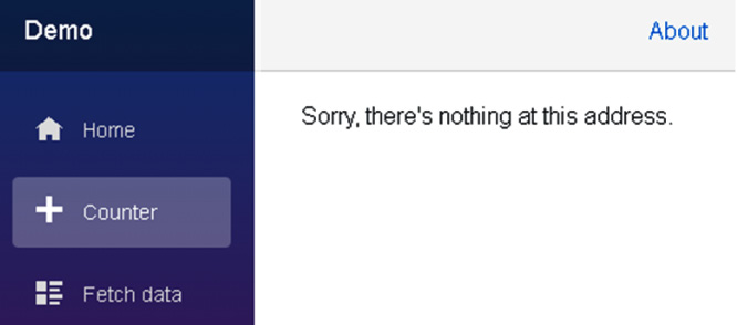
Figure 2.17 – Page not found
Tip
If you need to navigate to a URL in code, you should use NavigationManager. NavigationManager provides a NavigateTo method that is used to navigate the user to the specified URI without forcing a page load.
Using partial classes to separate markup from code
Many developers prefer to separate their markup from their C# fields, properties, and methods. Since Razor components are regular C# classes, they support partial classes. The partial keyword is used to create a partial class. We will use a partial class to move the code block from the RAZOR file to a CS file. We do this as follows:
- Return to Visual Studio.
- Right-click the Pages folder and select Add, Class from the menu.
- Name the new class
Counter.razor.cs. - Update the
Counterclass to be a partial class by using thepartialkeyword:public partial class Counter{} - Open the
Pages/Counter.razorfile. - Copy all of the code in the code block to the partial
Counterclass in theCounter.razor.csfile. - Delete the code block from the
Counter.razorfile. - Add the following
usingstatement to theCounter.razor.csfile:using Microsoft.AspNetCore.Components;
- From the Build menu, select the Build Solution option.
- Return to the browser.
- Use Ctrl + R to refresh the browser.
- Navigate to the Counter page.
- Click the Click me button to verify that it still works.
- Close the browser.
Using partial classes gives you the flexibility to move the code in the code block to a separate file, allowing you to use the code-behind technique.
We have created a Demo project by using the Blazor WebAssembly App project template provided by Microsoft. We added a parameter to the Counter component and moved the code in the code block of the Counter component to a separate file.