
So, it's time to install WPtouch on our site! We could simply install the plugin and have a mobile site that's ready to go, but it's possible to configure some options to make it look and behave the way we want it to.
1. Install WPtouch, either by downloading the plugin and uploading it to your plugins folder, or via the plugins page on your WordPress dashboard.
2. To configure WPtouch, click on WPtouch in the Settings menu.
3. Start by configuring the General Settings, as shown in the following screenshot:

4. The General Settings screen gives you a few options. Let's look at the most relevant ones:
WPtouch Language: Leave this as Automatically detected to fit with the rest of your site
WPtouch Home Page: Change this if you want visitors on mobile devices to arrive at a page other than your home page while accessing the site. This might be useful if there is a page with information that mobile users will need quickly, such as location and opening hours.
Site Title: If your site title is very long, changing this will make it fit better on a small screen.
Excluded Categories and Excluded Tags: Add any posts, categories, and/or tags you don't want mobile users to see.
Text Justification Options: Use this to define whether you want the text left-aligned or justified. Justification can look neater but may make the text harder to read on a small screen, so isn't recommended for accessibility reasons.
Post Listings Options: You can choose to display calendar icons, thumbnails, or nothing next to each post on your main blog or any archive pages. You also have the option to turn off some of the metadata. For the Carborelli's site, we will turn off the author, categories, and tags metadata as the site is not a blog.
Footer Message: Edit this if you want a specific message. Unfortunately, this doesn't accept HTML so you can't add links.
5. Scroll down to the Advanced Options screen, as shown in the following screenshot:

For the Carborelli's site we have disabled most of these options as the site is not a blog and we are using a menu that has been defined on the WordPress dashboard.
Some of these options will be useful if your site has one or more of the following:
User login
An automatically generated menu
A Twitter link
Upcoming dates
6. Ignore the Push Notification Options. This is only relevant if you have a Prowl account. Prowl is a service that pushes notifications to an iOS device from a PC or Mac.
7. The Style & Color Options give you more control over the way your site looks. We can amend the background, H2 font, and colors to give our mobile site a look that more closely mirrors the desktop site:

Here, we have amended the fonts and colors to reflect the colors used in the Carborelli's desktop site. You can do the same for your site.
8. We will ignore the advertising options as this site doesn't include any advertising. If you are using Google Analytics to track visitors to your site, you will need to add your tracking code here. This is because the header in our desktop theme, where the tracking code is normally added, isn't loaded on mobile devices.
9. If you have an image or logo that you want to use as an icon on your mobile site, upload it to the icon pool via the Default & Custom Icon Pool editor. For the Carborelli's site we have uploaded the company's logo as an icon, as shown in the following screenshot:

10. If you've uploaded an icon or want to edit the settings for the pages, use the Logo Icon // Menu Items & Pages Icons editor:

As you can see from the previous screenshot, we've made some changes to the default settings to add some Carborelli's branding to the site and to add icons to our menu items.
11. Finally, click on the Save Options button at the bottom of the screen to save all your changes and then test your site on a mobile device.
There were quite a few options to go through, but we've now created a mobile version of the Carborelli's site, which has some of the styling from the desktop version and includes the content we need in it. The following screenshots show what the site would look like with WPtouch activated out of the box, and how it now looks with our styling tweaks on an iPhone:
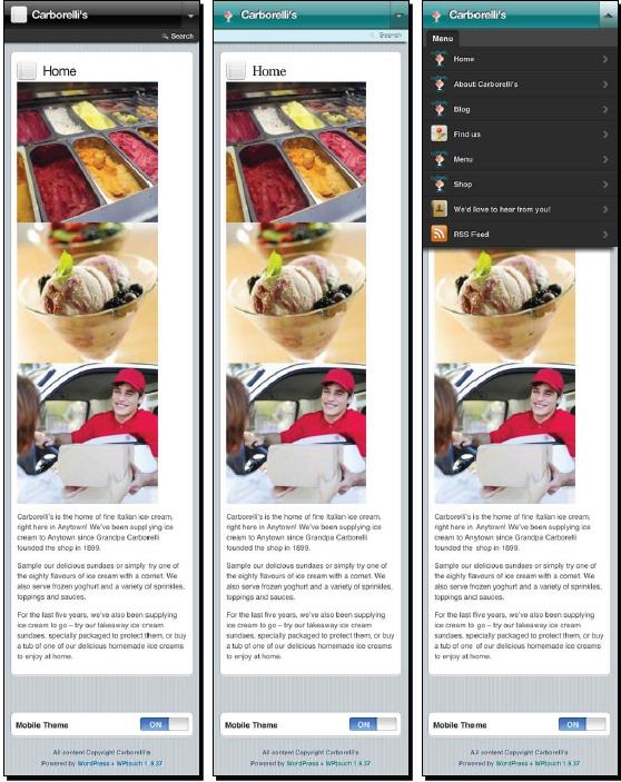
So, thinking about our criteria for choosing a plugin, how did WPtouch do?
The site will be targeting smartphones, in particular iPhones and iPod touches, Android devices, and Blackberries. Access from other phones is not essential.
WPtouch passed on this criterion; it targets a range of smartphones and other mobiles, and certainly works well on iOS, Android, and Blackberry.
The logo isn't crucial on mobile devices—it's more important for people to be able to get at the content.
WPtouch displays our logo, which exceeds our criteria.
The site uses a widget area for the sidebar, making it easier for the client to update this information in the future. So yes, it's important that widget areas are displayed.
WPtouch fails on this—it offers no option for displaying widgets. This means the location map on our site's home page isn't visible. One way to get round this would be by setting the Find us page as the home page for mobile devices.
Fine control over the styles isn't essential as long as the default style provided by the plugin is smart and images are displayed, as they will provide a lot of the visual cues.
WPtouch looks smart and the layout works well across a variety of devices. It was possible to edit the colors and tweak some text styling.
Speed and size are important to reduce data transfer.
WPtouch displays images smaller than those on the desktop site but actually downloads the same images. This could really slow down the site and annoy users who are paying for their data. The Google speed test gives the mobile Carborelli's' site a low score of just 33 out of 100. This is largely due to the fact that large images are being sent to mobile devices.
In summary, WPtouch, although a very powerful plugin with some very useful options, probably isn't the right plugin for the Carborelli's site because of the lack of support for widgets and the poor speed test results. How does it match up to the criteria for your site?