Book Image

WordPress Mobile Web Development: Beginner's Guide

By : RACHEL MCCOLLIN
Book Image

WordPress Mobile Web Development: Beginner's Guide

By: RACHEL MCCOLLIN

Overview of this book

The chances are that more of your WordPress website visitors are using mobiles, or more clients are demanding responsive or mobile sites. If you can use WordPress to build mobile-friendly sites you can win more business from clients and more traffic for your site. "WordPress Mobile Web Development Beginner's Guide" will benefit you whether you've dabbled in WordPress or worked with it for years. It will help you identify which approach to mobile is most appropriate for your site (responsive, mobile, or web app) and learn how to make each one work, demonstrating a variety of techniques from the simple to the more complex, working through clear practical examples and applying these to your own website. Start by quickly making a WordPress site mobile-friendly, using off the shelf plugins and responsive themes, choosing the best ones for you and customising them. This leads into responsive theme design, with advice on layout, images and navigation. Finally, learn how to build a web app in WordPress, making use of plugins, APIs and custom code. If you need to hit the ground running with mobile WordPress development, then this book is for you. With practical examples and exercises from the beginning, it will help you build your first mobile WordPress site without having to learn aspects of WordPress or mobile development that aren't relevant. It will also help you understand which approaches work and why, so you can apply this knowledge to future projects.
Table of Contents (18 chapters)
WordPress Mobile Web Development Beginner's Guide
Credits
About the Author
About the Reviewers
Acknowledgement
www.PacktPub.com
Preface

Time for action—adding a select menu


To do this, we need to install a plugin called Responsive Select Menu. First, we will install that plugin via the Plugins screen in the WordPress admin, and activate it. We will then perform the following steps:

  1. 1. The plugin can be configured via a screen, which we access by clicking on Appearance and then Responsive Select, as shown in the following screenshot:

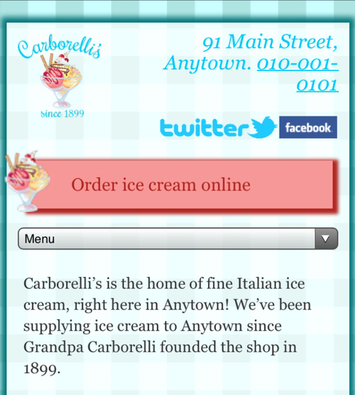
  2. 2. There are a number of options we can change, but for the Carborelli's site, we're just going to change one—the text displayed in our select box. In the First Item Name field, we will type Menu.

  3. 3. Finally, we will click on Save all Settings to save our changes.

    Note

    Find out more about the Responsive Select Menu plugin at http://wordpress.org/extend/plugins/responsive-select-menu/.

What just happened?

We installed a plugin to convert all of our navigation menus into select boxes. Let's see what the top menu looks like now, as shown in the following screenshot:

When we tap on that menu, it looks like...