
Apple's Retina Display is a brand name for their high pixel density screens. These screens have so many pixels within a small space that the human eye cannot see pixelation, making images and text appear smoother. To compete with Apple's display, other manufacturers are also releasing devices using high-density displays. These types of displays are becoming standard in high quality devices.
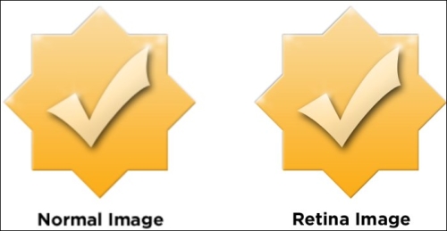
When you first start browsing the Web using a Retina Display, you'll notice that many images on your favorite sites are blurry. This is a result of low-resolution images being stretched to fill the screen. The effect can make an otherwise beautiful website look unattractive.
The key to making your website look exceptional on Retina Displays is the quality of the images that you are using. In this recipe, we will cover the basics of creating high-resolution images and suggestions on how to name your files. Then we'll use some simple HTML to display the image on a web page.
Creating a Retina-ready site doesn't require any special software beyond what you're already using to build web pages. You'll need a graphics editor (such as Photoshop or GIMP) and your preferred code/text editor. To test the code on Retina Display you'll also need a web server that you can reach from a browser, if you aren't coding directly on the Retina device.
The primary consideration in getting started is the quality of your images. A Retina image needs to be at least two times as large as it will be displayed on screen. If you have a photo you'd like to add to your page that is 500 pixels wide, you'll want to start out with an image that is at least 1000 pixels wide. Trying to increase the size of a small image won't work because the extra pixels are what make your image sharp.
When designing your own graphics, such as icons and buttons, it's best to create them using a vector graphics program so they will be easy to resize without affecting the quality. Once you have your high-resolution artwork gathered, we're ready to start creating Retina images.
To get started, let's create a folder on your computer called
retina. Inside that folder, create another folder calledimages. We'll use this as the directory for building our test website.To create your first Retina image, first open a high-resolution image in your graphics editor. You'll want to set the image size to be double the size of what you want to display on the page. For example, if you wanted to display a 700 x 400 pixel image, you would start with an image that is 1400 x 800 pixels. Make sure you aren't increasing the size of the original image or it won't work correctly.
Next, save this image as a
.jpgfile with the filename[email protected]inside of the/images/folder within the/retina/folder that we created. Then resize the image to 50 percent and save it asmyImage.jpgto the same location.Now we're ready to add our new images to a web page. Create an HTML document called
retinaTest.htmlinside the/retina/folder. Inside of the basic HTML structure add the two images we created and set the dimensions for both images to the size of the smaller image.<body> <img src="images/[email protected]" width="700" height="400" /> <img src="images/myImage.jpg" width="700" height="400" /> </body>
If you are working on a Retina device you should be able to open this page locally; if not, upload the folder to your web server and open the page on your device. You will notice how much sharper the first image is than the second image. On a device without a Retina Display, both images will look the same. Congratulations! you've just built your first Retina-optimized web page.
Retina Displays have a higher amount of pixels per inch (PPI) than a normal display. In Apple's devices they have double the PPI of older devices, which is why we created an image that was two times as large as the final image we wanted to display. When that large image is added to the code and then resized to 50 percent, it has more data than what is being shown on a normal display. A Retina device will see that extra pixel data and use it to fill the extra PPI that its screen, contains. Without the added pixel data, the device will use the data available to fill the screen creating a blurry image. You'll notice that this effect is most obvious on large photos and computer graphics like icons. Keep in mind this technique will work with any image format such as .jpg, .png, or .gif.
As an alternative to using the image width and height attributes in HTML, like the previous code, you can also give the image a CSS class with width and height attributes. This is only recommended if you will be using many images that are of the same size and you want to be able to change them easily.
<style>
  .imgHeader { width: 700px; height: 400px; }
</style>
<img src="images/[email protected]" class="imgHeader" />We created both a Retina and a normal image. It's always a good idea to create both images because the Retina image will be quite a bit larger than the normal one. Then you'll have the option of which image you'd like to have displayed so users without a Retina device don't have to download the larger file.
You'll also notice that we added @2x to the filename of the larger image. It's a good practice to create consistent filenames to differentiate the images that are high-resolution. It'll make our coding work much easier going forward.
When designers with a print background first look into creating graphics for Retina Displays there can be some confusion regarding dots per inch (DPI). Keep in mind that computer displays are only concerned with the number of pixels in an image. An 800 x 600 pixel image at 300 DPI will display the same as an 800 x 600 pixel image at 72 DPI.