
Border images were introduced in CSS3 and are not widely used yet. This topic has been included in case you'd like to experiment with border images, but be aware that they are not supported in Internet Explorer. To find more about CSS support in various browsers take a look at http://caniuse.com/. Border images allow you to wrap a border around an HTML element using CSS and an image instead of the standard dotted, dashed, or solid line border. This can be especially useful when applying a border to a group of images or calling out specific content. This recipe will cover how to turn your border images into high-resolution Retina images.
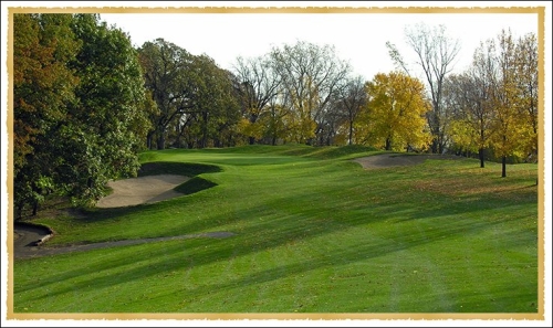
To get started we'll need to gather a couple of images. First, get a high quality image you'd like to use as a border. It should be a full square and could be a picture frame, torn paper, or some other repeating pattern. For our demo we'll be placing the border on an image, and any photo will work. After you've gathered these two graphics we're ready to build a Retina border image.
First, open the border image you chose in your graphics editor. Just like other Retina images, you'll want the initial graphic to be 2x as large as it will be displayed on screen. Save this image as
[email protected]into the/images/folder that is within the/retina/folder. Then resize the image to 50 percent and save it asmyBorder.pnginto the same folder.Next save the photo you've selected into the
/images/folder within the/retina/folder asmyBorderPhoto.jpg. Now we've got all the images ready to start writing our CSS and HTML code.Create a new HTML document called
borderTest.htmlinside of the/retina/folder. Add some CSS to create the border.<style> .imageBorder { border-width: 10px; -webkit-border-image: url(images/myBorder.png) 10 repeat; border-image: url(images/myBorder.png) 10 repeat; } .imageBorderRetina { border-width: 10px; -webkit-border-image: url(images/[email protected]) 10 repeat; border-image: url(images/[email protected]) 20 repeat; } </style>Then add your photo in HTML and apply the CSS styles to create both a Retina and non-Retina border image.
<img class="imageBorder" src="images/myBorderPhoto.jpg />
<img class="imageBorderRetina" src="images/myBorderPhoto.jpg />
If you are working on a Retina device you will be able to open this page locally; if not, upload the folder to your web server and open the page on your device. You'll notice that the second border is much sharper than the first.
To create our border, first we set the border-width property in CSS to specify how wide the border will be on each side of our image. If we wanted different widths, we could list out each side starting at the top and continuing clockwise, ending on the left-hand side (for example, border-width: 5px 10px 15px 5px;).
Next we add in two border-image statements to create the border. The first includes the –webkit vendor prefix, which allows the code to work in older versions of iOS. The first part of the property sets the image URL. The following numerical value tells the browser where to slice the image. You can include a value for each side of the border just like the border-width property. We've used pixels, but this can also be a percentage. The final value in the property determines the method of generating the border (repeat, round, or stretch).
The trick to getting the Retina border to work is doubling the slice value. This is because the Retina image is twice as large as the original and has double the pixels. If you were using a percentage value instead of pixels you would leave the value the same for each border image.