
Finding images that can be replaced with code accomplishes two goals at the same time. It will make your site load faster, and any graphics created using CSS will be high-definition. CSS3 introduced many new properties that can be used to create simple shapes and apply effects to elements and text.
When these CSS styles are applied they will fill all the pixels that are available on your device, so you don't need to worry about creating Retina versions. The code remains the same for all devices, which saves development time and loads quickly for your users. In this recipe we'll create a button and a few shapes using only code to demonstrate the different methods that can be used to create graphics with CSS.
To get started, create a new HTML document called
cssGraphics.htmlinside the/retina/folder. Then inside the basic HTML structure we'll add some CSS code to create a button.<style> .buttonArea { margin: 50px; } .button { background: #7999ff; background: -webkit-linear-gradient(#7999ff 0%, #002c62 100%); background: linear-gradient(#7999ff 0%, #002c62 100%); border-radius: 60px; box-shadow: 1px 1px 4px #666; cursor: pointer; padding: 10px 40px; color: #fff; font-size: 20px; text-align: center; text-decoration: none; text-shadow: 1px 1px 2px #000; }Then we'll create a diamond for our first CSS shape.
  .diamond {
    background: #000;
    margin: 40px 20px;
    width: 50px;
    height: 50px;
    -webkit-transform: rotate(45deg);
    transform: rotate(45deg);
  }
Next we'll create a circle with CSS.
  .circle {
    margin: 20px;
    background: #000;
    border-radius: 50px;
    width: 50px;
    height: 50px;
  }
Finally, we'll create a triangle in CSS.
.triangle {
  margin: 20px;
  width: 0;
  height: 0;
  border-bottom: 25px solid transparent;
  border-top: 25px solid transparent;
  border-left: 25px solid #000;
}
</style>
Then we'll add the HTML code to display the button and shapes we created.
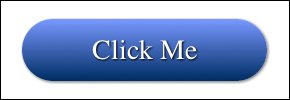
<div class="buttonArea">

  <a class="button">Click Me</a>

</div>

<div class="diamond"></div>

<div class="circle"></div>

<div class="triangle"></div>
If you run this code in your Retina device you should see all the elements we just created. Note that for our example we only added a vendor prefix for Webkit (Safari and Chrome). You'll need to add other browsers' vendor prefixes for additional support.
The first element we created in our CSS code was the button. We started out by creating an optional wrapper called buttonArea, just to give the button some spacing so that it would look better in the browser. The button itself starts out with a few background settings. The first is a fallback for browsers that don't support gradients. Then we added a couple of background properties with linear-gradients. The first one includes the -webkit vendor prefix for browser support since this property isn't finalized at this point, although it is included in most new browsers. To support additional browsers, you'll also want to include their vendor prefixes (-o, -moz, -ms).
linear-gradient works by setting a color and its location. 0 percent is the color at the top of the button and 100 percent is the color at the bottom. This simple gradient will create a transition between these two colors. If you'd like to, you can create complex gradients with multiple values and also change the direction. You can find CSS gradient generators online that will help you when writing this code.
Next, we added the border-radius property to round the edges of the button. Changing this value will affect the amount of curve, letting you create rounded corners or a fully rounded edge like we did in this example.
The box-shadow property creates a drop-shadow on the element. The values for this property from left to right are the horizontal offset, the vertical offset, the blur radius, and the color. The first two properties change the distance of the shadow from your element, and the blur radius will determine how sharp your shadow appears. To create a shadow inside of your shape you can add inset before your other properties (box-shadow: inset 1px 1px 4px #666).
The next two elements were added to finish off the last details of our button. The cursor property makes sure that the button looks clickable when the user hovers over it, and the padding gives us some space between our text and the edges of the button.
The remaining styles in our button are to format the text. The main property to note here is text-shadow. This works the same as the box-shadow property by setting the offsets, blur, and color of the shadow.
Next we created a few shapes using CSS. We've added the margin values to the shapes to space them apart from each other. The diamond was built using a square and then rotating it with transform. Transforming uses a rotation value to move the element on its axis (360 being a full circle). When using this property, you'll want to include vendor prefixes to include support for all browsers as this property is not finalized yet.
To create a circle we created a rectangle and then gave it border-radius. For this to work the radius value must be the same as the sides of the square.
To create our triangle we're making a box with no width or height and using borders to create the shape. Make the two perpendicular sides to the direction you want the arrow to point transparent. This will create the angle and then apply a border to the opposite direction to fill it in. You can also apply the transform property to point the triangle any direction.
Now that you know how to create these different shapes you can try applying the effects we used on the button to enhance them. For example, you could use a shadow on a circle to create a callout on a product, or a gradient on an arrow to indicate a drop-down navigation element.
When creating shapes you may want to position them on top of each other to create a larger graphic. You can do this using the CSS position property. You can also add transparency to your shapes to reveal what is beneath them. To do this, you can use the rgba settings for your background (background: rgba(255, 0, 0, 0.5);). The first three values are the red, green, and blue color values followed by the alpha value (from 0 to 1). If you'd like the transparency to apply to the element and all of its children, you could use the opacity property instead (opacity: 0.5;).
When you create a CSS button it's also worth noting that you can use the same hover effects you're used to using on other CSS links (a:hover {}). For example, you could change the gradient and shadow to make it look like the button is raising or lowering when the user hovers over it.