
Canvas is an HTML5 element that lets you create graphics using JavaScript. It is raster-based, which means that it has a set amount of pixels and is not updated when zooming, resulting in pixilation. Also, canvas is drawn using JavaScript so it is not accessible and will not work when JavaScript is disabled. This makes canvas a poor solution in most scenarios for creating Retina images.
In most cases it is recommended that you use another solution for creating high-density graphics, but we are going to cover canvas because there are some situations where you may want to use it. You may want to use canvas because it is often the best option for creating games or animated elements that require lots of data manipulation. These animations will typically run better in canvas than if you tried to use SVG.
This recipe will show the basics of the canvas element and show you how to create some simple shapes to get an idea of how canvas works.
To get started, create a new HTML document called
canvas.htmlinside the/retina/folder. First, inside of the<head>tag of our HTML structure we'll add a call to include jQuery.<head> <script src="http://code.jquery.com/jquery-1.5.1.min.js"></script> </head>
Then inside of the
<body>tag of our HTML we'll add a canvas element.<canvas id="myCanvas" width="400" height="400"> </canvas>
Now that we have a canvas element, we can draw in it using JavaScript. First, we'll create variables for the values we'll need to change.
<script type="text/javascript">

  var c = document.getElementById("myCanvas"),
    ratio = window.devicePixelRatio || 1,
    cWidth = c.width,
    cHeight = c.height,
    ctx = c.getContext('2d');
Then we'll add our code to change our variables if the device being used has a high-density display.
if (ratio > 1) {
      $(c).attr('width', cWidth * window.devicePixelRatio);
      $(c).attr('height', cHeight * window.devicePixelRatio);
      $(c).css('width', cWidth);
      $(c).css('height', cHeight);
      ctx.scale(2, 2);
  }
Now we'll start drawing some shapes onto our canvas element. First we'll draw a rectangle.
if (c.getContext) {
  var ctx = c.getContext('2d');
  ctx.fillStyle="#009820";
  ctx.fillRect(0,0,100,80);
Next we'll add a circle, continuing our
ifstatement.var ctx2 = c.getContext('2d'); ctx2.fillStyle="#cc0000"; ctx2.strokeStyle="#666666"; ctx2.arc(150,40,40,0,Math.PI*2,true); ctx2.fill(); ctx2.stroke();Then we'll add some text into our
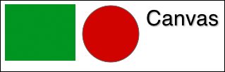
ifstatement.var ctx3 = c.getContext('2d'); ctx3.shadowOffsetX = 1; ctx3.shadowOffsetY = 1; ctx3.shadowBlur = 2; ctx3.shadowColor = "#999999"; ctx3.fillStyle="#000000"; ctx3.font="30px Helvetica"; ctx3.fillText("Canvas",200,30); } </script>Now you can run this code inside your browser to see the graphics inside of our canvas.
To begin we added the jQuery library to our code. This will make it easy to resize our canvas if the device is high-density. Then the first step to create our drawing was adding an HTML5 canvas element. We gave this element an id of myCanvas, so that we could manipulate it using JavaScript, and set its height and width.
Next we added some JavaScript code to draw within our canvas element. The first line of our script created a variable named c to reference the canvas element. Then we created variables to store the pixel ratio (to determine if the device is high-density) and the size of our canvas. Then we needed to create a variable to call the canvas element's getContext() method and set it to 2d so we can draw within the canvas.
Next we created an if statement to check if the devicePixelRatio value is greater than 1, meaning it is a Retina device. If this statement is true, we expand the HTML canvas size and then return it to the normal size in CSS. Then we set the scale of the context to be twice as large. This gives us double the amount of pixels within the same area.
Then we created another if statement to check if the user's browser supports canvas. By adding this you could choose an alternative for older browsers such as loading a static image in the canvas element's place.
Within our if statement we started by creating a rectangle. Using the context variable (ctx) that we created previously, we can start adding drawing methods and properties.
To start creating a rectangle we set the fillStyle property with the color we wanted it to be. Then we used fillRect to create a rectangle filled with that color. We added four values to this drawing method: x position, y position, width, and height. Now we have a green rectangle within our canvas.
Next, we added a circle to our canvas. To begin, we defined a new variable for a second context. This allows us to change the styles that will be applied to the shape. If we wanted the same style as our rectangle we could have continued to use the same context. We set a new fillStyle property and then added a strokeStyle property to set a dark grey stroke around our circle. Next we created a circle using arc(). The values we added to the arc specify the x position, y position, radius, start angle, end angle, and direction flag (true for counter-clockwise and false for clockwise). We used the Math module to calculate the radians for the circle. Then we applied our color fill and stroke to finish the circle.
Finally, we created some text in our canvas. To begin, we defined a third variable for this context. Then we added a shadow using similar settings to defining a drop-shadow in CSS. Then we set a fillStyle property (to color the text), a font size, and a font family. The last item in our if statement was fillText containing the text and x and y offsets.