
A simple table is basically composed of the <table>, <tr>, and <td> tags. Besides this, its contents should also make sense if you remove these tags. Hence you should have a clear understanding of its contents.
With the use of additional elements such as caption, thead, tbody, and tfooter, we have a data table, that is two or more dimensions. Each data cell <td> needs to be represented by a minimum of two unique vertices for the <th> headings.
Also, the table needs to be structured so that when it is rendered, for each row there are the same number of columns.
Using these elements we can maintain our table with a semantic code. As mentioned in the W3C Candidate Recommendation for tabular data (dated 17 December 2012), it is not mandatory to close <thead>, <tr>, <th>, <td>, and <tbody> tags.
Before we see the difference in the code, let's see a simple table. Remember, every table requires a minimum markup to be valid, it should have at least the <table>, <tr> and <td> tags. The following screenshot shows a simple table without any stylesheet:
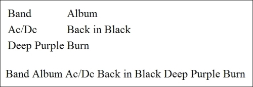
Table 01
Now we use a more complex markup with the <caption>, <thead>, <tbody>, and <tfooter> tags. In order to achieve a better visual result, we apply some lines of CSS. The following screenshot shows a table with a basic stylesheet:
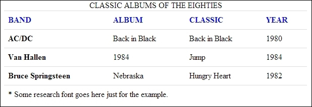
Table 02
Here we assume that you already have the minimum markup of an HTML5 document formatted, but if you prefer open the example (Chapter01_Codes) of the book and follow the code:
First insert the minimum markup necessary to create a table.
Then we use the
<caption>,<thead>, and<tbody>elements to give us more flexibility in styling the table.And finally apply the style to format the table and improve the visualization as follows:
  <!--Very basic Table layout-->
  <table>
  <tr>
  <td>Band</td>
  <td>Album</td>
    </tr>
  <tr>
  <td>Ac/Dc</td>
  <td>Back in Black</td>
  </tr>
  <tr>
  <td>Deep Purple</td>
  <td>Burn</td>
  </tr>
  </table>
Now we add the new elements to the HTML document:
<!--This div is only to create a border around the table -->
<div class="container">
  <table class="table">
    <caption>CLASSIC ALBUMS OF THE EIGHTIES</caption>
    <thead>
    <tr>
    <th scope="col">BAND</th>
    <th scope="col">ALBUM</th>
    <th scope="col">CLASSIC</th>
    <th scope="col">YEAR</th>
    </tr>
    </thead>
    <tfoot>
    <tr>
    <td colspan="4">* Some research font goes here just for the example.</td>
    </tr>
    </tfoot>
    <tbody>
    <tr>
    <th scope="row">AC/DC</th>
    <td>Back in Black</td>
    <td>Back in Black</td>
    <td>1980</td>
    </tr>
    <tr>
    <th scope="row">Van Hallen</th>
    <td>1984</td>
    <td>Jump</td>
    <td>1984</td>
    </tr>
    <tr>
    <th scope="row">Bruce Springsteen</th>
    <td>Nebraska</td>
    <td>Hungry Heart</td>
    <td>1982</td>
    </tr>
    <tbody>
  </table>
</div>
And finally, we add the CSS rules to our table as follows:
.container {
      width:600px;
      overflow: hidden;
      border:1px solid #000;
    }
    .table {
        background-color: transparent;
        border-collapse: collapse;
        border-spacing: 0;
        background-color: #fff
    }
    .table th,
    .table td {
        padding: 8px;
        line-height: 20px;
        text-align: left;
        vertical-align: top;
        border-top: 1px solid #dddddd;
    }
    .table th {
        font-weight: bold;
    }
    .table thead th {
        vertical-align: bottom;
        color:#0006ff;
    }
The result is what we saw in screenshot, Table 02.
For the purposes of this book, the CSS code was embedded in the header of our page as you can see in the code examples.
With the addition of new elements, you can easily stylize your table only using the <thead> and <th> selectors. Note that we add the .table class just for demonstration.
This is a very simple style, but our markup is semantic and our code can be easily interpreted by the screen readers. With the aid of the <scope> tag, we can define the individual headers for each column as follows:
<tr>
    <th scope="col">BAND</th>
    <th scope="col">ALBUM</th>
    <th scope="col">CLASSIC</th>
    <th scope="col">YEAR</th>
</tr>
And apply the blue color to all our headers as you can see in Table 02.
The <scope> syntax is very intuitive and is written as follows:
<th scope="col|row|colgroup|rowgroup">
The preceding syntax is explained as follows:
col– The header cell is a header for a columnrow– The header cell is a header for rowcolgroup– The header cell is a header for group of columnsrowgroup– The header cell is a header for group of rows
Let's take a look at the tables by the User Experience Design perspective:
Always give abbreviations for numbers and names as it's unnecessary to display every digit of a number. You can abbreviate large numbers such as $250,000 to $250k and large names such as John Doe Novatto to John Doe.
Tooltips are welcome too. It helps the users see the real and full value for each field.
Keep headers fixed on table scrolling. It's hard for users to know what the information they're looking at is, without seeing the column header. See line 125 for example.
Differentiate their lines with different colors (zebra stripes), extensive tables are very easy to get confused when you look at certain lines.
Get used to using the
<caption>tag to describe the contents of your tables, it is very important for accessibility because screen readers identify this information and use the<scope>tag to associate the cells with the headers.
Of course, this list has a few tips but you can search more info on the web.
Tip
Accessibility tip
Use of the <th> and <scope> tags combined with the <caption> and <summary> tags will provide sufficient information for most newer screen readers to process simple tables.
A good resource for accessibility can be found here at http://accessibility.psu.edu/wcag2.