
In this section we'll get started by creating a simple page and making it responsive.
Create a folder on your desktop called Responsive. Inside of that, create a file called playground.html. Open it up in your favorite editor and open the same file in the browser of your choice (right-click on the file and look for Open with...).
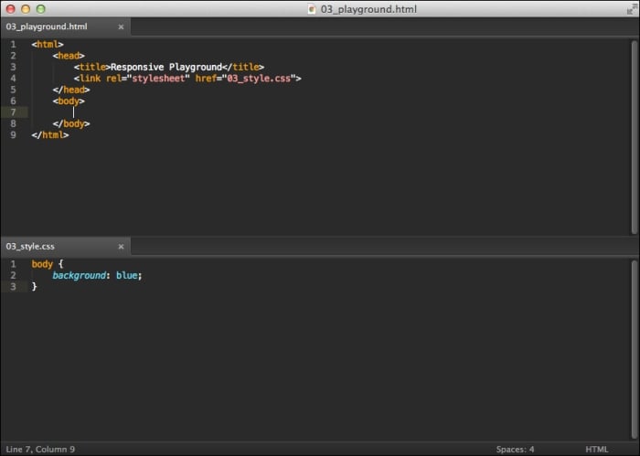
Add some boilerplate HTML code to playground.html shown as follows:
<html>
    <head>
        <title>Responsive Playground</title>
        <link rel="stylesheet" href="style.css">
    </head>
    <body>

    </body>
</html>
Tip
Downloading the example code
You can download the example code files for all Packt books you have purchased from your account at http://www.packtpub.com. If you purchased this book elsewhere, you can visit http://www.packtpub.com/support and register to have the files e-mailed directly to you.
We're creating a very generic web page that links to an external stylesheet to help separate the structure of our site (HTML) from the style (CSS).
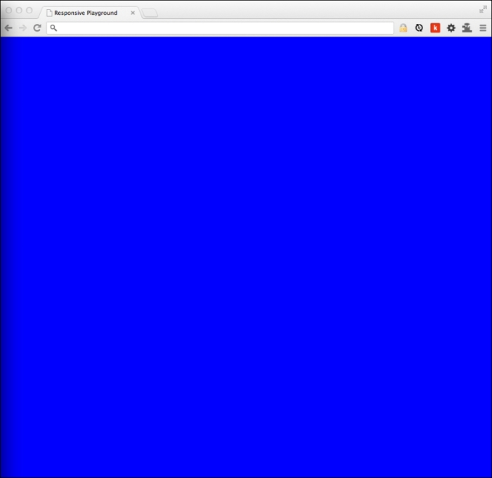
Create a file called style.css in the same folder and open it in your editor. Add the following code to it just to make sure that it's working properly:
body {
    background: blue;
}
Note
We're just setting the background color to blue to make sure the stylesheet is linked to our playground.html page properly.
Now refresh playground.html in your browser. Have a look at the following screenshot:
You should notice your page's background is now blue:
Make sure your browser window isn't maximized; use your mouse to grab the left edge of the browser and shrink it to the right as much as you want, then expand it back to the left. You'll end up doing a lot of this. For brevity, I'll refer to this specific action as contracting and expanding from now on.
So, what happened? Well, we simulated what your site might look like on a generic mobile device, but other than that, nothing changed visually.
Let's wrap our entire body { … }selector with a media query shown as follows:
@media (max-width: 700px) {
    body {
        background: blue;
    }
}
Note
The @media symbol essentially monitors any changes to the browser's properties and will activate the wrapped CSS when those changes are True.
Save your changes and refresh your browser. Now expand and contract your web page. What happens? Well, when the viewport of your browser hits 700 px, your web page should go from white (the default) to blue (our media query).
Congratulations! You just took a huge step towards becoming a RWD master.
But, how often are you actually going to be swapping the background of your design for various devices? Let's create a real-world responsive website complete with:
Logo
Primary horizontal navigation
Sidebar with page-specific navigation
Content area
Footer with some social media links
Modify your playground.html file to include the following code:
<!DOCTYPE html>
<html>
    <head>
        <title>Responsive Playground</title>
        <link rel="stylesheet" href="style.css">
    </head>
    <body>

        <header class="top">
            <a href="/" class="logo"><img src="logo.png" alt="RWD Logo"></a>
        </header>

        <nav class="primary">
            <a href="#">Link</a>
            <a href="#">Link</a>
            <a href="#">Link</a>
            <a href="#">Link</a>
        </nav>

        <div class="main">

            <aside class="sidebar">
                <nav>
                    <a href="#">Sublink</a>
                    <a href="#">Sublink</a>
                    <a href="#">Sublink</a>
                </nav>
            </aside>

            <section class="content">

                <article>
                    <header>
                        <h1>Hello World</h1>
                        <p>
                            Lorem ipsum...
                        </p>
                    </header>
                </article>

            </section>

        </div>

        <footer class="bottom">
            <nav>
                <a href="#">Facebook</a>
                <a href="#">YouTube</a>
                <a href="#">Twitter</a>
            </nav>
        </footer>

    </body>
</html>
Note
We're using semantic (meaningful to search engines and screen readers) HTML5 tags to structure our page. To learn more about HTML5 tags check out HTML5Doctor.com.
Now, replace the code in your style.css file with the following code:
* {
    margin: 0;
    padding: 0;
    background: rgba(0,0,0,.05);
}
body {
    width: 980px;
    margin: 20px auto;
    font: 13px/21px Arial, sans-serif;
}
.top {
    overflow: hidden;
    margin-bottom: 20px;
}
.logo img {
    float: left;
    margin-right: 20px;
    height: 100px;
}
nav.primary {
    float: right;
    overflow: hidden;
    margin-top: 35px;
}
nav.primary a {
    float: left;
    padding: 5px 30px;
}
.main {
    overflow: hidden;
    margin-bottom: 20px;
}
.sidebar {
    float: left;
    width: 280px;
    margin-right: 20px;
}
.sidebar a {
    display: block;
    margin-bottom: 10px;
}
.sidebar a:last-child {
    margin-bottom: 0;
}
.content {
    float: left;
    width: 680px;
}
p {
    margin-bottom: 20px;
}
p:last-of-type {
    margin-bottom: 0;
}
h1 {
    font-size: 30px;
    line-height: 1.1;
    margin-bottom: 10px;
}
footer {
    overflow: hidden;
}
footer a {
    float: left;
    padding: 5px 15px;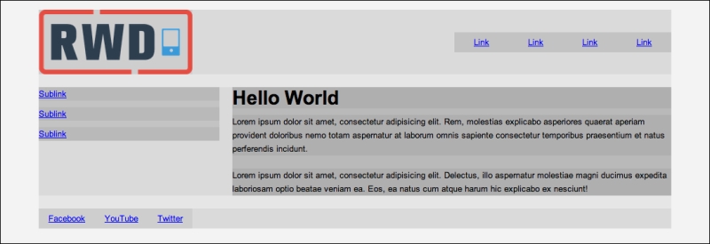
}Save your files and refresh your browser and you should see something similar to the following screenshot. Did you notice the * { background: rgba(0,0,0,.05); } bit? That little trick is great for prototyping a layout. It helps you visualize all the building blocks of your site.
Now expand and contract your page. What happens? If you're on a big monitor, the margins on the sides of the page will shrink while the layout stays centered, but when the width of the viewport becomes smaller than 980 px, the design is cut off and you get a horizontal scrollbar—not good!
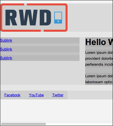
Oh no! It's not responding to devices with smaller viewports. Poor mobile users!
This is called a Fixed layout. It is set for a specific size (and usually centered), but when you view it on a mobile device, it's clipped. We can fix the Fixed layout by providing certain CSS, so when the page falls to 980 px, that will rearrange the layout of the site. This will give all the site's visitors a great experience.
As any good programmer knows that making a checklist helps in organizing their tasks. So, let's make a checklist of things we would like to rearrange:
Logo: The logo should stack on top of the primary navigation and be centered
Primary Navigation: Each link should stack on top of each other and span the full width of the page
Secondary Navigation: For simplicity's sake, we'll just have these links stack on top of each other too
Content area: Again, let's just stack this content up too
Footer: Since we're pretty confident this will only be a few links (3), we can just leave them side-by-side, but maybe we should make them span the width of the page so they look nice
Notice anything about our plan? So far, we're just stacking things on top of each other and usually making them full-width elements. Of course you can arrange and rearrange things however you want, but an easy way to make a site phone-friendly is to simply stack elements on top of each other.
But, won't this bore people on mobile devices? No! They are used to sites that deliver a terrible mobile experience and they're typically not browsing websites on their mobile device for the sheer beauty, but rather, they're out with friends at a coffee shop and want to see if their favorite band is playing that night. If they can go to the band's website on their phone, click on their Gigs page, and quickly find when the band is playing next, you've done your job as a responsive web designer exceptionally well and you can expect that visitor to come back the next time they're out with friends.
There are definitely things we can do to make the design a bit friendlier (have a Menu button that expands the menu rather than wasting screen real-estate by stacking buttons on top of each other on every page), but we'll get into those later. To produce a job that responds quickly, the stack-width approach is an absolute gem.
Without further ado, here is the code that will make your Fixed layout beautifully responsive. You'll need to append this onto the end of your style.css:
@media (max-width: 980px) {
    body {
        width: 100%;
        margin: 10px auto;
    }
    .top {
        margin-bottom: 10px;
    }
    .logo {
        display: block;
        text-align: center;
        margin-bottom: 10px;
    }
    .logo img {
        float: none;
        margin-right: 0;
        height: auto;
        width: 30%;
    }
    nav.primary {
        float: none;
        margin-top: 0;
        text-align: center;
    }
    nav.primary a {
        float: none;
        display: block;
        margin-bottom: 10px;
    }
    nav.primary a:last-child {
        margin-bottom: 0;
    }
    .sidebar {
        float: none;
        width: 100%;
        margin-right: 0;
        margin-bottom: 10px;
        text-align: center;
    }
    .main {
        margin-bottom: 10px;
    }
    .content {
        float: none;
        width: 96%;
        padding: 2%;
    }
    footer a {
        width: 33.333%;
        padding: 5px 0;
        text-align: center;
    }
}
Note
Did you notice how we are making all of these changes within the same media query? The fewer media queries, the fewer times you're rearranging the layout, the better.
Let's save, refresh our browsers, and enjoy our handy work! Voila! We now have a website that looks, and more importantly, functions beautifully on almost every device. Hey! You're pretty good for a beginner! Have a look at the following screenshot:
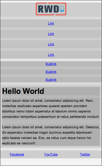
The layout you get at smaller screen widths
So what did we do exactly? First, we created a wrapper that directs the browser to activate the code when the browser's width gets to and below 980 px. After that, we just started removing floats from things and tweaking the widths and alignments of elements.
See? This stuff isn't that difficult. Don't be afraid of it. You just make a wrapper, contract your viewport, and then start tweaking things until they look good for smaller screens. There're a lot of cool things media queries can do and, as with anything, there are a lot of gotchas that you have to watch out for, but we'll cover all that in the next section. For now, be proud that you have understood the gist of RWD.